Tag Archives: PhD

Looking for letters

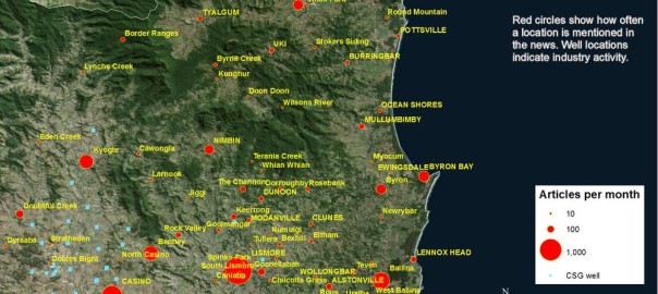
In the posts I’ve written to date, I’ve learned some interesting things about my corpus of 40,000 news articles. I’ve seen how the articles are distributed over time and space. I’ve seen the locations they talk about, and how this shifts over time. And I’ve created a thematic index to see what it’s all about. But I’ve barely said anything about the articles themselves. I’ve written nothing, for example, about how they vary in their format, style, and purpose.

To some extent, such concerns are of secondary importance to me, since they are not very accessible to the methods I am employing, and (not coincidentally) are not central to the questions I will be investigating, which relate more to the thematic and conceptual aspects of the text. But even if these things are not the objects of my analysis, they are still important because they define what my corpus actually is. To ignore these things would be like surveying a large sample of people without recording what population or cohort those people represent. As with a survey, the conclusions I draw from my textual analysis will have no real-world validity unless I know what kinds of things in the real world my data represent.

In this post, I’m going to start paying attention to such things. But I’m not about to provide a comprehensive survey of the types of articles in my corpus. Instead I will focus on just one categorical distinction — that between in-house content generated by journalists and staff writers, and contributed or curated content in the form of readers’ letters and comments. Months ago, when I first started looking at the articles in my corpus, I realised that many of the articles are not news stories at all, but are collections of letters, text messages or Facebook posts submitted by readers. I wondered if perhaps this reader-submitted content should be kept separate from the in-house content, since it represents a different ‘voice’ to that of the newspapers themselves. Or then again, maybe reader’s views can be considered just as much a part of a newspaper’s voice as the rest of the content, since ultimately it is all vetted and curated by the newspaper’s editors.

As usual, the relevance of this distinction will depend on what questions I want to ask, and what theoretical frameworks I employ to answer them. But there is also a practical consideration — namely, can I even separate these types of content without sacrificing too much of my time or sanity? 40,000 documents is a large haystack in which to search for needles. Although there is some metadata in my corpus inherited from the Factiva search (source publication, author, etc.), none of it is very useful for distinguishing letters from other articles. To identify the letters, then, I was going to have to use information within the text itself. Continue reading Looking for letters

How the news moves


Don’t feel like reading? Fine, skip to the pictures!

My last post explored the spatial and temporal dynamics of news production, looking at how the intensity of news coverage about coal seam gas varied over time across regional newspapers. In this post, I will look instead at the geographic content of news coverage: which places do news articles about coal seam gas discuss, and how has the geographic focus changed over time?

Coal seam gas development in Australia has become a matter of national interest, at least insofar as it has a place (albeit a shrinking one) on the federal political agenda, and has featured (albeit to varying degrees) in news coverage and public debate across the country. But it’s hard to talk sensibly about coal seam gas — whether you are talking about the industry itself, its social and environmental impacts, or how the community has responded to it —  without grounding the discussion in specific locations. From one gas field to another, the structures and dynamics of underground systems vary just as much as the social systems on the surface. I am convinced that any meaningful analysis of CSG-related matters must be highly sensitive to geographic context. (My very first PhD-related post on this blog, an analysis of hyperlinks on CSG-related web pages, pointed to the same conclusion.)

Most news stories about coal seam gas are ultimately about some place or another (or several), whether it be the field where the gas is produced, the power plant where it is used, the port from which it is exported, the environment or community affected, or the place where people gather to protest or blockade. Keeping track of which places are mentioned in the news could provide one way of tracking how the public discourse about coal seam gas develops. And the most logical way to present and explore this kind of information is with a map. In theory, every place mentioned in an article could be translated to a dot on a map. Mapping all of the dots from all of the articles should reveal the geographical extent and focus of news about coal seam gas.

Why do this? (Other than because I can, and it might be fun?) Firstly, because I’m still a little sketchy about how coal seam gas development and its attendant controversies have moved around the country over the last decade or two. I’m reasonably familiar with what has transpired in Queensland, but much less so with the situation in New South Wales. As for the other states, where there has been much less industry activity, I know virtually nothing about where and when coal seam gas has been discussed. So a map (especially one that can show time as well) of CSG-related news would provide a handy reference for understanding both the national and local geographic dimensions of the issue.

The other reason to map the news in this manner is that it may provide a way to both generate and answer interesting questions about the news landscape (or the public discourse more broadly) around coal seam gas — and this is, after all, what my PhD needs to do. Continue reading How the news moves

Mapping the news

Where did the last 12 months go? All I can really remember is something about being confirmed as a PhD candidate. I read a lot, and wrote a lot, but did very little of what I originally set out to do — namely, visualising and analysing text data. Now, finally, I am back in the sandpit. I’ve amassed a truckload of data in the form of news articles and blogs about coal seam gas development in Australia, and I intend to spend the next short while sifting through it and seeing what sort of sandcastles I can build before the tide of my next PhD milestone forces me to construct something more substantial.

The ultimate aim of my PhD is to explore how computational text analysis techniques such as topic modelling can assist in the analysis of public discourse. But for now, my objective is to get acquainted with my data. This data is divided into two piles, each representing a part of the discursive landscape around coal seam gas (or CSG) in Australia (if you’re American, think coalbed methane). One pile of data consists of texts published on the web by a range of actors (the sociology kind, not the Hollywood kind) including community groups, activists, lobbyists and politicians. I’ve siphoned these texts from a variety of websites using a data-crawling tool called import.io. The second, much larger, pile of data consists of news articles from hundreds of Australian mainstream media publications, from the national broadsheet right down to the local rags. I gathered these articles from the online news database Factiva, with the help of a script, available at the website for the conversation analysis tool Discursis, which converts Factiva’s HTML outputs into tabular format in the form of CSV files.

This post is devoted to exploring the second pile of data — the many thousands of news articles that I gathered from Factiva. Without attempting any fancy text analysis, I aim to get a first look at the overall volume, scope and diversity of the content. The focus in this post is on the overall volume and the geographic distribution of the content. In a future post, I plan to explore the the specific news sources in more detail. Continue reading Mapping the news

Mapping concepts, comparing texts

In the previous post, I explored the use of function words — that is, words without semantic content, like it and the — as a way of fingerprinting documents and identifying sets that are composed largely of the same text. I was inspired to do this when I realised that the dataset that I was exploring — a collection of nearly 900 public submissions to an inquiry by the New South Wales parliament into coal seam gas — contained several sets of documents that were nearly identical. The function-word fingerprinting technique that I used was far from perfect, but it did assist in the process of fishing out these recycled submissions.

That exercise was really a diversion from the objective of analysing the semantic content of these submissions — or in other words, what they are actually talking about. Of course, at a broad level, what the submissions are talking about is obvious, since they are all responses to an inquiry into the environmental, health, economic and social impacts of coal seam gas activities. But each submission (or at least each unique one) is bound to address the terms of reference differently, focussing on particular topics and making different arguments for or against coal seam gas development. Without reading and making notes about every individual submission, I wanted to know the scope of topics that the submissions discuss. And further to that, I wanted to see how the coverage of topics varied across the submissions.

Why did I want to do this? I’ll admit that my primary motivation was not to learn about the submissions themselves, but to try my hand at some analytical techniques. Ultimately, I want to use computational methods like text analytics to answer real questions about the social world. But first I need some practice at actually doing some text analytics, and some exposure to the mechanics of how it works. That, more than anything else, was the purpose of the exercise documented below. Continue reading Mapping concepts, comparing texts