Tag Archives: maps

HeatTraKR – A Knime workflow for exploring Australian climate data

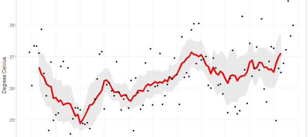
Recently, I decided to crunch some data from the Australian Bureau of Meteorology (which I’ll just call BoM) to assess some of my own perceptions about how the climate in my home city of Brisbane had changed throughout my lifetime. As always, I performed the analysis in Knime, a free and open software platform that allows you to do highly sophisticated and repeatable data analyses without having to learn how to code. Along the way, I also took the opportunity to sharpen my skills at using R as a platform for making data visualisations, which is something that Knime doesn’t do quite as well.

The result of this process is HeatTraKR, a Knime workflow for analysing and visualising climate data from the Australian Bureau of Meteorology, principally the Australian Climate Observations Reference Network – Surface Air Temperature (ACORN-SAT) dataset, which has been developed specifically to monitor climate variability and change in Australia. The workflow uses Knime’s native functionality to download, prepare and manipulate the data, but calls upon R to create the visual outputs. (The workflow does allow you to create the plots with Knime’s native nodes, but they are not as nice as the R versions.)

I’ve already used the HeatTraKR to produce this post about how the climate in Brisbane and Melbourne (my new home city) is changing. But the workflow has some capabilities that are not showcased in that post, and I will take the opportunity to demonstrate these a little later in the present post.

Below I explain how to install and use the HeatTraKR, and take a closer look at some of its  outputs that I have not already discussed in my other post. Continue reading HeatTraKR – A Knime workflow for exploring Australian climate data

Confessions of a climate deserter

For so long, climate change has been discussed in Australia (and indeed elsewhere) as if it were an abstract concept, a threat that looms somewhere in the future. Not anymore. In 2019, climate change became a living nightmare from which Australia may never awake.

While I prepared this post in the dying weeks of 2019 and the beginning of 2020, there was not a day when some part of the country was not on fire. As at 24 January, more than 7.7 million hectares — that’s an area about the size of the Czech Republic — have burned. Thirty-three people have died. Towns have been destroyed. Old-growth forests have burned. Around a billion animals have been killed. Whole species have probably been lost.

The effects were not only felt in the bush. Capital cities such as Sydney, Melbourne and Canberra endured scorching temperatures while choking in smoke. Newspaper front pages (except those of the Murdoch press) became a constant variation on the theme of red. The country entered a state of collective trauma, as if at war with an unseen and invincible enemy.

The connection between the bushfires and climate change has been accepted by nearly everyone, with the notable exception of certain denialists who happen to be running the country — and even they are starting to change their tune (albeit to one of ‘adaptation and resilience’). One thing that is undeniable is that 2019 was both the hottest and driest year Australia has experienced since records began, and by no small margin. In December, the record for the country’s hottest day was smashed twice in a single week. And this year was not an aberration. Eight of the ten hottest years on record occurred in the last 10 years.  Environmentally, politically, and culturally, the country is in uncharted territory.

Climate deserters

I watched this nightmare unfold from my newly adopted city of Melbourne, to which I moved from Brisbane with my then-fiancée-now-wife in January 2019. As far as I can tell, Melbourne has been one of the better places in the country to have been in the past few months. The summer here has been pleasantly mild so far, save for a few horrific days when northerly winds baked the city and flames lapped at the northern suburbs. It seems that relief from the heat is never far away in Melbourne: the cool change always comes, tonight or tomorrow if not this afternoon. During the final week of 2019, as other parts of Victoria remained an inferno, Melbourne reverted to temperatures in the low 20s. We even got some rain. It was almost embarrassing.

Finding relief from the heat is one of the reasons my wife and I moved to Melbourne. Having lived in Brisbane all of our lives, we were used to its subtropical summers, but the last few pushed us over the edge. To be sure, Brisbane rarely sees extreme heat. In summer, the maximums hover around 30 degrees, and rarely get beyond the mid-30s. But as Brisbanites are fond of saying (especially to southerners ), it’s not the heat, it’s the humidity that gets you. The temperature doesn’t have to be much about 30 degrees in Brisbane before comfort levels become thoroughly unreasonable. Continue reading Confessions of a climate deserter

Where are we now?

It’s been a busy few months. Among other things, I presented at the Advances in Visual Methods for Linguistics 2016 conference held here in Brisbane last week; I submitted a paper to the Social Informatics (SocInfo) 2016 conference being held in Seattle in November; and I delivered a guest lecture to a sociology class at UQ. Somewhere along the way, I also passed my mid-candidature review milestone.

Partly because of these events, and partly in spite of them, I’ve also made good progress in the analysis of my data. In fact, I’m more or less ready to draw a line under this phase of experimental exploration and move onto the next phase of fashioning some or all of the results into a thesis.

With that in mind, I hope to do two things with this post. Firstly, I want to share some of my outputs from the last few months; and secondly, I want to take stock of these and other outputs in preparation for the phase that lies ahead. I won’t try to cram everything into this post. Rather, I’ll focus on just a few recent developments here and aim to talk about the rest in a follow-up post. Specifically, this post covers three things: the augmentation of my dataset, the introduction of heatmaps to my geovisualisations, and the association of locations with thematic content. Continue reading Where are we now?

What do you do with a thousand place names?


My previous post was all about turning place names in news articles into dots on a map. Using a fairly straightforward method, I matched the place names in a collection of 26,863 news articles against the names and geographic coordinates in the Australian Gazetteer 2012, which lists and locates virtually every named place in Australia. Using such a comprehensive list created a fair amount of extra work, but resulted in a very rich and satisfying visualisation of how the news coverage about coal seam gas has moved over time. Ultimately however, I want to translate these rich visualisations into simpler narratives and numerical descriptions. And to do this, individual statistics for every one of the 1,448 places on my list will not be of much help. I will need some way of aggregating the locations into relevant regions or locales.

To achieve this, one could perhaps use some technique to group the locations based on spatial proximity — something akin to drawing fences around the places that form discrete clusters on the map. But there might be reasons besides proximity to group places together. Spatially distinct places might be united by common issues or events, just as proximate places might be subject to separate laws and controversies. Given that my ultimate object of study is public discourse, such non-geographical unifying factors may prove to be as important as geographical ones.

Latent Deary What?

Only some of these thoughts had crossed my mind when the idea hit me to use a topic modelling technique called Latent Dirichlet Allocation (LDA) to bring some order to my large list of locations. LDA is a technique that automatically identifies topics in large collections of documents, with a ‘topic’ in this context being defined as a set of words that tend to occur together in the documents that you are analysing. LDA uses some clever assumptions and iterative processes to find sets of words that, in most cases at least, correspond remarkably well with meaningful topics in the text. It is widely used for automated document categorisation and indexing, and more recently it has been applied to fields such as history and literary studies under the banner of the digital humanities. If you’re fluent in hieroglyphics, the Wikipedia page might be a good place to start if you want to know more about LDA. If you’re a mere mortal, pages like this one and this one offer a softer introduction.

Like many computational text analysis methods, LDA views each document as an unordered ‘bag of words’. (This might sound like the surest way to render a document meaningless, but the payoff is that it makes the text amenable to all kinds of statistical techniques.) So I figured, why not instead feed the LDA algorithm bags of places, which is exactly what I had created from my collection of news articles when preparing my last post. I saw no reason why LDA couldn’t turn this data into groups of locations that were both spatially and discursively meaningful. Places that are mentioned together in articles are likely to be physically close to one another, linked by social context, or most likely, both. Meaningful groupings of these places could be called geographic topics, or geotopics for short. Continue reading What do you do with a thousand place names?