In the previous post, I explored the use of function words — that is, words without semantic content, like it and the — as a way of fingerprinting documents and identifying sets that are composed largely of the same text. I was inspired to do this when I realised that the dataset that I was exploring — a collection of nearly 900 public submissions to an inquiry by the New South Wales parliament into coal seam gas — contained several sets of documents that were nearly identical. The function-word fingerprinting technique that I used was far from perfect, but it did assist in the process of fishing out these recycled submissions.
That exercise was really a diversion from the objective of analysing the semantic content of these submissions — or in other words, what they are actually talking about. Of course, at a broad level, what the submissions are talking about is obvious, since they are all responses to an inquiry into the environmental, health, economic and social impacts of coal seam gas activities. But each submission (or at least each unique one) is bound to address the terms of reference differently, focussing on particular topics and making different arguments for or against coal seam gas development. Without reading and making notes about every individual submission, I wanted to know the scope of topics that the submissions discuss. And further to that, I wanted to see how the coverage of topics varied across the submissions.
Why did I want to do this? I’ll admit that my primary motivation was not to learn about the submissions themselves, but to try my hand at some analytical techniques. Ultimately, I want to use computational methods like text analytics to answer real questions about the social world. But first I need some practice at actually doing some text analytics, and some exposure to the mechanics of how it works. That, more than anything else, was the purpose of the exercise documented below.
Enter Leximancer
Various computational tools and techniques have been developed to extract semantic content from text. At some stage I might even get around to trying and comparing a bunch of them. For the moment, though, I am focussing my energies on a program called Leximancer. Developed at the University of Queensland, Leximancer extracts high-level concepts from text documents and presents them visually to reveal the structured meaning in the text.
For details about how Leximancer works, I suggest consulting the manual and this theoretical article. But in rough terms, Leximancer works by first identifying frequently occurring terms and using these as ‘concept seeds’. It then constructs a thesaurus of ‘evidence terms’ for each concept based on which words frequently co-occur with the concept seeds. During this process, new concepts are often identified that were not among the original seeds. Finally, Leximancer examines the co-occurrence of the concepts and constructs a concept map showing which concepts are most closely related to one another. Clusters of related concepts can be further grouped into themes. This will all make more sense as you read on below.
Data inputs
Leximancer can accept text input in a variety of formats, including Word documents, PDFs, plain text files, and spreadsheets. The submissions that I retrieved from the New South Wales Parliament website were all in PDF format, but I chose to convert them to plain text and then to collate the text into a single table in a comma-separated value (CSV) file. I converted the PDFs to text partly on a hunch that it would speed up the processing time for Leximancer and any other tools (such as KNIME) that would be analysing them. I also figured that seeing the documents in plain text would provide a more honest picture of the data, which in this case was not very ‘clean’. Many of the original PDFs had been scanned from paper rather than converted directly from the source documents. This meant that the text data was derived through Adobe Acrobat’s optical character recognition (OCR) engine, which yields accurate results with high-quality scans, but struggles if the scan is poor. By converting the PDFs to text, I could see just how poor some of the OCR results were, and in some cases I excluded documents from the analysis because the text was mostly gibberish.
I collated the text documents in to a CSV file (using KNIME) so that I could easily categorise and filter the submissions. Leximancer can use the folder structure of a collection of documents as a classification system, but I figured that filtering columns of a spreadsheet would be preferable to moving documents around if I changed my mind about how I wanted to classify them.
And how did I classify the submissions? Firstly, I kept track of which submissions were duplicates, and which family of duplicates each one belonged to. For the Leximancer analysis, I filtered out the duplicates prior to processing. Secondly, and more importantly, I classified the submissions according to who wrote them. I thought it might be useful to discriminate, for example, between those written by individuals and those written by gas companies, scientific experts or local governments. The full list of categories I used is:
- Submissions from individuals with no stated affiliation with an organisation or interest group.
- Submissions from businesses, lobby groups or industry associations within the agricultural industry.
- Submissions from community groups, which I defined as organisations focussed on issues in a particular community or locality, generally without any corporate structure or external funding. These included a large number of anti-CSG groups.
- Submissions from environmental groups, which I defined as organisations with a formal environmental advocacy role, generally operating at the regional, state or national level.
- Submissions from scientific, technical or legal experts and professionals with qualifications relevant to the inquiry’s terms of reference.
- Submissions from local governments, including city councils, shire councils and regional councils.
- Submissions from companies, lobby groups and associations affiliated with the extractive resource industry, including coal seam gas companies.
(I also had a few leftovers from state governments, advisory bodies and other businesses which I omitted for the purposes of this analysis.)
Some of these distinctions are unambiguous, while others are subjective, even arbitrary. I make no claims regarding their theoretical validity or their practical utility. I chose them based on my intuitive sense of the differences in motivation and interests among the submissions, hoping that at least some these differences could be picked up by the text analysis. In the near future, I would like to try doing this the other way around by using the text analysis to identify natural groups within the submissions. But for now, my own clunky classifications will have to do.
Concept maps
The concept map that Leximancer built from the submissions is shown below. Before unpacking it, however, there are some decisions behind it that I need to explain. Firstly, this map contains only ‘word-like’ concepts; it does not included any named entities such as people, places and companies. Leximancer can identify names as well as words, but for the purpose of this analysis I decided to keep things simple and exclude the names. Secondly, many of the concepts on the map are ‘compound concepts’, meaning that they are rule-based combinations of the concepts that Leximancer identified automatically. The compound concepts on this map are those flagged with an asterisk or that consist of two or more words. Some of these compound concepts simply group together concepts that mean the same thing: ‘fracturing’ and ‘fracking’, for example, are both represented in the concept ‘fracking*’. Others, such as ‘environmental impacts’ are true combinations of two or more automatically identified concepts. In many cases, I retained the component concepts on the map but took care to separate them from the compound terms of which they were a part. So, for example, ‘impact*’ was defined as ‘(impact OR impacts OR effects) AND NOT (social OR environmental OR health OR economic)’. In a similar fashion, ‘coal seam’ was distinguished from ‘coal*’, ‘gas*’ and ‘coal seam gas’.
Finally, I excluded from the map some of the concepts identified by Leximancer. These were generally concepts that were of little interpretive value, such as ‘inquiry’ and ‘submission’. I also removed my own compound concept ‘coal seam gas’, as it was too strongly connected to too many concepts to be useful.
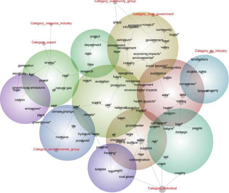
Each node in the central portion of the map is a concept, with the size of the circle reflecting its importance in the dataset. The lines joining the nodes indicate strong connections between concepts, and the map is arranged so that proximity reflects relatedness. The coloured bubbles are thematic groupings of concepts. Themes that are more central and red-coloured are more prominent in the text, while those that are blue and on the periphery are less prominent. On the outskirts of the map are the ‘tags’ representing the categories with which I grouped the submissions. The category tags are closest to the concepts and other categories with which they have most in common.
The main thing that I took away from this concept map is that it makes a lot of sense. The meaning and relevance of most (not all) of the concepts is readily apparent to anyone familiar with the issues around coal seam gas, and the relationships implied by their proximity to one another are also meaningful. We can see, for example, that ‘water’ is one of the most prominent topics, and that it is closely associated with discussions about aquifers, risk, impact, chemicals, contamination and, of course, fracking. Another theme brings together discussions about farms, property, landholders, and the access rights of gas companies.
The positioning of the category tags also makes a degree of sense. The agricultural industry is right next to the concepts relating to farms and property. The local government category is close to concepts like ‘council’, ‘community’ and ‘social’, while the category for the resource industry (as well the category for experts) connects with the theme pertaining to energy, power, and various types of fuel. The environmental groups are connected to concepts concerning climate change and greenhouse gases. The category for individuals is connected to locally themed concepts like ‘creek’ and ‘country’, but also to very general concepts like ‘world’ and ‘water’ — make of this what you will.
Having confirmed that Leximancer can indeed pull something meaningful out of these submissions, I wanted to see what more it could reveal about the categories into which I had grouped them. Leximancer includes various features designed to assist with profiling, and can generate detailed statistics as well as customised concept maps to assist with this task. The method I chose was to profile each category of submissions against the set of concepts as appear in the map above.
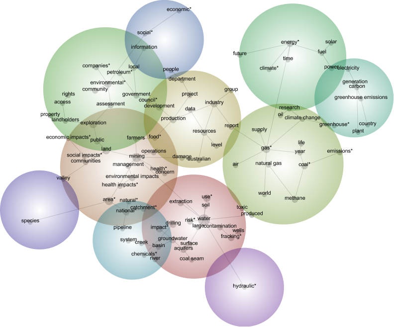
As always, the first output to inspect is the concept map. I hoped that a comparison of the maps for each group might reveal some interesting differences. And they can, if you stare at them long enough. For example, the maps for environmental groups and the resource industry are shown below. You could probably read something into how ‘toxic’ and ‘chemicals’ are relegated to the periphery of the resource industry’s map, yet are more central in the map for the environmental groups. But to be honest, I am struggling to find much else to say about these two maps, which I picked specifically because I thought that they would be among the least similar.
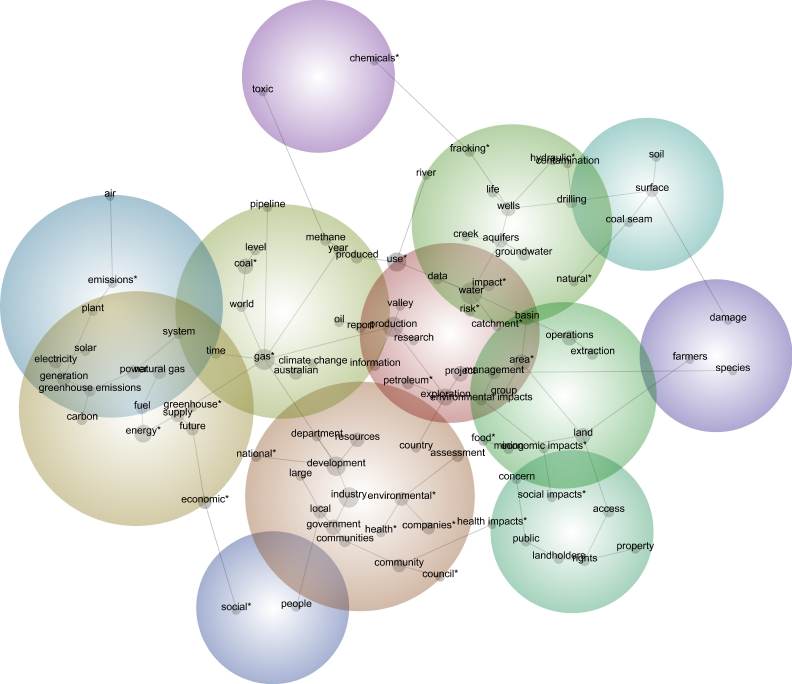
One conclusion that could be drawn here is that the concepts being mapped here are not very discriminating. After all, they were generated by analysing the entire dataset rather than each individual group of submissions. Another possible conclusion is that there really isn’t much of a difference among the groups. I suspect that there is some truth in both of these conclusions, but I also feel that these concept maps are not a very efficient tool for spotting the kinds of differences I am looking for. So how else might we compare the groups?
The simplest method of comparison is to look at the how often each concept occurs in each group of submissions. Leximancer lists this information alongside the concept map. We can learn, for example, that the three most prominent concepts used by local governments are ‘council’, ‘water’ and ‘government’, while the top three concepts in the resource industry group are ‘water’, ‘gas’ and ‘industry’. This looks promising, but if we want to compare more than the top three concepts, let alone all 100 of them, we will need a better way of doing it than just lining up all the groups’ scorecards side by side. Actually, the method that I arrived at does little more than this, but with a key difference: it converts the numbers to colours.
Heat maps
To convert the numeric outputs from Leximancer into a more visual format, I loaded them into KNIME, a data analysis program that I discussed in my previous post. I simply fed a table of concept frequencies 1 into KNIME’s heatmap node, and got the following result:
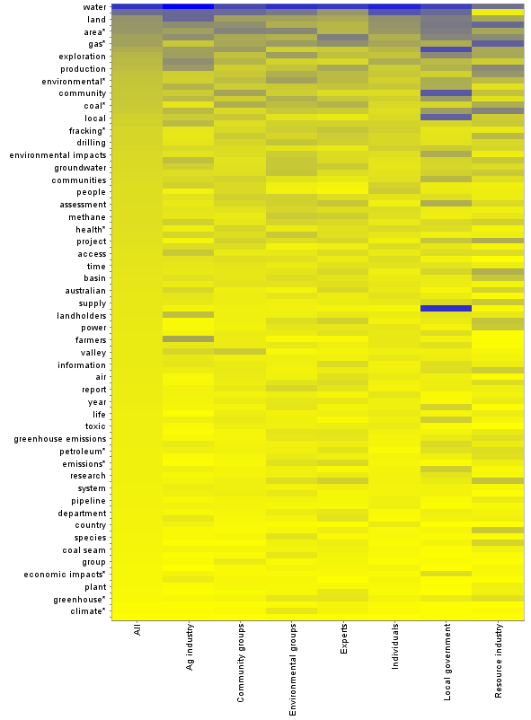
This graph lists all 100 mapped concepts (though not all are labelled) in descending order of their occurrence in the whole dataset. Dark blue is the highest frequency (around 25%), and bright yellow the lowest (zero). At a glance, this graph shows how much each group deviates from the dataset as a whole, and also reveals the concepts for which the deviation is greatest. A dark line towards the bottom of the graph, or a bright line towards the top, indicates that a concept is used much more or less frequently by a particular group than in the dataset as a whole. The shading of the ‘individuals’ column is broadly similar to that for the whole dataset, which perhaps is not surprising given that submissions from individuals account for more than half of the whole dataset. By contrast, the two columns on the right, representing local government and the resource industry, show a greater number of aberrations, suggesting that the interests or priorities of these groups are somewhat different to those of the other groups.
The next image shows just the upper portion of the heatmap, sized so that the label of each individual concept is displayed.
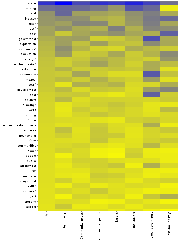
We can see from this graphic that the submissions from local governments mention the concepts ‘government’, ‘community’, local’ and (just outside this zoom) ‘council’ more frequently than any other groups of submissions. No surprises there! We can also see that the resource industry uses the concept ‘mining’ (listed second from the top) far less frequently than other groups. Anyone who has conversed with people from the industry will immediately know why: industry folk never use the term coal seam gas mining, not because of any connotations that it might have, but because to them, mining is about pulling rocks out of the ground, whereas natural gas is extracted or produced from reservoirs that are otherwise left intact. Scientists and technical experts generally follow the same convention, and sure enough, this is reflected in the heatmap as well.
What this visualisation communicates depends heavily on how the concepts are ordered. The example above uses the whole dataset as the benchmark, but it could be sorted according to any of the columns to allow for comparisons with a specific group. It could also be ordered by something other than descending frequency. For example, the concepts could be grouped into thematically related clusters.
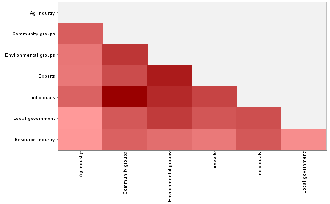
The heatmap method used above can provide a visual ‘sense’ of which groups are most similar or different to one another in terms of their concept use, but it would be nice to be able to quantify these differences more precisely. Again, there are various ways in which one could go about doing this. I decided to try the same method that I used to identify duplicated submissions in the previous post — that is, using KNIME to calculate a distance matrix (using Euclidean distance) based on each group’s use of the concepts (yes, all 100 concepts). The output is a triangular matrix with numbers specifying the degree of difference between each pair of groups. Rather than focus on the numbers, I again chose to present it as a heatmap:
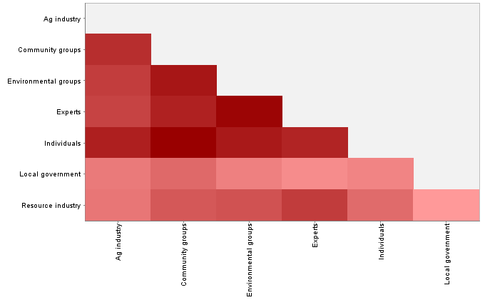
This heatmap uses just one number to represent every hundred numbers from the previous heatmap, but it seems to bear out some of the impressions gained from the more nuanced view. Most strikingly, the two lightly coloured rows on the bottom suggest that local governments and the resource industry are the outliers, in that on average, their usage of the concepts has less in common with the other groups than the other groups have with each other. A possible exception is the pairing of the resource industry with the experts — a result that, to me at least, is not surprising.
There are other pairings that make some sense, but I am hesitant to say much more about this graph. While I think this method of comparison is sound, much more care needs to be taken in choosing the concepts to compare. Is there an even thematic spread in the 100 concepts that I used? If not, then the comparison might skewed towards certain themes at the expense of others. Perhaps thematic groupings, rather than individual concepts, would be the more sensible unit of comparison. And perhaps it would make more sense to compare the groups with respect to one theme at a time rather than all of them at once.
Concept co-occurrence
Having worked through some comparisons based on concept frequencies, I was curious to try the same with one other Leximancer output. I wondered if the groups of submissions could be distinguished from one another based on the frequencies with which different pairs of concepts occur. The co-occurrence of concepts is what Leximancer uses to generate the concept maps, and given that there were no startling differences evident in the different groups’ concept maps, I probably shouldn’t have expected any interesting differences to emerge by representing the data in any other way. But nonetheless, I was curious.
If nothing else, I figured that it would be worthwhile to visualise the co-occurrence matrix using the heatmap method. Here is what the matrix for the whole dataset looks like:
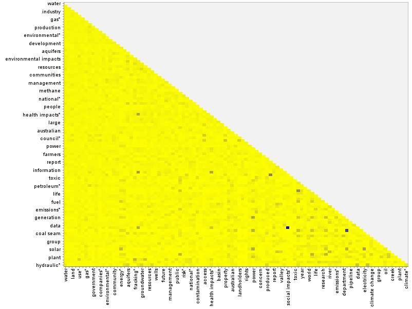
The main thing that this graph shows is that only a few pairs of concepts occur with high prominence. 2 Most concepts are weakly paired, while a smattering are moderately paired. Zooming in on a segment of the graph (below), we can see that one of the dark spots corresponds to the pairing of ‘electricity’ and ‘generation’ — terms that perhaps could have been joined into a compound concept. The darkest spot is the pairing of ‘social impacts’ and ‘economic impacts’. Depending on how these concepts two relate to other concepts, there could be a case made for combining them into a compound concept called ‘socio-economic impacts’.
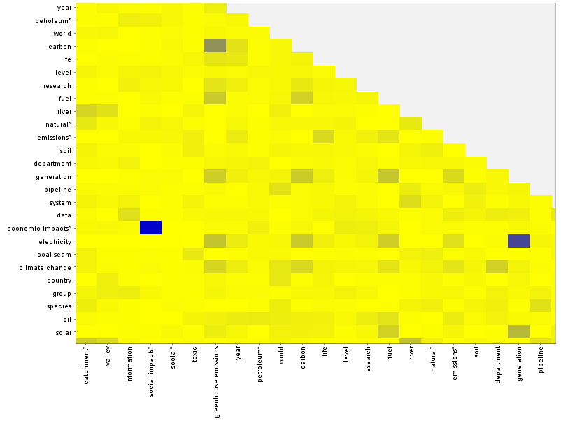
How do concept pairings differ from group to group? As an example, you can compare the heatmap for the agricultural industry with that of the resource industry by hovering over the image below (or tapping it if you are using a touchscreen).
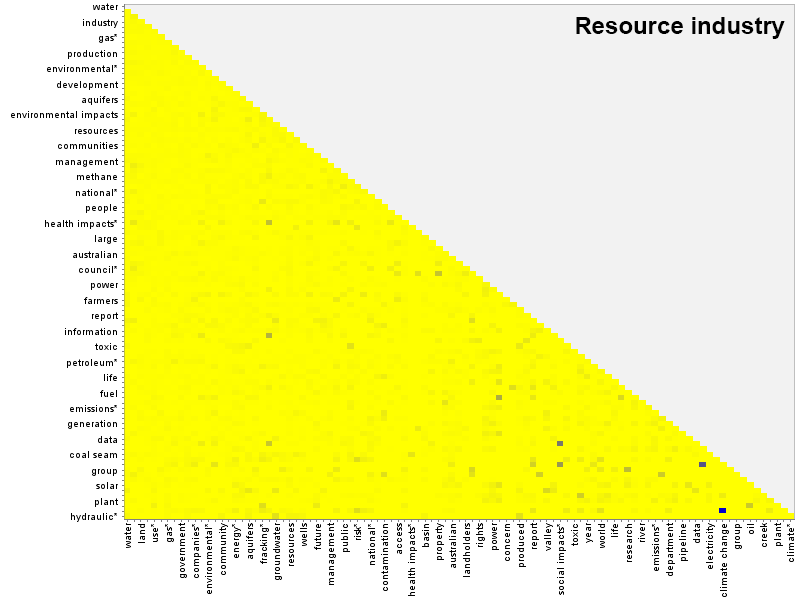
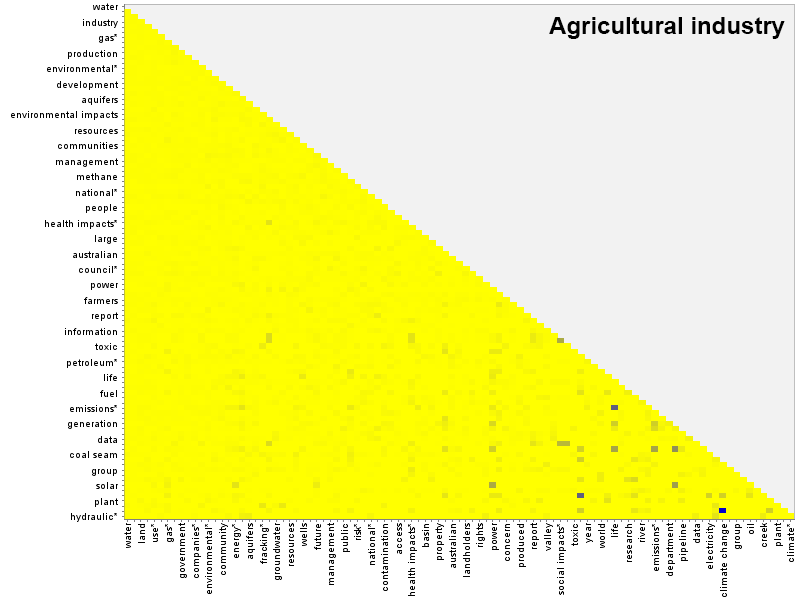
There are differences in the lightly shaded pairs throughout the matrix, as well as a few dark spots specific to each group. The submissions from the resource industry, for example, include a strong pairing between ‘country’ and ‘economic impacts’ that is not shared by the submissions from agricultural industry. The agricultural industry, meanwhile, has its own unique pairing of ’emissions’ and ‘life’.
Do these co-occurrence matrices amount to a ‘fingerprint’ for each group? Maybe. But as with the concept frequencies, I’m not sure how useful it is to distill the differences for every pairing down to a single number. I tried doing just this (using something called the Frobenius matrix norm) and the resulting similarity matrix (below) is even less discriminating than the one for the concept frequencies. And the two similarity matrices share little in common, other than relatively strong associations between community groups and individuals, and between environmental groups and experts.
So what?
So what indeed. As I mentioned earlier, the purpose of this exercise never really was to learn much about the submissions, but rather to explore methods through which their conceptual profiles might be compared. Even on that account I am not sure that I have achieved much that is worth sharing (if you think otherwise, do let me know!). But I now know a hell of a lot more about how this stuff works than I did when I started, and that counts for something.
There is more in this vein that I would like to explore, such as methods with which I might cluster and classify the submissions in a more defensible way than I did here. But there is something else I need more urgently, and that is an actual research question to which these methods can be applied. So my plan now is to down the tools and pick up the books. If I don’t see another Leximancer bubble plot for several weeks, I’ll be a happy man.
Notes:
- Specifically, the number of times a concept occurred in the dataset divided by the number of ‘context blocks’ in the dataset, where a context block is two concurrent sentences. ↩
- Leximancer calculates the ‘prominence’ of concept pairings by dividing the frequency with which the pairing occurs by the product of the frequencies of the two individual terms. In other words, the raw co-occurrence frequency is ‘scaled’ to account for the frequency of the individual terms. This way, strong pairings of infrequent terms are weighted equally to pairings of frequent terms. ↩