Tag Archives: R

GameStop on Twitter: a quick squiz at the short squeeze

GameStop the press!

Remember GameStop? You know, the video game retailer whose decaying share price exploded after a bunch of Reddit users bought its stock and succeeded in bankrupting a hedge fund who was trying to short it? Yeah, that was nearly a week ago now, so my memory of it is getting hazy. I mostly remember all the explainers about how the share market works and what a short squeeze is. And the thought pieces about how this kind of coordinated market behaviour is nothing criminal, just ordinary folk playing the big boys at their own game and finally winning. And the memes: who can forget the memes? Well, me, for a start.

Somewhere amid the madness, I decided that I should harvest some Twitter data about this so-called GameStop saga (can something really only be a saga after only three days?) to capture the moment, and to see whose hot takes and snide remarks were winning the day in this thriving online marketplace of shotposts and brainfarts.

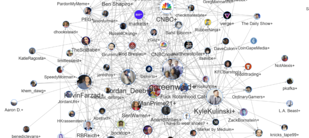
I confess that I had another motive for doing this as well, which was to provide some fodder for my TweetKollidR workflow, which turns Twitter datasets into pretty and informative pictures. The TweetKollidR is a workflow for the KNIME Analtyics Platform that I developed while locked down for three months in the latter half of 2020. I’ve made the workflow publicly available on the KNIME Hub, but it is still in need of road-testing, having been used (by me, at least) to analyse only two issues — the Covid-19 lockdown that spurred its genesis, and the wearisome public discourse about Australia Day. I felt that it was time to test the workflow on an issue that was not so close to home.

So, using the TweetKollidR workflow to connect to Twitter’s Search API, 1 I collected just over 50,000 tweets containing the terms gamestop or game stop. Because I am not paying for premium access to the API, I was only able to grab tweets that were made within about 24 hours of the search (usually you can go back in time up to a week, but the sheer volume of activity around this topic might have shortened the window offered by the API). The 50,000 tweets in the dataset therefore cover just two days, namely 28 and 29 January 2021.

Let’s take a squiz! (By which, for the non-Australians among you, I mean a look or glance, esp an inquisitive one.) Continue reading GameStop on Twitter: a quick squiz at the short squeeze

Notes:

  1. API stands for application programming interface, which is essentially a protocol by which content can be requested and supplied in a machine-readable format, rather than as eye candy.

Qualitative evaluation of topic models: a methodological offering

Topic models: a Pandora’s Black Box for social scientists

Probabilistic topic modelling is an improbable gift from the field of machine learning to the social sciences and humanities. Just as social scientists began to confront the avalanche of textual data erupting from the internet, and historians and literary scholars started to wonder what they might do with newly digitised archives of books and newspapers, data scientists unveiled a family of algorithms that could distil huge collections of texts into insightful lists of words, each indexed precisely back to the individual texts, all in less time than it takes to write a job ad for a research assistant. Since David Blei and colleagues published their seminal paper on latent Dirichlet allocation (the most basic and still the most widely used topic modelling technique) in 2003, topic models have been put to use in the analysis of everything from news and social media through to political speeches and 19th century fiction.

Grateful for receiving such a thoughtful gift from a field that had previously expressed little interest or affection, social scientists have returned the favour by uncovering all the ways in which machine learning algorithms can reproduce and reinforce existing biases and inequalities in social systems. While these two fields have remained on speaking terms, it’s fair to say that their relationships status is complicated.

Even topic models turned out to be as much a Pandora’s Box as a silver bullet for social scientists hoping to tame Big Text. In helping to solve one problem, topic models created another. This problem, in a word, is choice. Rather than providing a single, authoritative way in which to interpret and code a given textual dataset, topic models present the user with a landscape of possibilities from which to choose. This landscape is defined in part by the model parameters that the user must set. As well as the number of topics to include in the model, these parameters include values that reflect prior assumptions about how documents and topics are composed (these parameters are known as alpha and beta in LDA). 1 Each unique combination of these parameters will result in a different (even if subtly different) set of topics, which in turn could lead to different analytical pathways and conclusions. To make matters worse, merely varying the ‘random seed’ value that initiates a topic modelling algorithm can lead to substantively different results.

Far from narrowing down the number of possible schemas with which to code and analyse a text, topic models can therefore present the user with a bewildering array of possibilities from which to choose. Rather than lending a stamp of authority or objectivity to a textual analysis, topic models leave social scientists in the familiar position of having to justify the selection of one model of reality over another. But whereas a social scientist would ordinarily be able to explain in detail the logic and assumptions that led them to choose their analytical framework, the average user of a topic model will have only a vague understanding of how their model came into being. Even if the mathematics of topics models are well understood by their creators, topic models will always remain something of a ‘black box’ to many end-users.

This state of affairs is incompatible with any research setting that demands a high degree of rigour, transparency and repeatability in textual analyses. 2 If social scientists are to use topic models in such settings, they need some way to justify their selection of one possible classification scheme over the many others that a topic modelling algorithm could produce, 3 and to account for the analytical opportunities foregone in doing so.

If you’ve ever tried to interpret even a single set of topic model outputs, you’ll know that this is a big ask. Each run of a topic modelling algorithm produces maybe dozens of topics (the exact number is set by the user), each of which in turn consists of dozens (or maybe even hundreds) of relevant words whose collective interpretation constitutes the ‘meaning’ of the topic. Some topics present an obvious interpretation. Some can be interpreted only with the benefit of domain expertise, cross-referencing with original texts, and perhaps even some creative licence. Some topics are distinct in their meaning, while others overlap with each other, or vary only in subtle or mysterious ways. Some topics are just junk.

If making sense of a single topic model 4 is a complex task, comparing one model with another is doubly so. Comparing many models at a time is positively Herculean. How, then, is anyone supposed to compare and evaluate dozens of candidate models sampled from all over the configuration space? Continue reading Qualitative evaluation of topic models: a methodological offering

Notes:

  1. The generative model of LDA assumes that each document in a collection is generated from a mixture of hidden variables (topics) from which words are selected to populate the document. The number of topics in the model is a parameter that must be set by the user. The proportions by which topics are mixed to create documents, and by which words are mixed to define topics, are presumed to conform to specific distributions which are sampled from the Dirichlet distribution, which is essentially a distribution of distributions. The shape of these two prior distributions is determined by two parameters—often referred to as hyperparameters to distinguish them from the internal components of the model—which are usually denoted as alpha (α) and beta (β). Whereas alpha controls the presumed specificity of documents (a smaller value means that fewer topics are prominent within a document), beta controls the presumed specificity of topics (a smaller value means that fewer words within a topic are strongly weighted). Like the number of topics, these hyperparameters are set by the user, ideally with some regard for the style and composition of the texts being analysed.
  2. It’s important to recognise that criteria such as transparency and repeatability are not applicable to all textual analysis traditions. Some traditions assume a degree of interpretation and subjectivity that render such criteria all but irrelevant. The probabilistic nature of topic models presents a very different set of challenges and opportunities to such traditions, at least insofar as practitioners are inclined to use them.
  3. That is, assuming that only one fitted topic model is used in the analysis. Conceivably, an analysis could use and compare several models.
  4. In this post, as in much of the literature on topic modelling, the term ‘topic model’ may describe one of two things. The more general sense of the term refers to a particular generative model of text, which may or may not be paired with a specific inference algorithm. In this sense, LDA is one example of a topic model, and the structural topic model is another. The second sense of the term refers to the outputs, in the form of term distributions and document allocations, obtained by applying a topic model in the first sense to a particular collection of texts. (These outputs may also be referred to as a ‘fitted topic model’.) The relevant sense of the term will usually be evident from the context in which it is used.

TweetKollidR – A Knime workflow for creating text-rich visualisations of Twitter data

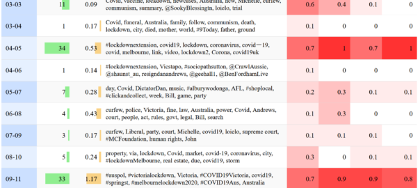
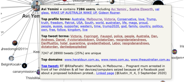
Several weeks ago, I posted an analysis of tweets about the restrictions imposed on Melbourne residents in an effort to control an outbreak of Covid-19. That analysis was essentially a road-test of a Knime workflow that I had been piecing together for some time, but that was not quite ready to share. Since writing that post, I have revised and tidied up the workflow so that anyone can use it, and I have made it available on the Knime Hub.

In the present post, I provide a thorough description of the workflow, which I have named the TweetKollidR, and demonstrate its use through a case study of yet another dataset of tweets about Melbourne’s lockdown (which, as I write this, still has not ended, although it has been eased). 1

Continue reading TweetKollidR – A Knime workflow for creating text-rich visualisations of Twitter data

Notes:

  1. As you will see from the search queries in Figure 3, this dataset includes some keywords that relate to Victoria more generally, rather than just Melbourne. However, since most of the content concerns the Melbourne lockdown, I will continue to refer to it as such.

HeatTraKR – A Knime workflow for exploring Australian climate data

Recently, I decided to crunch some data from the Australian Bureau of Meteorology (which I’ll just call BoM) to assess some of my own perceptions about how the climate in my home city of Brisbane had changed throughout my lifetime. As always, I performed the analysis in Knime, a free and open software platform that allows you to do highly sophisticated and repeatable data analyses without having to learn how to code. Along the way, I also took the opportunity to sharpen my skills at using R as a platform for making data visualisations, which is something that Knime doesn’t do quite as well.

The result of this process is HeatTraKR, a Knime workflow for analysing and visualising climate data from the Australian Bureau of Meteorology, principally the Australian Climate Observations Reference Network – Surface Air Temperature (ACORN-SAT) dataset, which has been developed specifically to monitor climate variability and change in Australia. The workflow uses Knime’s native functionality to download, prepare and manipulate the data, but calls upon R to create the visual outputs. (The workflow does allow you to create the plots with Knime’s native nodes, but they are not as nice as the R versions.)

I’ve already used the HeatTraKR to produce this post about how the climate in Brisbane and Melbourne (my new home city) is changing. But the workflow has some capabilities that are not showcased in that post, and I will take the opportunity to demonstrate these a little later in the present post.

Below I explain how to install and use the HeatTraKR, and take a closer look at some of its  outputs that I have not already discussed in my other post. Continue reading HeatTraKR – A Knime workflow for exploring Australian climate data