Tag Archives: news

Playing with page numbers

When was the last time you read a newspaper? I mean an actual, physical newspaper? Can you look at your fingertips and picture them smudged with ink, or remember trying to turn and fold those large and unwieldy pages? These are fading memories for me, and are probably totally foreign to many younger people today. Like many people, I consume virtually all of my news these days via the internet or, on rare occasion, the television. As far as I am concerned, newspapers are fast becoming nothing more than historical artifacts.

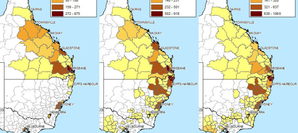
And yet, newspaper articles account for the bulk of the news data that I am analysing in my PhD project. To be sure, most of these newspaper articles were also published online, and would have been consumed that way by a lot of people. But I feel I can’t ignore the fact that these articles were also produced and consumed in a physical format. Unfortunately, there’s not much I can do to account for the physical presentation of the articles. My database doesn’t include the accompanying images or captions. Nor does it record how the articles were laid out on the page, or what other content surrounded them. But the metadata provided by Factiva does include one piece of information about each article’s physical manifestation: the page number of the newspaper in which it appeared.

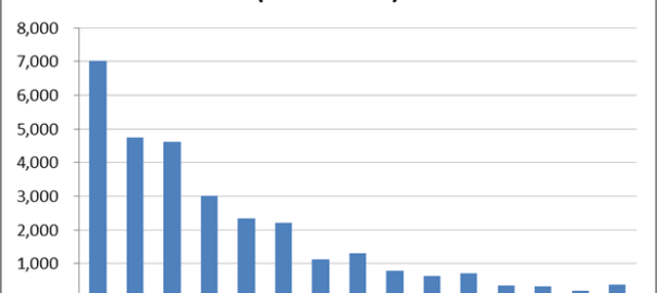
From the very beginning of the explorations documented on this blog, I have completely ignored the page number field in my dataset. I figured that I was analysing text, not newspapers, and in any case I couldn’t see how I would incorporate page numbers into the kind of analysis that I was planning to do. But after hearing a colleague remark that ‘article-counting studies’ like mine are often unsatisfactory precisely because they fail to account for this information, I decided to give it some more thought. Continue reading Playing with page numbers

How the news moves


Don’t feel like reading? Fine, skip to the pictures!

My last post explored the spatial and temporal dynamics of news production, looking at how the intensity of news coverage about coal seam gas varied over time across regional newspapers. In this post, I will look instead at the geographic content of news coverage: which places do news articles about coal seam gas discuss, and how has the geographic focus changed over time?

Coal seam gas development in Australia has become a matter of national interest, at least insofar as it has a place (albeit a shrinking one) on the federal political agenda, and has featured (albeit to varying degrees) in news coverage and public debate across the country. But it’s hard to talk sensibly about coal seam gas — whether you are talking about the industry itself, its social and environmental impacts, or how the community has responded to it —  without grounding the discussion in specific locations. From one gas field to another, the structures and dynamics of underground systems vary just as much as the social systems on the surface. I am convinced that any meaningful analysis of CSG-related matters must be highly sensitive to geographic context. (My very first PhD-related post on this blog, an analysis of hyperlinks on CSG-related web pages, pointed to the same conclusion.)

Most news stories about coal seam gas are ultimately about some place or another (or several), whether it be the field where the gas is produced, the power plant where it is used, the port from which it is exported, the environment or community affected, or the place where people gather to protest or blockade. Keeping track of which places are mentioned in the news could provide one way of tracking how the public discourse about coal seam gas develops. And the most logical way to present and explore this kind of information is with a map. In theory, every place mentioned in an article could be translated to a dot on a map. Mapping all of the dots from all of the articles should reveal the geographical extent and focus of news about coal seam gas.

Why do this? (Other than because I can, and it might be fun?) Firstly, because I’m still a little sketchy about how coal seam gas development and its attendant controversies have moved around the country over the last decade or two. I’m reasonably familiar with what has transpired in Queensland, but much less so with the situation in New South Wales. As for the other states, where there has been much less industry activity, I know virtually nothing about where and when coal seam gas has been discussed. So a map (especially one that can show time as well) of CSG-related news would provide a handy reference for understanding both the national and local geographic dimensions of the issue.

The other reason to map the news in this manner is that it may provide a way to both generate and answer interesting questions about the news landscape (or the public discourse more broadly) around coal seam gas — and this is, after all, what my PhD needs to do. Continue reading How the news moves

Mapping the news

Where did the last 12 months go? All I can really remember is something about being confirmed as a PhD candidate. I read a lot, and wrote a lot, but did very little of what I originally set out to do — namely, visualising and analysing text data. Now, finally, I am back in the sandpit. I’ve amassed a truckload of data in the form of news articles and blogs about coal seam gas development in Australia, and I intend to spend the next short while sifting through it and seeing what sort of sandcastles I can build before the tide of my next PhD milestone forces me to construct something more substantial.

The ultimate aim of my PhD is to explore how computational text analysis techniques such as topic modelling can assist in the analysis of public discourse. But for now, my objective is to get acquainted with my data. This data is divided into two piles, each representing a part of the discursive landscape around coal seam gas (or CSG) in Australia (if you’re American, think coalbed methane). One pile of data consists of texts published on the web by a range of actors (the sociology kind, not the Hollywood kind) including community groups, activists, lobbyists and politicians. I’ve siphoned these texts from a variety of websites using a data-crawling tool called import.io. The second, much larger, pile of data consists of news articles from hundreds of Australian mainstream media publications, from the national broadsheet right down to the local rags. I gathered these articles from the online news database Factiva, with the help of a script, available at the website for the conversation analysis tool Discursis, which converts Factiva’s HTML outputs into tabular format in the form of CSV files.

This post is devoted to exploring the second pile of data — the many thousands of news articles that I gathered from Factiva. Without attempting any fancy text analysis, I aim to get a first look at the overall volume, scope and diversity of the content. The focus in this post is on the overall volume and the geographic distribution of the content. In a future post, I plan to explore the the specific news sources in more detail. Continue reading Mapping the news