Newton’s third law of motion — that for every action, there is an equal and opposite reaction — would appear to apply to the coal seam gas industry in Australia. The dramatic expansion of the industry in recent years has been matched by the community’s equally dramatic mobilisation against it. As my previous post showed, there are literally dozens of organisations on the web (and probably even more on Facebook) concerned in some way with the impacts of coal seam gas development. Some of these are well-established groups that have incorporated coal seam gas into their existing agendas, but many others seem to have popped up out of nowhere.
Most of these groups could be classified as community organisations insofar as they are concerned with a specific region or locality. But to think of them all as ‘grassroots’ organsiations, each having emerged organically on its own accord, might be a mistake. As the website network in my last post suggests, many of these groups might better be thought of as ‘rhizomatic’ (or lateral) offshoots inspired by the Lock the Gate Alliance. Lock the Gate emerged in 2010 and quickly reconfigured the landscape of community opposition to coal seam gas. Its campaigns, strategies and symbolism provided a handy template upon which locally focussed organisations could form. You’ll be hard-pressed to find a community-based anti-CSG group without a link to Lock the Gate on their website.
The lesson here is that voices that appear to be independent may to some extent be influenced or assisted by a small handful of highly motivated (or well resourced) groups or individuals. Having observed this possibility in the network of anti-CSG websites, I recently encountered it again while sifting through a very different dataset that I am preparing for textual analysis. The dataset in question is the 893 public submissions that the Parliament of New South Wales received in response to its 2011 inquiry into the environmental, health, economic and social impacts of coal seam gas activities. The submissions came from all kinds of stakeholders, including community groups, gas companies, scientific and legal experts, government agencies, and individual citizens. Of particular interest to me were the 660 submissions from individual citizens. Here was a sizable repository of views expressed straight from the minds and hearts of individual people, undistorted by the effects of groupthink or coordinated campaigns. Or so I thought.
Recycled submissions
Having downloaded all 893 submissions from the NSW Parliament website, I began to skim through them to sort them into broad categories, such those submitted by individuals, community groups, local government, and so on. Among the submissions from individuals, I began to notice similarities that were too strong to be coincidental. It soon became clear that several sets of submissions shared large amounts of text in common, whether reproduced verbatim or with varying degrees of modification. So I was not looking at 660 independent voices at all, but rather an uncertain number of independent voices mixed in with many others that were at the very least singing from the same hymn sheets.
is this a problem? Well, that depends on how I intend to analyse the submissions and what I hope to learn from them. The use of recycled text in no way invalidates a submission, even if it does raise questions about the level of motivation or engagement of the person who submitted it. More importantly though, a large number of recycled submissions points to a certain level of coordination among the people submitting them. It means that these people are not acting alone but rather with the assistance and/or encouragement of certain proactive groups or individuals. (Not that there is anything wrong with that!)
Another consideration is how repeated blocks of text might affect an automated analysis of the submissions. Text analytics generally works by counting how often certain words, and groups of words, occur together in order to identify which words or concepts are most important. Verbatim repetitions of text could potentially upset the analysis, leading to the false identification or emphasis of key concepts.
In any case, I wanted to gain some idea of how much recycling was going on in these 660 submissions, but I didn’t want to determine this by reading every single submission. I expect that that there are plenty of automated methods available to do detect duplicated text across documents. After all, plagiarism detection depends on doing exactly this. But rather than searching for a ready-made solution, I spotted an opportunity to develop some skills that I expect will come in handy when I start analysing these and other texts.
What follows is primarily a document of my own learning process. If you are offended by messy workflows and dubious mathematics, I suggest walking away now. But if any of this is as new to you as it is to me, then you might get something out of the ride. Trust me, it does eventually lead somewhere!
Enter KNIME
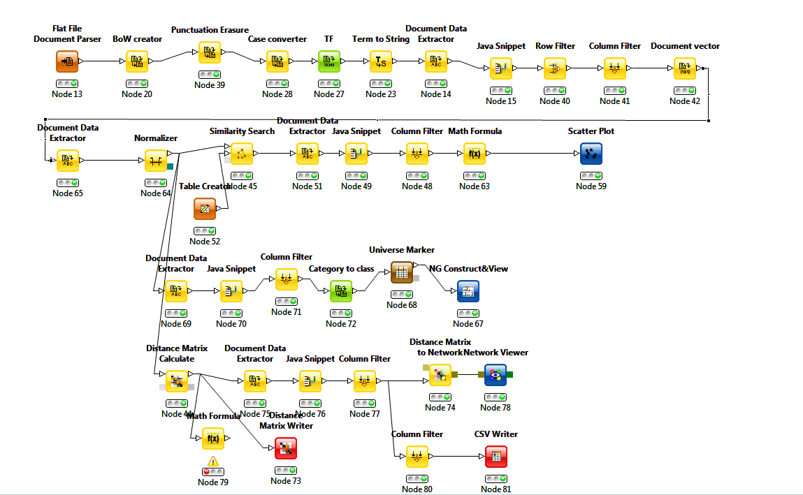
The toolkit that I chose for this exercise is KNIME, an open-source data analyitics platform developed at the University of Konstanz. For someone like me, who has a propensity for data analysis but lacks the math and coding skills with which it is typically performed, KNIME is a godsend. It provides a visual interface through which complex workflows can be constructed without any coding or scripting. To get an idea of what I mean, here is the workflow that I built to do what you will see in the remainder of this post. Don’t look too close, because it is an absolute mess. Just look long enough to understand that KNIME offers a vast repository of pre-built functions, or ‘nodes’, that can be assembled into a workflow simply by plugging one into another.
I’ll talk through the components of this workflow shortly, but first it will help to explain what the workflow was designed to achieve. The first step in comparing two documents is to quantify their textual content. That means doing some form of word counting to ‘profile’ each document. The next step is to apply some mathematical operation to the counted words to measure the ‘distance’ between each pair of documents. Those that are most similar will be separated by the smallest distances.
So the first decision in building the workflow is which words to count. One approach would be to count them all, and then look for the documents with the closest matching counts for every word used. But this is a ‘dumb’ approach, and very computationally expensive. A smarter way is to count and compare only as many words as are needed to reliably discriminate one document from another. For example, you could focus on keywords and compare documents based on their semantic content — that is, the topics they address. KNIME has at least one native module for identifying keywords (the Keygraph keyword extractor), and many other methods and algorithms have been developed to achieve similar ends.
Give function words a chance
Analysing semantic content would be the traditional text analytics approach, and would probably be effective in this instance. But I wanted to try another approach — one that turns the usual logic of text analytics on its head. I recently read a book called The Secret Life of Pronouns by the social psychologist James Pennebaker. The book describes how the analysis of function words can provide insights into the mind of the writer or speaker. Function words are the grammatical glue that binds semantic content together. They include words like articles (e.g. the, a, an), prepositions (at, near, on, to), and pronouns (he, she, I, it). Despite their functional importance, we barely register them because they are devoid of semantic content. For this reason, most automated text analysis methods systematically exclude function words by listing them among the ‘stop-words’ that get filtered out before the analysis even begins.
But it turns out that counting function words can reveal a surprising amount of information about the person who produced them. For example, the frequency of personal pronouns like I and we can indicate where a speaker’s attention is focussed as well as reveal aspects of their social or interpersonal status.
I wasn’t too concerned about psychology for the purpose of this exercise, but I wondered if function word frequencies might be useful for identifying documents that share large amounts of text. Function words might be blind to a text’s meaning, but they do encode information about a text’s style and structure. And similarities in style and structure are exactly what you would look for if you were trying to detect text that has been lifted from one document to another. In this regard, function words are probably a more reliable measure of similarity than semantic content, which would fail to discriminate between texts that discuss the same topics but that are written differently.
Working through the workflow
Returning to my KNIME workflow, the first tasks were to decide which function words to use, and to compute their relative frequencies in each document. These tasks more or less correspond with the top row of components in the workflow. The Flat File Document Parser is just a fancy name for a plain text file reader (although the documents were downloaded as PDFs, I converted them all to text files for the analysis). Into the document parser I fed the 660 submissions from individual citizens. The next node in the workflow is the Bag of Words (BoW) creator, which turns the documents into a table of words in preparation for the subsequent analyses and transformations. After punctuation has been removed and all letters converted to lower case, the TF node calculates the relative term frequency for every unique word in every document.
Skipping over the next three nodes (which are mostly just for housekeeping), we come to the Row Filter, which I used to filter out all words except the function words that I wanted to analyse. I didn’t think too hard about which words these would be. I more or less went with my gut and picked just five words: is, on, to, of, and I. Finally, the Document vector node reformats the filtered output so that each row represents a document and each column represents a word, with the term frequencies contained in the body of the table.
I also threw one other variable into the mix: the total number of terms in each document (this came from the Document Data Extractor node at the beginning of the second line). I included this variable in the distance calculations as a simple way of discriminating between documents with similar term frequencies but differing lengths, since documents of contrasting lengths are unlikely to be using the same template.
The next step in the workflow was to find an appropriate operation for calculating the distance between each pair of documents. The first one I tried was the Similarity Search, which compares each row (document) in the table against a set of reference values (defined in the Table Creator node). Prior to invoking this node, I used the Normalizer to convert the values in each column into Z-scores, which express values in terms of standard deviations from the mean. This ensured that each column was equally weighted, so no single variable would bias the final result. The Similarity Search offers a suite of different distance measures with colourful names like Euclidean, Manhattan and Tanimoto. Not knowing enough about them, I chose the default, which was Euclidean.
Everybody needs good neighbourgrams
The Similarity Search worked as advertised, but I couldn’t find an efficient way to interpret the results (the scatter plot on the workflow was just one failed attempt). The problem was that the node compares each document to a single reference point, whereas I really wanted to see how similar each document was to the other documents. I finally achieved this when I discovered something called a Neighbourgram generator. This node produced a graph that showed the following for every document:
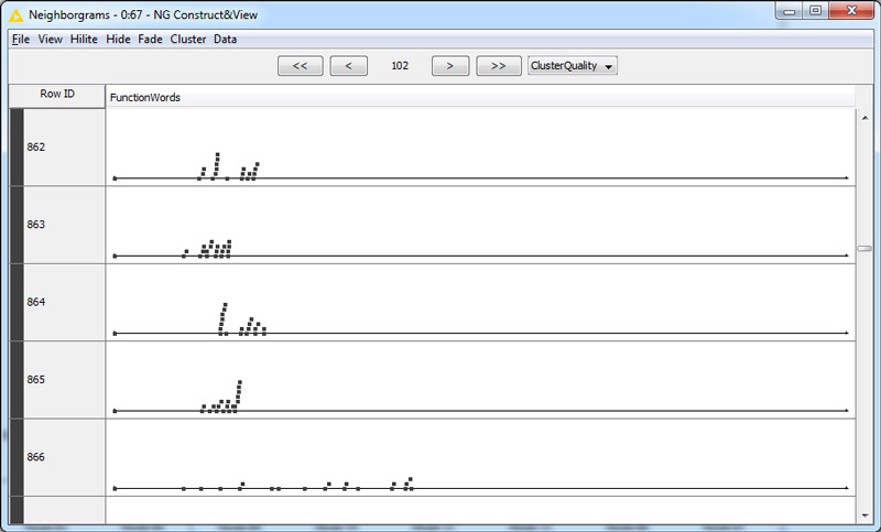
Each dot in the neighbourgram is a document, and the horizontal displacement represents distance from the document at the far left of the row. When I saw clusters of documents lined up in vertical stacks, I became very hopeful: surely these stacked documents were the duplicates. I inspected a few and confirmed that indeed they were. But beyond confirming that my distance metric was working, the Neighbourgram was not very useful for exploring the data. I needed a better visualisation.
The penny finally dropped when I found the Distance Matrix Calculate node. This node does something similar to the similarity search, but instead of using a set of reference values, it spits out a matrix specifying the distance from each row (or document) to every other row. The output is essentially an adjacency matrix that expresses the distance rather than the closeness between each pair of documents. In other words, it is just begging to be turned into a network.
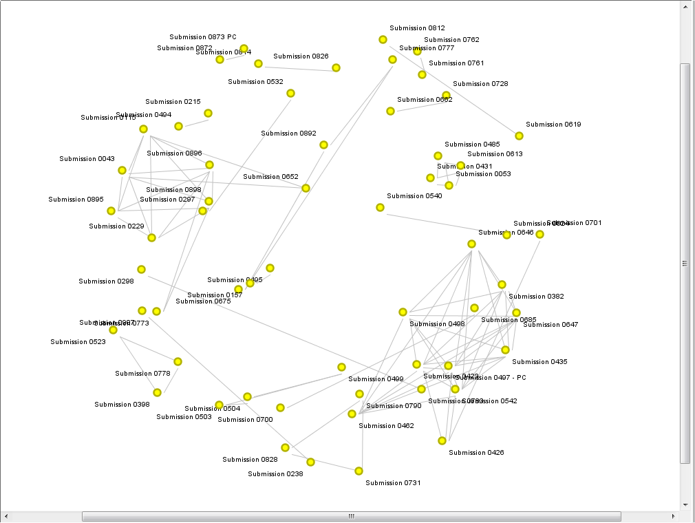
KNIME has a node designed specifically to turn a distance matrix into a network, and another to visualise the network. The network visualiser offers a range of layout options, but I ran with the default settings and got the result that you see below. It’s not pretty, but it shows what I had hoped to see: the families of submissions with shared content were clustered together.
Rather than making this graph prettier, I chose to import the data into Gephi, where I could explore the network more dynamically. The only challenge that this presented was inverting the values in the matrix so they expressed similarity rather distance. First I tried my luck by just dividing 1 by the distance values. This produced intelligible results in Gephi, but the range in edge weights was so large that it made the filtering (which is done with a mouse slider) too difficult to control. To counter this effect, I tried using the inverse of the square root of the distance values (1/sqrt[distance]). I have no idea how theoretically sound this approach is, but it worked, and I used it to calculate the the edge values in the graphs that you see below.
The similarity network
The graph immediately below depicts a filtered selection of the full set of submissions. Each node is a submission, and the weight of an edge indicates the similarity of the two submissions that it connects. All edges below a certain similarity threshold, and any nodes whose relationships depended on them, have been filtered out, leaving only pairs or clusters of documents that hare highly similar to one another. The graph is force-directed, so that nodes with stronger ties are drawn closer together. The nodes are coloured by cluster and sized by degree (number of connections).
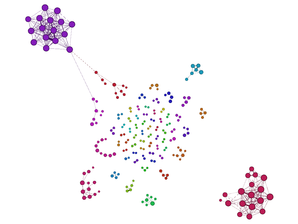
At the centre of the graph are pairs of documents that are highly similar to each other but not to any other documents. Moving outwards, the clusters of similar documents get larger, until we reach the two large clusters at the top-left and bottom-right. These two large clusters, in which nearly every document is similar to every other, are prime candidates for containing largely recycled text.
Here is a closer look at the top-left cluster, with the similarity threshold raised slightly so that the cluster is severed from the more distant nodes. The raised threshold has also isolated submissions 0193 and 0409 from the cluster.
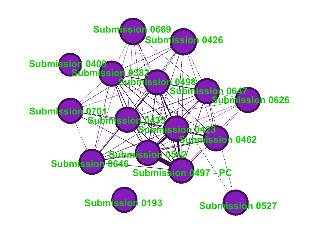
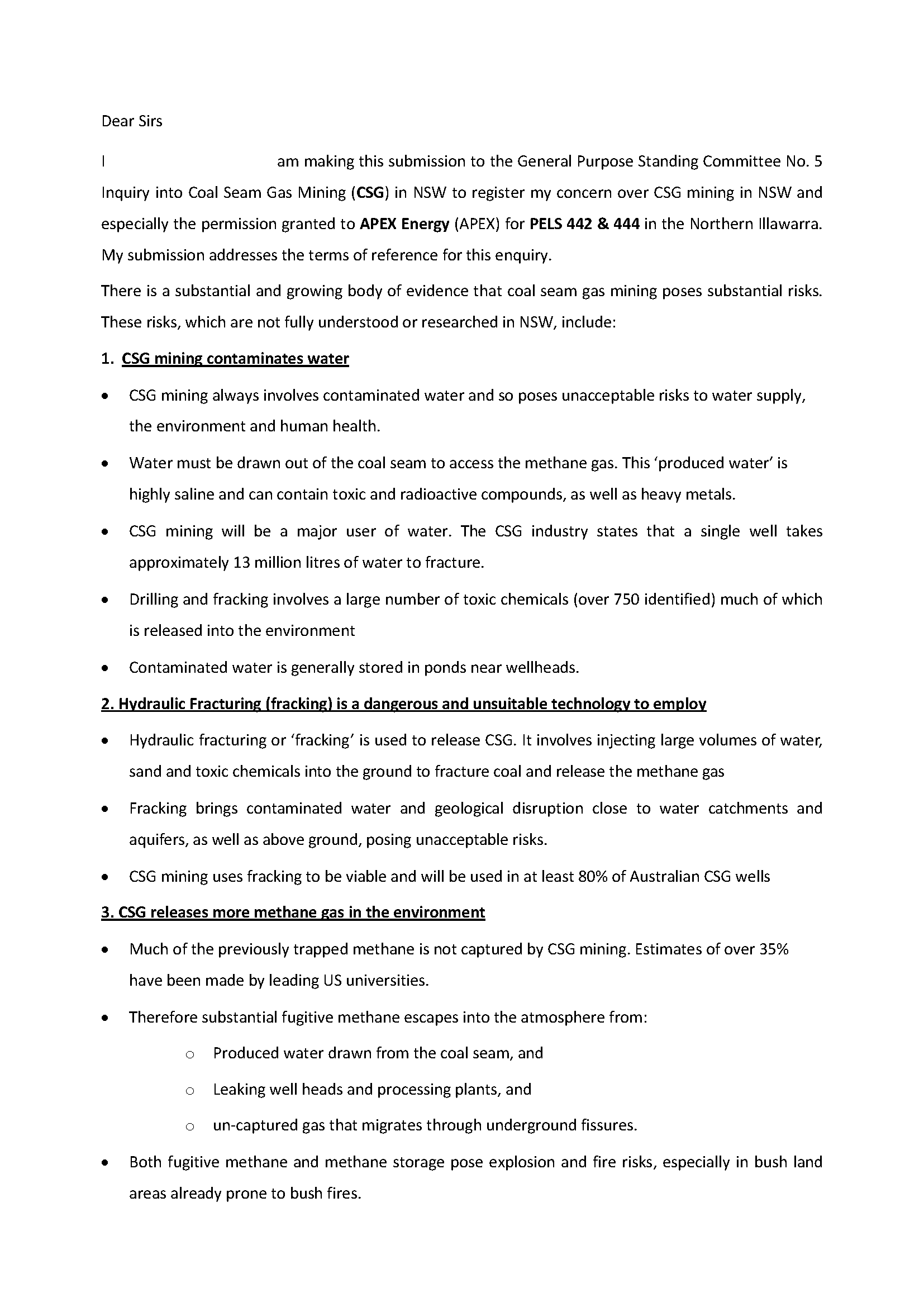
With the exception of Submission 0193, every one of the submissions in this cluster does indeed share the same basic text, with varying levels of additions and modifications. A relatively ‘clean’ presentation of the text common to these submissions can be found in Submission 0542, the first page of which is reproduced below (you can read the full document here and access the complete list of submissions here):
Now, here is the first page of Submission 0527, which includes two extra paragraphs of preamble in addition to reproducing the common text. Despite this addition, the submission was still rated as sufficiently similar to the other documents to appear in the cluster, albeit at the extremity.

Submission 409, which only remains in the cluster when the similarity threshold is lowered, departs even more from the standard version of the shared text. It includes an entire page of preamble, and truncates the shared text considerably.
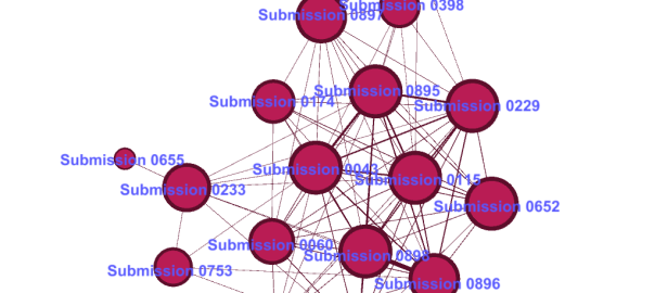
Now lets look at the bottom-right cluster. Again, all of the submissions in this cluster, except for the outlier 0655, draw on a common template.
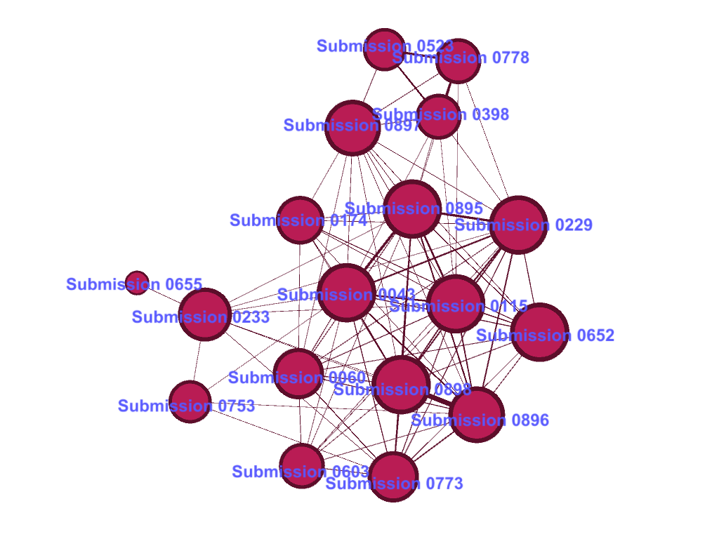
Here is the first page of Submission 0043 (the whole submission is two pages long):
Pro-tip: When using a template to make your submission, remember to remove any instructions first. Evidently, this text was never supposed to be copied verbatim; it was only intended as a guide. One submission that used the text more in line with its intended purpose is Submission 0233 (below), which includes a half-page preamble and does away with the suggested examples. This level of modification means that the similarity threshold of the graph had to be lowered to capture it, in the process causing the inclusion of Submission 0655, which does not belong in this family of submissions.

Pretty good bang for buck
By now you get the idea. The bottom line is that the strategy I chose to identify highly similar submissions — that is, calculating the Euclidean distance between normalised frequencies of five function words (is, on, to, of, and I) and the document length — works, at least to a point. Exactly how well it works, I can’t say without looking more closely at how many duplicates it detected and how many it missed. Apart from the two clusters discussed above, a handful of smaller clusters on the graph also correspond with sets of submissions with content in common. However, several other clusters can be classified as false positives, grouping together submissions that share no direct resemblance. In addition, at least some of the clusters in the graph are incomplete, as I discovered when I chanced upon additional submissions sharing those clusters’ signature content.
Given the simplicity of my approach, such imperfect performance is to be expected. But by the same token, I am pretty impressed at how many related submissions the approach managed to detect. It may be a budget option, but it delivers pretty good bang-for-buck.
I am sure that this approach could be optimised or enhanced, perhaps by using different distance measures (other than Euclidean) or choosing different (or simply more) words to count. Perhaps it could also be combined with some measure of semantic content, so that the comparisons account for both meaning and structure in the text. But I think that the greatest limitation of this approach is that it operates only at the whole-of-document level, and cannot detect similarities hiding in small portions of a document.
Am I going to refine this approach myself? Probably not. As I said right at the start, I suspect that there are ready-made methods available that will do the job better. The point of this exercise was never to come up with a definitive duplicate detection method, but to learn some techniques that I can apply more usefully elsewhere (namely, to semantic content analysis). And that much I have certainly done.