Where did the last 12 months go? All I can really remember is something about being confirmed as a PhD candidate. I read a lot, and wrote a lot, but did very little of what I originally set out to do — namely, visualising and analysing text data. Now, finally, I am back in the sandpit. I’ve amassed a truckload of data in the form of news articles and blogs about coal seam gas development in Australia, and I intend to spend the next short while sifting through it and seeing what sort of sandcastles I can build before the tide of my next PhD milestone forces me to construct something more substantial.
The ultimate aim of my PhD is to explore how computational text analysis techniques such as topic modelling can assist in the analysis of public discourse. But for now, my objective is to get acquainted with my data. This data is divided into two piles, each representing a part of the discursive landscape around coal seam gas (or CSG) in Australia (if you’re American, think coalbed methane). One pile of data consists of texts published on the web by a range of actors (the sociology kind, not the Hollywood kind) including community groups, activists, lobbyists and politicians. I’ve siphoned these texts from a variety of websites using a data-crawling tool called import.io. The second, much larger, pile of data consists of news articles from hundreds of Australian mainstream media publications, from the national broadsheet right down to the local rags. I gathered these articles from the online news database Factiva, with the help of a script, available at the website for the conversation analysis tool Discursis, which converts Factiva’s HTML outputs into tabular format in the form of CSV files.
This post is devoted to exploring the second pile of data — the many thousands of news articles that I gathered from Factiva. Without attempting any fancy text analysis, I aim to get a first look at the overall volume, scope and diversity of the content. The focus in this post is on the overall volume and the geographic distribution of the content. In a future post, I plan to explore the the specific news sources in more detail.
The Factiva dragnet
My PhD project is a little unusual in that its driving questions are methodological rather than empirical. For the time being at least, I’m more interested in exploring how particular tools and techniques can applied than in the specific questions about the world that might be answered in the process. So although I have decided to investigate the public discourse on coal seam gas, I have not decided what specific aspects of that discourse I will examine. Rather, I am allowing this to be shaped by the course of the methodological investigation. In other words, I’m keeping my options open while I explore what sort of questions I am in a position to answer.
When it comes to collecting data, this strategy means that I am casting a wide net. My Factiva search covered all articles that mention the terms ‘coal seam gas’, ‘CSG’, ‘coal seam methane’ or ‘coalbed methane’. 1 Although I expect to focus my study on the last five or ten years, I extended my search back until the relevant terms stopped appearing, which turned out to be around 1991. The only other constraint I placed on my search was to filter out articles not relating to Australia, which I did by using Factiva’s regional codes.
The search results included hundreds of different news sources based in Australia and overseas. Again, if I had a well-defined research question, I might have targeted just a few of these sources. But the only sources that I knew for sure that I didn’t want were those originating outside of Australia. Even after I had filtered those out, I was left with more than 300 different publications. The vast majority of these were local and regional newspapers, with the balance coming from the major national and metropolitan newspapers, as well as the Australian Broadcasting Corporation and the newswires Australian Associated Press and Reuters.
The resulting dataset contained 39,819 articles. 2
Thinning the numbers
While skimming through the articles I had collected, I noticed that some of them were not really about coal seam gas at all. This is not surprising, as I had not specified in the Factiva search how many times the search terms should occur. Among the highly relevant articles, Factiva had therefore also picked up articles that mentioned coal seam gas only once or twice in passing, and that were predominantly about other topics. Such articles are of little interest to me, given the sorts of questions that I intend to explore. So I decided to remove them from the dataset.
To do this, I devised a crude way to score the articles by their relevance. I first made a list of terms that I felt were reliable indicators that coal seam gas is being discussed. As well as the original search terms, these included the names of the gas companies and some of the locations associated with their major projects. I then tallied the occurrence of these terms in every article and divided that by the number of words in the article. I then sorted all of the articles by this score and scanned through them until I fount a point at which I was satisfied that virtually all articles below that score were irrelevant, and filtered those articles out.
This method left a considerable number of irrelevant articles in the dataset, and probably removed a few of the relevant ones, but the result was a cleaner and substantially smaller (and therefore more manageable) dataset. The filtering process removed 12,957 articles — about a third of the dataset — leaving a total of 26,863. This is a sizable reduction, so it probably warrants a closer look at the reliability of results. For the moment though, I will just present the following graph showing the temporal profiles of the filtered and unfiltered datasets. The bottom line represents the articles that were removed. The number of articles has been aggregated by three-month period.
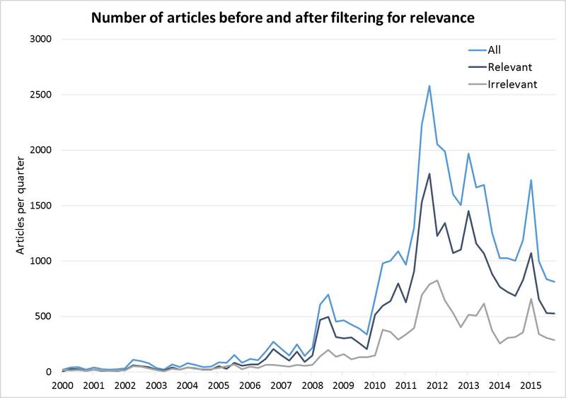
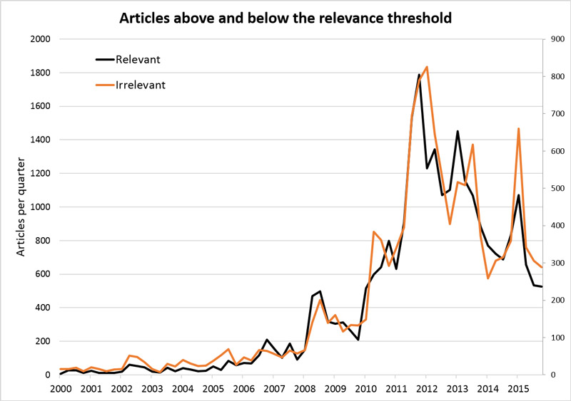
Clearly, the three lines trace more or less the same shape. Indeed, when the residuals are charted proportionally on their own axis, as in the figure below, the shapes are almost identical. That the two sets of articles follow the same temporal tend might suggest that they have more in common with one another than I had hoped. Equally though, it might be demonstrating that tangential references to coal seam gas vary in synchrony with more targeted media coverage on the topic. I suspect it’s a bit of both.
How does the volume of news vary over time? (And why?)
The overall shape of the dataset, at least when defined by the number of articles over time, appears to be much the same whether or not my filtering method is applied. So let’s take a look and see what this shape reveals about the news coverage of coal seam gas. For the remaining analyses, I’ll be using the filtered data. 3
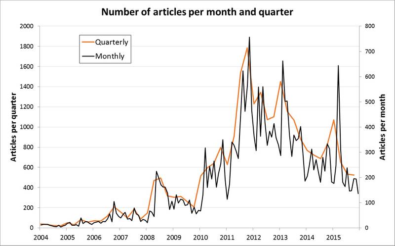
Figures 1 and 2 show that there was not much (but notably, not nothing) written about coal seam gas between 2000 and 2008. From that from that point onward, however, things changed dramatically. After some initial stirrings around 2007, there was a slight but sudden jump in coverage in 2008 followed by a much more dramatic rise between 2010 and 2012. From 2012, the overall trend in coverage is downwards, except for a couple of sharp peaks in 2013 and 2015. Just how sharp these peaks are can be seen in the next graph, which plots the data by month rather than by quarter, starting at 2004.
For the moment, I’m not going to dig very deeply to identify the causes behind the ups and downs in the intensity of news coverage. But I will offer some theories by drawing on my own knowledge and experiences gained from working on CSG-related projects in government and then in a research centre at the University of Queensland. While working in the latter role, it just so happens that I put together a catalogue of industry and policy milestones relevant to the Queensland CSG industry.
The turning point for the CSG industry in Australia was the announcement in July 2007 by the gas company Santos of a proposal to export CSG overseas as liquefied natural gas, or LNG. A similar announcement followed from the Queensland Gas Company (QGC) in February 2008, and then from Arrow Energy in June 2008 and Origin Energy in September 2008. At the time when these announcements were made, the CSG industry in Australia (which really only existed in Queensland) served only the domestic energy market. The prospect of reaching the the international market meant that the industry in Queensland could get much, much bigger.
These CSG-to-LNG project announcements surely underpin the jitters in coverage in 2007 and the jump in 2008, but this does beg the question of why the announcements in 2008 coincided with so much more coverage than the announcement from Santos in 2007. Possibly, it just took that long for the penny to drop among the media and/or the community that something big was on the horizon.
The jump in coverage in early 2010 coincides with the release of environmental impact statements for the Origin and QGC LNG projects, as well as announcements of the accompanying of multi-billion dollar supply contracts with overseas buyers. By this time, parts of the community had well and truly woken up to the environmental implications of these projects, and the Queensland Government was in full flight scrambling together new policies and regulatory frameworks.
The massive peak in coverage in late 2011 is hard to explain by looking at industry and policy milestones alone. The only such milestones that I catalogued were Origin’s project reaching its final investment decision in July 2011 and Arrow’s draft EIS being submitted in December 2011. Nor was there much happening on the policy front, save for the announcement of the Strategic Cropping Land policy. The driver of this spike, I suspect, was changes in community’s concerns and mobilisation strategies. At about this time, the public and the media began to turn their attentions from Queensland toward New South Wales, where the CSG industry was (and remains) merely prospective. The ensuing dynamic among the industry, community and government was quite different from what had occurred in Queensland. I will touch upon this difference later in this post, and I expect in future posts as well.
The punctuated downward trend in coverage after 2011 probably reflects a degree of fatigue about the issue in Queensland, where the course of the industry had been more or less set before any amount of protests could do anything about it. I suspect that the spikes in 2013 and 2015 will relate to policy developments or environmental incidents in New South Wales, but I will leave that for future explorations of the data to confirm.
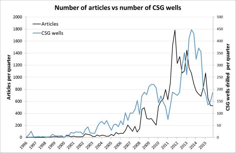
I’ll finish up this section with a graph that reinforces the point that industry activity and community concern do not always coincide. It plots the rate of news coverage alongside the rate of CSG well drilling in Queensland since 1996 (I could have added the wells from New South Wales, but they wouldn’t have made much difference). Media interest in CSG lagged considerably behind well activity until 2010, at which point media coverage shot up quickly before falling again, even as well activity increased. In the last year or so, well activity has plummeted to a level that is proportional to the media coverage.
How does the news move spatially?
The thing that intrigued me most about the data I gathered from Factiva was the number of local and regional newspapers among the sources. These included around 170 newspapers from rural areas and regional centres, and about 90 from the greater metropolitan areas of the capital cities. Most media analyses that I have come across (which admittedly isn’t a large number) tend to focus on one or a few news sources, and just as many geographic regions. I might end up following suit, but for the moment I am keen to see what I can learn by looking at the dataset in its entirety.
I felt that the data was crying out to be mapped spatially as well as temporally. The number of local news sources in the data pointed to the possibility of charting the locus of community concern as it shifted across the country. This meant spending a solid day or two looking up the distribution area of every one of the sources in the dataset. Even worse, it meant revisiting the nightmare that is ArcMap’s video animation capabilities (for future exercises, I hope to find a better alternative to this software). But I persevered. From the first part of this process, I emerged with a table that matched each news source to one or more local government areas. I’ll admit that compiling this list was hardly a precise science. Some publishers, most notably APN Regional Meida, describe clearly the distribution area for each of their publications. Other publishers (I’m looking at you, News Corp) are more hit-and-miss in their descriptions, which left me with a bit of guesswork. The inclusion of major metropolitan and state-wide newspapers also complicated things. Coding the Courier-Mail, for instance, to the whole of Queensland wouldn’t be very useful, but omitting it altogether would leave a hole in the story. So I coded the major newspapers (with the exception of the truly national ones such as The Australian) to the greater metropolitan areas of the relevant capital cities.
Geographical coverage of the data
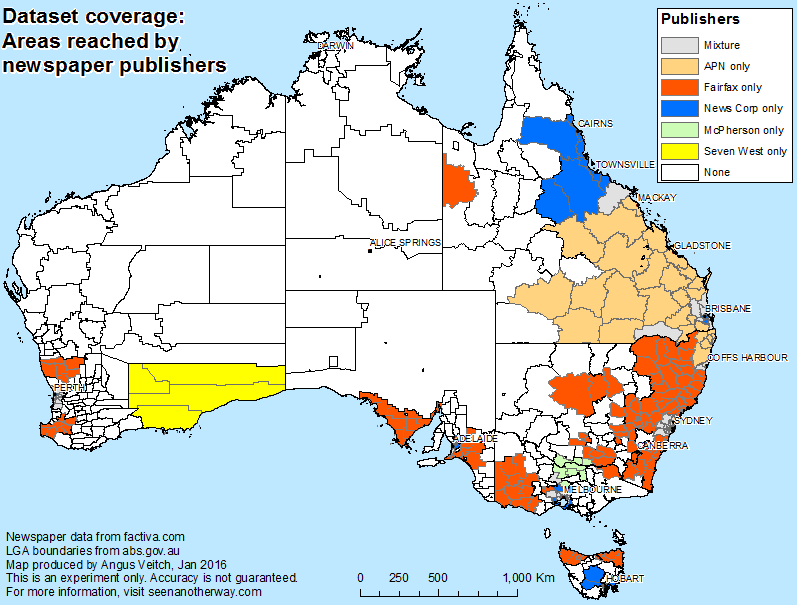
The following map shows the geographical coverage of the dataset, with each local government area (LGA) shaded to reflect the number of newspapers distributed to the area. The dense coverage of the eastern side of the country is encouraging, but some of the gaps and pale areas are concerning. I discovered, for example, that my dataset is missing the Western Star, which is the newspaper of Roma and the Maranoa region in Queensland, an area that has seen considerable CSG development. It turns out that Factiva doesn’t hold content from this newspaper, despite holding content from numerous other regional newspapers from the same publisher, Fairfax. Also missing from Factiva is the one and only newspaper covering Coonabarabran (the independently published Coonabarabran Times) in New South Wales, where Santos has been looking for gas.

In other words, the geographic coverage of the dataset is incomplete, and I don’t even know how incomplete it is. But I think it is rich enough to yield some meaningful results, which I’ll get to soon. First, I thought it was worth presenting the mapin Figure 6, which summarises the coverage of different publishers in the dataset. It suggests that the regional newspaper market in Australia is dominated by Fairfax and APN, with News Corp coming a distant third. Furthermore, it shows that the territories of these publishers rarely overlap.
Including gas wells in the animation
Having linked up the newspapers in the dataset with local government areas, I proceeded to tally the number of articles distributed to each area for every three-month period, starting from January 2000 (before which there isn’t much data to plot). I then risked my sanity in order to visualise the result as a timeseries animation with the GIS software ArcMap. For added interest, I included in the animation the locations of CSG wells as a proxy for industry activity. A few words about this data and how I visualised it are in order.
Each state government in Australia has made freely available online GIS-ready versions of their petroleum well datasets. Queensland provides data describing CSG wells separately from the data describing other kinds of petroleum wells (mainly these are wells for extracting oil or gas in the more conventional, less controversial way). New South Wales only provides one petroleum well dataset, and it apparently contains only CSG wells. I’m not sure if conventional petroleum wells have been bundled with these by mistake, or the conventional well data is not available, or if New South Wales doesn’t have any conventional wells. I suspect that the first of these three possibilities is the case, but to keep things simple I have assumed that they are all indeed CSG wells.
The other states (and the Northern Territory) provide petroleum well datasets that do not identify CSG wells. In some cases this might be because there are none, but I know that there has been some CSG prospecting in Western Australia (at least there is according to these guys), and according to this group, there is also other unconventional gas prospecting (which may involve fracking) going on as there well. I am less sure about the other states, but I decided to include their petroleum wells in the animation just in case their presence helps to explain the location of CSG-related news coverage.
Gas wells differ in their purpose. Some are drilled merely for prospecting, in which case they might be decommissioned after just a few months. Others are for commercial production, in which case they might remain active for years or decades. In the animation, I have chosen to show all wells prominently for three months after they are drilled. Conventional or unclassified petroleum wells then disappear, while CSG wells remain as smaller dots to show which areas have a history of CSG activity.
The animation itself
Without further ado, here is the animation. Each second represents four months, so a year passes every three seconds. I recommend watching it full-screen, and if possible in high-definition (though I’ve noticed that it can take a while before Youtube bumps the resolution up).
Yes, there’s rather a lot to see, and it can’t all be seen at once. To see what’s going on at a finer scale, I also created separate animations for the areas of greatest interest in Queensland and New South Wales:
You could attach many different narratives to these animations, but here are what I think are some of the most interesting observations:
The early years (before 2008)
Until 2008, almost all of the news coverage is restricted to the capital city areas and to the region around Townsville, despite there being substantial industry activity in various parts of Queensland and New South Wales. The capital city news coverage derives primarily from the major daily newspapers, while the region shaded around Townsville is the cluster of LGAs that I assigned to the Townsville Bulletin (this paper actually covers northern Queensland all the way west to Mount Isa). I suspect that the news in the capital cities in this period relates mainly to business and investment, with the exception of some of the coverage around Sydney, where the gas company AGL was exploring. The coverage in the Townsville Bulletin may well have a local slant as well, given the proximity of the gas fields at Moranbah, south-west of Mackay.
Queensland ignites (2008 – 2010)
Starting in about April 2008, the news coverage spreads suddenly across south-eastern and central Queensland, as well as to the north-eastern tip of New South Wales. This coincides with the announcement of the CSG-to-LNG projects discussed earlier. These projects all specified Gladstone as the point where the gas would be liquefied and shipped, and the Surat Basin region in southern Queensland as the source of most of the gas. Prior to that, most CSG had been produced in the Bowen Basin, further north. The shift to the Surat Basin brought the industry closer to prime farming land, which resulted in a greater level of conflict with the community. (Note that the news coverage around Roma is under-represented in the animations because the main newspaper, the Western Star, is not in Factiva’s collection.)
The patchy news coverage around Lismore in New South Wales in 2008 cannot be attributed directly to the CSG-LNG project announcements, as this area was not nominated to supply gas for any of those projects. Nor is the well activity in this area a sufficient explanation, because it had been going on for several years prior to 2008. My guess is that the coverage of the developments in Queensland at this time sensitised the Lismore community to the issues surrounding CSG development.
New South Wales catches on (2011 – 2015)
Unlike Lismore though, other communities in New South Wales where CSG exploration was occurring did not react in 2008. News coverage around Pilliga, Gunnedah, Muswellbrook and Gloucester does not appear in the animation until early 2011. Then something interesting happens: the drilling of CSG wells in New South Wales stops almost completely, even as the news coverage continues with equal or greater intensity.
Here lies the central difference between the experiences with coal seam gas in Queensland and New South Wales. In Queensland, the industry had too much momentum to be stopped even once the community had mobilised. In New South Wales, however, the industry was still in the prospecting stages, so the government (and I suppose the gas companies as well) had less to lose by applying the brakes. Clearly though, the communities in New South Wales have remained on high alert, particularly around Lismore, where several bursts of intense coverage are visible in the period from 2011 onward.
What’s going on in Victoria and Western Australia?
Leaving aside the CSG hotspots in Queensland and New South Wales, there are a few other points of interest in the Australia-wide animation. I’m only going to mention these for now, and will not even attempt any explanations. One is the recurring coverage in the south-eastern part of Western Australia, despite the apparent lack of any well activity in this region. Meanwhile, there is some well activity in the coastal areas north and south of Perth throughout the animation, but these are not joined by any news coverage until the final few years. Another area of interest is south-western Victoria. This area lights up on several occasions beginning in July 2011, despite very few petroleum wells being drilled.
Some plain old static pictures
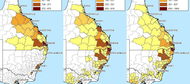
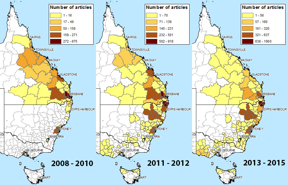
To wrap up, I’ll finish up with two figures that summarise some of the key findings of the animations. First, the series of maps in Figure 7 shows the dramatic difference in the geographic distribution of CSG-related news before and after 2011. (Note that the scales are different in each map; this is just intended to show the distribution of news within each period.) Prior to 2011, nearly all coverage was based in Queensland. In 2011 and 2012, coverage was of about equal intensity in Queensland and New South Wales. From 2013 onward, the balance shifted towards New South Wales.
The shift in coverage from Queensland to New South Wales can be seen with a bit more temporal precision (but less spatial detail) in the graph below. This graph also shows that the spikes in coverage in 2013 and 2015 can be attributed almost entirely to news published in New South Wales. It suggests that from mid-2012 onward, news coverage about CSG in the two states has followed largely separate trajectories.
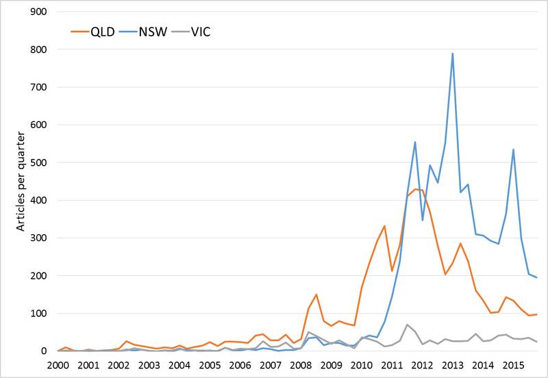
One problem with this graph, and to some extent with all of the other figures in this post, is that the article counts have not been normalised to reflect differences in population size and the number, size and frequency of news publications. New South Wales has a larger population than Queensland, and probably has a greater number of news publications. So a higher number of articles in New South Wales does not necessarily translate to a higher level of media interest. If I explore article counts much more in the future, I may look at approaches to normalising these values.
What’s next?
The analyses in this post might be a bit rough-and-ready, but they have fulfilled their purpose. I now have a have a much clearer picture of where and when news coverage about coal seam gas has been generated in Australia over the last 15 years. On the other hand, I’m still pretty hazy about the contributions of individual news sources, and I expect to explore these in another post soon.
Still on geography, I intend to shift focus from where the news is published to which places the news talks about. For this I intend to use named entity recognition tools to identify and visualise the places mentioned in the news stories.
Finally, I need a better tool for generating animated maps than ArcMap. A method that is more interactive HTML-native would be ideal. If anyone knows of a solution, I’d love to hear it.
Notes:
- Almost no-one in Australia uses the latter two terms now, but I included them in case earlier articles used them. Probably I should have also included ‘fracking’, to cover the few relevant cases where that term might be used without reference to coal seam gas. If there turn out to be many articles fitting that description, I’ll add them at a later date. ↩
- Before reaching this number, I also removed online sources that mostly duplicated printed sources (the online version of The Australian, for example), as well as articles that were duplicated, generally due to corrections between different newspaper editions. I opted not to have Factiva filter out duplicates, as I wanted to make sure that I did not exclude articles that were duplicated across publications. My procedure for identifying duplicates involved matching up the publication, date, and first 25 characters of the headline. This procedure probably did not identify all duplicates, but it did identify 2,207 of them. ↩
- This analysis of the overall volume of news coverage partly replicates a similar unpublished analysis by Daniel Angus and Elizabeth Mitchell prepared in 2014 for the University of Queensland’s Centre for Coal Seam Gas. That analysis used data from Factiva, albeit with a different selection of news sources and search terms. Nonetheless, insofar as they overlap (the previous analysis only included coverage up to 2013), the two analyses describe very similar trajectories in the intensity of news coverage over time. ↩