An ode to the 27th of January
The 27th of January is an important day in the Australian calendar. As the fog rises from the Christmas break and the last public holiday for at least eight weeks, this date marks the resumption of business as usual, the start of the new year proper. It is also the moment when millions of Australians breathe a sigh of relief, knowing that the divisive and tiresome debate about the date of Australia Day will now subside for another 358 days, give or take.
The 27th of January is the day after the day when, in 1788, Captain Arthur Phillip sailed into into Sydney Cove and planted a British flag. Trailing behind him was a fleet of 11 ships carrying an assortment of convicts, civil officers and free settlers, the first members of a new colonial outpost that would ultimately become the nation state of Australia. Watching the arrival from the shore were the land’s indigenous human inhabitants, custodians of more than 40,000 years of continuous culture and occupation.
Long recognised as the anniversary of the colony’s foundation, the day before the 27th of January was in 1935 adopted by all states and territories as Australia’s national day of celebration. For many years, most Australians were happy with this arrangement. Australia Day was a day of national pride and innocent celebration, a day to have a barbecue, drink some beer, listen to the Hottest 100 countdown and play some beach or backyard cricket — often all at the same time. But now, as the country has finally began to confront some of the darker chapters of its colonial past, the 26th of January is losing its lustre as a day when such simple pleasures can be enjoyed, let alone pursued in the name of national pride. It turns out that it is rather difficult to drink beer, play cricket and enjoy the last year’s top songs while at the same time contemplating the country’s legacy of dispossession and genocide against its first peoples. (Indeed, Triple J moved its Hottest 100 countdown from Australia Day to the fourth weekend of January in 2018, and this year Cricket Australia chose not to mention Australia Day in its promotion of matches held on 26 January.)
And so, in the third decade of the 20th century, the 27th of January is now the day after tens of thousands of people partake in Invasion Day rallies to plead for meaningful reconciliation and to advocate changing the date of the national day, or to abolish it altogether. The 27th is the day after a day of exasperated commentary about the recipients of Australia Day honours, which in 2015 included Prince Phillip, inexplicably knighted by the then prime minister, Toby Abbott; and which this year included Margaret Court, whose legacy as one of the greatest ever tennis players has in recent times been overshadowed by her outspoken and controversial views about homosexuality, gay marriage and transgender people. In short, the 27th of January is the day after a wave of difficult, awkward, and at times ugly public debate peaks and subsides. Until next year.
Australia’s dysfunctional public sphere
As you can probably guess from that introduction, I don’t particularly enjoy Australia Day anymore. It’s a date and a concept that has outlived its usefulness and needs to be rethought from the ground up before it can perform any kind of unifying function. An increasing number of people feel this way, and yet there is no sign that either of the major political parties (and especially not the current conservative government) is even remotely ready to facilitate the national conversation that needs to happen. Hence, the debate somehow feels both vital and futile at the same time.
To be fair, a lot of public debates feel this way nowadays. In part, this is probably due to the polarisation of political views that has been widely observed in America and also seems to be occurring in Australia. No debate can go anywhere if there is no common ground or shared understanding. However, I think it’s fair to say that some of the blame can also be levelled at media outlets that instead of helping to bridge these divisions have sought to profit from them. Discussions about topics that should be a matter of science rather than ideology (such as action on climate change) or that challenge traditional views but could nonetheless be discussed respectfully (such as marriage equality) have become utterly derailed. Instead of facilitating informed debate and well-meaning deliberation, these outlets spread doubt and disinformation, emphasise damaging and divisive narratives, and amplify publicly unutterable views by encoding them in in dog-whistles and double-speak.
As an example, take the public discourse around the three-month lockdown that was imposed on Melbourne (and to a lesser extent, regional Victoria) to eliminate Covid-19 from the state of Victoria. While there was always a legitimate debate to be had about the fairness, effectiveness and necessity of different control measures, I think it is fair to say that some media outlets, most notably those owned by News Corp, engaged in a way that was nakedly political and thoroughly unhelpful. If you need any convincing about this, you can find a thorough documentation and dissection of News Corp’s exploits during this period in David Milner’s series of articles for The Shot.
I came to some of my own realisations about this unholy marriage of political and media forces when I performed an analysis of Twitter content about the Victorian lockdown. Being locked down in Melbourne myself, not to mention unemployed for much of the time, I kept myself busy creating an analytical workflow — which I dubbed the TweetKollidR — for building and making sense of Twitter datasets. The outputs of this workflow revealed a sizeable network of conservative and right-wing actors waging aggressive campaigns against the Victorian state government (especially its leader, known affectionately in these circles as Dictator Dan) and its lockdown policies. This network intersected not only with ostensibly mainstream actors from Australia’s news media, but also with right-wing outlets and personalities in the United States. The distance between Trumpism and state-level Australian politics turned out to be much smaller than I could have imagined.
The Australia Day debate on Twitter
As Australia Day approached this year, and with some memories (those that had not been repressed) of the lockdown debate still fresh in my mind, I wondered if the Australia Day debate on Twitter might have fallen prey to the same dynamic. To find out, I dusted off the TweetKollidR workflow and used it to assemble a dataset of tweets mentioning Australia Day 1 posted between the 19th and 26th of January (that is, up to midnight of the 26th). The dataset clocked in at around 127,000 tweets and included more than 41,000 users. 2
I then fed these tweets into the TweetKollidR to produce an interactive network visualisation that you can see and explore below. As I have documented in an earlier post, the TweetKollidR enables you to build a dataset and create such visualisations without the use of any code. Once the dataset is compiled (and assuming that Knime and the workflow have been installed), the visualisations can be created with a handful of clicks and in as little as a few minutes, depending on the size of the dataset. The TweetKollidR workflow is available for anyone to download from the Knime Hub, while the Knime Analytics Platform itself is free and open-source.
Making sense of the user network
Perhaps the most useful and popular way to visualise activity on Twitter is as a network of users linked together via their mentions or retweets of one another. Constructing such a network visualisation from a dataset of tweets can provide instant and deep insights into the structure of a public debate (at least insofar as that debate is playing out on Twitter).
In fact, making networks of Twitter data is so hot right now that I’m not even the first person to create a network visualisation of tweets about Australia Day. On the afternoon of 25 January, Tim Graham, a senior lecturer at the QUT Digital Media Research Centre, tweeted this fantastic rendering of 130,000 tweets posted about Australia Day in the previous week:
Zooming in, have a look at the Twitter accounts that bridge the divide between @RealMarkLatham and the rest of the Australian Twittersphere
Notice any patterns there? https://t.co/U7nDBcfHNP pic.twitter.com/2plJyBepQl
— Tim Graham (@Timothyjgraham) January 25, 2021
While I was momentarily bummed to learn that Tim had compiled almost the same dataset as I was, I realised that this was a great opportunity to compare and triangulate the insights offered by this visualisation and the one produced by the TweetKollidR.
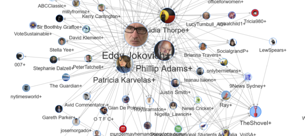
The TweetKollidR’s representation of the users tweeting about Australia Day looks like this:
Before getting into the technical reasons why the graphs look so different, I should emphasise that they do not show exactly the same data. My dataset includes tweets posted on 26 January, while Tim’s dataset ends at least day earlier. Furthermore, we almost certainly would have used slightly different search queries to acquire the data, producing a slightly different set of results. And finally, the nodes in my graph are linked together only by retweets, whereas Tim’s graph also shows connections in the form of mentions and replies.
Those caveats aside, the main difference between the two visualisations is that the TweetKollidR drastically simplifies the network by reducing it to clusters, or communities, of interacting users. This means that each node in the network above does not represent an individual account, but rather represents dozens, hundreds, or even thousands of accounts that can be lumped together on account of their retweeting activity. The name and profile image assigned to each cluster reflects the account that was most heavily retweeted by other users within the cluster.
In Tim’s graph, this kind of abstraction is achieved indirectly through the sizing of the node labels, which (I assume) reflect the number of mentions and retweets attained by each user. In theory, then, we should expect to see some overlap between the larger names in Tim’s graph and the clusters in the TweetKollidR’s graph.
And indeed we can. At a glance, I can see Patricia Karvales (or PatsKarvales on Tim’s graph 3), Eddy Jokovich, Phillip Adams, Lidia Thorpe, The Shovel, and The Real Mark Latham on both graphs. (Phew!)
Detail on demand
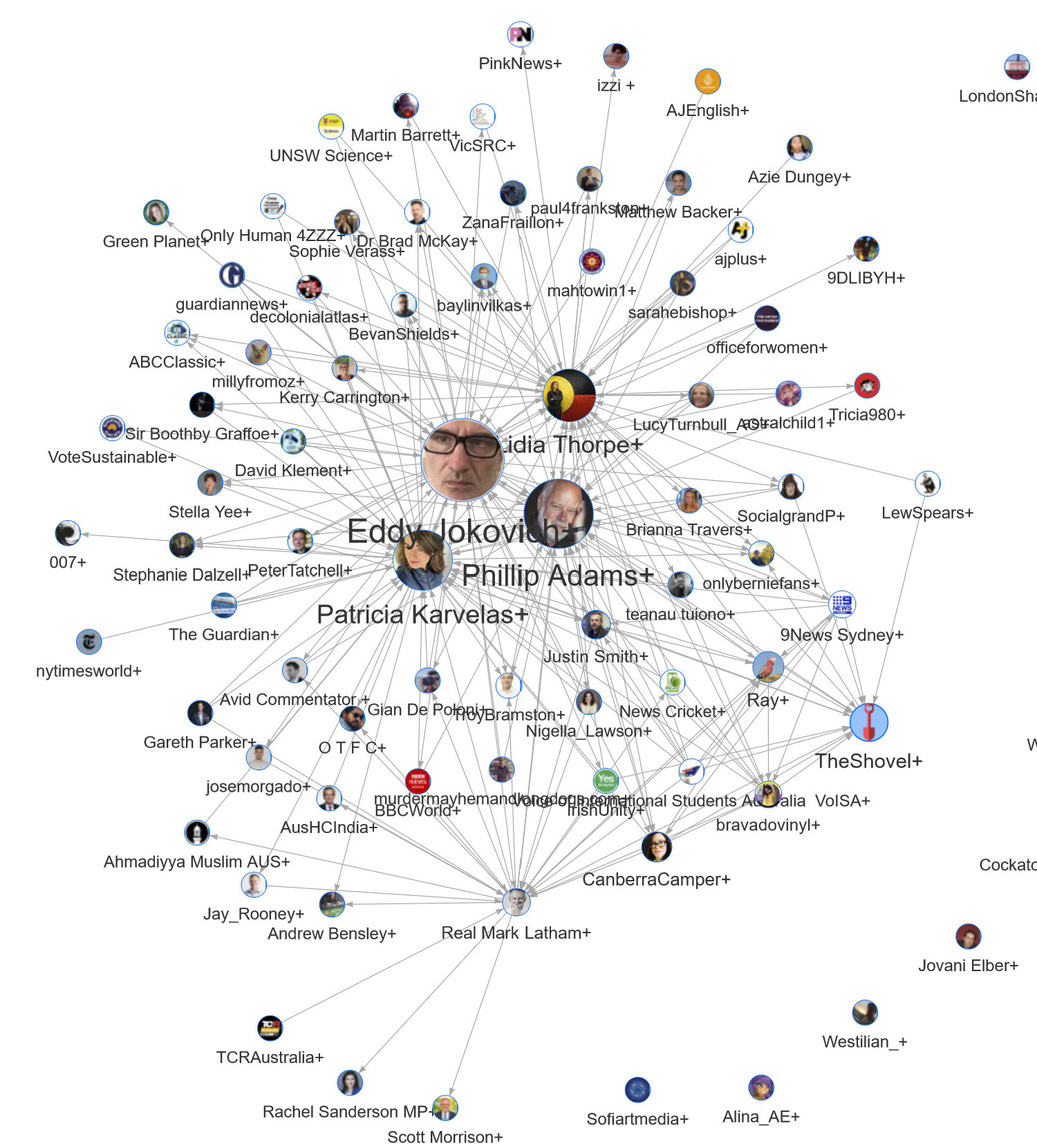
Many of the other names in Tim’s graph are also lurking in the TweetKollidR’s output, but they are not visible directly. They can be found in the pop-up information that is available in the interactive version of the visualisation. Hover over the Phillip Adams+ cluster, for example, and you will see the following:
Here we learn that this cluster also contains MrKRudd (Kevin Rudd, a former Prime Minister of Australia), the journalists Barrie Cassidy and Peter van Onselen, and the current federal opposition leader, AlboMP. All except the last of these names can be found hovering in close proximity to Phillip Adams in Tim’s graph. 4
The pop-up information also tells us something about the users and the tweets in this cluster. The top profile terms (which were extracted from users’ profile decriptions) suggest that users in this cluster are predominantly from Melbourne, Sydney and Brisbane (no surprises there), are highly educated (listing professions and interests such as science, teacher and writer), are in many cases retired, and are politically progressive (insofar as mentioning climate change and a preferred pronoun can be interpreted this way). The top tweet terms also suggest progressive attitudes, pointing to a comfort with the Invasion Day label, the change the date campaign, and with calling out people as bigots or racists. Finally, the list of top web domains reveals that the news sources most commonly shared in this cluster are The Guardian, the ABC, and the Sydney Morning Herald.
Providing easy access to this textual information is the main reason why I developed the TweetKollidR. While a complete network visualisation (like the one Tim made) is an efficient way to explore the accounts and communities in a Twitter dataset, it can’t tell you much about the content and interests that bind the communities together. The purpose of the interactive visualisation produced by the TweetKollidR is to save you the hassle of flicking back and forth between the visualisation and the raw data (or perhaps a web browser) to learn more about the users and tweets behind the communities.
Mark Latham and the arse end of Australian politics
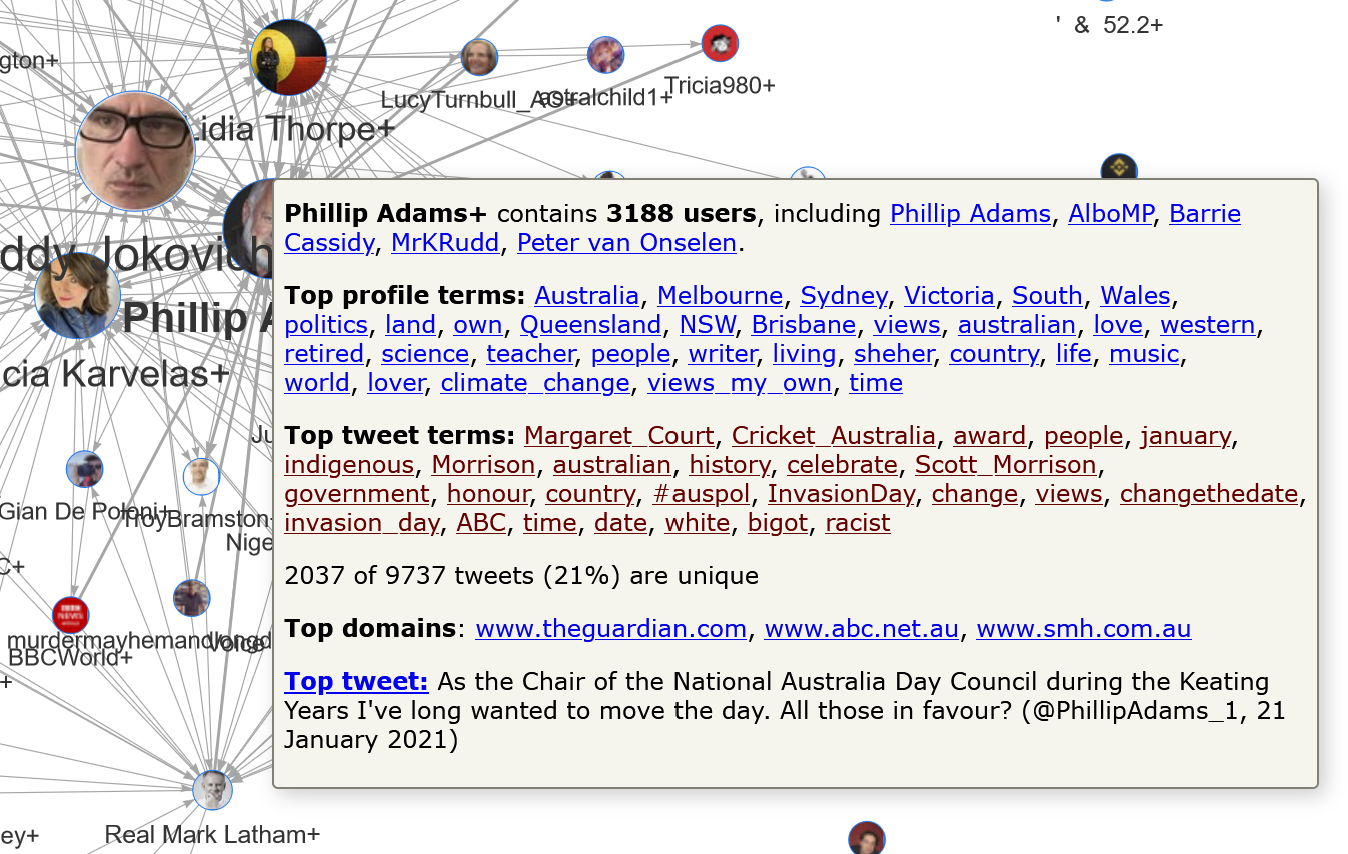
Following Tim Graham’s description of his network graph as “the Australian Twittersphere VS @RealMarkLatham”, the technology writer Stilgherrian observed even more poetically that the graph showed “Mark Latham dangling off the arse end of Australian politics and media like a dag on a fly-blown sheep”. So how does Mark Latham (who, for the uninitiated, once came close to being the prime minister of Australia) fare in the hands of the TweetKollidR? Satisfyingly, the graph in Figure 1 does indeed show Mark Latham — or rather, the cluster of 3,389 users grouped together in his name — dangling off the bottom end of the network, with a few further appendages (one of whom happens to be the current Prime Minister) dangling off of it in turn.
The summary information for the cluster is as follows:
The top terms from profiles and tweets in this cluster contrast markedly with those in the Phillip Adams cluster. The geographic bearings are the same, but profile terms like Conservative, Aussie, MAGA, patriot, freedom and free speech all point to a much more conservative or right-wing orientation. Also mentioned in these users’ profiles are Parler and Gab, which are social network platforms favoured by the far right. The tweets in this cluster look to have a much more celebratory vibe than those in the Phillip Adams cluster, featuring terms like celebrate, celebrating, honour, and happy. Interestingly, the tweets in this cluster also talk about Invasion Day, although the hyperlinked examples are actually retweets of the Aboriginal senator, Lidia Thorpe. This is a reminder that the clusters are not entirely homogenous entities.
Unsurprisingly, given the right-wing orientation of this cluster, the three most popular news sources are News Corp outlets. Among them is Sky News, on which Latham briefly had his own chat show before being fired in 2017. The Twitter account of Sky News is also among the prominent accounts in the cluster, as you can see in the pop-up information above and in the figure below, which shows another clustered network generated only from the users in the Mark Latham cluster. (Rather than provide any commentary about this network, I’ll leave it for you to explore in more detail through the interactive version.)
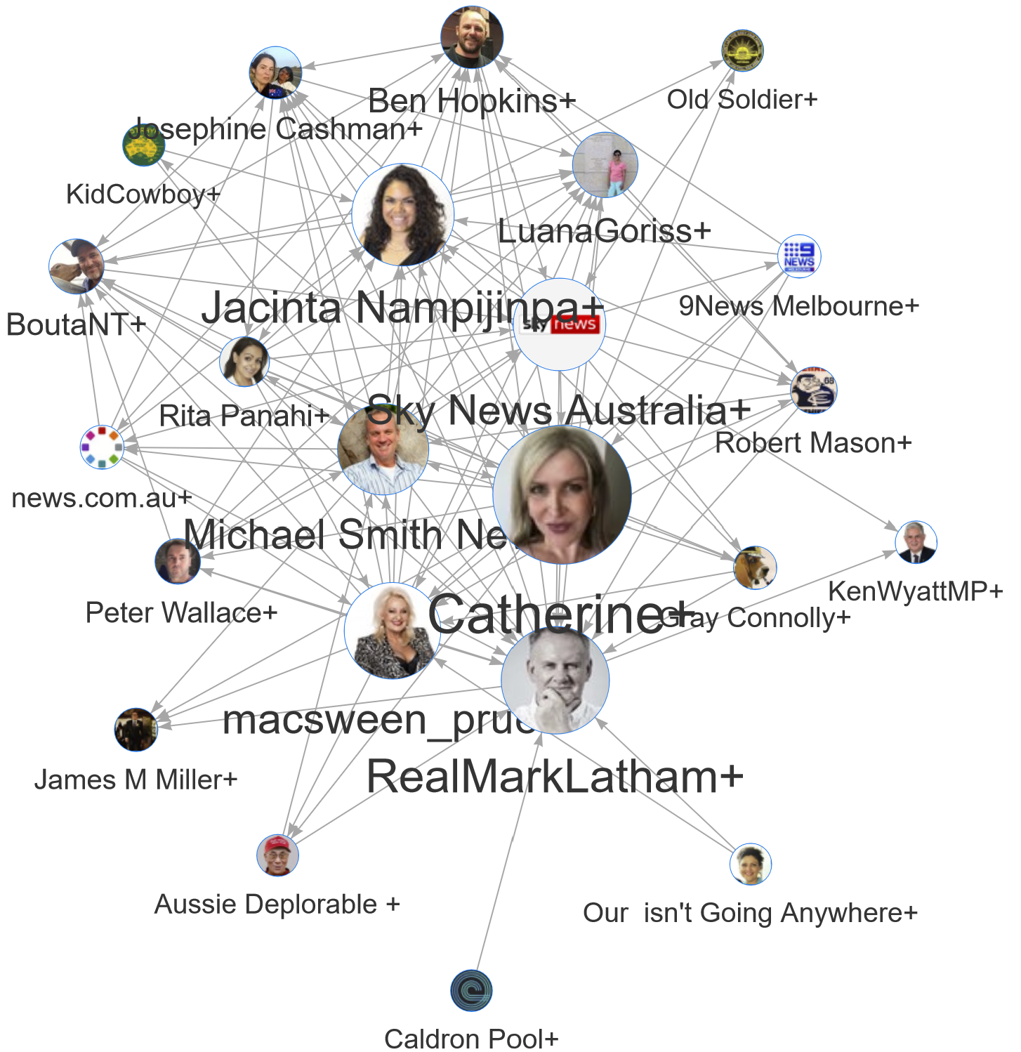
The location of Mark Latham’s cluster at the edge of the network reflects Latham’s own position at the fringes of political discourse in Australia. Also of note, however, is the size of the node denoting his cluster, which reflects not the number of users in the cluster (which at 3,389 users is large relative to others in the network) but the number of times that users in this cluster have been retweeted by users in other clusters. By this measure, Latham’s cluster is small, indicating that his influence beyond his own cluster is rather limited.
Finally, I want to caution against reading too much into the visible connections between Latham’s cluster and other clusters. In particular, don’t assume that the arrow from Latham’s cluster to that of the Prime Minister, Scott Morrison, means that these two people have directly engaged with one another. Rather, it means that a user from one cluster has retweeted a user from the other. Only a closer inspection of these connections (which the TweetKollidR facilitates) can reveal their significance.
Conclusion
The above is a very cursory examination of the Twitter interactions around Australia Day, curated mainly to demonstrate the output of the TweetKollidR and to build on the observations that have already flowed from Tim Graham’s analysis. Along the way, I neglected to say much about my original research question, which was whether the debate on Twitter about Australia Day had been substantially influenced by right-wing political and media actors.
The answer, at least based on this particular line of evidence, appears to be no. Other than the accounts in the Mark Latham cluster and a few of those hanging off it, I can see little evidence of coordinated opposition to the critical and reflective stance towards Australia Day that runs through most of the rest of the network. To be sure, there are several clusters in the network that discuss Australia Day positively without being overtly political. But in stark contrast with the lockdown debate, the right-wing political voices simply do not appear to have made many inroads into the rest of the discourse.
But of course, there’s always next year.
Notes:
- The search terms included variations of Australia Day, AusDay, Invasion Day, the hashtags AustraliaDay2021 and InvasionDay2021, and Margaret Court, the latter on account of the controversy surrounding her Australia Day honour. ↩
- This dataset was compiled within the limitations imposed by Twitter’s free Search API, which means that it has limited historical depth and may not include all tweets matching the search criteria — which in turn were only ever going to catch a subset of all tweets about Australia Day. I collected the data between 23 and 27 January, performing a few queries each day. ↩
- The labels in Tim’s graph show the permanent user names of each account, while my graph shows the more descriptive (but changeable) screen names where these are available in the data. ↩
- The absence of Albo (more formally known as Anthony Albanese, the federal opposition leader) from Tim’s graph might be explained because his tweet on 22 January about Margaret Court did not explicitly mention Australia Day, and was only captured by my dataset because I explicitly searched for mentions of Margaret Court. Also, Albo posted a series of tweets about Australia Day on 26 January, which was after Tim’s dataset was compiled. ↩