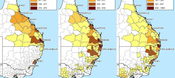
Don’t feel like reading? Fine, skip to the pictures!
My last post explored the spatial and temporal dynamics of news production, looking at how the intensity of news coverage about coal seam gas varied over time across regional newspapers. In this post, I will look instead at the geographic content of news coverage: which places do news articles about coal seam gas discuss, and how has the geographic focus changed over time?
Coal seam gas development in Australia has become a matter of national interest, at least insofar as it has a place (albeit a shrinking one) on the federal political agenda, and has featured (albeit to varying degrees) in news coverage and public debate across the country. But it’s hard to talk sensibly about coal seam gas — whether you are talking about the industry itself, its social and environmental impacts, or how the community has responded to it — without grounding the discussion in specific locations. From one gas field to another, the structures and dynamics of underground systems vary just as much as the social systems on the surface. I am convinced that any meaningful analysis of CSG-related matters must be highly sensitive to geographic context. (My very first PhD-related post on this blog, an analysis of hyperlinks on CSG-related web pages, pointed to the same conclusion.)
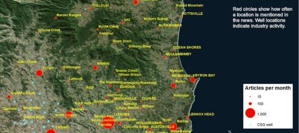
Most news stories about coal seam gas are ultimately about some place or another (or several), whether it be the field where the gas is produced, the power plant where it is used, the port from which it is exported, the environment or community affected, or the place where people gather to protest or blockade. Keeping track of which places are mentioned in the news could provide one way of tracking how the public discourse about coal seam gas develops. And the most logical way to present and explore this kind of information is with a map. In theory, every place mentioned in an article could be translated to a dot on a map. Mapping all of the dots from all of the articles should reveal the geographical extent and focus of news about coal seam gas.
Why do this? (Other than because I can, and it might be fun?) Firstly, because I’m still a little sketchy about how coal seam gas development and its attendant controversies have moved around the country over the last decade or two. I’m reasonably familiar with what has transpired in Queensland, but much less so with the situation in New South Wales. As for the other states, where there has been much less industry activity, I know virtually nothing about where and when coal seam gas has been discussed. So a map (especially one that can show time as well) of CSG-related news would provide a handy reference for understanding both the national and local geographic dimensions of the issue.
The other reason to map the news in this manner is that it may provide a way to both generate and answer interesting questions about the news landscape (or the public discourse more broadly) around coal seam gas — and this is, after all, what my PhD needs to do. Continue reading How the news moves