In the last post, I started looking at how the level of coverage of specific regions changed over time — an intersection of the Where and When dimensions of the public discourse on coal seam gas. In this post I’ll continue along this line of analysis while also incorporating something from the Who dimension. Specifically, I’ll compare how news and community groups cover specific regions over time.
Regional coverage by news organisations
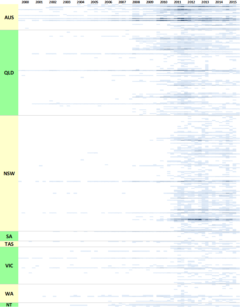
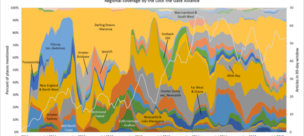
One of the graphs in my last post compared the ratio of coverage of locations in Queensland to that of locations in New South Wales. Figure 1 below takes this a step further, breaking down the data by region as well. What this graph shows is the level of attention given to each region by the news sources in my database (filtered to ensure complete coverage for the period — see the last post) over time. In this case, I have calculated the “level of attention” for a given region by counting the number of times a location within that region appears in the news coverage, and then aggregating these counts within a moving 90-day window. Stacking the tallies to fill a fixed height, as I have done in Figure 1, reveals the relative importance of each region, regardless of how much news is generated overall (to see how the overall volume of coverage changes over time, see the previous post). The geographic boundaries that I am using are (with a few minor changes) the SA4 level boundaries defined by the Australian Bureau of Statistics. You can see these boundaries by poking around on this page of the ABS website.
The regions in Figure 1 are shaded so that you can see the division at the state level. The darker band of blue across the lower half of the graph corresponds with regions in Queensland. The large lighter band above that corresponds with regions in New South Wales. Above that, you can see smaller bands representing Victoria and Western Australia. (The remaining states are there too, but they have received so little coverage that I haven’t bothered to label them.) I have added labels for as many regions as I can without cluttering up the chart.
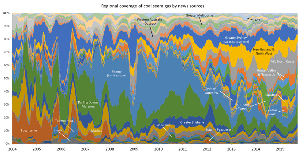
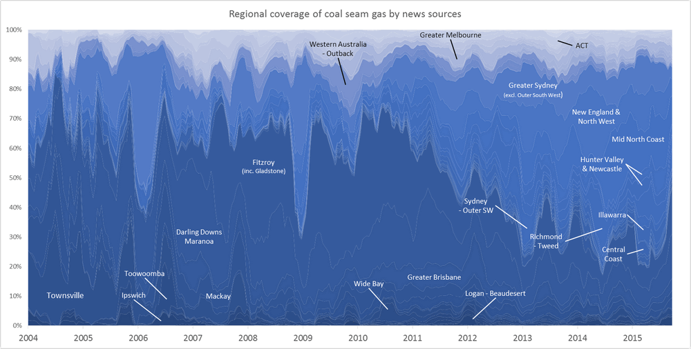
Figure 1. Coverage of geographic regions in news stories about coal seam gas, measured by the number of times locations from each region are mentioned in news stories within a moving 90-day window. The blue shadings group the regions by state. Hovering over the image shows a colour scheme suited to identifying individual regions. You can see larger versions of these images by clicking here and here.
Continue reading Tracking and comparing regional coverage of coal seam gas