Tag Archives: Gephi

A thesis relived: using text analytics to map a PhD journey


Your thesis has been deposited.

Is this how four years of toil was supposed to end? Not with a bang, but with a weird sentence from my university’s electronic submission system? In any case, this confirmation message gave me a chuckle and taught me one new thing that could be done to a thesis. A PhD is full of surprises, right till the end.

But to speak of the end could be premature, because more than two months after submission, one thing that my thesis hasn’t been yet is examined. Or if it has been, the examination reports are yet to be deposited back into the collective consciousness of my grad school.

The lack of any news about my thesis is hardly keeping me up at night, but it does make what I am about to do in this post a little awkward. Following Socrates, some people would argue that an unexamined thesis is not worth reliving. At the very least, Socrates might have cautioned against saying too much about a PhD experience that might not yet be over. Well, too bad: I’m throwing that caution to the wind, because what follows is a detailed retrospective of my PhD candidature.

Before anyone starts salivating at the prospect of reading sordid details about about existential crises, cruel supervisors or laboratory disasters, let me be clear that what follows is not a psychodrama or a cautionary tale. Rather, I plan to retrace the scholastic journey that I took through my PhD candidature, primarily by examining what I read, and when.

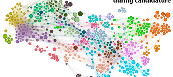
I know, I know: that sounds really boring. But bear with me, because this post is anything but a literature review. This is a data-driven, animated-GIF-laden, deep-dive into the PhD Experience. Continue reading A thesis relived: using text analytics to map a PhD journey
The Who dimension

My last post focussed on my progress in making sense of the Where dimension of the public discourse on coal seam gas, including how the Where intersects with the What. This post is about the Who. Somehow, I’ve managed to say almost nothing on this blog so far about the Who dimension of my data. Nearly all of what I’ve written has been about the What, Where and When. It’s time to rebalance this equation.

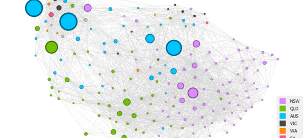
Until recently, the Who dimension of my data was represented only by a pool of Australian news organisations (at more than 300 sources, it was admittedly a rather large pool), as I was working just with the data I retrieved from the Factiva news database. Now that I have incorporated additional data that I scraped from the websites of community, governments and industry stakeholders (as discussed in my last post), the Who dimension has become a little bit richer. Before I start exploring questions about specific stakeholders and news organisations, or make decisions about which sources I might want to exclude all together, I want to survey the full breadth of sources in my data. I want the birds-eye view. But how to get it?

Who × When ÷ Where = Wha…?

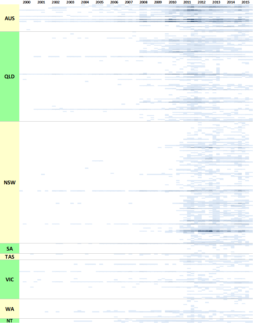
In the previous post, I listed all of my stakeholder sources in colourful tables showing the production of content over time. Initially I thought that doing the same thing with 300 news sources would be ridiculous, but then I figured it might just be ridiculous enough to work. Through a creative deployment of Excel’s conditional formatting feature, I managed to make what you see in Figure 1. Each horizontal band is an individual news source, and the darkness of the band corresponds with the number of articles produced by that source per quarter. Within each state, the sources are grouped by region, although I haven’t indicated where these groupings begin and end (maybe next time!).

Figure 1. The temporal coverage of all news sources in my corpus.
Figure 1. The temporal coverage of all news sources in my corpus. Each horizontal band represents a news source, while the shading indicates the number of articles published per quarter.

For an experiment that I didn’t take very seriously, this viz actually isn’t too bad. It highlights several features of the data that are useful to know. Firstly, it shows that very few publications have been reporting on coal seam gas continuously since 2000. Nationally, there are The Australian, The Financial Review, Australian Associated Press, and Reuters News (these are not labelled on the graph, so you’ll have to take my word for it). In Queensland, there are the Courier-Mail, the Gold Coast Bulletin, and (to a lesser extent) the Townsville Bulletin. In New South Wales, there has been more-or-less continuous coverage from the Sydney Morning Herald, and somewhat patchier coverage from the Newcastle Herald. The long horizontal lines in Victorian part of the chart represent the Herald Sun and The Age. Continue reading The Who dimension

Adventures in harmonic space

Long, long ago, I studied music. In fact, when I finished high school, music was all I wanted to study. To be sure, I didn’t just want to study it: I wanted to compose it as well. 1 But I soon discovered that music theory was something worthy of study in itself, quite apart from the grounding it provided for composition. Music theory, especially the analysis of harmonies and harmonic progressions, provided a way to pop the hood on a piece of music (or even a whole genre) and learn what makes it tick. As if that weren’t exciting enough, I sensed that there were more profound truths waiting to be teased out of these harmonic structures. For if they offered clues about what makes music tick, then surely they said something about what makes us tick as well.

I never did pursue my vision of a grand unified theory of tonal harmony and psychoacoustics. I soon found that there were also other things worth studying, many of which came with the bonus incentive of career prospects. One thing led to another, and for better or worse, I ended up working for the government. And not as a music theorist. But to this day, I can’t help hearing a piece of music and thinking about what makes it tick. The theorist within me is always plugging away, even while the rest of me is just enjoying the tune.

Unsurprisingly then, when I started playing with network graphs about 18 months ago, among the first things I asked myself is what application they might have for music theory. The beauty of network graphs is that they can be used to represent just about anything. Any system or community of inter-related parts can be turned into a network of nodes and connections. So far on this blog I’ve used network graphs to explore the linkages among websites related to coal seam gas, and to identify clusters of documents containing duplicated text. On my other blog, I used network graphs to see how the names of different people and places featured across a collection of my posts.

In this post, I will use network graphs to visualise the relationships among chords within a piece of music. You could examine melodies in much the same way, by breaking them down to their individual notes and tracking which notes pair up and cluster together most often. But I suspect that there is more to be gained from visualising the harmonic relationships. Continue reading Adventures in harmonic space

Notes:

  1. Eventually, years later, I did get around to writing some music. And I have finally published some of the results onto Youtube.
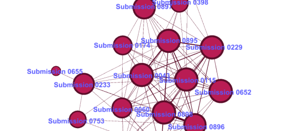
The bottom-right cluster. All of these documents except Submission 0655 draw on the same template.

Using Junk words to find recycled text

Newton’s third law of motion — that for every action, there is an equal and opposite reaction — would appear to apply to the coal seam gas industry in Australia. The dramatic expansion of the industry in recent years has been matched by the community’s equally dramatic mobilisation against it. As my previous post showed, there are literally dozens of organisations on the web (and probably even more on Facebook) concerned in some way with the impacts of coal seam gas development. Some of these are well-established groups that have incorporated coal seam gas into their existing agendas, but many others seem to have popped up out of nowhere.

Most of these groups could be classified as community organisations insofar as they are concerned with a specific region or locality. But to think of them all as ‘grassroots’ organsiations, each having emerged organically on its own accord, might be a mistake. As the website network in my last post suggests, many of these groups might better be thought of as ‘rhizomatic’ (or lateral) offshoots inspired by the Lock the Gate Alliance. Lock the Gate emerged in 2010 and quickly reconfigured the landscape of community opposition to coal seam gas. Its campaigns, strategies and symbolism provided a handy template upon which locally focussed organisations could form. You’ll be hard-pressed to find a community-based anti-CSG group without a link to Lock the Gate on their website.

The lesson here is that voices that appear to be independent may to some extent be influenced or assisted by a small handful of highly motivated (or well resourced) groups or individuals. Having observed this possibility in the network of anti-CSG websites, I recently encountered it again while sifting through a very different dataset that I am preparing for  textual analysis. The dataset in question is the 893 public submissions that the Parliament of New South Wales received in response to its 2011 inquiry into the environmental, health, economic and social impacts of coal seam gas activities. The submissions came from all kinds of stakeholders, including community groups, gas companies, scientific and legal experts, government agencies, and individual citizens. Of particular interest to me were the 660 submissions from individual citizens. Here was a sizable repository of views expressed straight from the minds and hearts of individual people, undistorted by the effects of groupthink or coordinated campaigns. Or so I thought. Continue reading Using Junk words to find recycled text