In the last post, I started looking at how the level of coverage of specific regions changed over time — an intersection of the Where and When dimensions of the public discourse on coal seam gas. In this post I’ll continue along this line of analysis while also incorporating something from the Who dimension. Specifically, I’ll compare how news and community groups cover specific regions over time.
Regional coverage by news organisations
One of the graphs in my last post compared the ratio of coverage of locations in Queensland to that of locations in New South Wales. Figure 1 below takes this a step further, breaking down the data by region as well. What this graph shows is the level of attention given to each region by the news sources in my database (filtered to ensure complete coverage for the period — see the last post) over time. In this case, I have calculated the “level of attention” for a given region by counting the number of times a location within that region appears in the news coverage, and then aggregating these counts within a moving 90-day window. Stacking the tallies to fill a fixed height, as I have done in Figure 1, reveals the relative importance of each region, regardless of how much news is generated overall (to see how the overall volume of coverage changes over time, see the previous post). The geographic boundaries that I am using are (with a few minor changes) the SA4 level boundaries defined by the Australian Bureau of Statistics. You can see these boundaries by poking around on this page of the ABS website.
The regions in Figure 1 are shaded so that you can see the division at the state level. The darker band of blue across the lower half of the graph corresponds with regions in Queensland. The large lighter band above that corresponds with regions in New South Wales. Above that, you can see smaller bands representing Victoria and Western Australia. (The remaining states are there too, but they have received so little coverage that I haven’t bothered to label them.) I have added labels for as many regions as I can without cluttering up the chart.
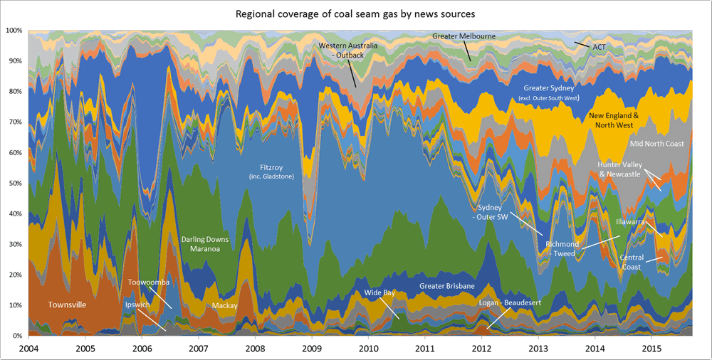
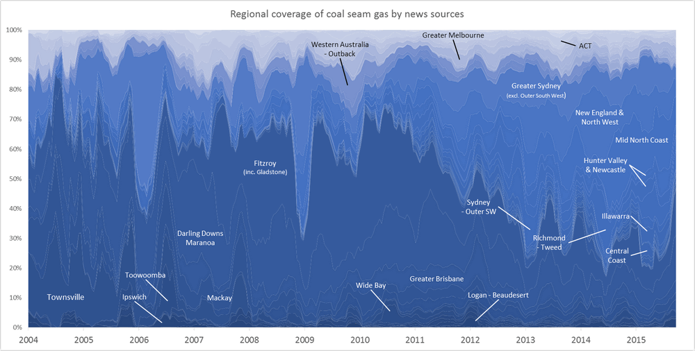
Figure 1. Coverage of geographic regions in news stories about coal seam gas, measured by the number of times locations from each region are mentioned in news stories within a moving 90-day window. The blue shadings group the regions by state. Hovering over the image shows a colour scheme suited to identifying individual regions. You can see larger versions of these images by clicking here and here.
Looking at the state-level groupings, Figure 1 confirms what have I already observed in previous analyses: that the news coverage was predominantly about locations in Queensland until the focus started to shift to New South Wales in about 2011. Interestingly though, there were some sharp spikes in the coverage of locations in New South Wales prior to 2011.
To see what is behind these spikes — and to see all of the individual regions more clearly — hover your cursor over Figure 1 (or try touching the image if you are using a mobile device). What you will see is, to be sure, some kind of Technicolor nightmare (that’s what I get for using Excel!), but it does allow you to track each region over time more easily than the blue shading. We can see that the spike in 2006 was driven almost entirely by coverage of Greater Sydney, while the spike in 2008-09 also included some coverage of the New England & North West and the Mid North Coast regions.
Looking at the original text, I can see that the coverage of Greater Sydney in 2006 relates to QGC’s takeover bid of Sydney Gas. The spike in 2008-09 appears to be something of a false positive as far as Sydney is concerned, as the references to Sydney are mostly incidental to other subject matter. The action in the New England region at this time relates to negotiations around a gas pipeline, while the news about the Mid North Coast concerns AGL’s purchase of a gas lease in the Gloucester Basin.
Within Queensland, the early coverage relates mostly to the Townsville, Mackay and Darling Downs – Maranoa regions, which is not surprising given that these regions contain the Bowen Basin and Surat Basin gas fields. From 2007, the Fitzroy region starts to hog the limelight. This is because the region includes Gladstone, the port city at the centre of the CSG-LNG export proposals that were first announced in 2007. (Ideally, Gladstone would be analysed separately from the rest of the Fitzroy region. For later analyses, I may put in the effort required to achieve this.)
If you peruse the graph, you’ll notice various other regions getting their 15 weeks of fame. I’ll look more closely at some of these in the analyses later in the post.
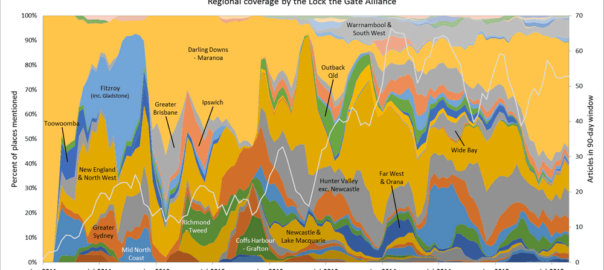
Regional coverage by the Lock the Gate Alliance
Have community groups focussed on the same regions as the media? The obvious way to find out would be to do the same analysis as above for all of the community groups in my corpus. But instead I’ll look just at the textual outputs from the website of the Lock the Gate Alliance, who could be described as the peak organisation campaigning against coal seam gas development in Australia. I’m doing this partly because my coverage of community groups is very patchy over time (see this post), and a temporal analysis aggregating their outputs could therefore be misleading. But I also think that studying Lock the Gate on its own makes for an interesting study, as it may reveal something about their campaign strategy.
Figure 2 shows the regional coverage of Lock the Gate between 2011 and 2015, as measured by the locations mentioned in the news updates section of their website. Before you compare it to Figure 1, please note that the shading here has been reversed: New South Wales is the dark band along the bottom, and Queensland is the lighter band above it. There’s no good reason for this, other than that fixing it would require more time than I’m willing to spend on it right now. (Sorry!) I did at least remember to include the trend line for the total number of articles on this graph. Note also that Figure 2 covers a much shorter time period than Figure 1.
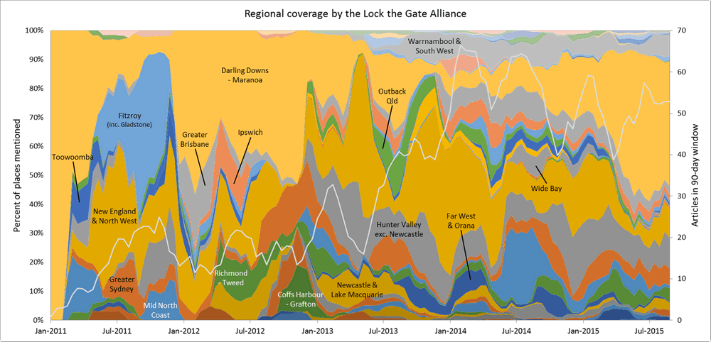
Figure 2. Coverage of geographic regions on the the Lock the Gate Alliance website from 2011 to 2015. The blue shadings group the regions by state. Hovering over the image shows a colour scheme suited to identifying individual regions. You can see larger versions of these images by clicking here and here.
Figure 2 suggests that Lock the Gate gave at least equal coverage to Queensland as they did to New South Wales until about the end of 2012. Prior to that point, their focus was squarely on the Darling Downs – Maranoa region, although they did also talk about the Fitzroy region (especially risks posed to Gladstone Harbour and the Great Barrier Reef) during 2011 (and interestingly, almost never thereafter). The New England and North West region, which includes the Pilliga Forest as well as the Liverpool Plains, also received some attention in 2011, as did Greater Sydney, the Hunter Valley and the Mid North Coast (the latter spans from about Newcastle to Coffs Harbour, and includes the town of Gloucester).
As with the news coverage, you can see in Figure 2 instances where certain regions suddenly receive attention, only to be ignored again soon afterwards. The Richmond – Tweed (or Northern Rivers) region doesn’t quite suffer this fate, but nor does it appear to be a mainstay Lock the Gate’s campaign activities. It doesn’t enter the picture until early 2012, and the nearby Coffs Harbour – Grafton region (which really is only a flash in the pan on this graph) doesn’t appear until late 2012. This is interesting because these regions, especially the Northern Rivers, are the national hotspots for protest-related news coverage, as shown in the last two maps in this previous post. Perhaps the anti-CSG movement took on a life of its own in that part of the country, and Lock the Gate could afford to direct its energies elsewhere.
A final point of interest in Figure 2 is the emergence of a sustained campaign about the Warrnambool and South West region of Victoria in 2013. This region registers as a barely noticeable blip on the graph of news coverage in Figure 1 — so small that I didn’t bother to label it. Is this an example of a campaign that didn’t find traction with the media? Could it be because the development proposed in this region was largely other kinds of unconventional gas than CSG, and thus might have slipped through my search? Or might it have more to do with the fact that Lock the Gate’s national coordinator, Phail Laird, shares his surname with a location in the region, and my geoparsing process can’t diasmbiguate between the two? Rest assured, Laird won’t be in my geoparsing dictionary next time I run this analysis!
Drilling deeper – comparing news and community coverage
Figures 1 and 2 provide a big-picture overview of how the geographic focus of the news media and the largest anti-CSG campaign group has changed over time. The graphs that I will discuss next provide a more detailed look at how news outlets and community groups have covered individual regions. In these analyses, I have aggregated the outputs from the community groups, despite my previously stated misgiving about doing so. The important thing to know about the community group data is that for many of the groups, I only have continuous text data for short periods, such as one or two years, or even less in some cases. This reflects the coverage of time-stamped text available from these groups’ websites (and no, I didn’t attempt to collect content from their Facebook pages). In some cases, this coverage may genuinely reflect the rise and fall of activity from the group; but in other cases, it probably says more about the level of resourcing that they directed to their websites. I haven’t yet done the necessary digging to distinguish between these two possibilities, so when interpreting the graphs that follow, we’ll just have to keep this in mind.
In the previous post, I presented a graph showing how much news coverage locations in the Hunter Valley had received over time. Figure 3 below shows a very similar graph, but with a few important differences. The most obvious difference is that I’ve included a line representing the community groups’ coverage alongside the line for the news publications. A more subtle difference concerns how I have calculated the values for the two lines. There are various ways of calculating these values, and to be honest I’m still not sure which is the ‘best’. As usual, there probably is no best way, as it all depends on the subtleties of the question you’re asking. If you don’t care about these particular subtleties, feel free to skip the next two paragraphs.
For previous analyses of this kind, I simply tallied the number of articles mentioning locations in the relevant region (in this case the Hunter Valley). (What I didn’t do, but probably should have, was to then divide this tally by the total number of articles produces in the aggregation period.) This is a perfectly reasonable approach, but it doesn’t account for the fact that some articles might be long and mention a region only once, while others might be shorter, yet mention the region several times. Arguably (and this is an argument that I am still having with myself), articles that mention the region more frequently should be weighted more strongly in the final tally. So I’ve chosen instead to measure each article’s geographic content by taking the relative term frequency of place names pertaining to each region — that is, by dividing the number of instances of the relevant place names by the total number of words in the article.
Having measured the relative term frequency of each region for each article, I then averaged these values for each time period being measured — in this case a rolling window of 90 days. I might have chosen to do this differently as well: for example, I could have added up the total number of place name occurrences for the period and divided this by the total word count for all articles. This method would have weighted long articles more heavily (or something along those lines), whereas the method I used treats all articles as equally important. Which method is more suitable? I don’t know, but I’m fairly confident that it won’t make a lot of difference, especially given the exploratory nature of these particular analyses. And from a practical standpoint, the averaging approach that I took is easier to implement in conjunction with the moving time window technique. 1 However, it does come at the cost of having a less interpretable metric. Is an average term frequency of 0.001 high or low? And what if some sources, such as community groups, tend to use place names more or less frequently than others, such as news outlets? For these sorts of reasons, I’m now thinking that a metric based on the percentage of all places mentioned might be more for this purpose. There’s always next time.
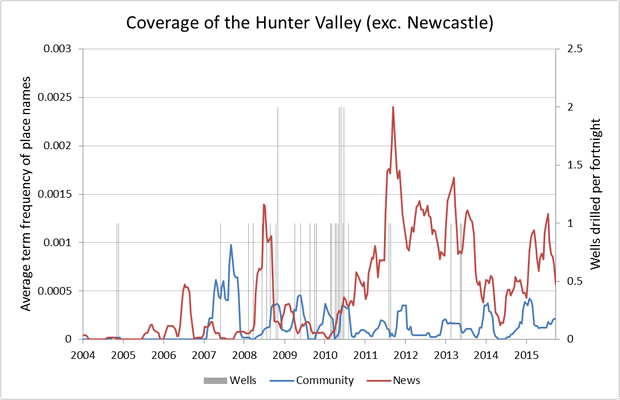
Figure 3. The coverage of locations in the Hunter Valley by news outlets and community groups, as measured by the average relative term frequency of place names. The drilling of coal seam gas wells is also shown.
Let’s just look at the graph and see what it tells us. As I mentioned in the previous post, the most obvious finding is that the bulk of news coverage came after the majority of gas wells had been drilled. But this graph helps us to see this coverage in the context of the community’s activity. I should point out that during the period from the beginning of 2007 to the end of 2009, the only community group that was active — or rather the only group for which I have any data — was the Hunter Valley Protection Alliance (refer to this chart from an earlier post for more information). Not surprisingly, we can see that the group’s written outputs in this period were focussed quite strongly on locations in the region (judging by the other graphs in this section, a term frequency of 0.0005 is fairly high for a community group’s outputs). In the years that followed, other community groups joined the fray, most notably Lock the Gate in 2011, but as a proportion of the community groups’ overall attention, the Hunter Valley did not increase beyond what it had been previously. Meanwhile, interest from the news media increased to well beyond what it had been before.
Adding topics to the analysis
We’d have to look beyond this graph, and perhaps beyond my entire dataset, for an explanation of what is going on here. But let’s see what more we can learn by incorporating data about what the news outlets and the community groups were talking about.
As per previous posts on this subject, I have chosen to encode the thematic content of my corpus with a set of ‘topics’ extracted by a topic modelling algorithm known as LDA. I have previously associated this topic data with the locations in the text by adapting Bayes’ Theorem as well as a simpler averaging process as described in this post. Here I’m sticking with the simpler averaging process, whereby I multiply the topic scores for each document by the relative term frequencies for the regions, and average the results for a given time period. I ran the calculations separately for the news sources and community groups, allowing me to see which topics each set of sources was associating most strongly with a given region.
The real challenge is deciding how to explore and visualise the results. Figure 4 shows one way. Here I’ve recreated a smaller time window from the graph in Figure 3, and annotated three time periods with the top five terms of the top five topics used by the news and community sources in association with locations from the Hunter Valley. You’ll probably have to enlarge it to read all the text.
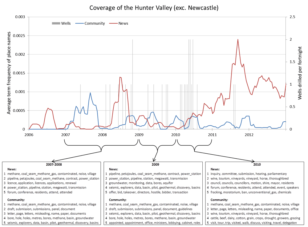
When reading Figure 4, keep in mind that these topics (of which there are 80 in total) were generated from the entire corpus about 40,000 articles. They have not been tailored to the Hunter Valley. What this figure is showing are the topics that best fit the articles about the Hunter Valley at these times. So not all of the words in each topic necessarily appear in the articles that they have been matched to.
Even with just the top five terms from the top five topics, there is a lot of information to take in. And reading them doesn’t even tell us any of the specifics of what was being discussed. If that were the aim, I’m sure there are more efficient ways of achieving it. What I am trying to do here is see how useful my set of 80 topics is for characterising and comparing the discourse of the news and community groups at this temporal and geographic scale.
And the data does indeed tell a story, or indeed several, depending on how we look at it. One thing Figure 4 helps us to see is the similarities and differences of the agendas of the news the and community. From 2007 to the and of 2009, for example, the news sources seem to focus on topics relating to pipelines, power stations, licences, and corporate takeovers, none of which feature in the community’s top topics. The community, meanwhile, appears to be more concerned with submissions, letters, ministerial appointments and bore holes. In 2010, the topic mix shifts, with the news sources starting to talk about more political matters, while the community seems to talks more about local industry.
Estimating ‘thematic distance’ between news and community coverage
But here we’re looking at just five topics at a time. If we really want to compare the discourse of news and community groups, we should make use of all 80 topics. Doing this is relatively easy if we don’t care about how things change over time. See, for example, the network diagrams that I constructed previously using exactly this data. Incorporating the temporal dimension requires a bit more creativity. I’ll present just one possible solution for the moment. This solution is somewhat unsatisfactory, as it leaves you with no information at all about what topics two the sources share, but the trade-off is that it does take into account all 80 topics in calculating the similarity. I’m currently experimenting with a technique called principal component analysis which might provide a more satisfying trade-off between accuracy and information, but that will have to wait for another post — or at this rate, another thesis.
The method I’ve used to compare the similarity of topics discussed by the news and the community is essentially the same as the one I used to construct the network diagrams in my earlier post. It involves calculating the cosine similarity (although I’ve chosen to express it as a distance rather than a similarity) between two sets of topic scores. In this case, the sets being compared are the news and community scores in each period of aggregation. I’ve reverted to aggregating by quarter here, as it is computationally much simpler than using the moving window.
In Figure 5 is my measurement of what I’m calling the ‘thematic distance’ between news and community discourse about the Hunter Valley:
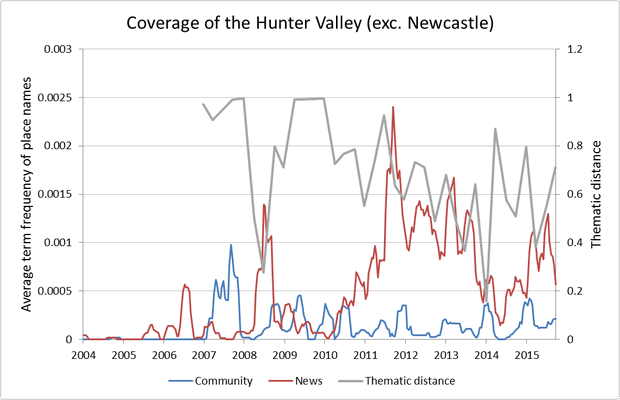
Keep in mind that the data underlying Figure 5 is at times very sparse, especially among the community texts. This sparsity accounts for some of the periods where the distance measure is at or close to 1. It’s important to note that at several points on this graph, the data is based on just a few articles. Tentatively though, this graph suggests that the topics discussed by the news and the community in relation to the Hunter Valley became more similar to one another over the period from 2011 to 2014, but were somewhat less similar thereafter.
There are two moments where the thematic distance is particularly small. The first is in mid-2008, and the second is in late 2013 or early 2014. Interestingly, both of these moments coincide with spikes in the news and/or community coverage, which suggests to me that the convergence is being driven by newsworthy events or announcements. By inspecting the original text, I found that in the third quarter of 2008, both the community and the news media were discussing issues relating to the drilling of exploration wells in the area by AGL and Sydney Gas. (These wells can be seen in Figure 3.) Gas well drilling at this time was still quite new to the region.
The convergence between the news and the community in the first quarter of 2014 seems to be driven by announcements by industry and government. In January and February of 2014, the announcement by the state government of proposed CSG exclusion zones prompted news outlets as well as the Hunter Valley Protection Alliance to discuss the issue of co-existence between the gas industry and local residents and agriculture. In March, several news outlets and Lock the Gate discussed the announcement by Rio Tinto that it would resubmit its application for a major expansion of the Warkworth open-cut coalmine. (Incidentally, I’m noticing that Lock the Gate’s primary interest in the Hunter Valley may be coal mining, not coal seam gas.)
The data for this region might be too thin to yield any solid conclusions via this method of analysis. But there’s just enough here to satisfy me that this method might be useful. In the following section, I’ve added the thematic distance to the graphs for two other regions — the Darling Downs & Maranoa, and New England & North West — as rollovers that you can see by hovering the mouse over the graphs. Points of interest include a dip in the thematic distance in the New England region in early 2014 — about the same time as the dip occurred in the Hunter Valley — and the very noticable and sustained increase in thematic distance in the Darling Downs – Maranoa region after 2012.
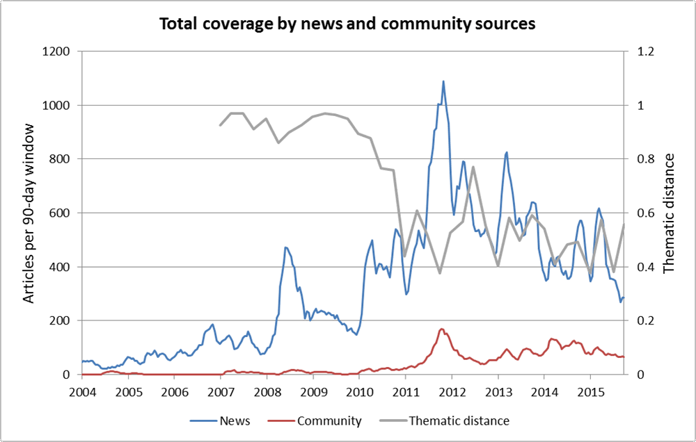
I’ll finish this section with a look at the thematic distance between all community and news groups 2 combined, and with no regional association. This appears to tell a compelling story, but it’s important to take the distance calculation of the early years with a grain of salt due to the limited amount of data from community groups.
Regional round-up
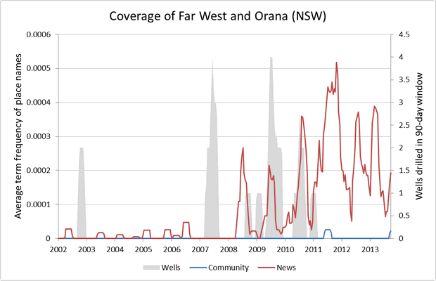
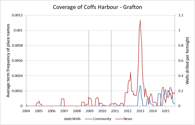
I’ll finish by showing a series of ‘regional profile’ graphs similar to the earlier graph of the Hunter Valley. These attempt to show the level of attention received by each region by the news media and community groups. For context, the graphs also show the number of gas wells drilled in each region over time. Please keep in mind that these analyses are highly experimental, and are not intended to demonstrate or prove anything. These graphs are designed to raise questions rather than answer them.
Most of these graphs show a similar overall story of media interest picking up after 2010, despite, in some cases, significant amounts of industry activity having taken place much earlier. The Northern Rivers (Richmond & Tweed) region shows by far the starkest example of this pattern. The exception to this pattern is the Darling Downs – Maranoa region, where media coverage actually started to decrease as the industry ramped up to full pace.
I’m offering these graphs without any interpretation or any attempt to link what they show to events described in the underlying texts. If you happen to have special knowledge about any particular location and want to chime in about something the graph shows, or doesn’t show, please feel free to leave a comment or contact me.
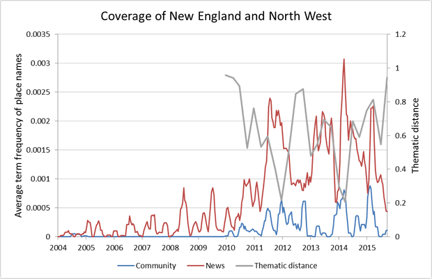
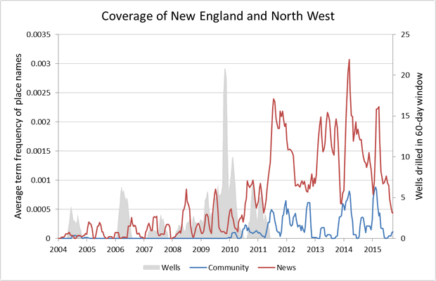
Figure 7. The coverage of locations in the New England and North West region by news outlets and community groups, as measured by the average relative term frequency of place names. Hovering over the image will reveal an approximation of the ‘thematic distance’ between the coverage of the news and the community groups.
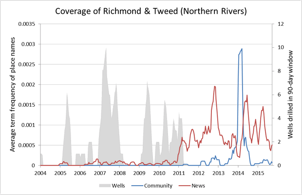
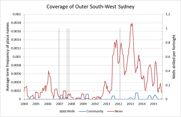
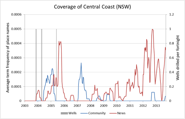
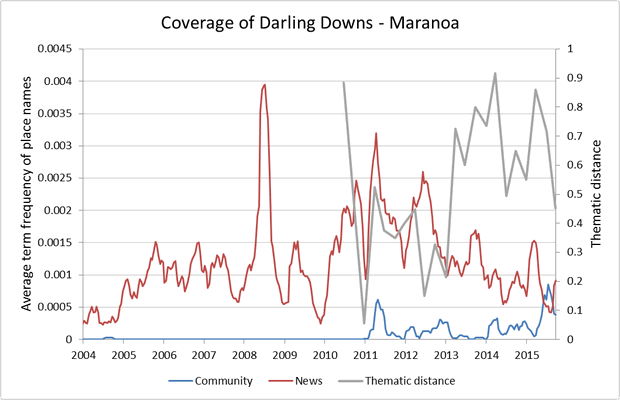
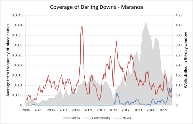
Figure 11. The coverage of locations in the Darling Downs – Maranoa region by news outlets and community groups, as measured by the average relative term frequency of place names. Hovering over the image will reveal an approximation of the ‘thematic distance’ between the coverage of the news and the community groups.