What we talk about when we talk about the lockdown
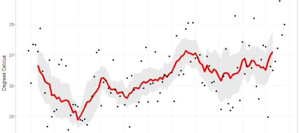
Back in January, I wrote a lengthy, data-driven meditation on the merits of my relocation from Brisbane to Melbourne. My concern at that time was the changing climate. Australia had been torched and scarred by months of bushfires, and I was feeling pretty good about escaping Brisbane’s worsening heat for Melbourne’s occasionally manic but mostly mild climatic regime.
But by gosh do I wish I was back in Brisbane now, and not just because Melbourne’s winter can be dreary. While Brisbanites are currently soaking up as much of their famed sunshine as they like, whether on the beach or in the courtyard of their favourite pub, Melburnians are confined to their homes, allowed out of the house for just an hour a day. During that hour, we are unable to venture more than 5km from our homes or to come within 1.5 meters of each other, leaving little else to do but walk the deserted streets and despair at all of the shuttered bars, restaurants and stores. All in the name of containing yet another existential threat that we can’t even see.
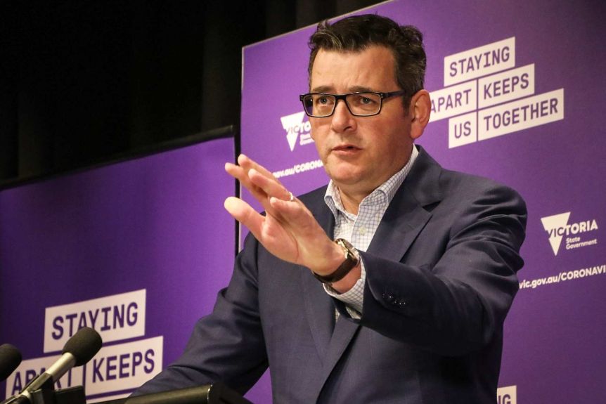
Of course, just because we can’t see the coronavirus doesn’t mean we can’t talk about it. Indeed, one unfortunate consequence of the ‘Stage 4’ lockdown 1 that’s been in place in Melbourne since the 2nd of August is that there is little else to talk about. We distract ourselves from talking about how bad things are by talking instead about how things got so bad in the first place. On days when our tireless premier (who at the time of writing has delivered a press conference every day for 50 days running) announces a fall in case numbers, we dare to talk about when things might not be so bad any more.
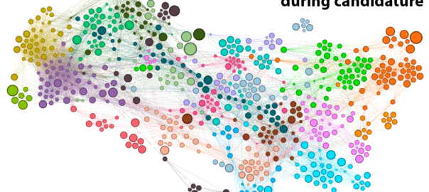
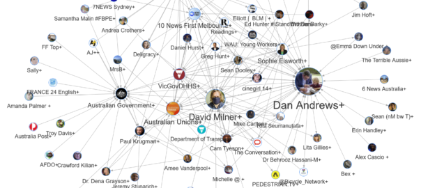
This post is anything but an attempt to escape this orbit of endless Covid-talk. Quite the opposite. In this post, I’m not just going to talk about the lockdown. I’m going to talk about what we talk about when we talk about the lockdown. Continue reading Tweeps in lockdown: how to see what’s happening on Twitter
Notes:
- To date, we’ve been from Stage 3 back to Stage 2, and then up again to Stage 3 before ratcheting up to Stage 4. Hopefully we’ll be back to Stage 3 in a few weeks. We keep using that word, but I don’t think it means what we think it means. If I lapse into calling it ‘Level 4’ instead, that’s why. ↩