The last two posts have updated my progress in understanding the Where and the Who of public discourse on coal seam gas, but didn’t say much about the When. Analysing the temporal dynamics of public discourse — in other words, how things change — has been one of my driving interests all along in this project, so to complete this series of stock-taking articles, I will now review where I’m up to in analysing the temporal dimension.
At least, I had hoped to complete the stock-taking process with this post. But in the course of putting this post together, I made some somewhat embarrassing discoveries about the temporal composition of my data — discoveries that have significant implications for all of my analyses. This post is dedicated mostly to dealing with this new development. I’ll present the remainder of what I planned to talk about in a second installment.
The experience I describe here contains important lessons for anyone planning to analyse data obtained from news aggregation services as Factiva.
The moving window of time
The first thing to mention — and this is untainted by the embarrassment that I will discuss shortly — is that I’ve changed the way I’m making temporal graphs. Whereas previously I was simply aggregating data into monthly or quarterly chunks, I am now using KNIME’s ‘Moving Aggregation’ node to calculate moving averages over a specified window of time. This way, I can tailor the level of aggregation to the density of the data and the purpose of the graph. And regardless of the size of the time window, the time increments by which the graph is plotted can be as short as a week or a day, so the curve is smoother than a simple monthly or quarterly plot.
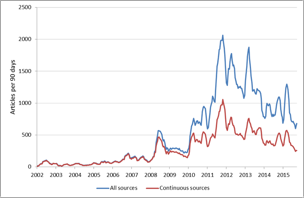
One reason why this feature is so useful is that the volume of news coverage on coal seam gas over time is very peaky, as shown in Figure 1 (and even the 30-day window hides a considerable degree of peakiness). Smoothing out the peaks to see long-term trends is all well and good, but it’s important never to lose touch with the fact that the data doesn’t really look that way.
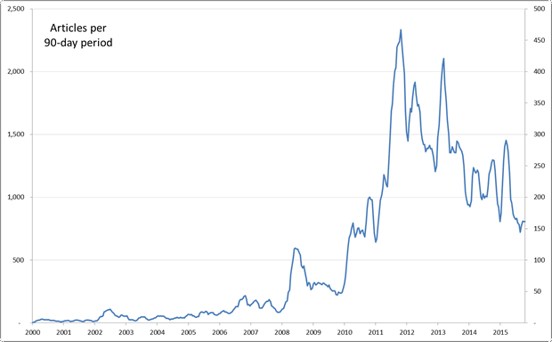
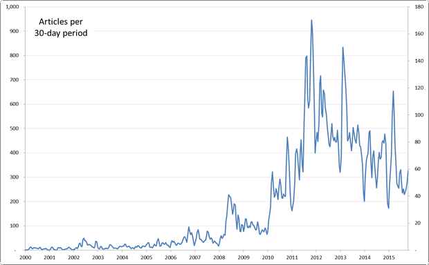
Figure 1. The number of articles in my corpus over time, aggregated to a 30-day moving window. Hovering over the image shows the same data aggregated to a 90-day window.
That feeling when you realise the data isn’t what you thought it was
The overall-volume-of-stuff-over-time graph that you see in Figure 1 recreates the very first graph I made upon assembling my data, as reported in this early post. While acknowledging that this graph tells me nothing about who is generating all the text, where it comes from or what it is about, I took it as a valid summary of the big picture — of the overall level of activity in the public discourse on coal seam gas in Australia. Since then, I have dissected the data along several dimensions, focussing mainly on the Where, What, and When (or equivalently, geography, topics, and time), with only a belated effort to examine the patterns and relationships among the many sources on the Who dimension. In particular, until recently I hadn’t looked in any detail at the outputs from individual sources over time.
Big mistake. Because now that I have started looking at this aspect of the data, I’ve realised that the data isn’t quite what I thought it was. I had assumed that most of the 300 or so news sources in the Factiva search results were represented continuously across the duration of the query. Sure, some sources might have been added to Factiva a little later than others, but I assumed that these would be the exceptions.
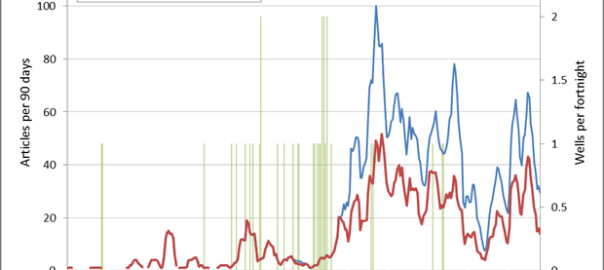
One clue that Factiva’s coverage of sources is more patchy than I had assumed came from the chart of regional coverage per quarter that appeared as Figure 2 in the last post. In my discussion of that chart I noted an anomaly: there was absolutely no coverage by local news sources in the Hunter Valley region before 2011, even though gas exploration in the Hunter Valley had commenced several years earlier than that that. This same anomaly showed up when I charted the number of articles from Hunter Valley news sources (of which there are no fewer than seven in my dataset) against the number of gas wells drilled in the region:
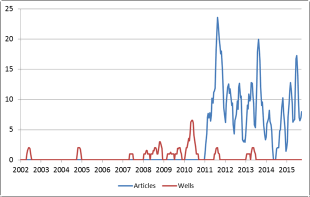
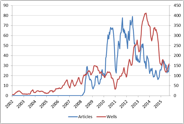
Did the local media really ignore coal seam gas until 2011? Probably not. The more likely explanation is that Factiva didn’t catalogue any of these sources until 2011. Dang! Oh well, maybe the Hunter Valley papers are an exception in this regard, and the coverage for other regions will be better. Again, probably not. I graphed several other regions and saw a similar result. For example, here are the gas wells and local news activity in the Darling Downs and Maranoa region:
Shit! By this point, a mild sense of horror had set in. How many of the news sources in my database had coverage as incomplete as this? And how many of my analyses and observations had been skewed or confounded by these data gaps?
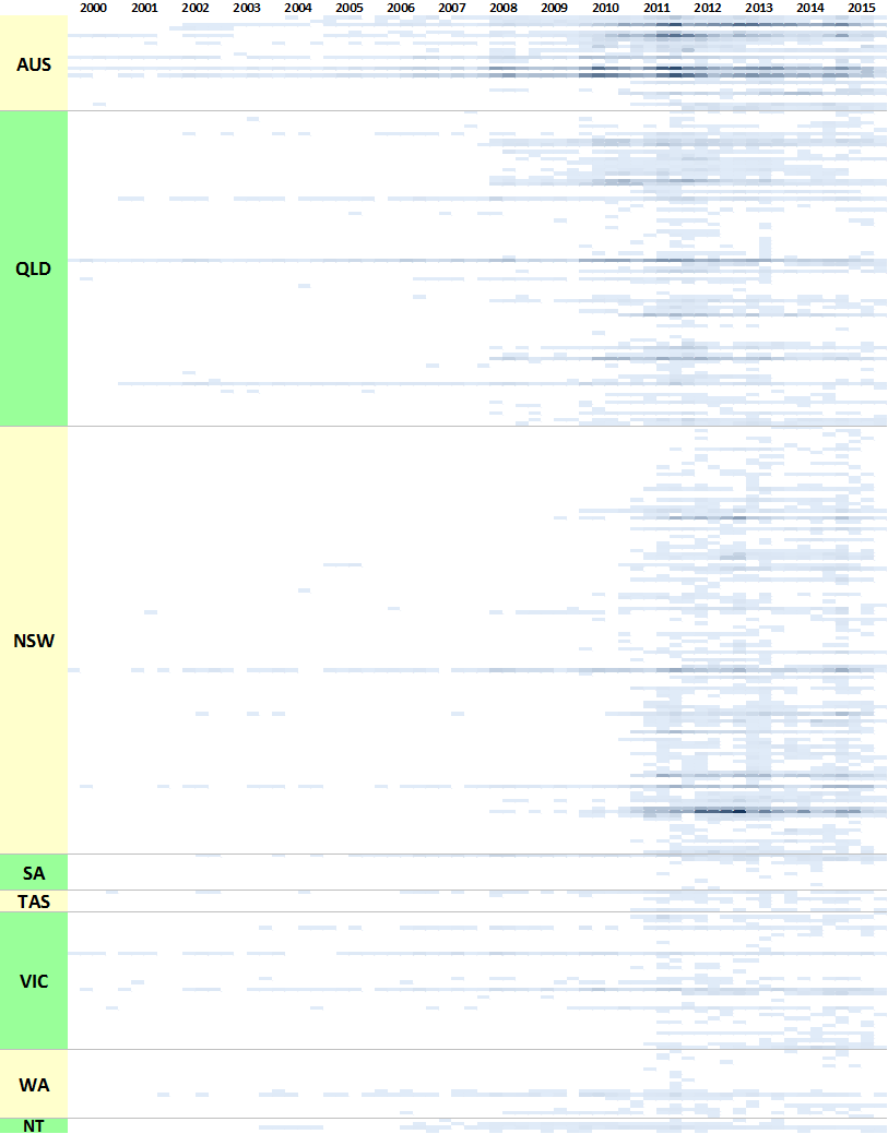
Take, for instance, the chart I showed in the last post depicting the output over time for all of the news sources in my database. In discussing that chart, I noted two points in time — in 2008 in Queensland, and in 2011 in New South Wales — where large numbers of sources suddenly became active all at once. I assumed that I was seeing state-wide explosions of interest at those times. But maybe the chart was instead revealing something about Factiva’s coverage of those sources. Shiit!
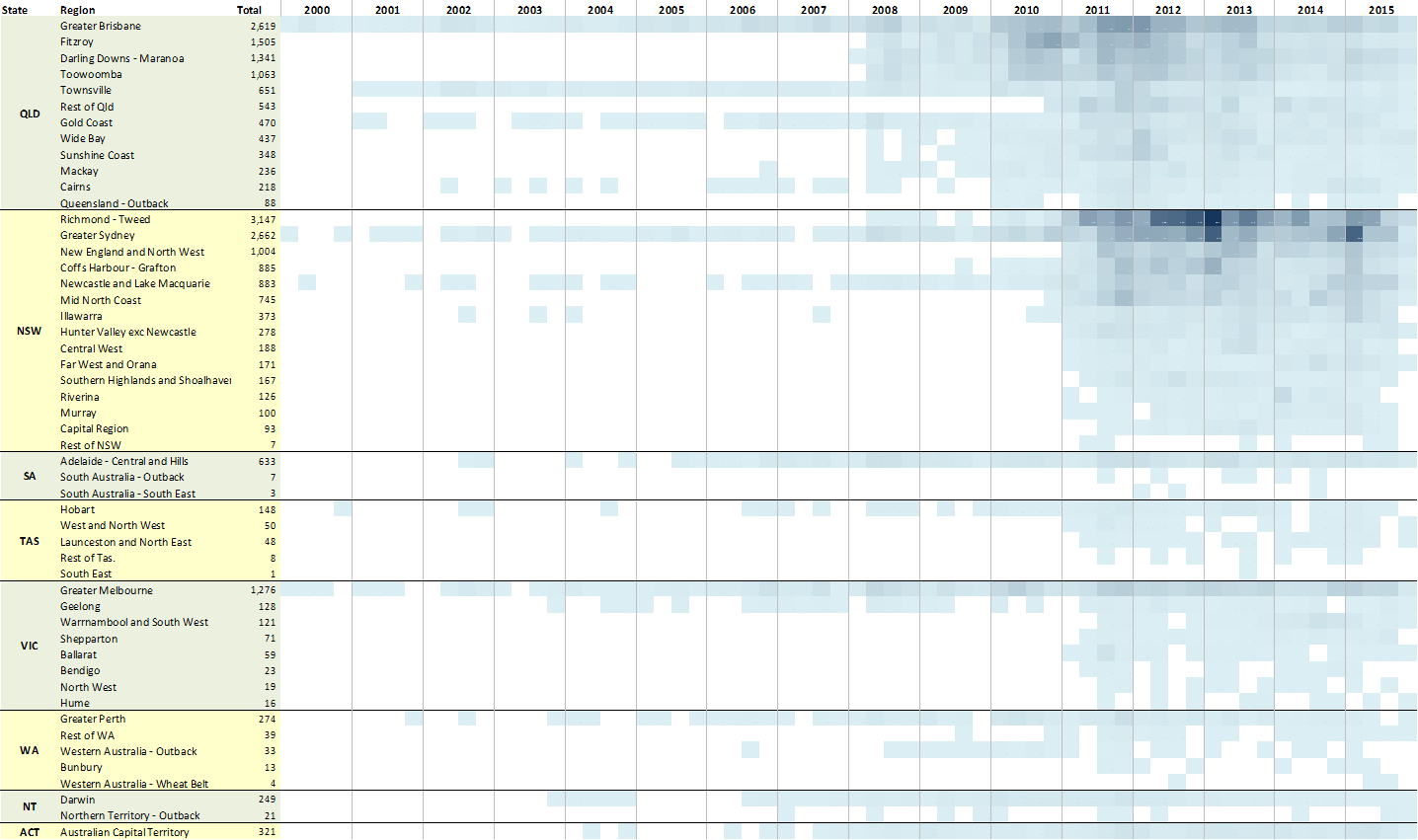
To find out what was going on, I went back to Factiva and retrieved the date of the earliest issue catalogued for every one of my news sources, and added these dates to the chart. The result is what you see in Figure 4. As before, each horizontal band is a news source, and the depth of shading indicates the number of articles about coal seam gas in each quarter. The sources are grouped by geographic region, and the regions are sorted within each state so that those containing the most articles are listed first (the states are sorted the same way). But the most important feature of this chart is the green squares, which indicate when Factiva’s coverage of each source begins.
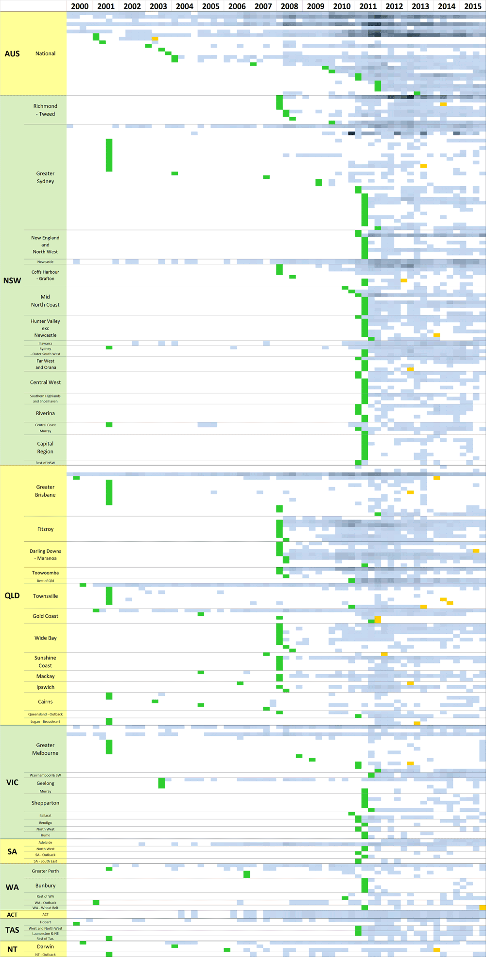
Shiiit!! To put it mildly, this is not what I had hoped to see. Those vertical green bands tell me that a large proportion of the sources in my database are not catalogued in Factiva prior to 2008 (for Queensland sources) or 2011 (for New South Wales Sources). Pretty much the only sources with earlier coverage those pitched to national, state or metropolitan audiences.
In only a few cases do these dates reflect when the news publications were founded. Nearly all of the news sources listed in Figure 4 were active for decades before Factiva came along. In other words, the Factiva dragnet is full of holes, and these holes could account for some of the most interesting trends I have observed in the data: the spikes in overall coverage in 2008 and 2011; the shift in attention from Queensland to New South Wales in 2011; even the similarities in agendas that I explored through network analysis and topic modelling in my last post (since sources that are only available in the same short time window are more likely to discuss similar topics).
Over to you, Clay.
Another view of Factiva’s coverage
Regardless of how these data gaps have tainted my previous analyses, I know now that my future analyses will have to make a trade-off between breadth of time and depth of coverage. The longer the time period I want to examine, the fewer available sources there will be with continuous coverage. The regions I choose to examine will also influence the pool of continuous sources. To better understand these trade-offs, I used the starting dates shown in Figure 4 to create the following graph, which shows the number of news sources in my database for which Factiva provides coverage at any point in time, broken down by state.
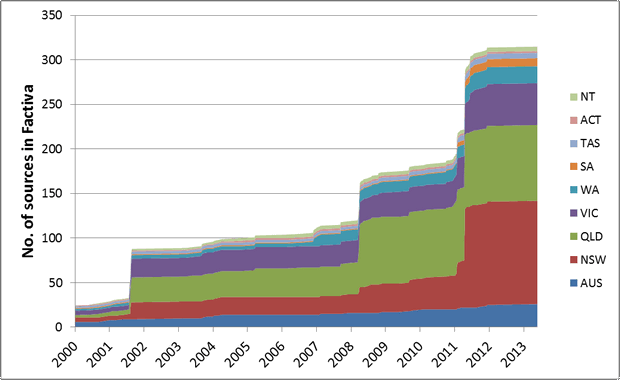
This graph is really useful. First, it tells me that I probably shouldn’t bother starting any of my analyses before mid-2001, because a significant number of sources from Queensland, New South Wales and Victoria were not available before that point. The graph also tells me that if I start an analysis in 2008, I can take advantage of about 30 additional sources from Queensland without skewing my results, and if I start an analysis as late as mid-2011, I can use about 75 additional sources from New South Wales.
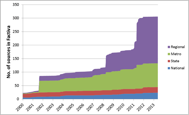
Figure 6 shows the same data divided up by the geographic distribution of the news source. These are my own designations based on the intended audience of each source. ‘National’ sources are publications like The Australian or the ABC News. ‘State’ sources are the major newspapers in each state, even if they are ostensibly targeted at capital cities (like the Sydney Morning Herald, for example). ‘Metro’ sources are papers with a local distribution in capital cities and their greater metropolitan areas, while ‘Regional’ sources are those targeted at rural areas and towns other than capital cities. Plotting the data this way confirms my earlier observation that the only sources with good long-term coverage are those pitched at national, state or metropolitan audiences. Regional sources are not well covered until 2008 for Queensland or 2011 for New South Wales.
The lesson
I should have made the discoveries I’ve described above much, much earlier. I should have checked the continuity of the sources as a matter of course, before proceeding with any other analyses. Such things are all easy to say in hindsight, and not really worth dwelling on except to draw out the lessons for next time. The most obvious lesson here is not to make assumptions about data that you didn’t create. Always check the integrity and completeness of your data before proceeding with analysis.
A more subtle lesson from this experience is to always question whether the results of an analysis are telling you something about the world, or something about your data. Both outcomes can be useful. Indeed, time and again I find that the most valuable outcome of visualising my data is that the visualisation reveals gaps, anomalies, biases, and other artefacts of the data that would be otherwise hard to spot. But there are times when quirks of the data can be mistaken for features of the world, especially when those quirks align with prior expectations or amplify real effects.
The impact
So, how many of my own findings so far have suffered this fate? To what extent have I been measuring the quirks of my data rather than features of the world? Rather than recreate all my previous analyses (that will come in time), I will present just a few basic comparisons.
Overall coverage
To start with, Figure 7 shows how the plot of the total number of articles over time changes when we remove all of the non-continuous sources — that is, all of the sources for which Factiva does not have coverage for the whole time period, whether because they commenced later than the beginning of the period, or ceased before the end.
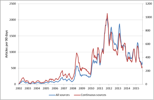
There is good news and bad news here. The good news is that even though the absolute numbers differ, the overall contour of the two curves is very much the same. This can be seen more easily in Figure 8, which plots the same data on two separate axes. With just a few exceptions (which themselves may be worth investigating), when one line goes up or down, so does the other. So observations based on spikes or dips in the coverage are likely to be valid regardless of whether or not the non-continuous sources have been filtered out. The bad news is that the unfiltered data strongly exaggerates the extent to which the intensity of coverage has changed since 2008. Put another way, these findings suggest that conclusions based on the unfiltered data are likely to be correct about the direction of change, but wrong about the magnitude.
Geographic content
I’ll finish up by looking at how the uneven coverage of sources in my data might have affected my analyses of geographic content, such as the maps of geographic coverage that I presented a couple of posts back. But rather than recreate those maps, I’m going to use simple line plots to look at the coverage of individual regions over time.
Figure 9 shows the number of articles mentioning locations in Queensland, again comparing the results for all sources against just the sources with complete coverage of the period shown. Hovering over the image will show the same data plotted with two separate axes. Here we see the same effect as in the previous graphs, but even more pronounced: the direction of change is generally the same, but the unfiltered data exaggerates the increases from 2008 onward.
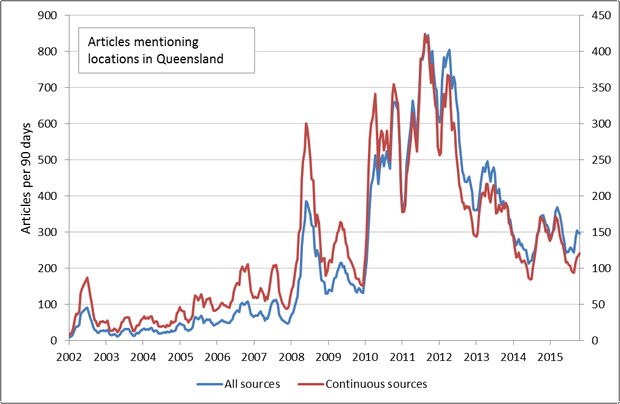
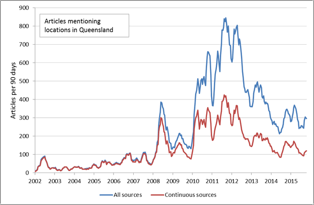
Figure 9. The number of articles mentioning locations in Queensland, comparing the results for all sources against the results for only the sources with continuous coverage. Hovering over the image shows the same data plotted on separate axes.
Figure 10 shows the same data for places in New South Wales. Again the pattern is the same, except the two curves deviate from each other a little latter than for the Queensland locations. This makes sense given that many of the regional New South Wales sources are not catalogued by Factiva until 2011.
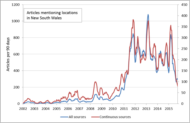
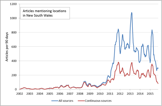
Figure 10. The number of articles mentioning locations in New South Wales, comparing the results for all sources against the results for only the sources with continuous coverage. Hovering over the image shows the same data plotted on separate axes.
What about the ratio of articles covering Queensland as opposed to New South Wales? Figure 11 shows that there is a definite shift from discussion about Queensland to discussion about New South Wales in about 2011, but that the shift is not as dramatic when only sources with continuous coverage are included.
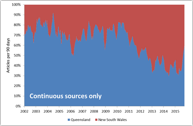
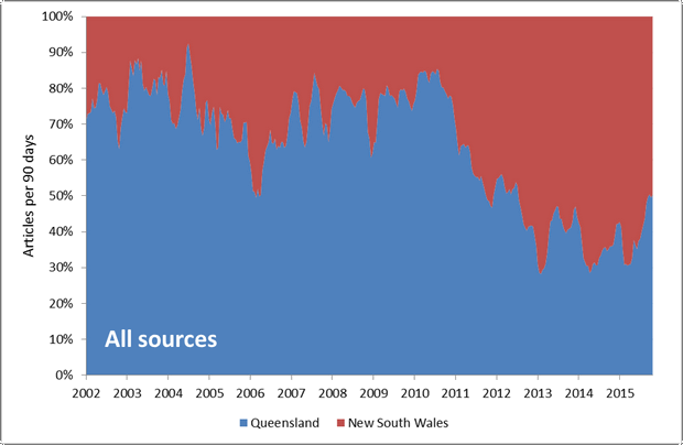
Figure 11. The ratio of articles mentioning places in Queensland to those mentioning places in New South Wales. Hovering over the image shows the results for continuous sources only.
Finally, Figure 12 returns us to the Hunter Valley, which is sort of where this journey began. Way back in Figure 2, I plotted the number of articles from Hunter Valley newspapers against the number of wells drilled in the same region. That wasn’t much of a success, because (as I now know) the data for those newspapers doesn’t begin until 2011, yet there were wells being drilled well before then. As a way of compensating for that data gap, Figure 12 instead plots the number of articles mentioning locations in the Hunter Valley. This allows me to draw on newspapers from outside the Hunter Valley for which Factiva (and thus my corpus) does have coverage in the years prior to 2011. Note that I’ve drawn the wells a little differently this time, as a rolling average isn’t really appropriate for plotting such sporadic events.
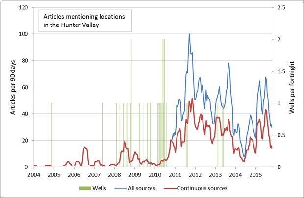
I’ll never know for sure how the local media in the Hunter Valley covered events prior to 2011, but by drawing on all of the other news sources in my corpus, I now have a pretty good proxy. 1 And the picture that emerges is really interesting, because it shows that the media’s interest in the region did not peak until well after most of the wells had been drilled.
I’d have to dig a little deeper to find out exactly what is going on, but one possible explanation is that prior to about 2010, the media and the general community did not know much about coal seam gas, and so the topic was unlikely to be covered even if there were local pockets of concern. Once the media and the broader public had been alerted to the issue, almost any CSG-related event, such as a community protest or the drilling of a well, is likely to be reported. That’s my current theory anyway!
This question of what has driven the media and the community to talk about coal seam gas in specific times and places is something I intend to pursue further by examining the data in this manner. To this end, one key thing missing from the data presented in this post is the activity of community groups concerned about coal seam gas. Another thing missing is the thematic content of news and community discussion. I will work both of those things into the analysis when I pick up this thread in the next post.
Notes:
- Although I just realised that I haven’t controlled for the ‘background noise’ created by the increase in the number of articles in the corpus as a whole. So I probably should try plotting the articles mentioning the Hunter Valley as a percentage of all articles. ↩