It’s been a busy few months. Among other things, I presented at the Advances in Visual Methods for Linguistics 2016 conference held here in Brisbane last week; I submitted a paper to the Social Informatics (SocInfo) 2016 conference being held in Seattle in November; and I delivered a guest lecture to a sociology class at UQ. Somewhere along the way, I also passed my mid-candidature review milestone.
Partly because of these events, and partly in spite of them, I’ve also made good progress in the analysis of my data. In fact, I’m more or less ready to draw a line under this phase of experimental exploration and move onto the next phase of fashioning some or all of the results into a thesis.
With that in mind, I hope to do two things with this post. Firstly, I want to share some of my outputs from the last few months; and secondly, I want to take stock of these and other outputs in preparation for the phase that lies ahead. I won’t try to cram everything into this post. Rather, I’ll focus on just a few recent developments here and aim to talk about the rest in a follow-up post. Specifically, this post covers three things: the augmentation of my dataset, the introduction of heatmaps to my geovisualisations, and the association of locations with thematic content.
No longer just the news
All along, my plan was to analyse news texts alongside texts produced by other sources active in the public discourse on coal seam gas — sources like community groups, gas companies, and governments. At about the same time as I gathered my news data, I collected a range of stakeholder texts by scraping the websites of these sorts of organisations. To enable temporal analyses, I collected only data that was time-stamped, such as media releases and blog-style updates. By digging into the website of the Parliament of Australia, I was also able to retrieve speeches by various members of parliament. For the texts of some community groups, I had to search internet archives such as the Wayback Machine and the National Library of Australia’s PANDORA Archive.
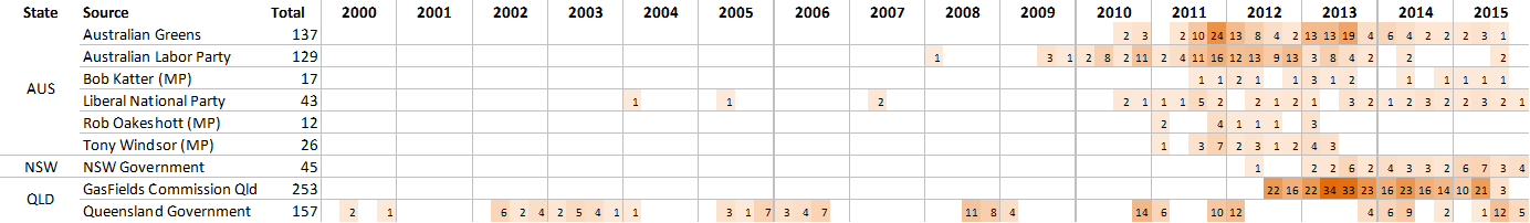
All in all, I ended up with 3,880 documents from 30 different stakeholders — still dwarfed by the 38,130 news articles (which include 2,244 letters), but nonetheless a substantial stream of supplementary data. Just under half of the stakeholder documents come from community groups, while about 30% come from government and 20% come from industry. Figure 1 compares the density of news and stakeholder sources across states and over time. Note that the shading is of a different scale for each class.
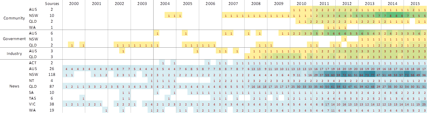
I chose this particular visualisation because it clearly shows where there are holes in the data. It tells me, for example, that if I want to compare community, government, industry and news sources all at once, I can’t meaningfully attempt to do this until at least 2007, because prior to then, the stakeholder sources are too patchy. Figure 1 also shows that Queensland and New South Wales sources dominate the news data (no surprise there) and that the bulk of community groups in the corpus are from New South Wales.
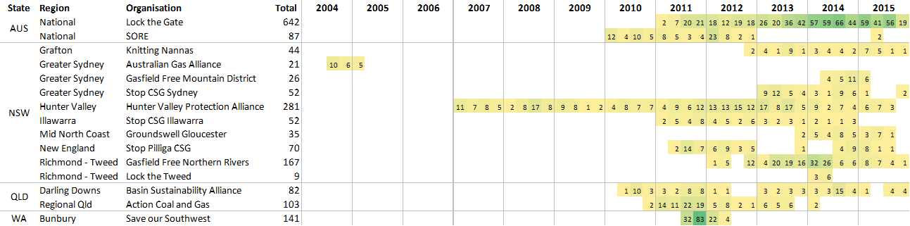
Figure 2 provides more detail about the 15 community groups in the corpus, this time tabulating the number of documents produced. It shows that until 2010, only two community groups had been active (although it is possible that there were other active community groups not included in my corpus). We can also see that once Lock the Gate got going in 2011, it soon began to produce more output than most of the other groups combined. A curious feature on the table is the West Australian group, Save our Southwest, which had a short but highly prolific year of activity starting in mid-2011, before going completely quiet again.
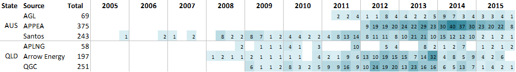
Documents produced by the industry groups in my corpus are tabulated in Figure 3. These are all gas companies except for APPEA, which is the peak industry body representing the petroleum industry in Australia. There is one very notable omission here, and that is Metgasco, one of the main operators in New South Wales. I can’t remember exactly why I did not collect text from Metgasco’s website — probably because it didn’t play nicely with my web scraping tool — but if I find a rainy day before now and the end of the year, I may well go back and have another attempt.
Finally, Figure 4 tabulates the documents produced by government sources. The first thing that stands out is that for a long time, apparently only the Queensland Government had much to say about coal seam gas. But this might reflect the limitations in what was available to me on the New South Wales Government website. Also, the gap in activity from the Queensland Government in 2007 gives me some cause for concern, because I know that there was at least one (and probably several) press release about Santos’s LNG project in that year. Somehow, my web crawl or search terms failed to pick this up.
Dealing with the holes in my data is something that I will have to approach very carefully. In some cases, the holes reflect a true lack of activity by the relevant actors. But in other cases, they reflect a gap or glitch in my data collection. And there will be times when I won’t even know which of these two possibilities is at play.
A further round of filtering
While I have added new data to my corpus, I also been excluding some as well. After running a new topic model on the expanded corpus (see this post for detail about the topic modelling method), I realised that there were still several topics in my corpus that were either incidental to discussion about coal seam gas or just not within my scope of interest (purely financial news, for instance). So I filtered out all of the documents that were predominantly about the irrelevant topics, and have since been using this slimmer, more CSG-focussed dataset for my analyes. The filtered dataset comprises 34,273 documents, making it about four fifths of the size of the unfiltered dataset (from which I had already removed some irrelevant articles, as discussed here). For subsequent analyses of thematic content, I produced a topic model just of the filtered data, this time using 80 topics.
How the news moves – now with heatmaps!
Way back in March this year, I wrote a post presenting some maps that showed how the geographic focus of news about coal seam gas has shifted over time. Those maps visualised the outputs of a geoparsing exercise in which I tabulated all of the references to 1,468 different place names in around 26,000 of the news articles in my corpus. The maps showed each location as a circle, sized to indicate the number of times it was mentioned in the news.
These maps were useful for showing where the news coverage was focussed and how this focus changed over time, but they are not very pleasing to the eye, and they present much more information that is necessary if you just want to see the broad spatial and temporal trends. Since making these maps, I’ve learned how to render the data in a way that addresses these shortcomings. Rather than plotting all of the locations individually, I can now represent them as a heatmap which interpolates the density and frequency of place-mentions and converts them into a smooth surface. The result not only looks nicer, but is also much easier to interpret at a glance, and permits the simultaneous display of other relevant features, such as gas wells. Figure 5 shows the heatmap representation of my entire (filtered) dataset. Hovering over the image (or touching it on a mobile device) will reveal the same data represented as proportional markers.
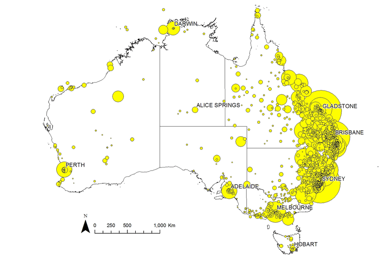
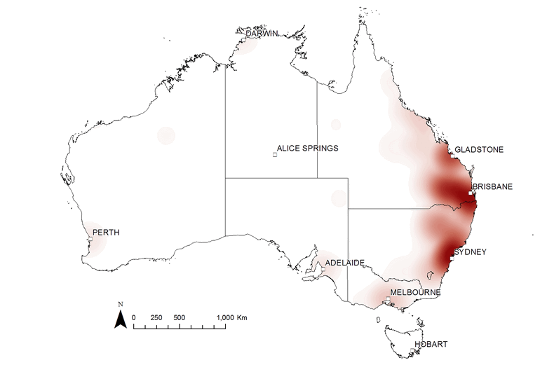
Figure 5. The locations mentioned in my dataset of news stories about coal seam gas from 2000 to 2015, represented as a heatmap. Hover over the image to see the same data represented as proportional markers.
The heatmaps cut out the clutter of the markers and reveal the broad-scale spatial variation more clearly. They are particularly useful for making comparisons, whether between time periods or between different sources of text. The two figures below, for example, show transitions at two pivotal points in the public discourse about coal seam gas. Figure 6 shows the sudden rise in interest in the Gladstone region after Santos’s announcement in April 2007 of their LNG export project (Gladstone being the port from which the LNG would be shipped). Figure 7 shows the shift in attention from Queensland to New South Wales that took place in 2011. (If I can find the time, I’d love to make an animated sequence using this technique.)
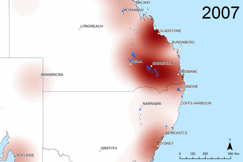
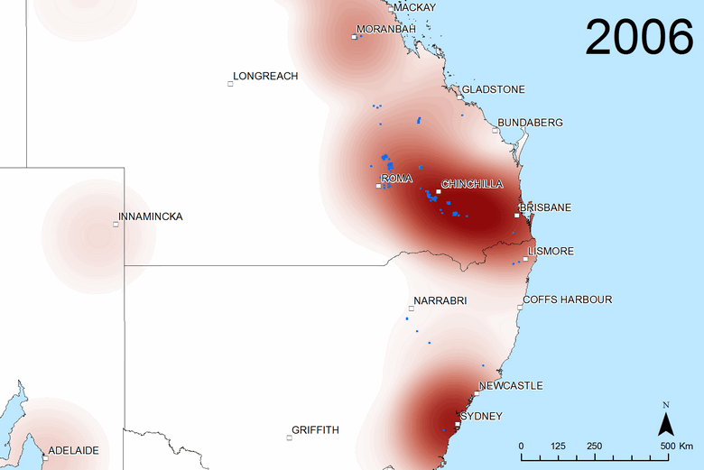
Figure 6. The geographic scope of coverage by all sources in 2006 and (if you hover over or touch the image) 2007. Blue dots show where coal seam gas wells were drilled in each year.
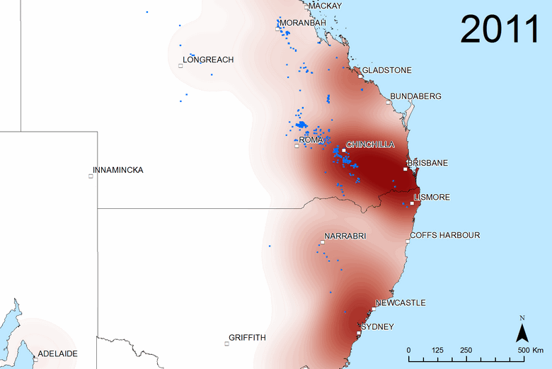
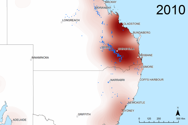
Figure 7. The geographic scope of coverage by all sources in 2010 and (if you hover over or touch the image) 2011. Blue dots show where coal seam gas wells were drilled in each year.
The heatmaps are just as effective for comparing the geographic scope of different news sources and other actors contributing to the public discourse. Hovering over (or touching) Figure 8, for example, compares the coverage of the ABC News with that of the Financial Review, the national paper of Fairfax Media. The most obvious difference is that the Financial Review is far more concerned with Gladstone, presumably because of its importance to the LNG export projects, which would be of interest to the paper’s business-focussed readers. Looking more closely, we can also see that the Financial Review has more coverage of Sydney and Brisbane, while the ABC has more coverage of the prospective gas fields around Lismore, Narrabri and Newcastle, as well as the active fields around Chinchilla. In general then, Figure 8 suggests that the Financial Review is focussed on capital cities and business topics, while the ABC has better coverage of the issues associated with gas development in regional areas.
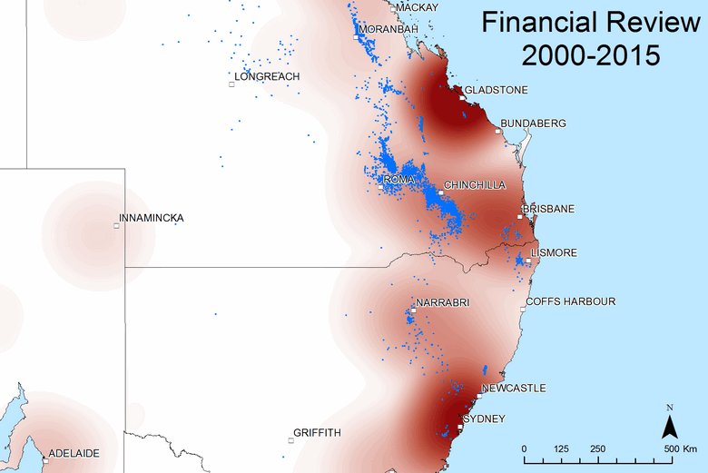
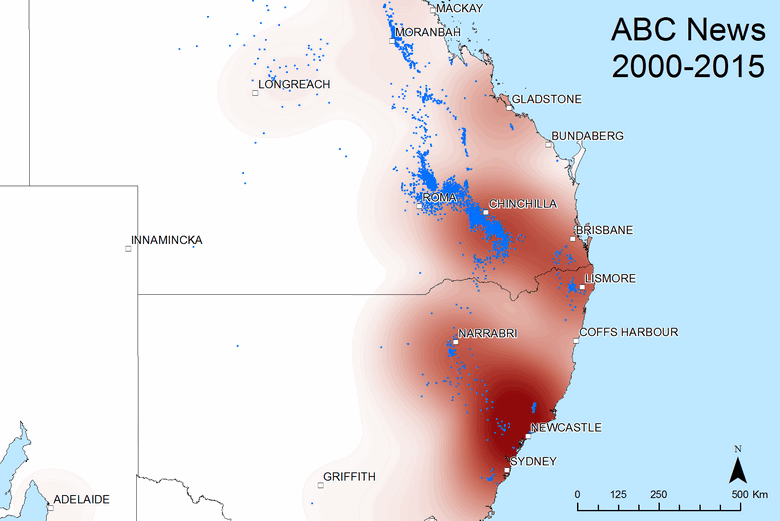
Figure 8. The geographic scope of coverage by the ABC News and (if you hover over or touch the image) the Financial Review from 2000 to 2015.
Is the Financial Review’s spatial coverage typical for a national paper? Figure 9, which shows the coverage of News Corp’s national paper, The Australian, suggests that it is. Hovering over the image shows that the spatial coverage of the two papers is very similar, with the main difference being that The Australian has more coverage of the gas fields in Queensland’s Darling Downs, around Chinchilla.
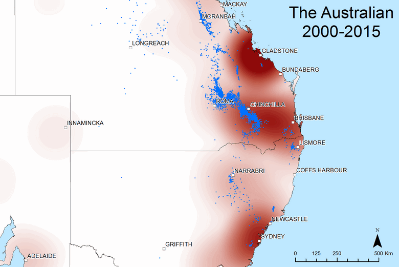
Figure 9. The geographic scope of coverage by The Australian and (if you hover over or touch the image) the Financial Review from 2000 to 2015.
Why might the Australian have better coverage than of the Darling Downs region when compared with the Financial Review? My guess is that News Corp also operates the Courier-Mail, the main newspaper in Queensland, as well as several regional papers operating in the Darling Downs area. Fairfax, meanwhile, has very limited presence in this part of the country. Figure 10 shows that The Courier-Mail provides good coverage of the Darling Downs region, but almost no coverage of anything south of the border. (I knew the Courier-Mail was parochial, but I didn’t expect it to be this stark!) Hovering over Figure 10 provides a comparison with the Australian.
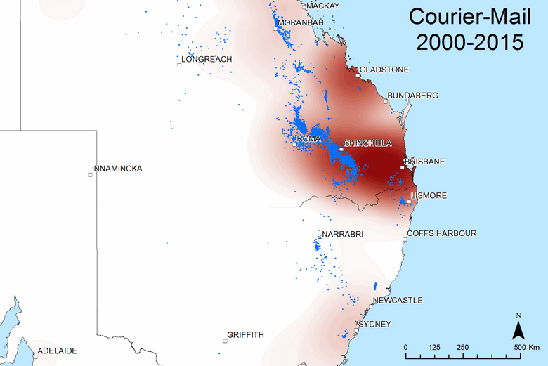
Figure 10. The geographic scope of coverage by The Courier-Mail and (if you hover over or touch the image) The Australian from 2000 to 2015.
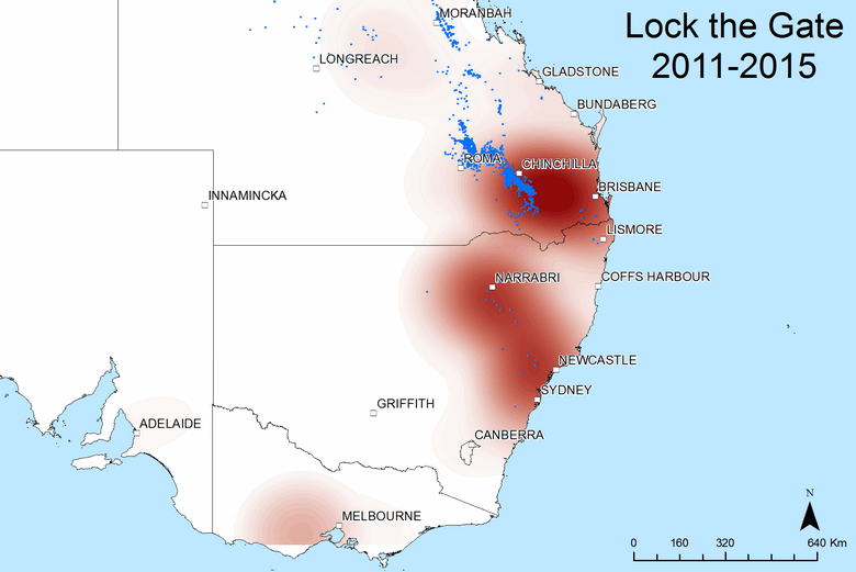
Finally, Figure 11 shows the spatial coverage of media releases and newsletters from the Lock The Gate Alliance, the peak anti-CSG campaign group in Australia. Evidently, Lock the Gate has said very little about Gladstone (which is interesting, given that the LNG projects caused considerable environmental disruption there), focussing instead on the gas fields around Chinchilla, Narrabri and Newcastle (the location of interest there is actually the town of Gloucester). I’ve used a slightly wider extent with this map to show that Lock the Gate has also campaigned in the region to the west of Melbourne.
I’m really happy with these maps, and not just because they look nice, but because they tell me things about my data that I couldn’t have guessed — or that if I could have guessed, I wouldn’t have been able to prove without a lot of effort. They have reinforced my suspicion that place is an integral part of the public discourse on coal seam gas. If I am going to analyse the agendas at play within this discourse, the places mentioned will be just as important to consider as the topics discussed. When does the media start talking about a particular place, and why? Are certain places thrust upon the media’s agenda through the efforts of community groups? These are questions I will explore in my thesis.
What to where: connecting topics to places
The analyses presented above are all about tracking the geographic content of my data, whether over time or across sources. They deal with the where of news coverage and public discourse. To analyse the what — that is, the actual topics that people talk about — I’ve employed a technique called topic modelling, as discussed in several earlier posts. With the data describing both the what and the where at my fingertips, I was immediately curious to see what could be achieved by combining them. I wondered what I could learn by visualising the connection between topic and place.
Between them, the location mapping and topic modelling analyses had given me the data I needed to ‘score’ every document in my corpus against every location and every topic. For the location data, I derived this score by dividing the number of times a place was mentioned in a document by the number of words in the document — in other words, I calculated the relative term frequency of the place name. To score the documents against the topics, I just used the data generated by the LDA algorithm, which describes how much of each document is allocated to each topic.
An unnecessary detour?
(No really, you can probably skip this bit.)
I first combined these document scores by using a fairly obvious but flawed method, and then by using a method that is less obvious and more complicated, but more useful. As I wrote this post, I realised that there is an obvious and much simpler method by which I could have achieved the same thing. Such is the benefit of doing things when you’re not in a rush!
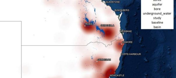
The obvious but unsatisfactory method was to simply multiply the topic and location scores for each document and aggregate the results for each topic-location combination. The result for a topic about groundwater is shown below. The relative size of each marker indicates the combined topic-location score for the location. Only the 300 highest-scoring locations are shown.
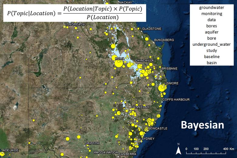
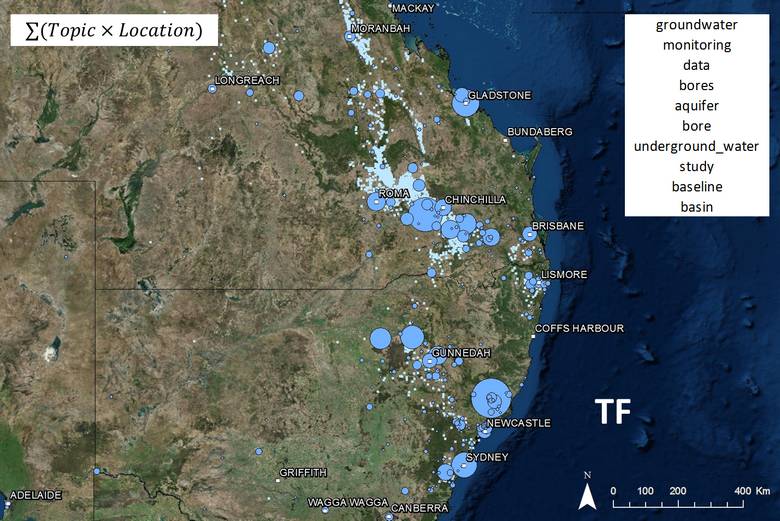
Figure 12. The spatial prominence of a topic about groundwater, as calculated by aggregating the products of the location term frequencies and topic scores for each document. Hovering over the image shows the results of a Bayesian calculation that more accurately represents the association of topic and place.
This map makes sense, in that most of the high-scoring locations are in areas where gas wells have been drilled, and thus where groundwater impacts could occur. However, also prominent are cities like Sydney, Brisbane and Gladstone, where groundwater impacts are unlikely to be an issue. These locations are prominent not because of a close association with groundwater, but because they are mentioned very frequently throughout the corpus, and my formula summed the scores rather than taking the average.
So the logical thing to do to correct this would be to take the average. That’s what I realised just now. But in the muddled and sleep-deprived throes of experimentation several weeks ago, I latched onto a different solution. I applied Bayes’ theorem to give me the probability of a specific topic being discussed, given that a specified location had been mentioned. The result for the groundwater topic can be seen below in Figure 13, or above when you hover over Figure 12. The good news, given the effort I expended applying Bayes’ theorem to my data, is that it works. Most of the high-scoring locations are again in the gas fields, and the irrelevant locations now barely feature at all. In addition, many relevant locations that were mentioned too rarely to feature on the previous map feature prominently among the Bayesian scores.
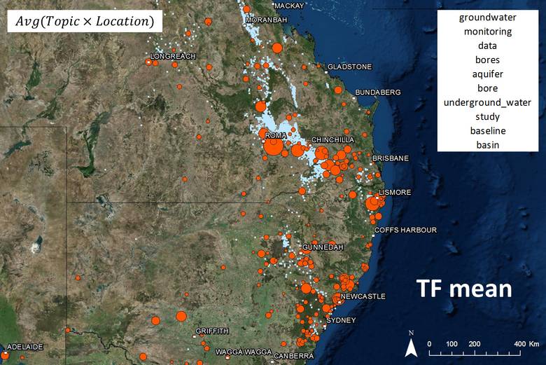
Figure 13. The spatial prominence of a topic about groundwater, as calculated using Bayes’ theorem. Hovering over the image shows the results of a simpler approach — that of taking the average (rather than the sum) of the products of the location term frequencies and topic scores.
The less-good news is that as far as I can tell, deriving the Bayesian scores was a waste of time, because virtually the same results can be obtained just by averaging (rather than summing) the products of the location term frequencies and topic scores. You can see this by hovering over Figure 13, which will reveal the averaged term-frequency scores. In light of this apparent equivalence, the only reason I’ve discussed the Bayesian method here at all is because I used it to generate all of the results that you will see below, and I don’t have time right now to run them again with the simpler method.
Geo-semantic profiles: some examples
With that somewhat embarrassing detour out of the way, here are some examples of what you might call the ‘geographic profile’ of several different topics. In these examples I’ll jump between the heatmap view that I introduced earlier and the proportional marker view that I was using previously. Regardless of their aesthetic virtues, both of these views have their separate strengths. While the heatmap is best for seeing the big picture, the markers reveal exactly where the data points lie and which ones have the highest scores. The marker view is particularly useful within a GIS environment, where you can click to identify each location.
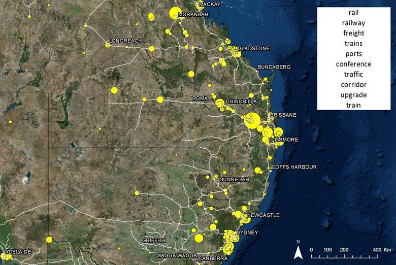
The first example I’ll show has limited bearing on the discourse about coal seam gas, but does serve to demonstrate that my calculations are working. The topic (which, as always, consists of more than just the top 10 terms shown) is clearly about transport, especially by rail. So I added railway lines to the map. Hey presto! Many of the locations associated with this topic fall along the railway.
Next is a topic about wastewater management. If you hover over Figure 15, you’ll see that this topic relates to different areas from the groundwater topic. Several gas production/exploration areas are prominent on the wastewater map, including the Pilliga Forest near Gunnedah, where a water spill (which occurred in 2011 but was not reported until 2013) caused considerable controversy.
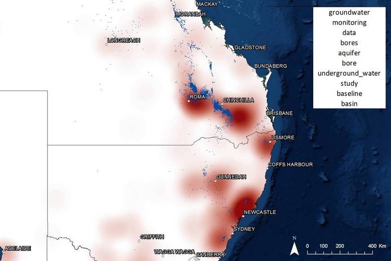
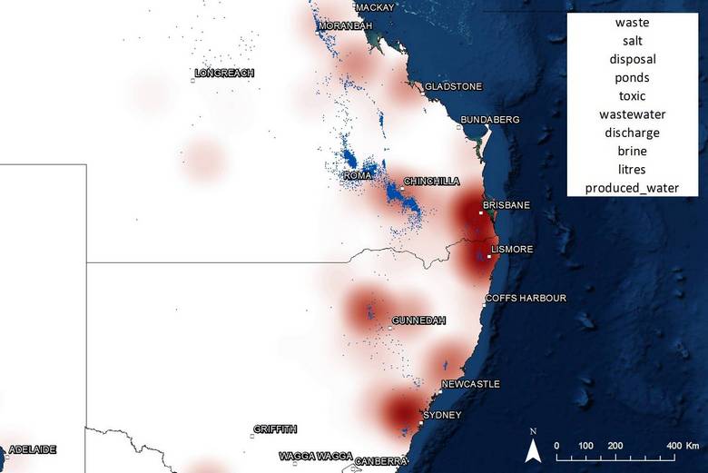
Figure 15. The goegraphic profile of coverage about wastewater management. Hovering over the image shows the profile for a topic about groundwater.
As shown in Figure 16, it turns out that many of the other locations strongly associated with this topic are waterways — no great surprise, but further proof that these results are accurate. More mysterious is the prominence of locations around Brisbane. Not all of these turn out to be closely connected with wastewater, but many of them do. One of them is Narangba, to which the gas company AGL sent wastewater to be treated all the way from Gloucester, north of Newcastle. Another is Swanbank, south-west of Brisbane, where Arrow Energy at one stage thought about sending their evaporated brine for disposal.
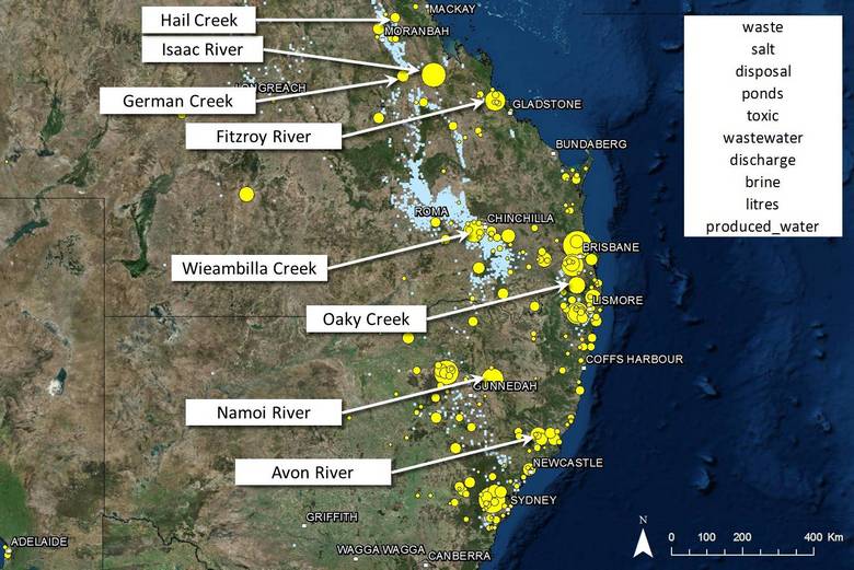
Figure 16. Many of the locations strongly associated with the wastewater topic are waterways.
Figure 17 shows the profile of a topic about yet another environmental issue, this time methane emissions, whether caused by leaky wells or bubbling rivers. The Condamine River, in which said bubbles were observed, accounts for some of the shading around Chinchilla, as does Hopeland, where noxious gases including carbon monoxide, hydrogen and hydrogen sulphide were detected in soils in March 2015, though apparently not as a result of coal seam gas extraction. The other hotspots include gas fields around Lismore and Camden in Western Sydney.
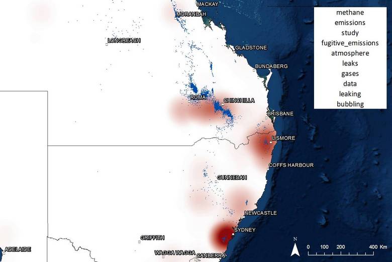
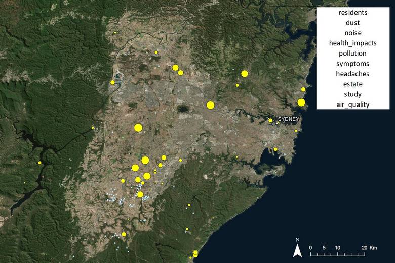
Figure 18 shows the locations associated with discussion about dust, noise and health impacts. Not surprisingly, this topic associates closely with residential areas, including Chinchilly, Dalby, Tara, and Sydney.

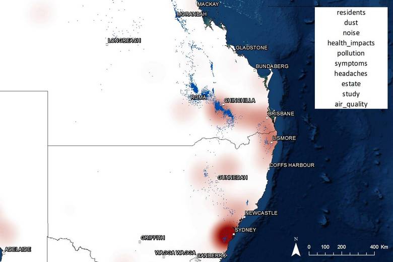
Figure 18. The geographic profile of discussion about dust, noise and health impacts relating to coal seam gas.
To prove that this data also works at a finer scale, Figure 19 shows just the locations in the Sydney region associated with this topic. Here we see that the hotspot for discussion of dust, noise and health impacts is near the gas field (active since 2002) at Camden in Sydney’s south-west.
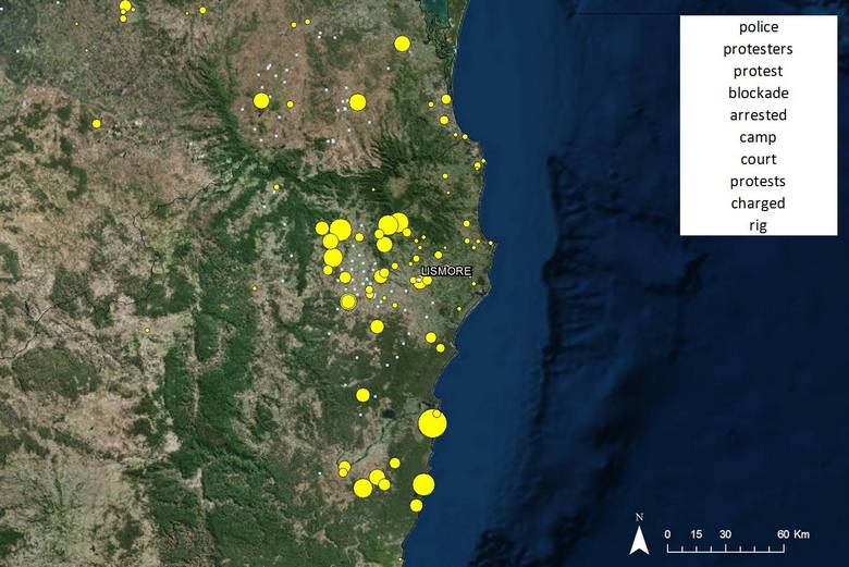
Finally, Figure 20 shows the areas most closely associated with discussion of protests and blockades. The hotspot on this map will be of no surprise to anyone familiar with the colourful culture of the Northern Rivers region, which is shown in more detail in Figure 21. This is the site of the Battle for Bentley, among other major anti-CSG protests.
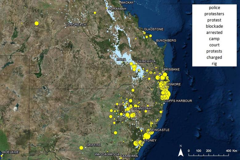
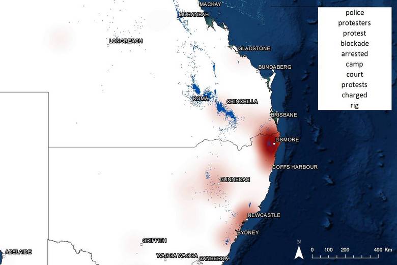
Figure 20. The region most closely associated with protest action is the Northern Rivers. The Pilliga Foreset, Liverpool Plains and Gloucester are also prominent.
Overall, I’m stoked with how well this technique of associating topics with places has worked. These examples prove that I can provide an accurate and useful answer to the question ‘where is Topic X an issue?’. I can see how this kind of information would be useful for a range of purposes, especially for governments, NGOs, PR firms or campaigners trying to decide where to target their efforts. But I confess that I’m not yet clear about where it will fit within my thesis, which I expect will focus on the interplay of agendas among different actors over time. Perhaps adding a temporal dimension, or comparing sources, will give these analyses a clearer role in that context.
Hopefully, the answer will become more apparent as I take stock of the other analyses I’ve run over the past few months. Watch this space, as I hope to write about them here soon.