My last post focussed on my progress in making sense of the Where dimension of the public discourse on coal seam gas, including how the Where intersects with the What. This post is about the Who. Somehow, I’ve managed to say almost nothing on this blog so far about the Who dimension of my data. Nearly all of what I’ve written has been about the What, Where and When. It’s time to rebalance this equation.
Until recently, the Who dimension of my data was represented only by a pool of Australian news organisations (at more than 300 sources, it was admittedly a rather large pool), as I was working just with the data I retrieved from the Factiva news database. Now that I have incorporated additional data that I scraped from the websites of community, governments and industry stakeholders (as discussed in my last post), the Who dimension has become a little bit richer. Before I start exploring questions about specific stakeholders and news organisations, or make decisions about which sources I might want to exclude all together, I want to survey the full breadth of sources in my data. I want the birds-eye view. But how to get it?
Who × When ÷ Where = Wha…?
In the previous post, I listed all of my stakeholder sources in colourful tables showing the production of content over time. Initially I thought that doing the same thing with 300 news sources would be ridiculous, but then I figured it might just be ridiculous enough to work. Through a creative deployment of Excel’s conditional formatting feature, I managed to make what you see in Figure 1. Each horizontal band is an individual news source, and the darkness of the band corresponds with the number of articles produced by that source per quarter. Within each state, the sources are grouped by region, although I haven’t indicated where these groupings begin and end (maybe next time!).
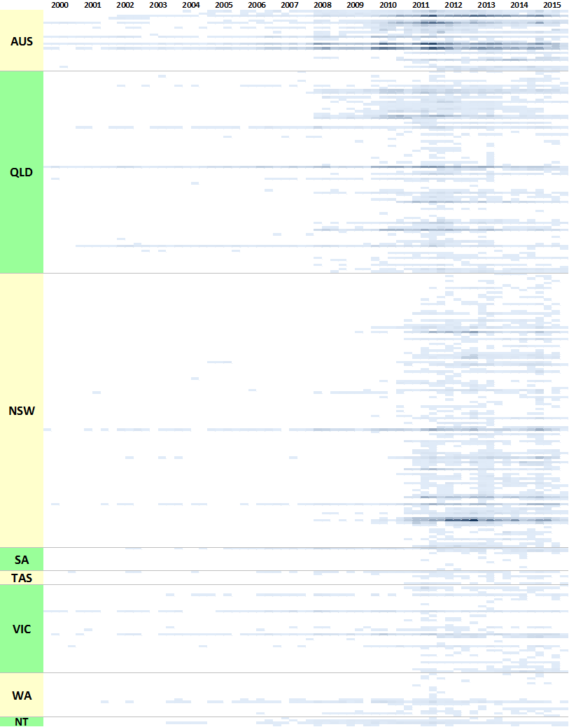
For an experiment that I didn’t take very seriously, this viz actually isn’t too bad. It highlights several features of the data that are useful to know. Firstly, it shows that very few publications have been reporting on coal seam gas continuously since 2000. Nationally, there are The Australian, The Financial Review, Australian Associated Press, and Reuters News (these are not labelled on the graph, so you’ll have to take my word for it). In Queensland, there are the Courier-Mail, the Gold Coast Bulletin, and (to a lesser extent) the Townsville Bulletin. In New South Wales, there has been more-or-less continuous coverage from the Sydney Morning Herald, and somewhat patchier coverage from the Newcastle Herald. The long horizontal lines in Victorian part of the chart represent the Herald Sun and The Age.
Figure 1 also shows that the majority of Queensland sources began reporting on coal seam gas about two years ahead of sources in other states. And while some sources generally publish more articles than others, there are instances where specific sources are highly active for a short time. The dark spot in New South Wales in 2012 can be traced to the Northern Star, and to a lesser extent the Northern Rivers Echo, both from the Northern Rivers region. In Queensland, the Toowoomba Chronicle and the Queensland Country Life were very active between 2010 and 2012.
Scanning vertically down the figure, we can see a few moments where a large number of sources were active all at once, at least in Queensland and New South Wales. To my eye, these moments occur towards the end of 2011, in the middle of 2013, and in New South Wales early in 2015 (from previous analyses, I know that this is when the state election was held). At these times, we can infer that there were topics being discussed that were of national or state interest rather than just local.
The really important thing about Figure 1, though, is that it reveals just how patchy my data is when broken down to individual sources. If I do compare individual sources over time, I’ll have to be careful about which ones I pick. More likely, I’ll want to aggregate the sources somehow. Local government areas are one possibility, but I’ve opted to go one level higher by linking the news sources to the SA4 regions defined by the Australian Bureau of Statistics. These regions tend to align with areas that people actually talk about, like the Darling Downs and New England.
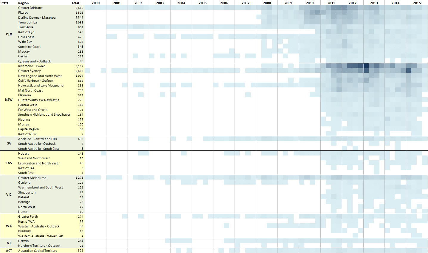
Figure 2 shows that at the regional level, I have fairly continuous coverage in many parts of Queensland from 2008 and of New South Wales from 2011. At a stretch, I could also investigate parts of Victoria. Or the ACT (ha, only kidding!).
In Figure 2, I’ve sorted the regions within each state by the total number of articles. This makes it easier to see which regions have seen the most activity, and when. In Queensland, these regions are the Fitzroy, Darling Downs – Maronoa, and Toowoomba, from 2010 to 2013 (I’m ignoring Greater Brisbane, which is dominated by the Courier Mail). In New South Wales, the most active region is clearly the Richmond-Tweed, otherwise known as the Northern Rivers. Other regions of interest include New England, Coffs Harbour – Grafton, Newcastle, and the Mid-North Coast. (The Central Coast should be there as well, but I just realised that I’ve assigned all sources in that region to Greater Sydney. That’s something to fix!!) Interestingly, the Hunter Valley is halfway down the list, and has no coverage until 2011, even though the Hunter Valley Protection Alliance was active in this region continuously from at least 2007. Does this say something about the interest of media, or about the completeness of my data? This is an interesting lead that I may follow up in my thesis.
Who × What = Where
The charts above provide one kind of birds-eye view of the Who dimension — one seen through the lens of the Where and When. What kind of a picture might we get by mixing the Who with the What instead?
As you can learn from my previous posts, I am characterising the What of my corpus with the assistance of LDA, a popular topic modelling algorithm. My current model of the corpus includes 80 topics (this sounds like a lot, but many of them are just variations on themes), and every one of the documents in the corpus is scored against each of these topics. By aggregating these scores for each source, I can produce a set of 80 numbers that characterises the thematic output — the Whatness — of each source. You could describe this set of numbers as the ‘topic profile’, or at a stretch, the agenda, of each source. This is all the information that I need to produce a What-based picture of the Who dimension.
First though, these topic profiles have to be compared mathematically. There are various ways by which sets of numbers like these can be compared, and I do not profess to know them all very well. As usual, I approached this problem by starting with what I knew and pushing it a little further.
What I knew in this instance was how to make a network from an adjacency matrix. An adjacency matrix in this case tabulates the similarity (I used a measure called cosine similarity) of every pair of sources based on the 80 LDA scores. With a bit of additional data wrangling, I got the data into a state where it could be loaded into the network visualisation software Gephi.
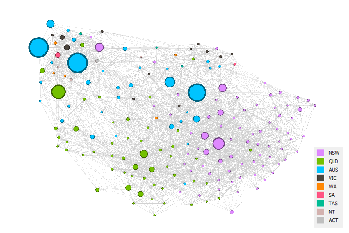
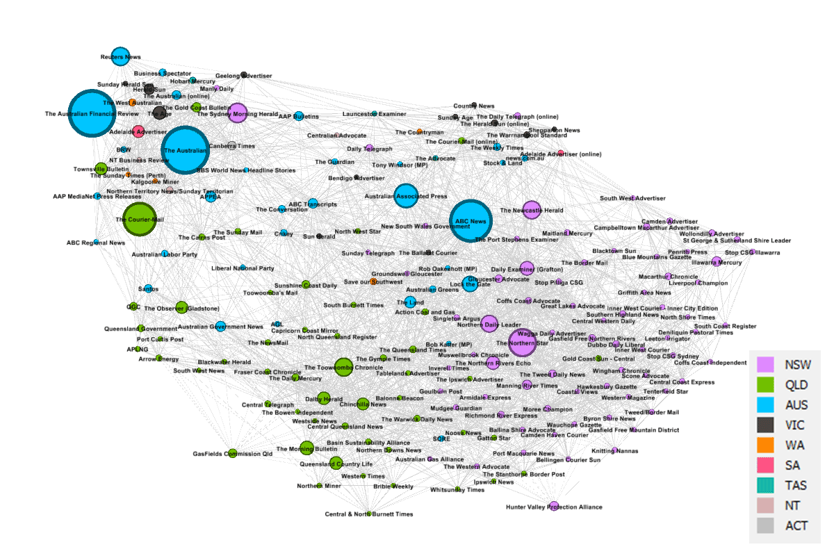
The network that I made in Gephi is shown in Figure 3. Each node is a source, and its size reflects the number of articles produced by the source between 2000 and 2015. The ‘edges’ connecting the sources have strengths that reflect the degree of similarity between the sources. Pairs of sources that have similar agendas (or topic profiles) get pulled closer together in the network, while sources that discuss dissimilar topics drift further apart. So generally speaking, sources with similar agendas will be closer to one another in the network.
The full network has tens of thousands of connectors — one for every pair of sources — but for aesthetic reasons I filtered out all but the 30 strongest for each node. No doubt there are other ways of filtering out edges, but this method proved effective, and it made little difference to the overall shape of the network. I also filtered out any sources that had fewer than 10 articles in my corpus, leaving me with just 178 sources.
The sources in Figure 3 are coloured according to the state or territory to which the sources pertain. National sources, such as The Australian or the ABC News, are coded ‘AUS’. When interpreting all that follows, it’s important to know that the topics by which the similarity of these sources has been measured contain no explicit geographic information. Prior to running the topic model, I stripped out every place name, and for that matter every other kind of name as well (although a few slipped through, like Lock the Gate and Northern Rivers). So the textual content that the topics describe is strictly conceptual rather than nominal. In other words, I did all I could to remove the Where dimension from this analysis.
And yet, the Where has found its way back again. Much of the network is clearly structured along geographic lines, as you can tell from the areas of uniform colouring. This should not be surprising. I’ve been saying all along that the discourse on coal seam gas is defined by geography. Still, I was a little spooked by how strong an influence geography has exerted here.
Divide by five
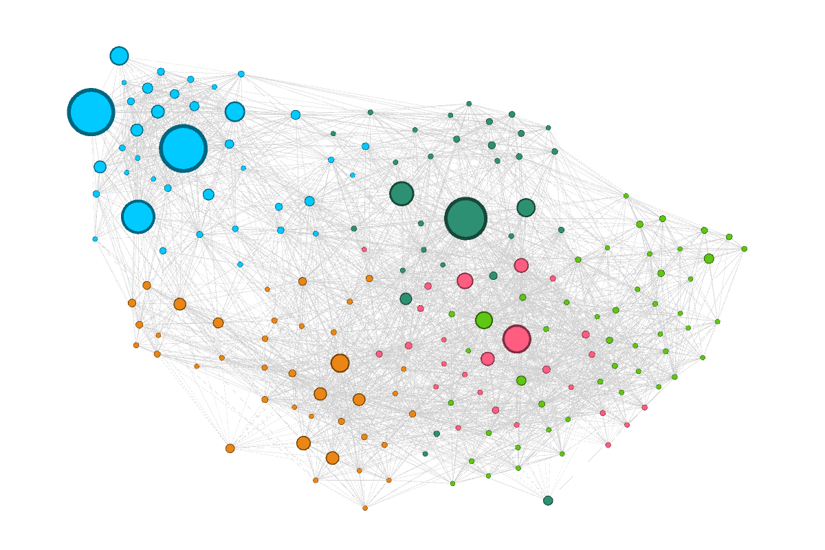
In order to explore the structure of the network more closely, I’ve coloured the nodes in Figure 4 according to their membership of five modularity classes, or communities, which I detected using Gephi’s modularity tool. Modularity is a standard measure for detecting communities in networks. The idea is that members of a community are more similar to one another than to the other nodes in the network. The number of communities detected by the algorithm is somewhat arbitrary. If I’d changed the resolution threshold of the algorithm, I could have divided the network into more than five communities. Looking at the topology of the network, it doesn’t take too much imagination to see where further divisions might be drawn.
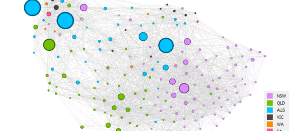
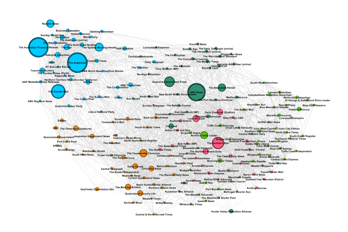
I’m going to step through each of the five classes individually, starting with the blue cluster at the top-left. Figure 5 shows this cluster on its own, with the layout redrawn and the nodes coloured according to the type of source. I’ve also included a map showing the ‘home town’ of each source (other than the national sources), and the top ten terms of the top five topics used by this group. 1
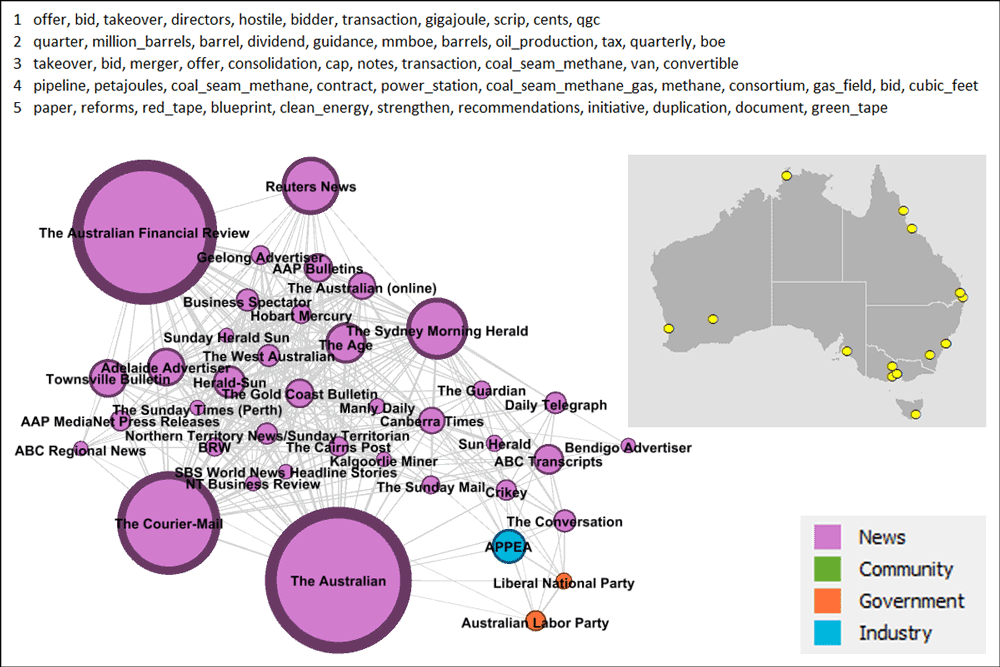
The cluster in Figure 5 is dominated by national, state-wide and major metropolitan sources. A few regional sources are present too, though I haven’t followed up to see what they have in common. The non-news sources in this group are APPEA (the peak national body representing the petroleum industry) and MPs from the major federal political parties. These three sources occupy their own corner of the graph, suggesting a shared but distinct agenda compared to the other sources. In terms of topics, this cluster is primarily interested in the growth and development of the gas industry, and to a lesser extent, its regulation by government.
The cluster in Figure 6 also has no single geographic affiliation, although the map suggests that it might include some discrete smaller clusters. The largest two sources are again national in their scope, but they are accompanied by a diverse mix of other sources, including four community groups, two independent federal MPs, and the New South Wales Government. Three of the four community groups are in the general area comprising the Newcastle, Central Coast and Hunter Valley regions (the Australian Gas Alliance is one of these), and close to them in the network are newspapers from the same regions: the Newcastle Herald, The Gloucester Advocate, the Maitland Mercury, and the Port Stephens Examiner. The electorate of Rob Oakeshott was in this area too. At the other end of the network is a cluster of newspapers from Victoria and Tasmania.
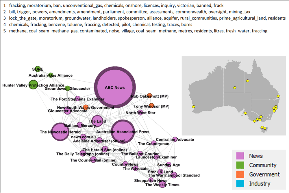
The inference to be taken from this information is that these disparate regions are united by common concerns. A look at the top five topics provides a pretty good clue about what these concerns might be. Three of these five topics contain references to fracking, and another relates to groundwater impacts, among other things. There is also a strong interest in regulation, including via a moratorium.
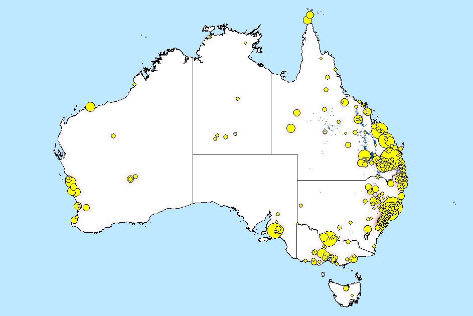
These areas are indeed all hotspots of concern about fracking, as shown by the map in Figure 7, which plots locations in the corpus with a high probability of being mentioned in connection with just one of these fracking-related topics. (For the method behind this map, see my previous post.) The sources in this modularity class are by no means the only ones concerned about fracking. For one thing, they do not represent the parts of Queensland where fracking has been frequently discussed. To find the Queensland sources, we’ll have to look elsewhere in the network.
…And here they are. Figure 8 is unambiguously the Queensland cluster. The one outlier is a West Australian community group called Save our Southwest, based near Perth. Why it has attached itself to this cluster rather than to any other West Australian sources, I don’t know, but I’ll be interested to find out.
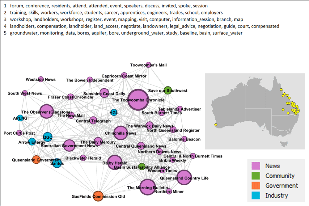
As well as most of the Queensland news sources in my corpus, this group also includes the five gas companies, the Queensland Government, the government-appointed Queensland GasFields Commission, and a community group called the Basin Sustainability Alliance, which is based in the Darling Downs region. None of this is very surprising. The four gas companies on the left side of the graph are all highly active in Queensland, some exclusively so. The Queensland Government is primarily responsible for regulating them, so its proximity to the gas companies also makes sense.
Somewhat more interesting (but still not surprising) is the separation of the GasFields Commission from the other sources. As I recall (since I was working in the government at the time), this commission was set up specifically to address the issue of how the gas industry co-exists with agriculture. The only other stakeholder that I know of with a comparable level of interest in this topic is the farmer-led Basin Sustainability Alliance, which, fittingly enough, is not far away on the graph. Several of the news sources nearby in the network are also based in the Darling Downs and/or have a strong interest in the agricultural sector.
The top five topics in this cluster shed some light on what issues unite the Queensland sources. The first and third topics relate to information events, including workshops for landholders. The fourth is about landholders and their legal rights — a large component of the co-existence theme I mentioned above. The second topic listed relates to education and employment considerations in the wake of the gas boom — a topic that would be irrelevant in the rest of the country, where the industry remains prospective or small-scale. The fifth topic deals with the monitoring of groundwater impacts which have been a huge concern in the gasfields around the Darling Downs and elsewhere in the Surat Basin.
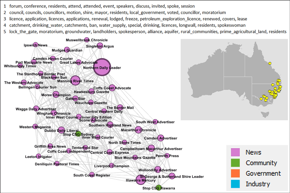
The sources in Figure 9 are pretty much the New South Wales counterpart to the Queensland cluster. There are just a few sources in this cluster from the other side of the border, the most obvious being the Whitsunday Times (and I have no idea what it is doing here). The Ipswich News and the Gatton Star are also over the border, but much closer to the rest of the group. This group has pretty good representation in just about every part of New South Wales (ignoring the desert) except for one: the Northern Rivers. Interestingly, this cluster includes three news sources from the Hunter Valley, yet the community groups most active in that region — the Hunter Valley Protection Alliance and the Australian Gas Alliance — are in a the cluster discussed earlier in Figure 6.
I mentioned that sources from the Northern Rivers were missing from Figure 9. That’s because they’re all hanging out in the cluster in Figure 10. Several community groups are present here, including Lock the Gate, which could be described as the peak anti-CSG organisation in Australia. Lock the Gate and the Northern Rivers both appear in this cluster’s top topics (a slip-up on my part, since I intended to the topics to be free of places and names), which overwhelmingly have a political or community action flavour.
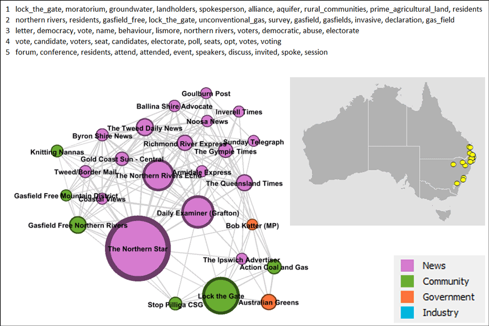
Given the political nature of the topics in this group, it’s not surprising to see the Australian Greens in the mix as well as Action Coal and Gas, which is an initiative of the Queensland Greens. You might be surprised to see Bob Katter close by, given that he is an arch enemy of the Greens. In part this exemplifies the power of coal seam gas to bring together stakeholders from opposite sides of the political fence (think Alan Jones standing next to Drew Hutton), but it also reflects an important feature of the analytical methods being used here, which compare the sources on the basis of what they talk about, not the position they take. Understanding arguments is something that topic modelling is just not designed to do.
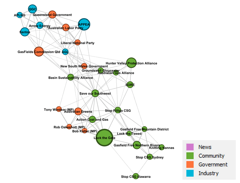
I’ll finish with a network showing only the non-news sources. It captures some of the relationships I’ve already commented on and reveals a few more. But I’ve said enough, so I’m going to leave it here and let it speak for itself.
The sum of the parts
I made these networks several weeks ago now, and I’m still ruminating on their meaning and significance. As with many of the other methods I’ve explored, I’ve found myself see-sawing between wondering if these topic-based networks are just a complicated way of stating the obvious, and sensing that they can provide deep insights. Sometimes they seem to do both things at once. I mean, duh — of course the issues people talk about will be influenced by where they are. But can the specific lines of division, or the cleanness of segregation, be reliably intuited or measured by other means? And what about the sources that don’t conform to prior expectations or to the principles that seem to organise the rest of the data? The very fact that so many of the results are not surprising makes me reluctant to brush off the exceptions as flukes. The method has earned my trust, and so it has my attention.
It’s also possible that if I strip away the biggest sources of variation — by looking at just the sources from one cluster, for example — more subtle and surprising results might emerge. I might find something similar if I apply these methods to a more finely tuned research question — that is, if I apply them to the elusive Why dimension that I seem to be so comfortable ignoring.
But I shouldn’t be so dismissive. The Why dimension is indeed present in all of the above, since my reason for doing it was to gain a deeper understanding of the full gamut of sources on my Who dimension. And on this account the network analysis has been a resounding success. I don’t know how long it would taken me to learn what I’ve presented here just by reading the source material, or even how I would have gone about it. Better still, the analysis threw up some loose ends that could prove to be fruitful case studies. Why does the Hunter Valley Protection Alliance seem to be distant from the other community groups, and indeed the Hunter Valley news sources? Why does the only Western Australian community group in my corpus seem to have more in common with Queensland news sources than with any others? And what is so special about the Northern Rivers that causes it to occupy a niche of its own?
Finally, I should mention that I’ve been playing with another method of unpacking the Who dimension. Inspired by some of what I saw at the recent Advances in Visual Methods for Linguistics conference, I have tried out principal components analysis (PCA) combined with scatter plots to see how sources and documents in my corpus cluster together. The initial results are reassuring, insofar as they echo some of the findings from the network analysis. Exactly what other insights PCA can reveal is a question I’m still probing. With any luck, I’ll find time to share the results in the coming weeks.
Notes:
- I calculated the top five topics by first averaging the topic scores for each source, then summing the results across the modularity class. Thus the overall number of articles produced by any one source does not influence the results, and each source is equally represented. Interestingly, the results obtained when I summed the topic scores instead of averaging them were almost the same. ↩