When was the last time you read a newspaper? I mean an actual, physical newspaper? Can you look at your fingertips and picture them smudged with ink, or remember trying to turn and fold those large and unwieldy pages? These are fading memories for me, and are probably totally foreign to many younger people today. Like many people, I consume virtually all of my news these days via the internet or, on rare occasion, the television. As far as I am concerned, newspapers are fast becoming nothing more than historical artifacts.
And yet, newspaper articles account for the bulk of the news data that I am analysing in my PhD project. To be sure, most of these newspaper articles were also published online, and would have been consumed that way by a lot of people. But I feel I can’t ignore the fact that these articles were also produced and consumed in a physical format. Unfortunately, there’s not much I can do to account for the physical presentation of the articles. My database doesn’t include the accompanying images or captions. Nor does it record how the articles were laid out on the page, or what other content surrounded them. But the metadata provided by Factiva does include one piece of information about each article’s physical manifestation: the page number of the newspaper in which it appeared.
From the very beginning of the explorations documented on this blog, I have completely ignored the page number field in my dataset. I figured that I was analysing text, not newspapers, and in any case I couldn’t see how I would incorporate page numbers into the kind of analysis that I was planning to do. But after hearing a colleague remark that ‘article-counting studies’ like mine are often unsatisfactory precisely because they fail to account for this information, I decided to give it some more thought.
This post reports some of the methods I’ve experimented with to incorporate page numbers into a large-scale thematic analysis. As has often been the case on this blog, the emphasis is on the viability of the methods themselves, rather than the results extracted thus far. It’s possible that I will end up using none of these methods, but I felt it would be worthwhile to document them nonetheless.
Before jumping in, I should note that many of the considerations about formatting and positioning that apply to physical newspaper articles could equally apply to articles published and consumed online. Just as newspapers have a front page, news websites also have top stories that are given more prominence than others by virtue of images, positioning, size, and so on. Stories on news websites are constantly rotating in accordance with their popularity or importance. And all of this information is completely absent from my data. I have no way of accounting for it. All I can do is acknowledge that I am analysing the news as disembodied text, and that this is a real — though I don’t think fatal — limitation to my analysis.
Hardly normal normalisation
As soon as I started thinking about how page numbers could feature in a statistical analysis, one fundamental challenge became evident: how do you meaningfully aggregate or compare page numbers from different publications, or even different issues of the same publication? Some newspapers are bigger than others, and the size of an individual newspaper will vary from day to day and over longer periods of time (have you noticed how thin newspapers are these days?). So a page number on its own, unless it refers to Page 1, does not convey much information about where within the newspaper an article appears.
This problem could be solved if I knew how many pages were in each issue of the paper. I could simply normalise the page number of an article against the number of the last page, and I would have a comparable value. Sadly, I don’t have this information, and I’m not sure where I might get it. The next best thing would be to normalise against an average length for each newspaper, or perhaps averages for successive time periods, as I suspect that most newspapers have been shrinking for some time. This I could conceivably acquire by searching Factiva, but the time it would take is more than I can spare at the moment. The next next best thing, which really isn’t very good at all, is to normalise against the largest page number within my dataset for each paper. This number represents the deepest page on which a story mentioning coal seam gas has featured, and as such is only a proxy — and potentially a very unreliable one — for the size of each publication. But on balance, I hope, it is better than nothing.
I also toyed with using the median rather than the maximum page number as the baseline for each publication, and started to wonder if I should be using z-scores or something similar to do the normalisation. But I knew that the method was going to be dodgy no matter how it was dressed up, so I decided to keep things simple.
So, to be clear, for the purpose of comparing or aggregating page numbers across publications, I normalised them by first dividing the page number of an article by the largest page number recorded for the publication, and then multiplying the result by the average maximum page number for all publications. This last multiplier is arbitrary — I could just as easily have picked a nice round number like 50 or 100, but I didn’t. Sorry.
To be honest, I’m not sure that there is much value in comparing and aggregating page number data across publications at all. Beyond the first few pages, newspapers are generally divided into sections, which many readers will access in a targeted fashion. So it would be simplistic to assume that the larger a page number, the less important an article is. But then again, if any clear trends emerge in the data, they could still point to something worthy of closer examination. And even if meaningful comparisons are difficult to make when looking at the full range of page numbers, the case might be different if we look only at the front page, or the first few pages.
Tracing page numbers over time
I’ll start by sharing the most gloriously reductionist of all the methods that I experimented with. I describe it this way because it reduces all of the page number data to a single line over time. This line, shown in Figure 1, represents the median normalised page number of all newspaper articles in each six-month period. These normalised page numbers assume that the newspaper is 68 pages long, so page 34 would be in the middle of the paper.
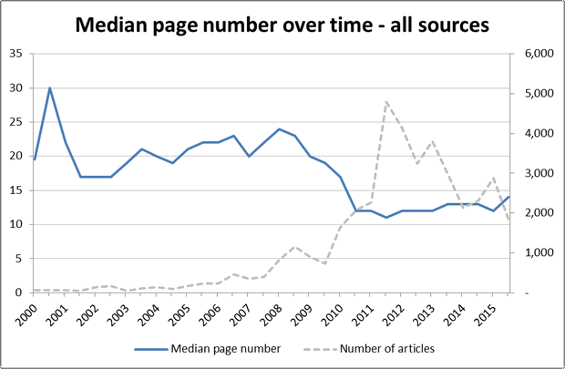
This graph tells an interesting story. Between 2002 and 2008, as the number of articles about coal seam gas was slowly increasing, the articles were moving deeper into the paper. Then, between 2009 and 2011, when coverage of coal seam gas started to increase more rapidly, the median page number of the stories dropped quickly, settling at around page 13 as overall coverage spiked and then fell. My take on what is happening here is that the news prior to 2009 was primarily about the financial and business aspects of the industry (see the last post for confirmation of this), and that this kind of news tends to appear in later sections of the paper (as later analyses in this post will show). After 2009, the coverage shifted to topics that were of broader public interest and that tend to appear towards the front of the paper.
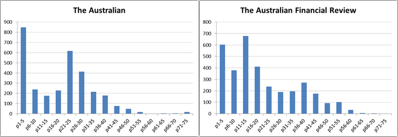
The same method of analysis can also be applied to individual papers. Figure 2 shows two comparisons. On the left is the median page number of CSG-related articles in The Australian and the Australian Financial review, the daily national papers published by NewsCorp and Fairfax Media respectively. The page numbers have not been normalised in this case. Interestingly, these two papers follow different trajectories. The median page number of CSG-related stories in The Australian starts relatively high and declines steadily until around 2010, at which point it drops further before hovering around page 15. The Financial Review, on the other hand, starts at a relatively low page number, increases steadily until about 2009, and then decreases at about the same rate to finish where it started, just above page 15, exactly in line with The Australian.
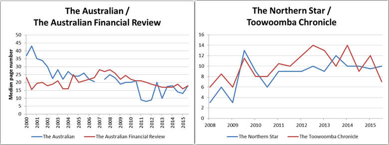
The second comparison in Figure 2 is between Newcastle’s Norther Star and the Toowoomba Chronicle, both published by APN News & Media. This comparison begins at 2008 because . . . oh, because it turns out that Factiva only holds APN’s newspapers from 2008 onwards. And I only just realised this now. Well, this is embarrassing. Who knows how many other holes and discontinuities there are in my dataset. Oh well, that’s a problem for another day. Anyway, the interesting thing is how similar these two papers are on this measure, despite covering very different geographical regions. Could this reflect higher-level editorial and formatting decisions made by the publisher?
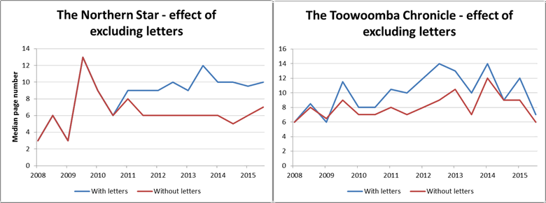
Another interesting thing about Figure 2 is that the median page number of CSG related articles in these two regional papers trends upwards over this period, whereas the two national papers, and the combined measure for all sources, all hold steady or decline. The reason for this is that the regional papers published a large number of letters about coal seam gas, and these letters appear in later sections of the papers. The Chronicle began publishing these letters in mid 2009, while the Norther Star began publishing them in 2011. Figure 3 shows how the median page number changes in each of these papers when the letters are removed from the data.
I took this method one step further and plotted the median page number across all sources for individual themes identified in my previous topic modelling exercise. The results were a bunch of flat lines, suggesting that the position of specific thematic aspects of an issue within newspapers does not change much over time, even if the position of the issue does (though admittedly, I could have dug a little deeper than I did to find something interesting). Perhaps another method of combining the page numbers with thematic information will prove more enlightening.
Seeing the full spread
All newspapers get binned in the end, don’t they? Rather than reducing page numbers to a single statistic and tracing that over time, I decided to examine how content was spread across pages of the newspapers. I did this by dividing the normalised page numbers into 15 equal sized ‘bins’ so that statistics could be calculated for each bin, and the page ranges from different papers could be aggregated and compared.
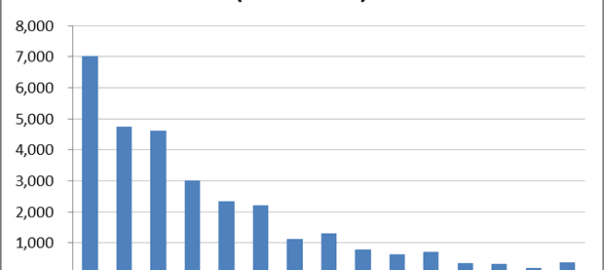
The aggregate distribution of all articles across the 15 bins is shown in Figure 4, which assumes a newspaper length of 75 pages. This graph suggests that the bulk of articles in the corpus appear in the front half of the newspapers in which they are published, and that very few appear towards the end of the paper.

I suspect that the picture in Figure 4 is broadly accurate, but I have more faith in the front end of the graph than the back end, because I suspect that the long tail is partly an artifact of the way in which I approximated the length of the papers. By using the largest page number for each publication, I opened up the possibility for unusually large page numbers to misrepresent the length of the paper. In other cases, the length of newspapers might have been underestimated because the sample did not contain a sufficiently large page number. If the long tail is accurate, it probably reflects a tendency for the later parts of papers to be populated with stories about sport and other matters in which coal seam gas is unlikely to feature.
In any case, it’s possible to make meaningful comparisons between different subsets of the data, such as different publications or themes. The overall distribution of articles across the two national newspapers is shown in Figure 5. Notably, both papers depart from the distribution for the whole corpus, and they differ significantly from one another as well.
What about the thematic dimension? Do certain topics tend to occupy particular parts of a newspaper? I investigated this question by scoring the bins according to the presence of the topics that I discovered using LDA (a topic modelling algorithm) in my previous post. To keep things manageable (but at the risk of obscuring the most interesting trends), I stuck with the same 11 thematic groupings of those 70 topics that I chose in the previous post. Figure 6 shows four pair-wise comparisons of these themes, looking at the whole corpus.
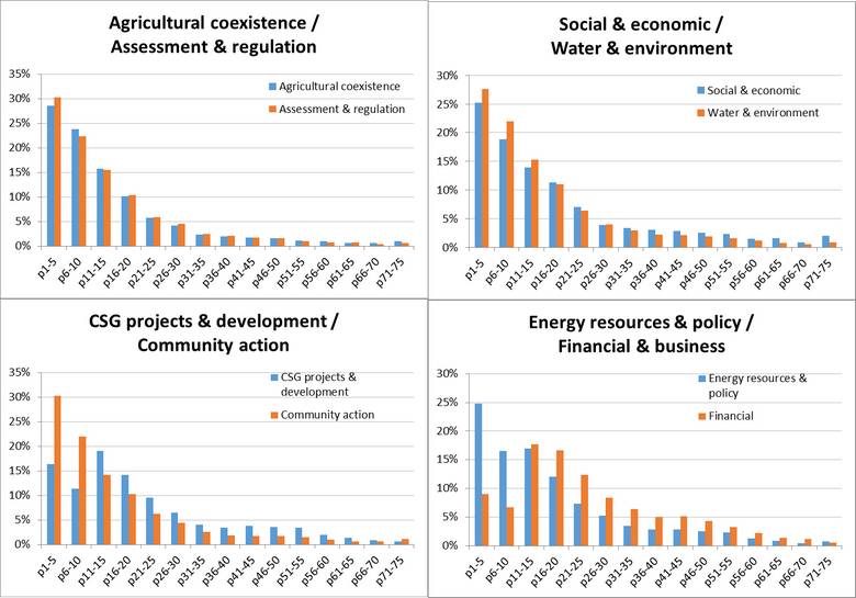
Whether or not the long tail in these distributions is exaggerated, we can see some notable differences and similarities. For example, the thematic groupings pertaining to Agricultural coexistence and Assessment & regulation (top left) are distributed almost identically (and in line with the corpus overall) while topics relating to CSG projects and to financial matters (bottom two graphs) are skewed towards the middle pages. You don’t sell papers by putting financial news on the front page.
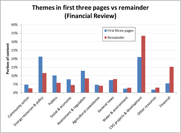
But then again, perhaps if your name is the Australian Financial Review, you might put financial news further towards the front than most other papers. The first plot in Figure 7 suggests that CSG-related news with a financial flavour is indeed placed closer to the front in the Financial Review than in The Australian. The second plot suggests that the two papers are more similar in their placement of news about social and economic topics, although the Financial Review places a comparatively larger amount of this content towards the back of the paper.

The privileged pages
I’ll be the first to admit that the foregoing analyses are problematic due to my questionable method of normalising and comparing page numbers. The next method I’ll present goes some way towards avoiding that issue. While any two newspapers that you pick up might have different numbers of pages, they will all share some things in common. For one thing, a newspaper can only have one front page. The front page is a privileged position within a newspaper, and it is one that I can reliably identify and compare within my data.
However, I am going to muddy the waters slightly by grouping the front page together with the second and third pages. While not as important as the front page, the next two pages still play a distinctive role. They are the first double-page spread of information that you see if you choose to open the paper, and often they will flesh out the minimal information presented on the front page. Even a casual reader is likely to glance at pages two and three. Turning further suggests a degree of commitment.
Granted, even the front page (let alone the first three pages) is not strictly comparable across papers. Differences in page size and formatting mean that some papers will fit more stories and substance on the front page than others. Nonetheless, a comparison of what newspaper editors put on the first few pages as opposed to the remainder of the paper should reveal something about the paper’s priorities.
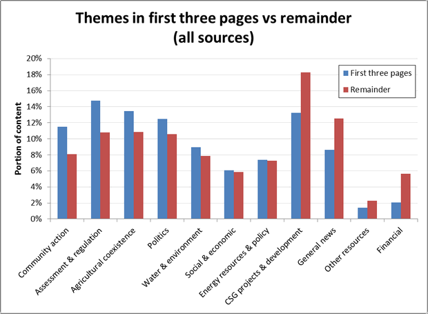
Figure 8 shows how content about specific themes across all publications is divided between the first three pages and the remainder of the paper. The measure on the vertical axis is the percentage of CSG-related articles in the relevant page range (1-3 or the remainder) occupied by a given theme. Themes on the left side of the graph occupy a larger portion of the first three pages than the remainder, while themes on the right hand side are more likely to be found after the first three pages. The graph shows that topics relating to assessment and regulation, community action and agricultural coexistence are featured more prominently in the first three pages than in the remainder, while discussion about finance, CSG projects and general news is more likely to be found in later parts of the paper. Articles relating to social and economic issues, and to energy and resources policy, are equally likely to be found in both sections of the paper.
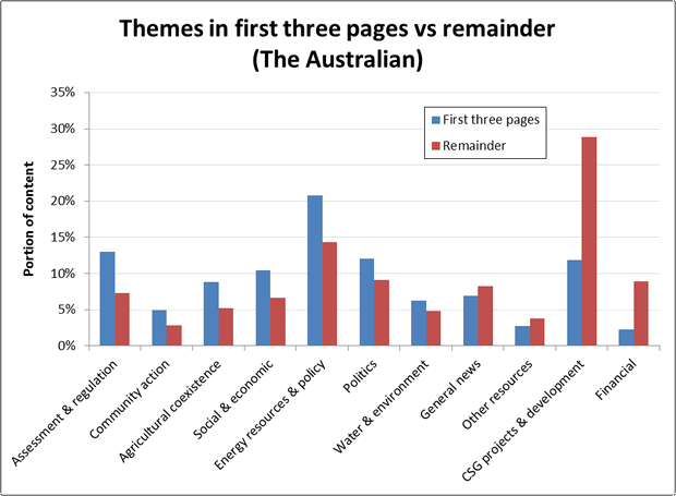
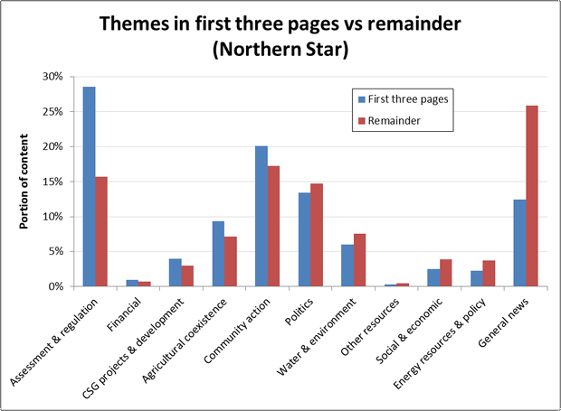
Figures 9 to 11 show the same information for three Individual papers. There are two points of comparison here. One is the order of the themes on the horizontal axis, especially which ones appear on the left or right side. The other is the heights of the bars, which indicates the prominence of a the themes within the two parts of each paper. On both of these points the Australian and the Financial Review are broadly similar to one another, while the Northern Star stands on its own. The Northern Star discusses CSG projects and development much less overall than the two national papers, but places more of this content at the front of the paper. It also contains much more content about assessment and regulation, community action, and general news, and considerably less about energy resources and policy, other resources, and financial matters.
ote similarity of first two, and prominence of assessment and regulation in NOS.
Front page coverage over time
Having isolated articles appearing the first few pages, I decided to plot their overall prominence over time. Figure 12 shows for all newspapers the number of CSG-related articles on the first three pages in each six month period, expressed as as percentage of the total number of articles published in the same period. The trend seems to be very erratic up until 2005, perhaps because of the low number of articles overall. From 2008, the trend is very clearly upwards, but only until mid-2009, from which point it stabilises until it drops again in 2014. Interestingly, the percentage of articles on the first three pages remains fairly steady between 2009 and 2014 even while the overall number of articles shoots up and down. Incidentally, this echoes the trend seen in the median page numbers in Figure 1.
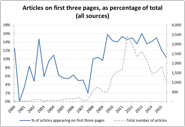
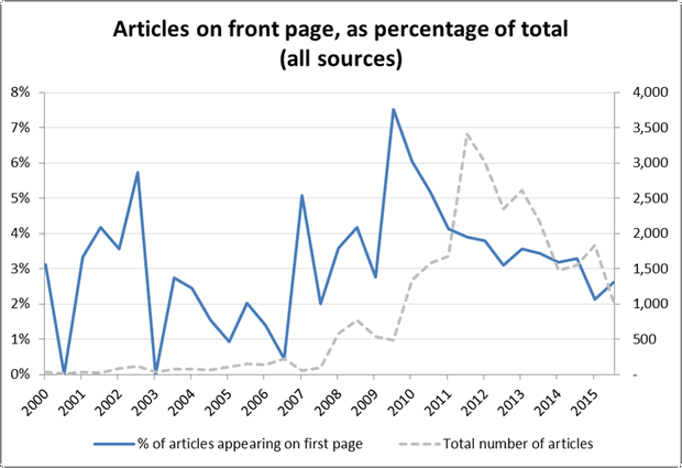
Figure 13 shows the corresponding information for articles appearing on the first page only. This measure also peaks in 2010, but it then falls straight away rather than remaining steady. Perhaps over this time, news about CSG remained newsworthy enough to appear frequently in the first few pages, but lacked the novelty to stay on the front page.
Like some of the other measures I’ve shown in this post, this one has some subtle yet potentially serious problems. The main one is that the first one or three pages of a paper constitute a limited space that could quickly reach a point of saturation. There is only room for so many articles about coal seam gas (or anything) in these pages, and once that room is taken, additional stories in the rest of the paper will force this measure downwards. Without knowing if saturation has been reached, interpreting this measure is therefore difficult. Partly for this reason, I have not bothered to present any of the results I produced for individual papers. The other reason is that they told no compelling stories anyway.
Wrapping up
Despite the conceptual and methodological problems underlying most of the analyses in this post, most of them still produced results that were meaningful, even if how they might be used is not entirely clear. I suspect that the value of these analyses will be in providing context for interpreting other findings, and in pointing to trends worthy of closer examination. For example, it’s hard to know what to make of the fact that median page numbers remained steady while the overall rate of coverage increased and decreased several-fold, but this finding suggests to me that some important elements of the news coverage were stable while others were changing at a dizzying pace. Uncovering what those stable elements are could yield interesting insights.
Perhaps of greater consequence than the dynamic analyses in this post, however, are those based on distributions. Seeing clear patterns and differences in how content is distributed across pages is an instructive reminder that the text I am analysing cannot, or at least should not, be completely divorced from the context of its publication — something that is very easy to do when reducing such complex phenomena as news production to mere numbers.