For so long, climate change has been discussed in Australia (and indeed elsewhere) as if it were an abstract concept, a threat that looms somewhere in the future. Not anymore. In 2019, climate change became a living nightmare from which Australia may never awake.
While I prepared this post in the dying weeks of 2019 and the beginning of 2020, there was not a day when some part of the country was not on fire. As at 24 January, more than 7.7 million hectares — that’s an area about the size of the Czech Republic — have burned. Thirty-three people have died. Towns have been destroyed. Old-growth forests have burned. Around a billion animals have been killed. Whole species have probably been lost.
The effects were not only felt in the bush. Capital cities such as Sydney, Melbourne and Canberra endured scorching temperatures while choking in smoke. Newspaper front pages (except those of the Murdoch press) became a constant variation on the theme of red. The country entered a state of collective trauma, as if at war with an unseen and invincible enemy.
The connection between the bushfires and climate change has been accepted by nearly everyone, with the notable exception of certain denialists who happen to be running the country — and even they are starting to change their tune (albeit to one of ‘adaptation and resilience’). One thing that is undeniable is that 2019 was both the hottest and driest year Australia has experienced since records began, and by no small margin. In December, the record for the country’s hottest day was smashed twice in a single week. And this year was not an aberration. Eight of the ten hottest years on record occurred in the last 10 years. Environmentally, politically, and culturally, the country is in uncharted territory.
Climate deserters
I watched this nightmare unfold from my newly adopted city of Melbourne, to which I moved from Brisbane with my then-fiancée-now-wife in January 2019. As far as I can tell, Melbourne has been one of the better places in the country to have been in the past few months. The summer here has been pleasantly mild so far, save for a few horrific days when northerly winds baked the city and flames lapped at the northern suburbs. It seems that relief from the heat is never far away in Melbourne: the cool change always comes, tonight or tomorrow if not this afternoon. During the final week of 2019, as other parts of Victoria remained an inferno, Melbourne reverted to temperatures in the low 20s. We even got some rain. It was almost embarrassing.
Finding relief from the heat is one of the reasons my wife and I moved to Melbourne. Having lived in Brisbane all of our lives, we were used to its subtropical summers, but the last few pushed us over the edge. To be sure, Brisbane rarely sees extreme heat. In summer, the maximums hover around 30 degrees, and rarely get beyond the mid-30s. But as Brisbanites are fond of saying (especially to southerners ), it’s not the heat, it’s the humidity that gets you. The temperature doesn’t have to be much about 30 degrees in Brisbane before comfort levels become thoroughly unreasonable.
To me though, the real kicker about Brisbane’s summer is its consistency. The heat and humidity come back day after day, and sometimes never leave in between. You don’t even dream about getting a cool change followed by two days in the low 20s. On most days all you can hope for is a gentle sea breeze to take the edge off. Every now and then, you’ll be blessed with an afternoon thunderstorm — a true gift from the heavens, as long as the wind isn’t too destructive. But whatever happens, you can expect to be visited by the same old heat and humidity tomorrow, and the day after that.
Except in recent years, it hasn’t just been the same old 30-degree heat lingering for days on end. Increasingly, I was noticing strings of three or four days in the low-to-mid-30s — the kind of temperatures that, in the past, usually only hit for one or two days at a time.
For a long time, I have also had a perception that the frequency of thunderstorms–the only thing that makes a really hot day in Brisbane worth enduring — has decreased since I was young. I seem to remember lots of afternoon storms from my childhood. I remember watching them develop after lunch during the final period of school: the big, fluffy cumulonimbus clouds expanding like enormous blobs of shaving cream; the leaves dancing in the air as the wind picked up; the sky slowly darkening; the thunder rumbling in from the distance. The sky would open at about the same time we got home from school.
In my highschool and university days, these storms seemed to dry up. I certainly remember my mum saying that we no longer got storms like we used to. Ever since, I’ve felt like Brisbane doesn’t get the number of storms it deserves. Time and again I’ve watched the storms hurtle in from the west on the Bureau of Meteorology’s radar, only to see them split into two and skirt around the city, leaving disappointment in their wake.
Correct or not, these perceptions about Brisbane’s changing climate contributed to the decision my wife and I made to move to Melbourne. To this extent, we could be considered as climate refugees — albeit a very privileged, first-world class of climate refugee who hops from one highly liveable city to another. A better term for our kind might be climate deserters.
But was this desertion of our hometown justified? Are these perceptions about Brisbane’s climate actually correct? What follows below is the result of my efforts to answer this question. Predictably, what started as some innocent tinkering with data from the Bureau of Meteorology (BoM) website grew into a much grander holiday project. Rather than just crunching the data specific to my own questions, I constructed a workflow through which climatic trends all around the country can be explored. The BoM website already offers some of this functionality, but my workflow, which I call the HeatTraKR (after Knime and R, the two software platforms it uses) provides some alternative visualisations to the BoM website as well as some different ways of slicing and dicing the data. The workflow is freely available for anyone who is interested.
Brisbane in the sprummertime
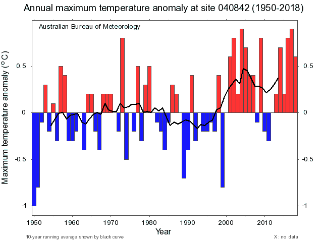
The easiest way to see how Brisbane’s climate has changed is to go to this page on the BoM website, select the Brisbane Airport station and the climatic variable of your choice, and view the resulting timeseries chart. The plot reproduced below shows the annual anomaly (that is, deviations from the long-term average) in maximum temperatures since 1950. The black line represents the average of the anomalies over a moving 10-year window.
The data plotted here comes from the the Australian Climate Observations Reference Network – Surface Air Temperature (ACORN-SAT) dataset, which has been developed specifically to monitor climate variability and change in Australia. You can get equivalent information (in many cases going back as far as 1910) for 112 different weather stations around the country.
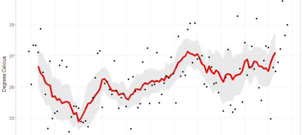
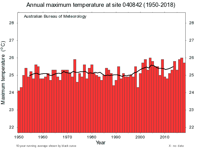
The corresponding plot that the BoM website produces for average maximum temperatures is less satisfying, as it is basically a series of very tall bars, making the long-term trend difficult to see. For the HeatTraKR, I chose a visualisation that would show both the absolute temperatures and the long-term trends clearly. Here is the plot for Brisbane Airport:
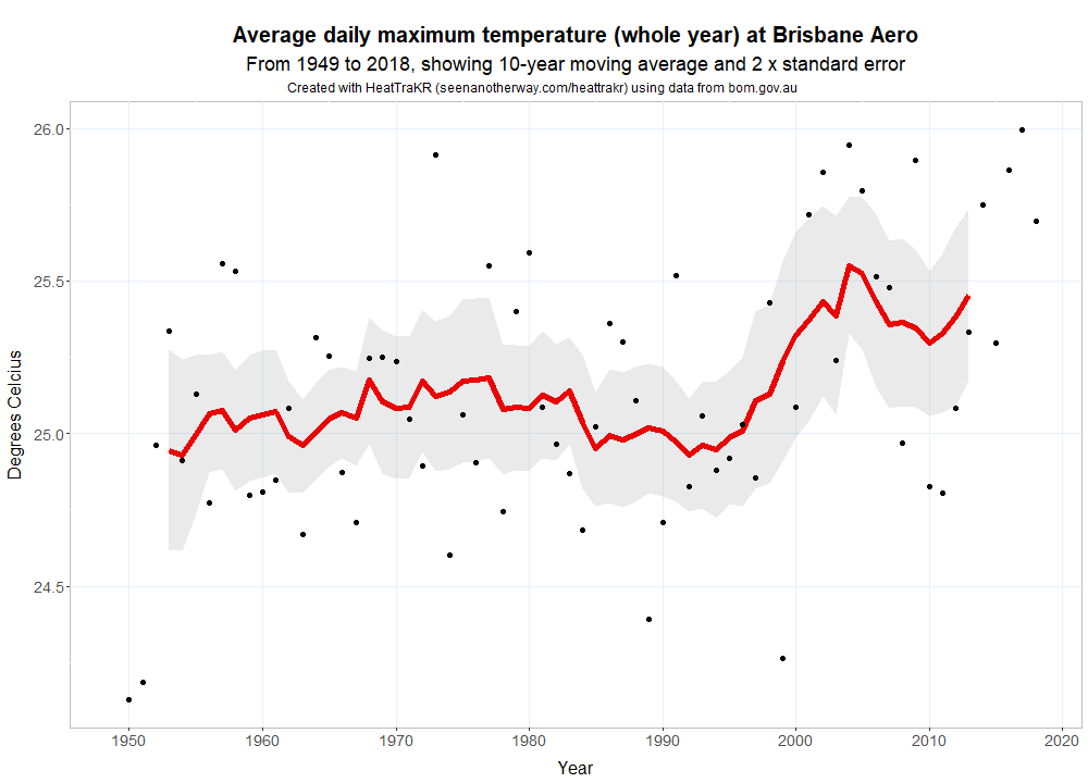
The line depicting the moving average in Figure 2 is the same as in the BoM plot (phew!), but here each year’s data is depicted by a dot, and the moving average is flanked by a shaded area that reflects the level of variability in the data. 1 What we lose with this visualisation is the ability to easily track the change from one year to the next — something you can do easily with the bar charts from the BoM website. But these year-to-year differences are less important if we are mostly interested in the long-term trend.
Whichever way you look at it, there is no question that Brisbane’s maximum temperatures have mostly been above average in the past 20 years. Interestingly though, there was no long-term movement in the preceding 50 years (or perhaps there was, but it was dampened by a cool period in the 1980s and 1990s). In this respect, Brisbane’s climate has followed a different trajectory from that of the country as a whole, which has warmed fairly steadily since at least the 1970s.
Separating the seasons
To address the questions that I set out to answer, which mostly concern Brisbane’s summer, a plot of annual average temperatures will not do. We need to see how the individual seasons have changed. This we can see in Figure 3. 2
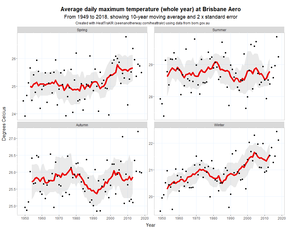
This is interesting indeed. Figure 3 shows that in Brisbane, climate change is being felt quite differently at different times of the year. Maximum temperatures in summer appear not to have warmed at all in the long-term (although the last three years were all quite high). By contrast, winter maximums have warmed a whole degree Celsius since 1950. Spring temperatures were late to move but have increased by at least half a degree since the 1990s, while Autumn temperatures have varied a lot over the years but are not really any higher now than in the 1960s (although the only two years above 27 °C have occurred since 2005).
Approximating inner Brisbane
There’s just one problem with Figure 3: the data it shows does not describe the Brisbane that I know — that is, the CBD and the inner-western suburbs. This data describes maximum temperatures at Brisbane Airport, which is closer to the coast than the CBD and tends to be one or two degrees cooler. Unfortunately, the ACORN-SAT dataset does not include data for Brisbane’s CBD. The nearest alternative location is Amberley, which is 36 km inland from Brisbane’s CBD and usually a couple of degrees warmer. Figure 5 shows the average maximum temperatures at these three locations during each month in 2019.
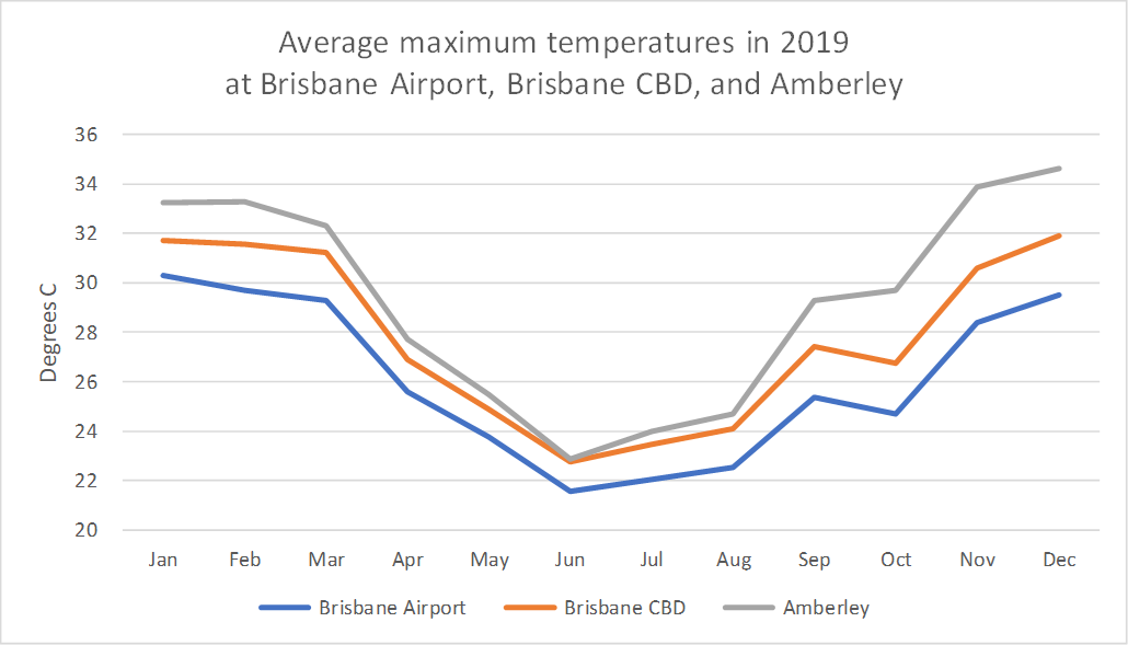
Surely the most sensible thing for me to do would be to use the Brisbane Airport observations for the remainder of this analysis. But at the risk of committing some kind of crime against climatology, I am going to take the average of the ACORN-SAT data for Brisbane Airport and Amberley to better approximate my experience of living in the inner western suburbs. I’ve set up the HeatTraKR so that the user can easily combine two or more stations in this manner, or even all of them at once.
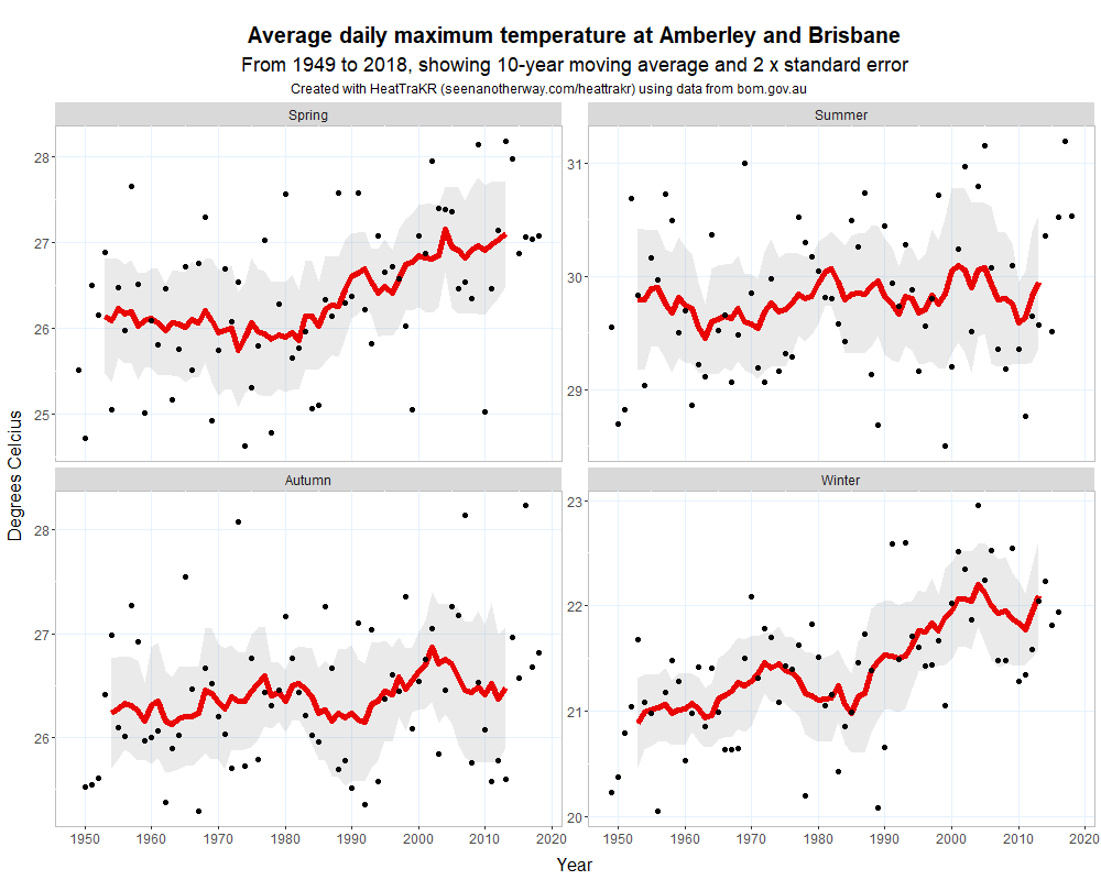
Figure 6 shows the seasonal maximum temperatures for the amalgam of Amberley and Brisbane Airport that I will use from this point forwards to approximate the climate of inner-western Brisbane. Overall, they look pretty similar to the Brisbane airport plots, but the summer maximums are much closer to the 30-degree mark, which is exactly where I would expect to see them.
Summer, spring, and successive stinkers
Figure 6 shows that my belief about Brisbane’s summer getting hotter is not quite right, and yet not quite wrong either. Although there is no long-term warming trend, it’s clear that the last three summers — and these are the ones that finally sent me troppo — were indeed particularly hot.
And take a look at spring: it has warmed by a whole degree since 1980. So perhaps it is fair to say that summer in Brisbane has gotten longer, even if it hasn’t gotten hotter. Figure 7 lends weight to this theory, showing that the number of days peaking over 29 °C in spring has been increasing steadily since the 1980s. Until the 1990s, there were typically fewer than 15 such summery days in spring, and very rarely as many as 20. Since the year 2000, all but three springs have had at least nineteen 29-degree days, and there have been four springs with more than thirty such days.
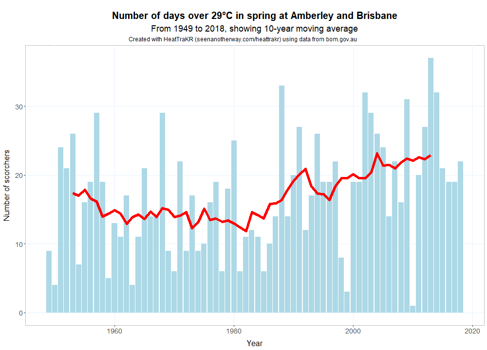
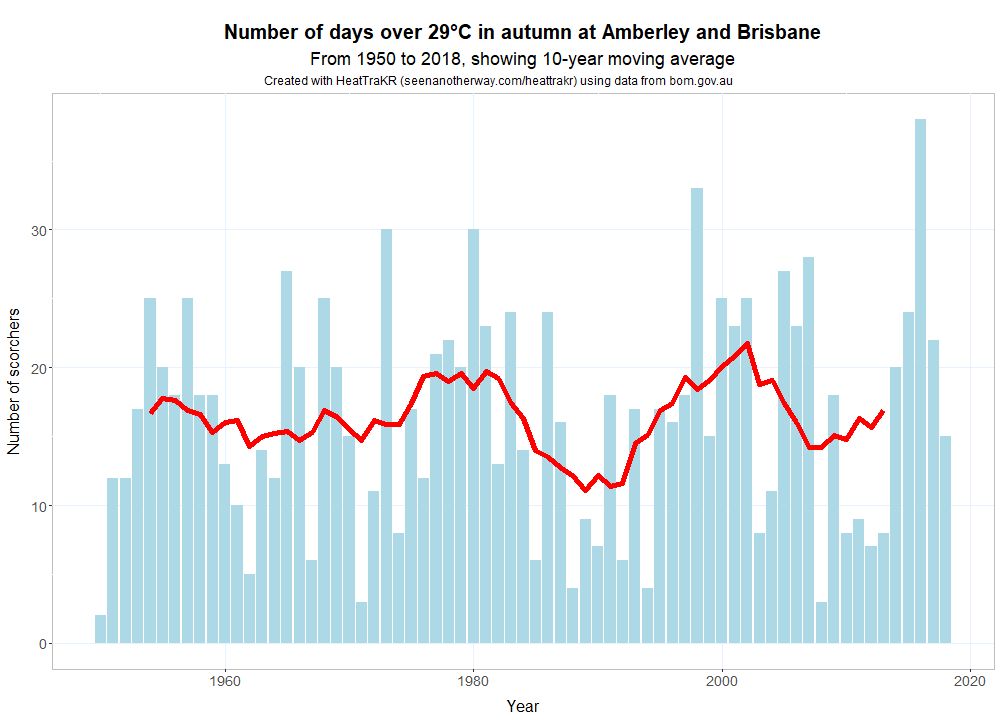
Interestingly, there is no corresponding trend in autumn, meaning that Brisbane’s summer is at least not hanging around any longer than it used to.
The average maximum temperatures in summer might not have increased, but what about my other hypotheses? Let’s look at the number and succession of especially hot days — the kind that in Brisbane might be called a stinker, but which might more conventionally be called a scorcher. Figure 8 shows the number of days over 32 °C in each season. This might seem like a low threshold, but trust me, 32 °C in Brisbane is plenty unpleasant. (Remember, it’s not the heat, it’s the humidity.)
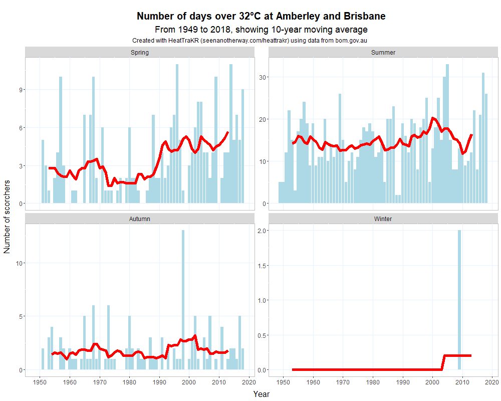
The succession of cooler summers between 2005 and 2015 makes it difficult to say whether, in the long term, these stinking hot days have become a more common feature of Brisbane’s summer. However, it’s fair to say that the number of these days has been well above average in four out of the last five years. And in spring, the average number of these days has almost doubled over the long term. This is further evidence that Brisbane’s summer is bleeding into spring.
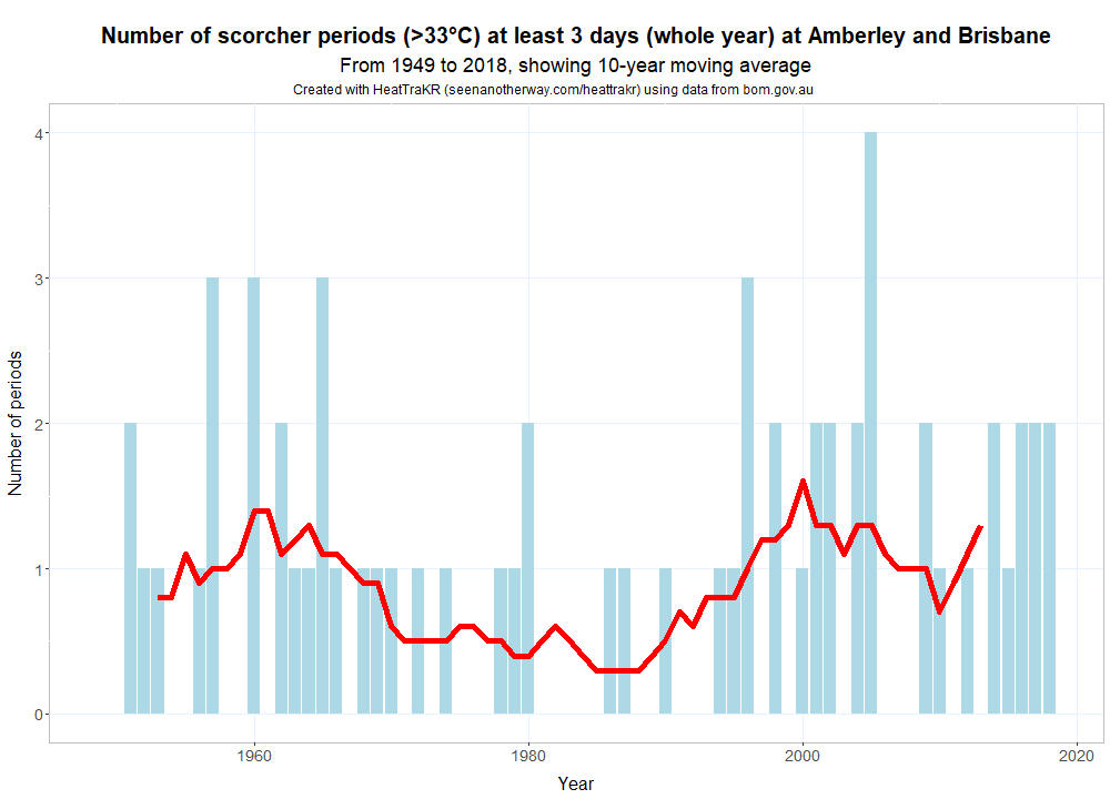
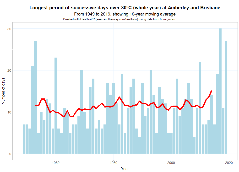
What about my perception that successions of really hot days have become more common? The verdict depends somewhat on how long a period and how hot a day we consider. Figure 9 shows that if we look at periods of three days or longer with maximums of at least 33 °C, four of the last five years have again tracked above average. It’s worth mentioning, however, that the 20-year period up to 1980 was not far behind the most recent 20 years on this measure.
Even if these ‘scorcher periods’ are becoming more frequent, I found no clear evidence that they are getting longer overall. However, I did find one interesting observation in Figure 10. 2017 was the first year on record in which Brisbane (or my approximation of it) endured 30 days in a row of days over 30 °C. The longest such period in 2019 (which is only covered up to May in this dataset) wasn’t far behind. 3
Stormy statistics
What about the summer storms? Have they really become less frequent since my primary school days in the 1980s and 1990s?
Testing this claim with the readily available data from the BoM website is not easy. Rainfall records are not available for all of the stations in the ACORN-SAT dataset, and where they are available, their historical coverage is in many cases patchy or limited. To give a decent representation of rainfall in the inner-west of Brisbane, I averaged the available rainfall data from the Brisbane CBD, the Mount Coot-tha Botanical Gardens, and the Toowong Bowls Club. These locations are close enough to one another that if it is raining at one, it is likely raining at the others. Needless to say, however, this combined dataset does not necessarily represent any other parts of Brisbane.
For the record, here is what this combined dataset says about total rainfall in the area since 1949.
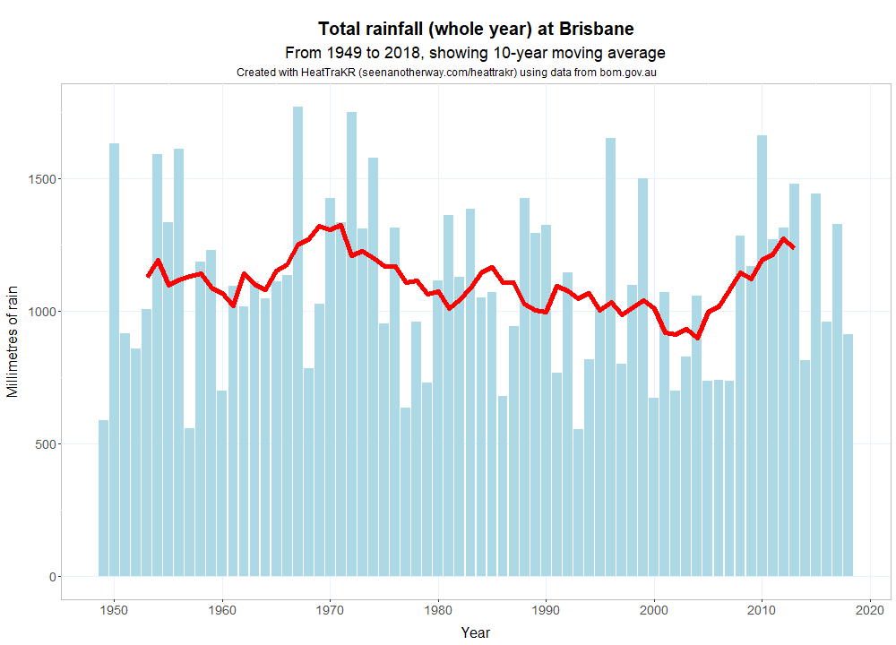
In these locations, there was a wet period in the 1970s (which included the severe flood of 1974), followed by a gradual reduction in rain which culminated in the Millennium Drought, which broke in the years leading up to the flood in 2011. When my parents told me during the 1990s and 2000s that they remember Brisbane being wetter before I was born, they were right. But it’s fair to say that rainfall has not been particularly low (except in the last few years!) since 2008.
The specific memories that I am putting to the test here relate not to total annual rainfall but to the number and timing of summer storms. It’s hard to isolate this particular type of rain event from the daily rainfall data. The best I can do is to assume that if any decent amount of rain falls at all on a hot summer day in Brisbane, it is likely to be a storm. I won’t lie: what I’m doing here is not remotely scientific, and might be downright dodgy, but since this is the question I most wanted to answer when I started this exercise, I’m going to try to answer it anyway. Shown below is the fraction of summer days each year over 32 °C on which at least 2mm of rain fell. 4
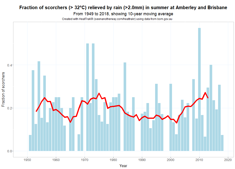
So my mum’s memory about the diminishing number of storms might have been right, but mine was imagined. The percentage of 32-plus °C days relieved by rain from the late 1980s through to the early 2000s was low relative to the 1970s and most of the 1950s and 1960s, but there was no period in my lifetime (I was born in 1980) in which I could have formed a valid memory of anything different. And since the early 2000s, the frequency of rain events on hot days has, on average, only increased.
The final verdict? At least some of my reasons for fleeing Brisbane’s climate turned out to be true, even if not quite in the way I expected. Over the last several decades, Brisbane’s summer has not gotten hotter but longer. It is eating into spring, which has warmed by a whole degree since 1980 and is featuring an increasing number of distinctly summery days.
This is not to say that Brisbane’s summer months will not also get hotter in the coming years. Maximum temperatures in four of the past five years to 2018 have been hotter than average. These are the years that pushed me over the edge, and they could yet become the new normal.
Out of the frying pan…
It’s nice to know that at least some of the climate-related reasons I had for leaving Brisbane were grounded in reality. But what exactly have I gotten myself into by moving to Melbourne, a city as famous for its crazy weather as for its vibrant culture? Without knowing more about Melbourne’s climate and how it is changing, was the decision to leave Brisbane really a wise one?
The drive down from Brisbane was hardly reassuring. We left Brisbane on the morning of the 24th of January, 2019, hoping to get to Melbourne in time to collect our key from the real estate office the next afternoon before the Australia Day long weekend. After catching a few hours of sleep overnight in Dubbo, we continued down the Newell Highway on the morning of the 25th. When we stopped for morning tea in Narrandera, the temperature was already in the high 30s. It was in the mid 40s when we had lunch at Tocumwal, a small town on the Yarra River, which marks the border between New South Wales and Victoria. As we continued south through the Golburn Valley, we saw sheep huddled under trees, panting desperately, close to death. The temperature at our destination was 43 °C. Back in Brisbane it was a mere 33 °C. We could see the joke, but we weren’t laughing.
Then, when we were a couple of hours out of the city — close enough to pick up a Melbourne radio station — we heard the words that every Melburnian waits for on a day like this: “The cool change has arrived!” By the time we got to our new home, the temperature had dropped by about 15 degrees. The following day reached a very comfortable 26 °C, while Brisbane peaked at 33 °C — its fourth day in a row at 33 °C or higher, and its 11th successive day above 32 °C. It would be a full month before Brisbane saw another maximum below 30 °C. Our move hadn’t been so misguided after all.
To be fair, Melbourne’s respite from the heat only lasted a couple of days before there were three days in the mid-high 30s, followed by two more in the low-mid 20s, followed by two more in the 30s, and so on. The chart below tells the story.
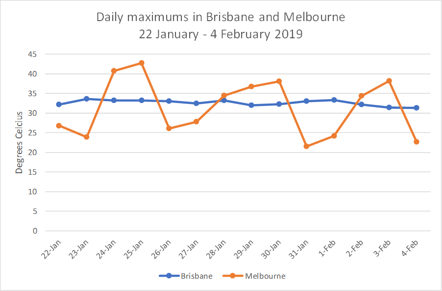
This plot is a perfect illustration of the difference between Melbourne’s schizophrenic variability and Brisbane’s subtropical consistency. In summer at least, I see Melbourne’s variability as a blessing. Sure, there are hot days, some of them extreme. But more often than not, they are tempered by a late cool change and followed by much milder conditions.
Winter, of course, is a different story. Melbourne’s cold and dreary winter is the price you pay for a mostly pleasant summer. In Brisbane, on the other hand, summer is the price you pay for several months of paradise in winter and autumn. Figure 14 captures the difference, showing the monthly average maximum temperatures across the year in each city along with the extent to which the actual temperatures tend to vary from the average.
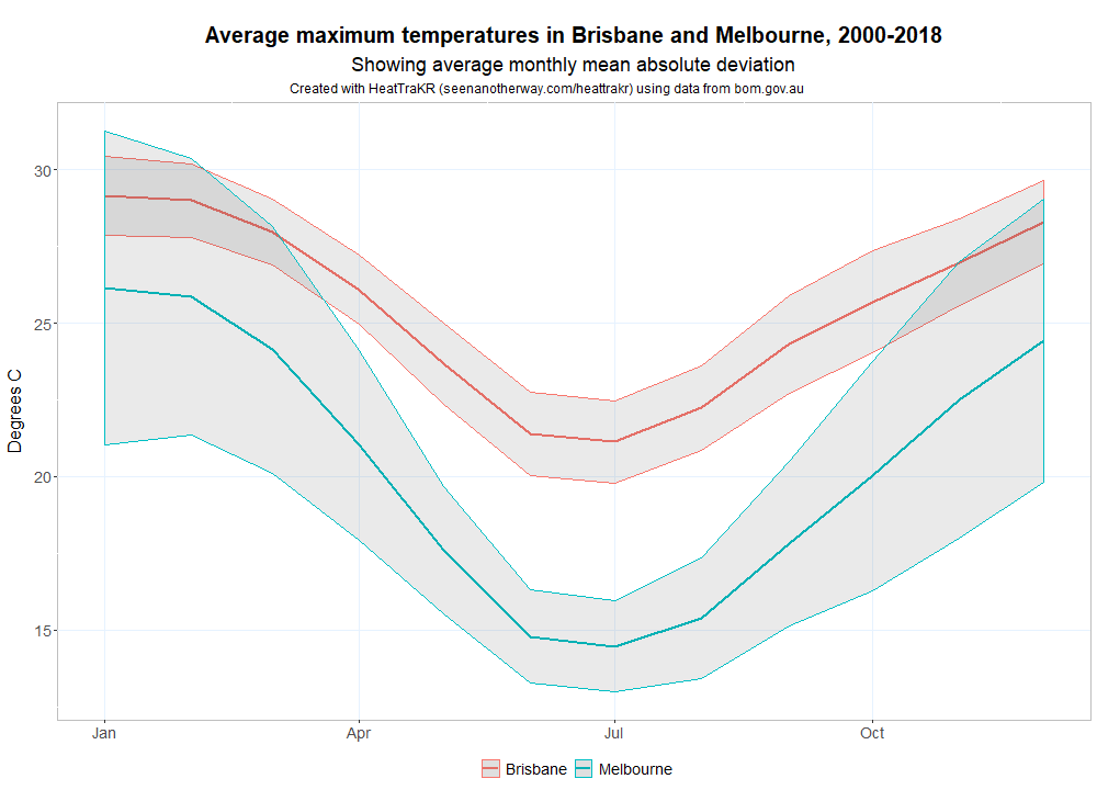
Which one you prefer is a matter of personal taste. Having endured one winter in Melbourne, I’m still happy to take it over Brisbane’s summer. But will this change as the climate continues to heat up? Could Melbourne be hit worse by climate change than Brisbane?
That’s really a question for climate modellers and long-range forecasters. But with the data at hand, we can at least see how Melbourne’s climate is tracking to date. Figure 15 shows the average maximum temperatures for each season since 1910.
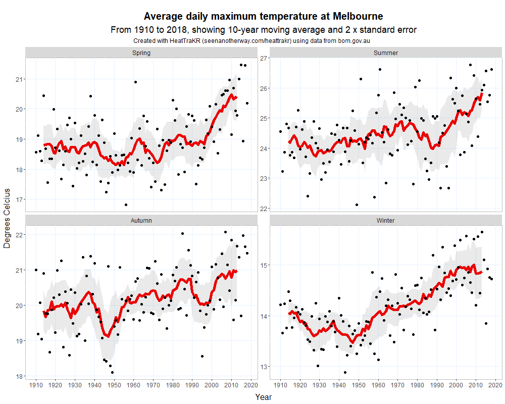
Unlike Brisbane’s summer, Melbourne’s is clearly warming. The average maximum temperature in 2018 was nearly 2 degrees higher than it was in the 1930s. But at just under 26 °C, this average is hardly anything to be scared of, and is certainly preferable to Brisbane’s summer average of around 30 °C. The bigger concern about Melbourne’s summer is the frequency of extremely hot days like the one that welcomed my wife and me on the 25th of January 2019.
As Figure 16 shows, the news on this front is not great. Before 2009, no year on record had experienced five days in the 40s. This record was broken again in 2014, which experienced six days in the 40s. Dropping the threshold to 38 °C yields a similar story. Before 1997, the most number of days in a year over 38 °C was six. Since then, there have been two years with eight such days and one with nine.
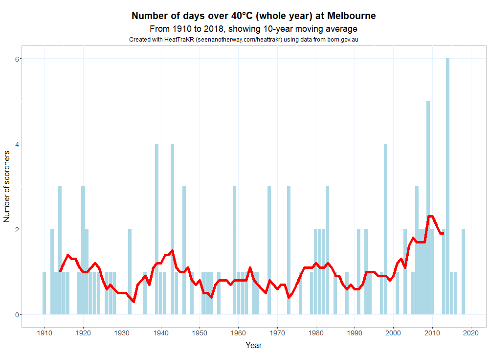
So while Melbourne’s average temperature in summer is still quite mild, the number of extremely hot days appears to be increasing. Good for cinemas and shopping malls, perhaps, but not for beer gardens and sidewalk cafes, which is where I would prefer to spend my time.
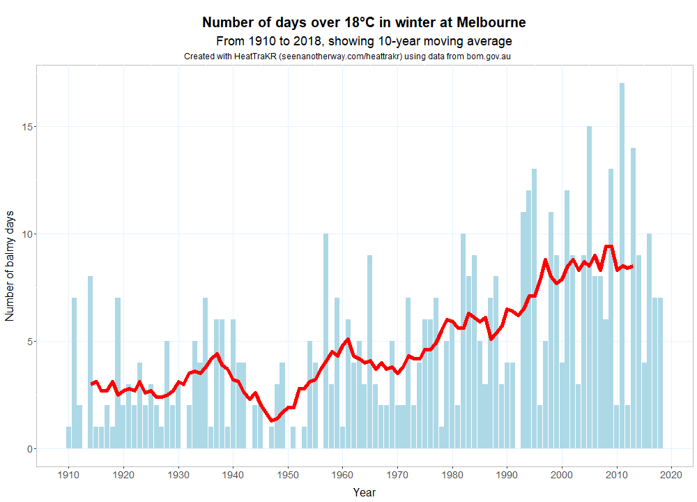
Melbourne is warming at other times of the year as well. Spring and winter have each warmed by about 1.5 degrees since the 1950s. This might be worrying in the abstract, but at a more selfish level, I doubt many Melburnians would complain about winter getting a bit warmer, especially if the trend in Figure 17 continues.
So, what’s the final score? Melbourne’s weather might indeed be mental, but on balance, I think it will offer a more tolerable climate than Brisbane in the coming years. On that basis at least, my relocation looks to have been a timely one. But of course, my wife and I didn’t move here for the weather alone, and other factors may one day compel us to move again.
Deserter’s guilt
While I’m glad to know a bit more about how the climate in Brisbane and Melbourne is changing, I have to admit that this comparative exercise has left me feeling uneasy. There is something troubling about the idea of people like me city-hopping to avoid the worst and make the most of climate change. While it is a perfectly rational thing to do, it could have profound social consequences if enacted at scale. Climate change may divide cities into winners and losers. Cooler cities, like Melbourne or Hobart, will become increasingly desirable, while warmer ones, like Brisbane, will edge closer to being unliveable. Those who are wealthy and mobile will flock to the cooler cities while those who can’t afford to move will be left behind as their cities decay both socio-economically and environmentally. The same dynamic could also play out for whole countries. It won’t be pretty, and even the winners will be losers. Melbourne, for example, is crowded and expensive enough as it is: the last thing it needs is more climate deserters like me trying to squeeze their way in.
So the last thing I want to do is to encourage people to desert their home cities as soon as the weather becomes less comfortable. We might be better served by narratives about fostering resilience and local pride, or about adapting to change and maintaining stability as so much around us gets reconfigured. (Of course, I am not suggesting for a second that we should focus on adaptation instead of doing all we can to stop climate change from spiralling out of control.) Then again, adaptation will also require us to acknowledge the diverse climatic realities revealed in data of the kind presented here. Every town, city and country will face a unique set of challenges, and in some cases will find opportunities as well. Perhaps the best outcome we can hope for — or aim for — is that the costs are not borne too unevenly.
Notes:
- In each direction, this shaded area spans an distance of twice the standard error of the moving average. In essence, this quantity tells us how meaningful the moving average is, given how far on either side of it the actual data points lie. If we imagine that the plot we are looking at is the result of a mythical simulation (EarthSim 2.0, or somesuch), and that we could run the same simulation over and over again, we could expect the moving average to lie within the shaded area 95% of the time. If that interpretation does your head in, just read the shaded area an indication of how much the data varies around the moving average. ↩
- Note that when splitting up the seasons, I have defined summer in a given year as December of that year plus January and February of the following year. ↩
- According to BoM’s daily maximum records for the actual Brisbane CBD station, in January-February 2019 Brisbane experienced 41 successive days of at least 30.0 °C. ↩
- BoM’s rainfall data generally records the amount of rain that fell in the 24 hours prior to 9AM on a given day. I shifted the rainfall data by a day in order to identify when rainfall coincided with hot days. I have no way of knowing what time the rain fell. In some cases, it might have fallen in the middle of the night! ↩