Recently, I decided to crunch some data from the Australian Bureau of Meteorology (which I’ll just call BoM) to assess some of my own perceptions about how the climate in my home city of Brisbane had changed throughout my lifetime. As always, I performed the analysis in Knime, a free and open software platform that allows you to do highly sophisticated and repeatable data analyses without having to learn how to code. Along the way, I also took the opportunity to sharpen my skills at using R as a platform for making data visualisations, which is something that Knime doesn’t do quite as well.
The result of this process is HeatTraKR, a Knime workflow for analysing and visualising climate data from the Australian Bureau of Meteorology, principally the Australian Climate Observations Reference Network – Surface Air Temperature (ACORN-SAT) dataset, which has been developed specifically to monitor climate variability and change in Australia. The workflow uses Knime’s native functionality to download, prepare and manipulate the data, but calls upon R to create the visual outputs. (The workflow does allow you to create the plots with Knime’s native nodes, but they are not as nice as the R versions.)
I’ve already used the HeatTraKR to produce this post about how the climate in Brisbane and Melbourne (my new home city) is changing. But the workflow has some capabilities that are not showcased in that post, and I will take the opportunity to demonstrate these a little later in the present post.
Below I explain how to install and use the HeatTraKR, and take a closer look at some of its outputs that I have not already discussed in my other post.
R integration in Knime
To a considerable extent, Knime and R offer different ways of doing the same things. Both platforms enable you to manipulate and analyse data in a wide variety of ways, spanning from from simple data management tasks through to sophisticated statistics and machine learning. The big difference between the platforms lies in how you go about doing these things.
In R, you perform analyses by writing scripts in R’s own coding language. There are packages to install, commands to look up, and syntax to learn. You will spend many, many hours wading through StackOverflow to figure out how to do–well, pretty much everything, since the official documentation for most R packages is so opaque as to be meaningless to anyone who is not already an expert. Few people know this, but R actually got its name because ‘Aarrrgh!!’ is the sound tend to make most of the time while trying to use it. 1
In Knime, you do not write scripts in the conventional sense, but rather assemble workflows out of visual elements called nodes. Each node is roughly equivalent to a line of code. The difference is that configuring a node is usually a simple matter of interacting with a configuration box, and can be done without first disappearing down a wormhole of Google results and StackOverflow pages.
The end result of running your data through Knime and R is generally the same–unless you care about how it looks. Knime has a limited range of visualisation functions. You can make a passable line plot or scatter plot, for example, but not much else. With R, on the other hand, you have access to a whole universe (or tidyverse) of data visualisation capabilities, many of which revolve around the widely used ggplot package. For me, these capabilities are just about the only thing that make the investment in learning R worthwhile. To date, there is almost nothing else that I have needed to do that I can’t do more easily in Knime.
The good news is that R and Knime can be made to play together quite nicely. Knime includes nodes specifically for integrating R into your workflow. You just connect your data to one of these nodes, enter your R script via a config box, and the node will spit out your plot or new data table at the other end.
In theory, R integration in Knime will work right out of the box, as long as you install the Interactive R Statistics Integration extension in Knime. If you already have R installed, you can point Knime to its location from within Knime’s settings. Or you can use the version of R that comes packaged in Knime. But in my experience, getting R to work in Knime is not always this simple. On some occasions, I have had to perform some the additional steps described on this page in the Knime forum.
To be clear, the HeatTraKR will work without R integration, but you will not be able to produce the full range of visualisations.
Getting warmed up
Installation
Once you have Knime and R ready to go, you can install the HeatTraKR workflow simply by retrieving it from the Knime Hub. When you fire it up, you will see something like this:
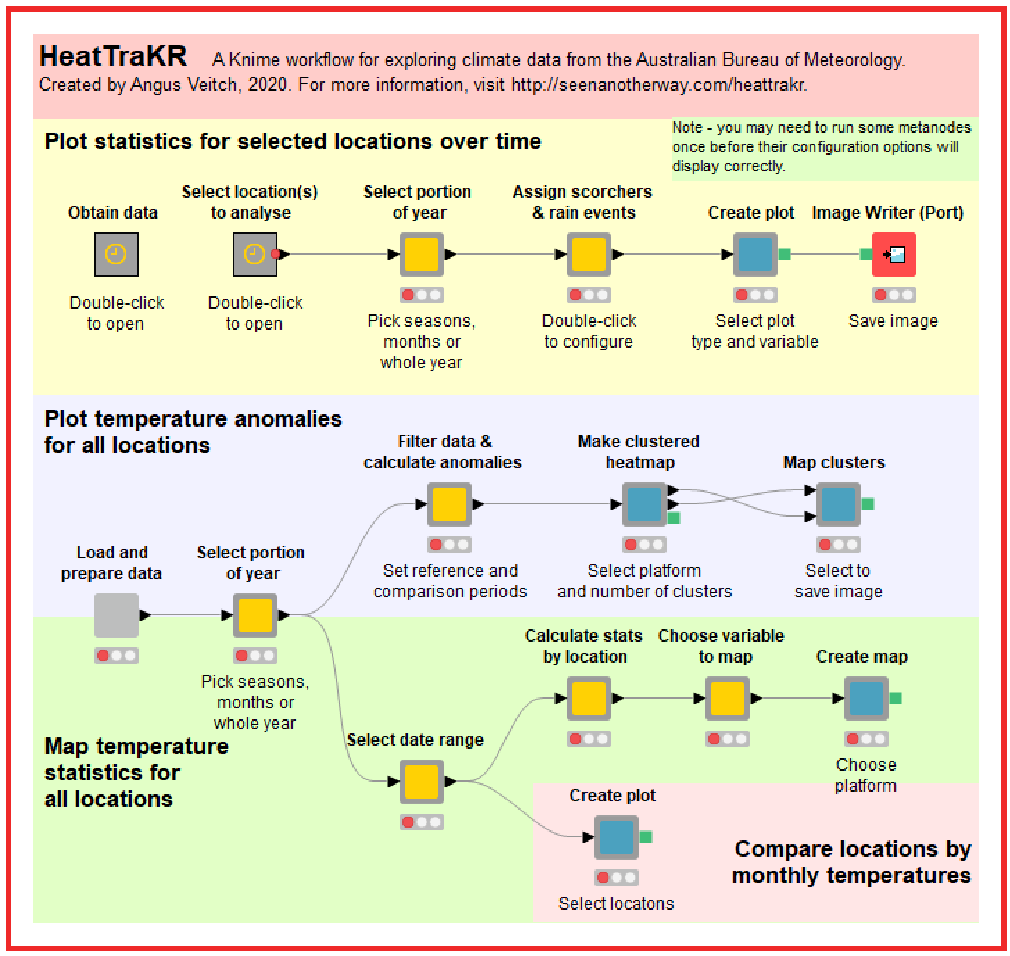
What you are looking at is a very high-level, interactive abstraction of the workflow. It’s somewhere between a script and a user interface. The grey boxes are metanodes, which perform two different functions. Their first function is to contain and organise all of the individual nodes that do all of the computational work. Their second function is to provide some degree of interactivity. Double-clicking on the light-grey boxes will open up configuration menus through which you can control various workflow options such as the season you want to analyse or the kind of plot you want to produce. (Double-clicking on the darker grey boxes will just open them up so you can see what is inside. You can see inside the light-grey boxes by using Ctrl+double-click.)
Actually, grey boxes is a great metaphor for Knime workflows more generally. Most user interfaces are black boxes: you pick some options and get an output, but you have no idea what happens behind the scenes. An example is the page on the BoM website 2 where you can obtain graphs similar to those produced by the HeatTraKR. You specify the location and climatic variables, and the page gives you a graph. You don’t know (and probably don’t care) how the graph was produced. Even R packages (as opposed to isolated scripts) tend to work like this. You enter a command and you get an output, but you can’t readily inspect the individual steps or lines of code that get run in the background. (I assume that you can inspect these steps if you know where to look, but this is far from obvious to the average user.)
The metanodes at the top level of the HeatTraKR are grey boxes both in the visual and metaphorical sense. They keep the messy details out of sight, but allow any interested user to inspect and modify all of these details with ease.
Knime workflows therefore offer a really interesting middle ground between scripts and user interfaces. The script and the interface are essentially the same thing. The upside is that users can do more than just get answers: they can also lift the lid and see how those answers are obtained. The downside is that Knime workflows are not as portable and accessible as scripts packaged for web interfaces. To be sure, Knime does have a premium product called Knime Server that allows Knime workflows to talk to web pages; but I’ve not had the opportunity to use it, and don’t expect to anytime soon.
Anyway, back to the HeatTraKR. The main point is that to use it, all you need to do is to click on things. But if you want to poke around and see how it works, you can do that as well.
To get started, you need to open on the metanode titled “Obtain data”. Inside, you will see this:
Installing the necessary R packages
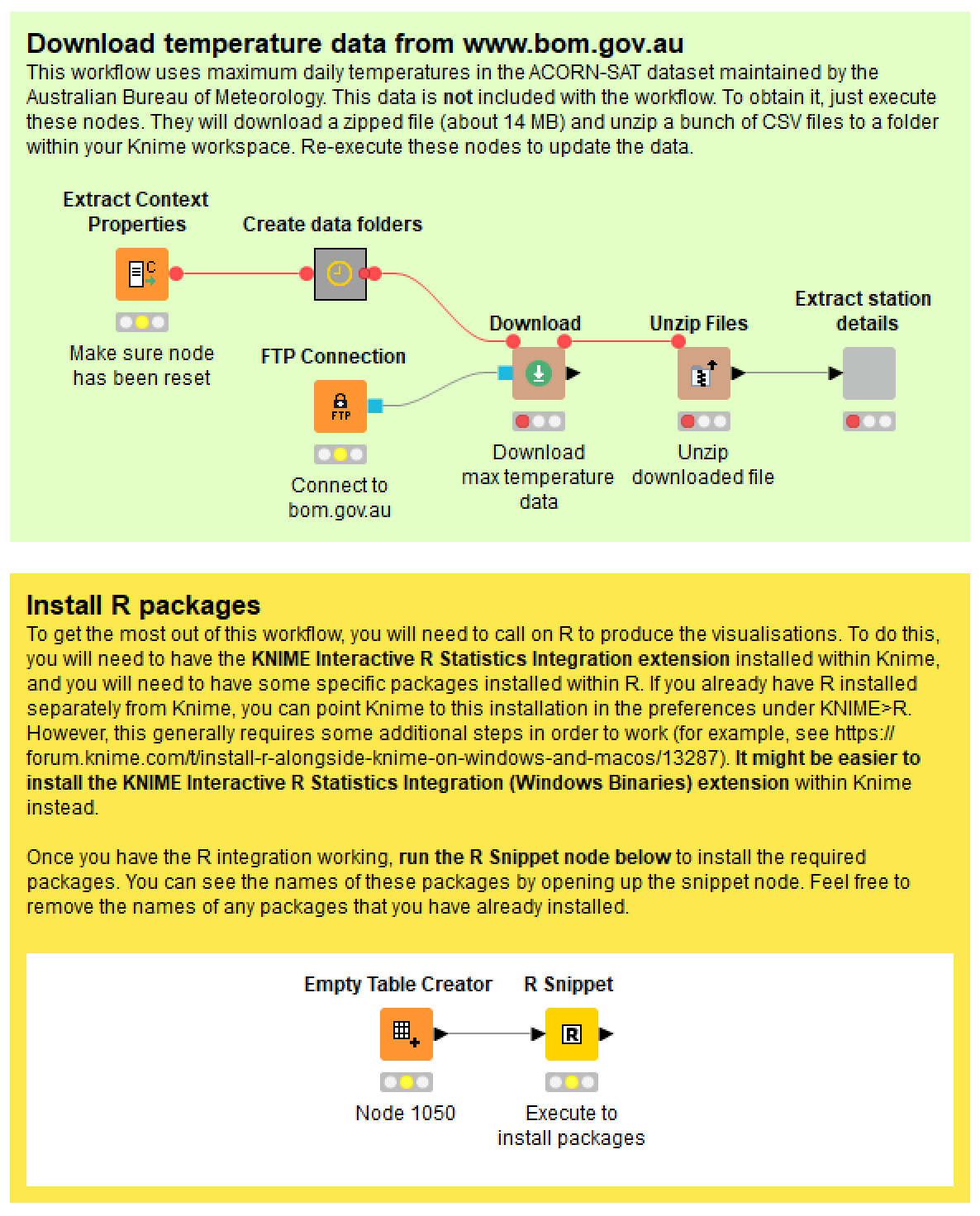
The R scripts in the HeatTraKR rely on several additional R ‘packages’ to produce the visualisations, especially ggplot2. To install these, just open up the ‘Install R packages’ metanode in the bottom-right corner and run the ‘R Snippet’ node inside. If you open up this node, you will see the script listing the packages to install. If you already have some of them installed, feel free to remove them from the list by inserting a ‘#’ at the beginning of the relevant lines. You should only ever need to run this step once.
Downloading the temperature data
Before you can use the workflow, you also need to download the temperature data for all observation stations from the Bureau of Meteorology. Do this by executing the nodes in the green panel. These nodes will create folders to house the data, and then they will download and unzip the ACORN-SAT dataset (just the maximum temperatures) from the BoM FTP server.
Plotting climate data over time
The main reason I created the HeatTraKR was to plot average temperatures and other climatic variables over time in a more customised way than is enabled by the BoM website. This task is performed by the first of the three rows of metanodes shown in Figure 1.
Selecting the location(s) to analyse
When you open the ‘Select location(s) to analyse metanode, you will see the following:
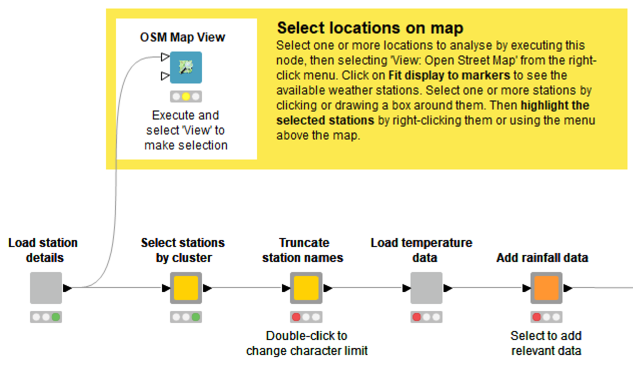
The HeatTraKR allows you to select one or more of the 112 sites in the ACORN-SAT dataset. If you select more than one site, the temperatures from each day will be averaged, which may or may not be meaningful depending on which sites they are.
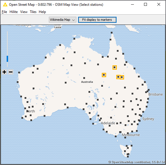
If you execute and open the OSM Map View node, you will see a map of locations that you can select by right-clicking and highlighting. You can repeat the action to add more locations, or select many at once by drawing a box around them. Then close the map and continue along the workflow. Alternatively, you can open the input table listing the stations, and highlight the relevant rows.
By double-clicking the ‘Truncate station names’ metanode, you can choose whether to keep the full names of the weather stations or to strip trailing components such as ‘Airport’ or ‘Research station’.
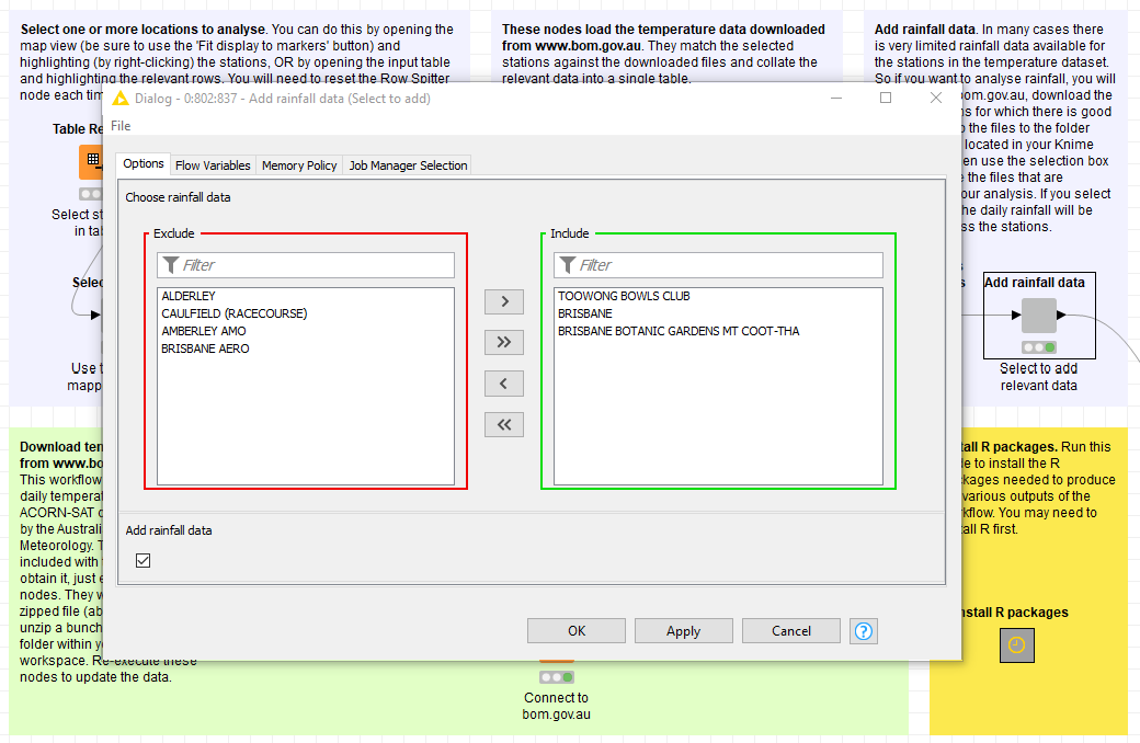
Adding rainfall data
I originally created this workflow to see whether summer thunderstorms had become less frequent in Brisbane. To do this, I had to find some way to inject rainfall data into the workflow. However, this is somewhat complicated because complete rainfall data does not exist for all of the stations in the ACORN-SAT dataset. My solution was to manually download data from relevant stations from this part of the BoM website, and allow the user to choose the data from within the workflow. As with the temperature data, if you choose more than one location, the HeatTraKR will combine them by averaging the rainfall amounts at the daily level. If you don’t want to bother with rainfall data, just leave the ‘Add rainfall data’ box unticked.
Ideally, the workflow would include steps to add the long-term high-quality rainfall data available via this page, but I haven’t gotten around to doing this yet.
Selecting time ranges and seasons
Once you’ve selected your stations and optional rainfall data, hop back out to the top level of the workflow and double-click the next metanode to select the time period of interest. You can analyse data from the whole year, for one or more seasons, or for one or more months. You can also limit the range of years from which to select data. The main reason you might want to do this is to exclude 2019, which at the time of writing was only present in the ACORN-SAT dataset up to May.
Note that summer in any given year is defined as December from that year plus January and February from the next year. This means that if you choose to plot data from summer, it will include January and February from 2019, even if you limit the overall range to 2018.
Setting thresholds
In the next metanode you can set the following threshold values, which relate to specific variables that you can choose to plot:
- The scorcher threshold is the temperature over which days will be counted as especially hot (or merely ‘balmy’, if the value is set below 29 °C).
- The minimum length of scorcher periods is the minimum number of successive hot (or balmy) days that must occur before a period is counted.
- The rainfall event threshold is the minimum amount of rain within a single day that will be counted as a rainfall event.
Choosing the variable to plot
The HeatTraKR can visualise the following range of variables, which you can select by double-clicking on the ‘Create plot’ metanode:
- Average max – the average of all maximum temperatures throughout each year (or specified month or season within each year)
- Highest max – the highest maximum temperature within each year or period
- Number of scorchers – the number of days with maximum temperatures above the scorcher threshold
- Percent of scorchers relieved – the fraction of scorchers on which that coincided with more than the threshold for a rain event
- Number of scorcher periods – the number of periods of successive scorchers, where a period is counted only if it is at least as long as the minimum scorcher period length
- Longest scorcher period – the greatest number of successive scorchers occurring in a period
- Total rainfall – the cumulative rainfall per period
- Rain events – the number of rain events per period meeting the rain event threshold
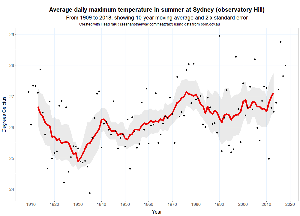
As well as the variable that you want to plot, you can also chance the length of the window in which the moving average will be calculated. The default is 10 years. The figure below is an example of the default plot type, which displays the annual averages as points along with a moving average and a band indicating variability (actually the standard error of the moving average).
Choosing the plot type
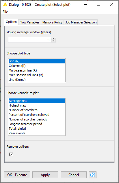
The ‘default’ visualisation shown above is useful for tracking average temperatures and some other variables, but less appropriate for visualising variables with lots of zero values, such as counts of hot days. For those instances, a column chart option is available. And if you can’t get R working, you can also use Knime’s native line chart function.
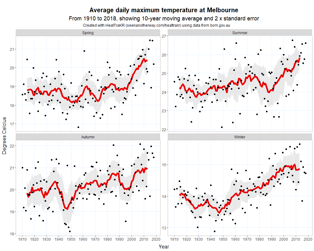
My favourite visualisation, however, is the multi-season line. This does the same thing as the line plot but produces a separate plot for each season. (It does this by taking advantage of ggplot’s awesome ‘facet wrap’ feature.) You can also do the same thing with the column plot.
Creating and saving a plot
Once you’ve configured all of the relevant options, create the plot by executing the ‘Create plot’ metanode. The easiest way to view the plot is to right-click the metanode and select ‘Outport 1’, which opens up the visual output of the R script. If you want to save the plot to a file, just execute the ‘Save image’ metanode, which will save a conveniently named PNG file in your Knime workspace.
If you want to see or modify the R script that produces the plot, navigate into the ‘Create plot’ metanode and open the relevant ‘R View’ node. Note that you will only be able to open one of these nodes when the relevant plot type has been selected by double-clicking on the metanode.
Other visualisations
The visualisations covered above are the most straightforward, and probably the most useful, part of the HeatTraKR. Below, I will discuss some other visualisations that the HeatTraKR can produce. These are designed primarily to explore patterns and differences across space rather than time, although they include some temporal comparisons as well.
All of the anomalies
One of the most effective visualisations of climate change made to date has to be the warming stripes created by Ed Hawkins. The example below shows annual temperatures in Australia from 1910 to 2017. You can explore the stripes for other countries at showyourstripes.info.
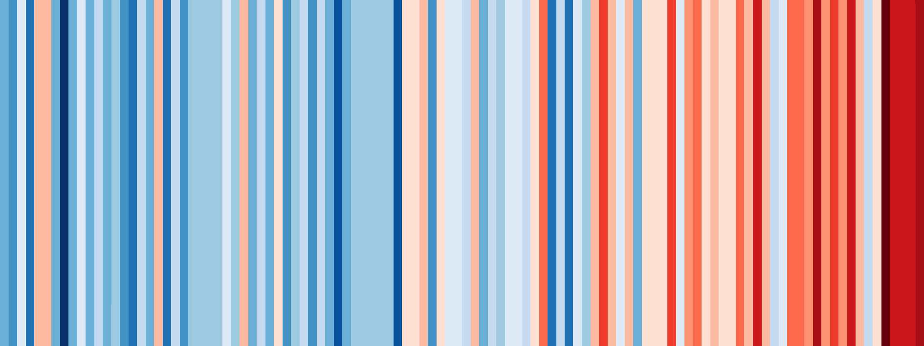
A feature to make one of these for each station in the ACORN-SAT dataset would be a logical inclusion in the HeatTraKR. I haven’t gotten around to that yet, but Just for kicks, I thought I’d see if I could build a similar visualisation to show the same information for 112 stations at once.
The warming stripes belong to a family of visualisations called, appropriately enough, heatmaps. A heatmap is just a table in which the cells are coloured according their values. The stripes shown above are essentially a table with a single row. Making a similar map with 112 rows is not much harder. The only real challenge is coming up with a meaningful way of ordering the rows so that the result is something other than a multicoloured mess. The solution is to group together rows that exhibit similar trends:
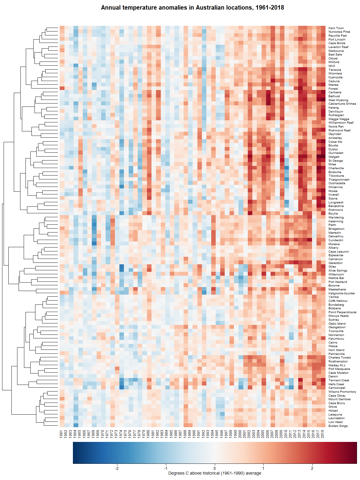
The 106 stations (some had too much missing data to include) in Figure 9 are clustered hierarchically. Each branch of the tree running up the left-hand side contains stations that share similarities in they way their temperatures have gone up and down over the years. Clearly, there is quite a lot of variation in how climate change has played out in different groups of locations. There are some clusters of locations, such as those in the upper-middle part of the figure, where most of the last 20 years have been much warmer than average. There are others, such as the band along the bottom, where the warming has been much more subtle.
(Actually, the heatmap that I have created is similar to the one on this page, which I only just stumbled across!)
Figure 10 shows how the clusters in Figure 9 are distributed geographically. In this map, the hierarchical tree has been cut into eight branches. The size of each marker indicates the average temperature anomaly since 1990.
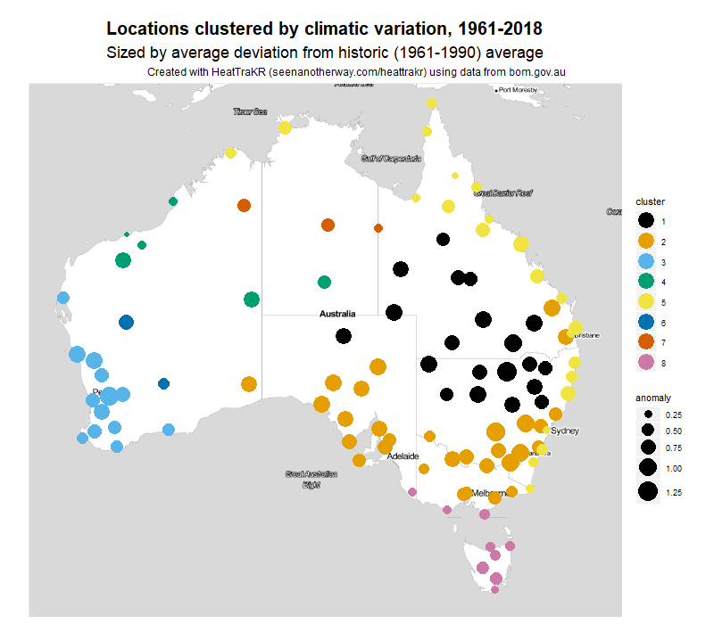
I’ll be honest: I had no idea that the clusters would have such a neat geographic expression. I am used to working with textual data, which is always messy and almost never sorts itself as neatly as this.
What do the clusters mean? I’m not sure, to be honest. To call them climatic zones would be going too far, because they are defined by just a single parameter, namely long-term variation in temperature. The climatic zones defined by BoM reflect variations in factors such as rainfall and overall temperature, which my clusters ignore.
The clusters in Figure 10 are zones defined by temperature variation, nothing less and nothing more. They tell us, for example, that the entire east and northern coast of Australia appear to be be subject to a common set of climatic drivers, as are the locations in the south-west of Western Australia, or the inland parts of southern Queensland and Northern New South Wales. We can also learn (especially when we cross-check against the heatmap in Figure 9) that the eastern coastal areas (along with Tasmania) are warming the most gently, while the inland areas are warming most aggressively.
You can create heatmaps and geo-maps like those above by running the second row of nodes in the main view of the HeatTraKR. In doing so, you can adjust the reference period against which the temperature anomalies are calculated (the default is 1961-1990, which is what BoM uses). Or if you really want to get experimental, you can run the whole analysis for just one part of the year.
The background layer of the map, by the way, is generated by stamen.com, invoked by the ggmap package. A better option might be to use Google Maps or Open Street Map, but those services require user credentials when invoked through R, and therefore would have demanded a lot more fussing around by the end user.
Mapping variability and other measures
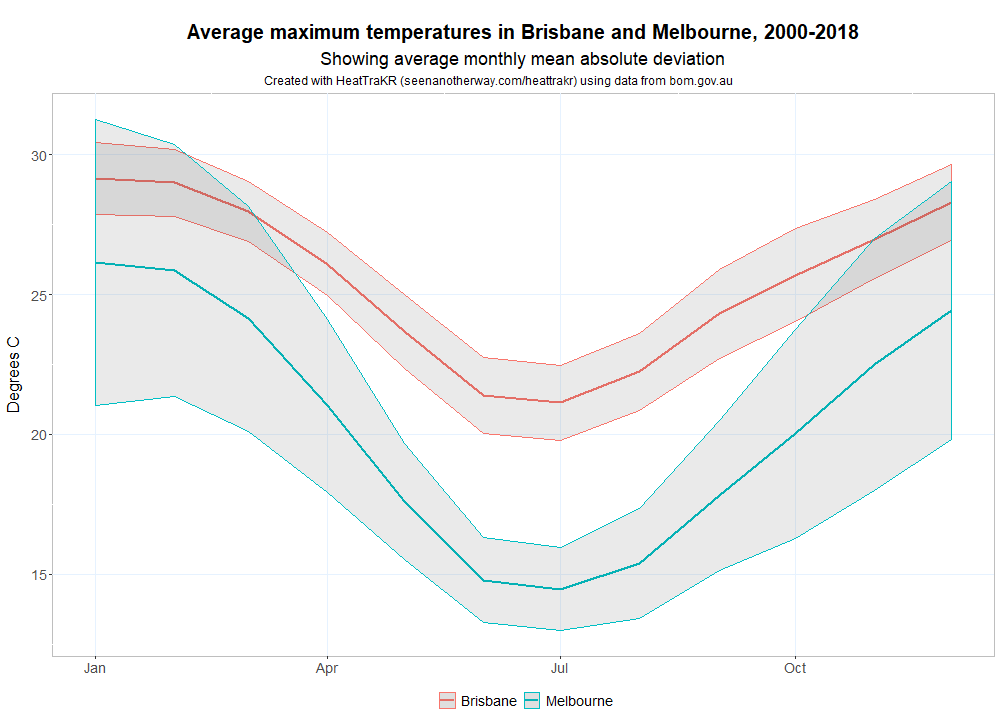
Perhaps the biggest climatic adaptation I’ve had to make in moving from Brisbane to Melbourne has been coming to terms with the variability of Melbourne’s weather. To be sure, it’s only once in a while that Melbourne experiences four seasons in one day, but all four seasons within a week is pretty normal. The chart below shows just how much more variable Melbourne’s weather is than Brisbane’s in the warmer months. The band around each of the averages indicates how far, on average, you can expect the daily maximum temperature to fall on either side of the monthly average. On any given day, the maximum in Melbourne could be several degrees hotter or cooler than in Brisbane.
The HeatTraKR allows you to make a graph like the above for any two locations in the ACORN-SAT dataset. Just configure and run the ‘Compare locations’ metanode.
You can also map the variability of all locations at once, a per the figure below. Here, the size of the circles corresponds with average variability, and the colour indicates the average maximum temperature.
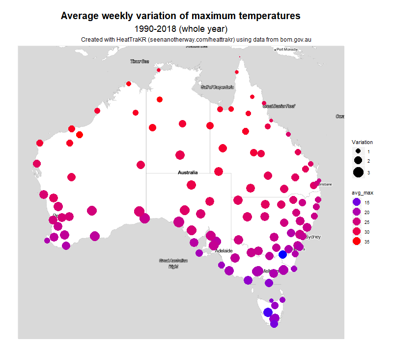
The measure I chose was the mean absolute deviation of daily maximums throughout each month. This measure takes the average temperature for a month, then measures how far each day’s maximum is above or below this average, and takes the average of those deviations. I think it’s a more intuitive measure of variability than standard deviation, which a statistician is more likely to use.
The clearest pattern visible to the naked eye is that variability tends to increase as we move south, away from the topics. A second pattern, evident mostly along the eastern side of the country, is that variability looks to be slightly less along the coast than at inland areas of the same latitude.
By this measure, Melbourne has the ninth most variable weather in the country. On average, each day is 2.8 °C above or below the weekly average temperature. The location with the most variable maximum temperatures is Ceduna (3.3 °C) on the South Australian coast, followed by nearby Eucla, Forrest, and Kyancutta. Brisbane is at the other end of the list, coming in at 102nd with a weekly MAD of just 1.1 °C.
In summer, the contrast is even greater, with Melbourne the second most variable (behind Ceduna) at 4.0 °C, and Brisbane 104th at 1.0 °C. So it’s fair to say that Melbourne’s reputation for variable weather is well deserved. Incidentally, Melbourne has the 13th most variable week ever recorded in Australia. The third week of January 1973 saw successive maximums of 21, 20, 21, 22, 37, 40 and 41 °C, giving an overall mean deviation of 9.2 °C.
In winter, it’s a different story. Melbourne is the 72nd most variable location, at 1.3 °C. Brisbane is at 98th at 1.1 °C. Most variable in winter is Alice Springs, at 2.3 °C. The overall pattern in Winter is not south to north but coastal to inland – perhaps show map. Given that Melbourne’s average maximum in winter is just 14.5 °C, this makes for something of an endurance.
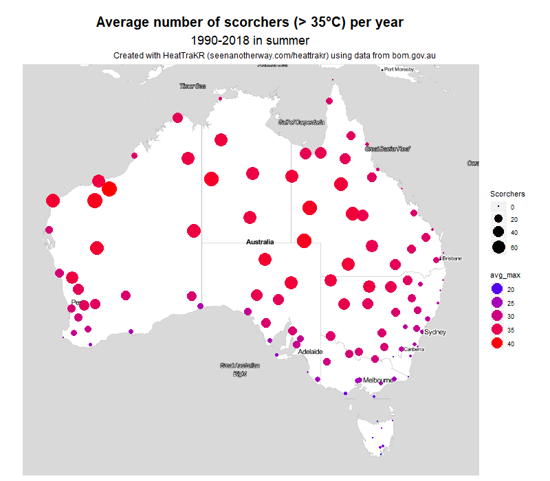
If you’re so inclined, you can map several other variables in the same way. Here, for example, is the number of days each year over 35 °C. This really shows what a difference it makes living on the coast–or the eastern coast at least.
These maps are fairly primitive as far as geovisualisations go. Someone who’s been making maps in R for longer than I have could probably produce something more like the maps on the BoM website, in which the point-based data has been interpolated into regions. But for me, that will be a project for another day.
Limitations and disclaimers
The HeatTraKR is largely something I made to satisfy my own curiosity and further my own education. If anyone else gets any joy or use out of it, then that’s great. If it inspires a few more people to have a play with Knime and try their hand at data analysis, then I’ll be stoked. If its outputs contribute in any way to people’s understanding of climate change, I’ll be thrilled.
I do realise that I’m wading into potentially treacherous waters by playing with climate data, and by offering a tool that helps people to make things out of that data. Contained within this data is one of the most important stories of our age, and it’s vital that this story is told in a way that is not only compelling and clear but also accurate and scientific.
Which is why I really hope I have handled it properly. I have tried hard to ensure that there are no errors in the workflow, but I can make no guarantees. This is not a peer-reviewed piece of work. If you use it for anything of importance, I suggest that you inspect the workflow and/or the results very closely to ensure that nothing is amiss. And if you do find something wrong, please let me know so I can fix it.
Possible bugs aside, there are plenty of ways in which the HeatTraKR could be improved. For a start, it could incorporate data for minimum temperatures or other variables for which long-term data is available. A few more visualisation options wouldn’t go astray either. But I have no idea if I’ll get around to doing such things. I only have so much time for side projects such as this! Of course, you are welcome to make improvements of your own and share the results!
The HeatTraKR could even be adapted to incorporate data from countries other than Australia. Presumably, climate datasets from other countries are structured similarly to those kept by the Australian Bureau of Meteorology. With only a few modifications, the HeatTraKR could be made to work with these datasets.
Finally, if you do publish or share anything created with the HeatTraKR, or if you modify it and make it into something else, please make some effort to cite it. Most of the visual outputs have the origin hard-wired into the subheading (which you may find annoying and can remove if you know your way around the R scripts), but if they aren’t displayed then please at least provide a link back to this page and, if you’re feeling really generous, cite my name (Angus Veitch).
Happy HeatTracking!
Notes:
- Not actually true. ↩
- I’ll be honest: I didn’t actually find this particular page on the BoM website until after I’d started building my HeatTraKR. It might have had something to do with the strange title ‘Australian climate change and variability networks’, and the fact that it was not integrated with the page titled ‘Australian timeseires graphs’, which would be the more logical place. Had I found the page, I might not have built the HeatTraKR at all! ↩