Your thesis has been deposited.
Is this how four years of toil was supposed to end? Not with a bang, but with a weird sentence from my university’s electronic submission system? In any case, this confirmation message gave me a chuckle and taught me one new thing that could be done to a thesis. A PhD is full of surprises, right till the end.
But to speak of the end could be premature, because more than two months after submission, one thing that my thesis hasn’t been yet is examined. Or if it has been, the examination reports are yet to be deposited back into the collective consciousness of my grad school.
The lack of any news about my thesis is hardly keeping me up at night, but it does make what I am about to do in this post a little awkward. Following Socrates, some people would argue that an unexamined thesis is not worth reliving. At the very least, Socrates might have cautioned against saying too much about a PhD experience that might not yet be over. Well, too bad: I’m throwing that caution to the wind, because what follows is a detailed retrospective of my PhD candidature.
Before anyone starts salivating at the prospect of reading sordid details about about existential crises, cruel supervisors or laboratory disasters, let me be clear that what follows is not a psychodrama or a cautionary tale. Rather, I plan to retrace the scholastic journey that I took through my PhD candidature, primarily by examining what I read, and when.
I know, I know: that sounds really boring. But bear with me, because this post is anything but a literature review. This is a data-driven, animated-GIF-laden, deep-dive into the PhD Experience.
The non-linear dynamics of PhD research
You might have guessed already that the journey I am about to describe has not been a straightforward one: otherwise, there wouldn’t be much point in retracing it. Indeed, I’d be willing to bet that very few PhD journeys are straightforward, or could ever be. The whole process seems to be designed to prevent such an outcome: take someone who has never conducted a large research project before, and whose understanding of their chosen field(s) of study is far from complete, and ask them to design and execute a three-year-plus research project with scant resources and limited oversight. What could possibly go wrong?
To be fair, all research has an element of uncertainty and unpredictability. If it didn’t, you could hardly call it research. But for the reasons I have alluded to above, PhDs are especially liable to stray off the charted course. They are essentially a trial by fire — a somewhat perverse and at times exploitative passage of initiation into a profession which, let’s face it, is in many ways both perverse and exploitative. 1
I have limited points for comparison, but I suspect that I embraced the non-linearity of the research process more so than most PhD candidates. Instead of trying to resist it, I more or less absorbed it into my methodology. When promising side-roads appeared, I usually took them. If the grass looked greener in another paddock, I often jumped the fence. Somewhere along the way, I abandoned any notion that I knew what my final thesis would look like. Instead of being a tunnel-visioned truth-seeker armed with a method and a dataset, I became a curator of possibilities, willing to be a passenger as much as a driver on a journey whose ultimate destination was unknown.
I call this the Apocalypse Now model of research — not because the story of a treacherous journey down a river into the jungle to kill a madman is a useful metaphor for doing a PhD (although it surely is), but because of the scarcely believable process through which this movie came into being. As revealed in the documentary, Hearts of Darkness: A Filmmaker’s Apocalypse, almost nothing about the production of this film went to plan. Filming had barely begun in the Philippines when a typhoon wrecked most of the sets. After filming had begun, Marlon Brando arrived on set overweight and under-prepared, forcing Francis Ford Coppola to improvise a new ending, a feat he achieved only with the help of some resourceful camerawork and editing. Late in filming, Martin Sheen had a heart attack, but passed it off as heatstroke to avoid scaring the already-spooked investors. Coppola included narration in the initial script, ditched it during filming, and then developed an entirely new narration during post-production. At no point would you have put money on the film being completed. Through much of it, not even the director knew how it was going to end. And yet, Coppola managed to assemble a masterpiece.

The story of Apocalypse Now is a reminder that sometimes, the unity and coherence that we find in a great movie, painting, or book, is all smoke and mirrors. What comes across as having been immaculately conceived and tightly executed might in fact have had a tortured birth and a convoluted path to completion.
Ideally, the coherence of a PhD thesis should result from careful planning and execution rather than a creative synthesis of elements, but there’s no reason why a thesis can’t sometimes emerge from the latter. Not that I’m advocating for such an approach. It’s an incredibly risky way of doing research, and is exactly the opposite of the kind of discipline that most research training seeks to instil. Depending on the outcome of my examination, I may yet regret adopting it. But I believe it has a place nonetheless, even if only as a fallback when things go awry.
In any case, I think there is value in laying bare just how non-linear a PhD trajectory can be, and this is what I plan to do with the rest of this post.
Turning my thesis on itself
To state the obvious, doing a PhD means doing a lot of reading. Research can’t happen in a vacuum, because it must build on what has been done in the past and avoid replicating it (unless the whole point is to replicate an experiment, but that’s an unlikely aim for a PhD). Invariably, a large part of a PhD candidate’s time — especially in the first year or so — will be spent trawling through Google Scholar or Scopus or some other research database to locate the articles and books that will pad out the references section provide the intellectual scaffolding for the eventual thesis.
I’m not sure how most scholars keep track of all the scholarly literature that they consume. For the most part, bookshelves and binders are no longer necessary. Probably, the more savvy researchers these days use bibliographic software like EndNote or Zotero to manage the hundreds of PDFs that constitute their scholarly universe. Throughout my candidature, I used system that was simpler, if occasionally cumbersome: I just downloaded and saved (with a consistently structured filename) every article that I intended to read, taking care to file it in a sensibly named directory so that I had some chance of finding it again. This collection of downloaded PDFs is the dataset that will underpin the following analysis.
Since my library of PDFs is largely without metadata (only the year of publication, the first author, and the title are encoded in the filenames), I have relied on a technique called topic modelling — specifically, an algorithm called latent Dirichlet allocation, or LDA — to classify the articles in terms of the subjects they cover. As I have discussed elsewhere on this blog, topic models work by detecting groups of terms that co-occur throughout a collection of texts. If the algorithm is tuned appropriately, these groups of terms will correspond with prominent topics within the collection. Even better, the algorithm will ‘allocate’ these topics in varying proportions to each document, providing an automated classification of the entire collection. As I explore in my thesis, there are all kinds of ways in which this classification process can go awry, or produce results that are not quite as they seem. But as a quick substitute for actually reading and manually classifying hundreds of documents, topic models are very useful things. And what better act of closure could I seek than to turn my thesis back on itself — to use the methods I learned in producing it to make sense of the academic terrain that I traversed in the process?
As a means of cataloguing my scholarly reading, this method is not perfect. For starters, it depends on the PDFs containing extractable text, which some of them do not. Secondly it excludes anything that I read in books, reports, or theses. Although I downloaded several items in these formats, I omitted them from the analysis because topic modelling works best when all of the documents are of similar sizes. Finally, this method ignores any articles that I cited in my thesis but neglected to download and save (not that very many fit into this category). So it is important to view the dataset as indicative of my reading interests, and not as a complete record.
I performed all of the text processing and data manipulation for this analysis with Knime, an open-source analytics platform that has served me well throughout my PhD. This includes the initial parsing of the PDFs, the text processing, the topic modelling, and the similarity calculations underlying the networks. I made the networks themselves using Gephi. In the near future, I hope to find time to share my Knime workflows and perhaps even write a post about Knime as a viable alternative to R or Python for scholars dabbling in digital social science and humanities.
2014-2018: a vector space odyssey
Perhaps the neatest thing about topic modelling is that it bridges two different forms of analysis: quantitative and qualitative. The things that topic models measure are the stuff of thought, and yet their presence within each document is precisely quantified, as is the relevance of each word to every topic. (Quantifying topics is in itself nothing new: it’s called content analysis, and researchers have been doing it for decades; but topic models enable it on a scale that is not possible with manual methods.)
The precision of topic model outputs should always be taken with a grain of salt (can you really quantify an idea to two decimal places?), but if we accept that the numbers and the topics are mostly meaningful, all kinds of analytical opportunities emerge. For example, with very little extra effort (assuming that a computer is crunching the numbers), we can calculate the degree of thematic similarity between any two documents. This is done by treating the topics as vectors that define the position of each document within a virtual multidimensional space. Within this vector space model of text, the spatial proximity of two documents reflects the similarity of their topic usage.
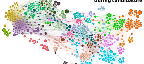
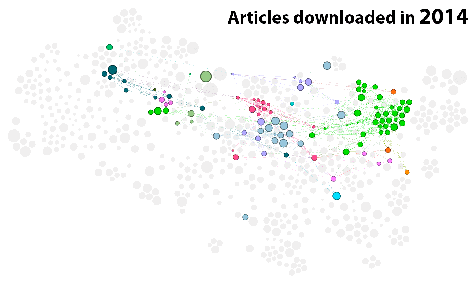
A convenient way of visualising these similarities is as a network, like the one shown below in Figure 1. As the title suggests, this network shows all 661 of the parsable documents that I downloaded between 29 August 2014 and 20 September 2018 (a further 30 or so did not contain any parsable text). The nodes in the network, each of which corresponds with an article in my collection, have been arranged by an algorithm (ForceAtlas2) that does its best to position each article nearest to those with which it is most similar. 2
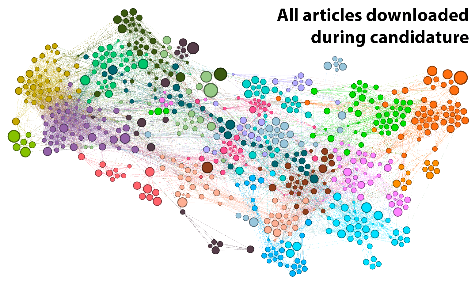
The resulting layout helps us to see the thematic structure of the collection. So too do the colours in the graph, which denote clusters of highly similar articles that have been identified by the community detection algorithm available in Gephi. The boundaries of these clusters are fuzzy to say the least: they shift slightly each time you run the algorithm, and the algorithm can be tuned to find smaller or larger clusters. And when you look closely, the clusters are not always what you want them to be. Nonetheless, they are useful. As the following analyses will show, these clusters provide (in most cases at least) highly sensible ways of grouping the 661 articles.
To explore the network interactively, and to see information about each individual article, try loading this page. (It might not work on all browsers.)
The practical end
Figure 2 shows the clusters located in the left-hand portion of the graph. Each cluster carries a label describing the subject matter of the corresponding articles. These labels are derived from my own synthesis of the article titles, their content (if I read them), and the most prominent topics (according to the topic model) in the cluster.
As an example, let’s look at the cluster that I’ve called Topic model evaluation. The top words of the two most prominent topics in this cluster are:
- topics, topic, words, documents, corpus, document, topic_models, topic_model, word, lda (33% of content)
- measure, measures, coherence, similarity, human, scores, distance, score, set, evaluation (16% of content)
The first of these topics is about topic modelling in general, while the second topic is about the evaluation of topic models through such methods as coherence metrics. Together, these topics account for nearly half of the content in the cluster. As we will see later in the analysis, the subject of topic model evaluation ended up being central to my thesis, and I cited many of the articles in this cluster.
A few steps removed from this cluster is one labelled Text mining and geoparsing. The top three topics in that cluster are:
- location, geographical, scope, names, event, toponym, locations, events, documents (24% of content)
- software, tools, system, project, engine, tool, processing, text_mining, systems, sources (17% of content)
- spatial, literary, gis, geographic, texts, space, geography, disease, density, historical (14% of content)
Most of the articles in this cluster relate to the mining of geographic information from text, and the various kinds of analyses (literary, historical, disease-related, etc.) that this enables. Piggybacking on these are an assortment of articles about text mining more generally, hence the more general label for the cluster. In a perfect world, these two parts of the cluster would be in separate clusters. Another run of the algorithm might have delivered such an outcome, but there’s only so much data-clustering roulette I am willing to play.
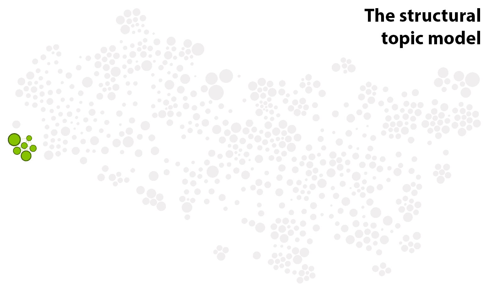
The common theme running through the clusters in Figure 2 is computer-driven textual analysis — primarily topic modelling, but also sentiment analysis and geo-textual analysis. Interestingly, the articles about topic modelling are spread across several clusters. As well as the cluster about topic model evaluation, there is a large cluster about LDA (sometimes called the ‘vanilla’ flavour of topic models) and the many variant models that have been derived from it; a cluster all about the visualisation of topic models (and text more generally); and a small cluster dedicated solely to the structural topic model (STM). The isolation of the STM is interesting, and probably reflects the efforts of the STM authors to develop a product that is targeted at social scientists rather than full-time computer nerds. Several articles that feature topic modelling are also present in the cluster about historical and cultural analyses.
Collectively, these seven clusters represent nearly all of the textual analysis methods that I reviewed in the course of my PhD, which ended up being a thoroughly methods-focussed investigation. As we will see shortly, there are a few more text analysis methods tucked away in the middle of the graph. For now, however, let’s jump to the other end of the network.
The theoretical end
Dancing around Figure 3 are the clusters comprising what you could call the theoretical end of the graph (that is, the end dominated by theoretical content, not the end, in theory). Until I fully embraced the practical and methodological nature of my thesis, I was concerned with finding a theoretical framework through which to analyse my data, which (as is detailed in other posts on this blog) pertained to the public discourse on coal seam gas development in Australia. One natural lens through which to investigate this phenomenon was the study of social movements. Another, which I considered briefly in the early stages of my candidature, was the communication of risk and the public understanding of science. Both of these fields have well-defined clusters in the network.
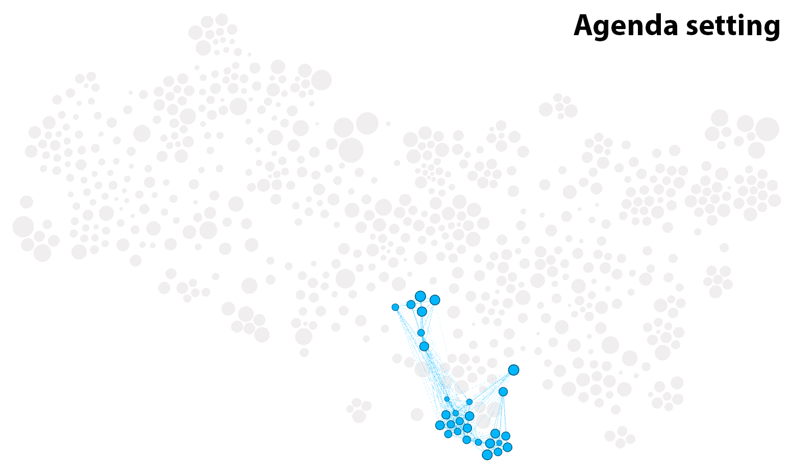
While frameworks like social movements and science communication provide lenses through which to study human action, they provide no guidance on how to understand text or language per se. For a textual analysis framework, I explored some of the usual suspects: framing and agenda setting on the one hand, and discourse analysis on the other. The layout of the graph suggests that discourse analysis (whatever you take that to be) has more in common with the study of social movements and risk communication, while framing is a more natural fit for the kinds of text mining techniques that I was exploring. The connection between the latter two is such that the cluster about framing is actually fused with a set of articles about computer-assisted content analysis.
Eventually, my thesis evolved to a point where none of these frameworks was especially important (although I am still excited by the prospect of using computational methods to operationalise concepts from framing, agenda-setting and discourse theory). One thing I couldn’t ignore, however, was the literature about coal seam gas development in Australia, since this is what defined my case study dataset. Articles about this subject account for nearly all of the cluster at the upper-right extremity of the graph. Interestingly, this CSG-focussed cluster is adjacent to the cluster about science and risk communication, suggesting that I would have found no shortage of theoretical connections with this field had I gone down that road.
The muddled middle
In the middle of the graph, as shown in Figure 4, are several clusters that are not very tightly defined in and of themselves, and that don’t have a lot to do with one another. They relate both to text analysis methods as well as broader empirical or theoretical frameworks.
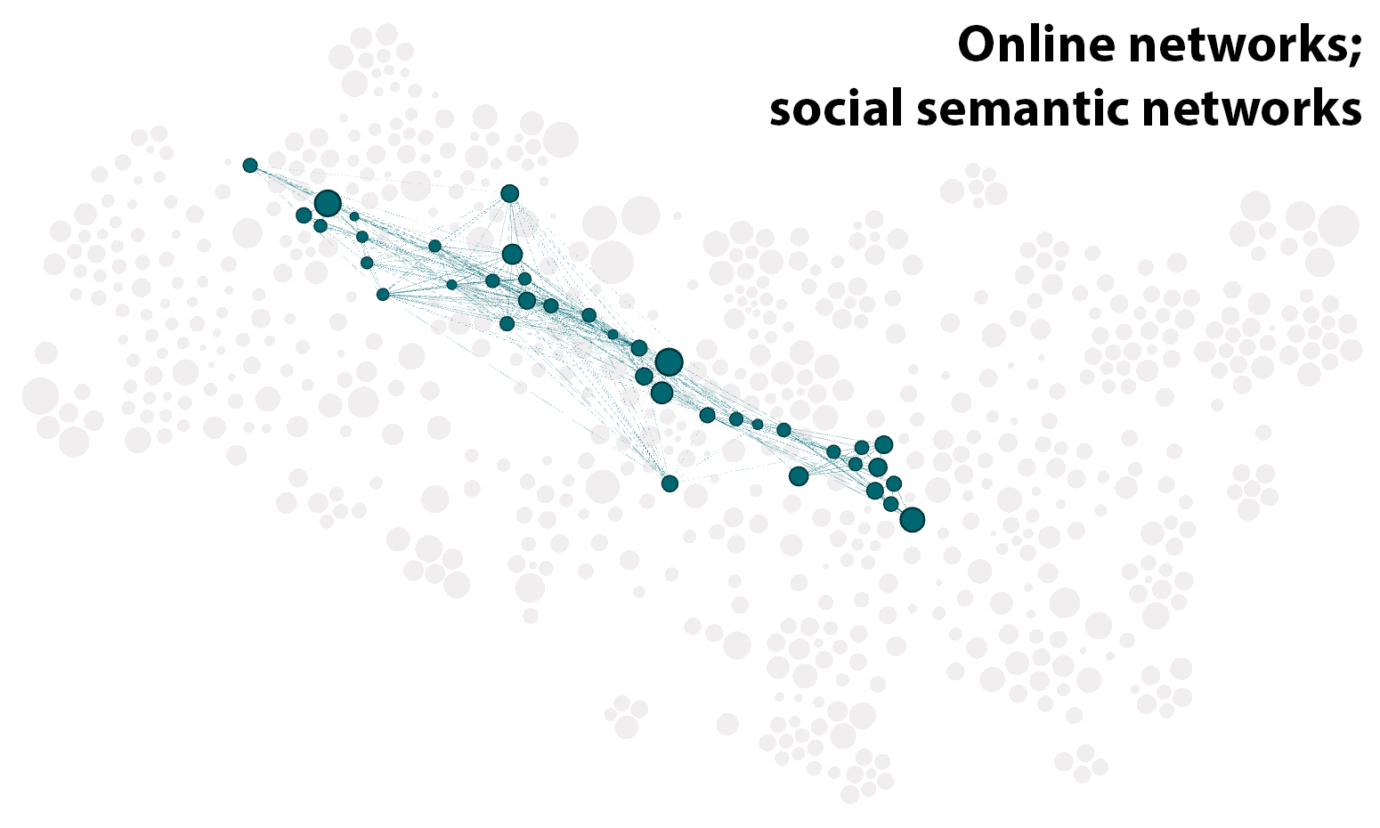
One of the more coherent of these clusters combines discourse analysis (largely of the ‘critical’ variety) with corpus linguistics, a text analysis approach that stands largely at odds with the topic modelling and text-mining approaches that I eventually settled on. Also of interest is the fusion of literature about memetics — an evolution-inspired approach to studying culture — with the literature about the implications of Big Data and computational methods for social science. Cutting across the entire mid-section of the graph is a cluster about networks, both the online kind found in the web and social media, and the more abstract kind defined by comparing the texts of social actors (much in the same manner as the present graph was constructed). Another cluster bundles latent semantic analysis (one of the precursors to LDA) with various other text analysis approaches that have the word ‘semantic’ in their name. Finally, there is a cluster defined primarily by the use of Leximancer, the text analysis program that I believed, right up until my confirmation milestone, I would be using in my thesis.
As we’ll see shortly, I engaged with the literature in the middle portion of this graph primarily in the first year or so of my candidature, and ultimately, not much of it found its way into my thesis.
Reading in cycles
To retrace my steps through the scholarly landscape defined by my collected reading materials, I extracted the ‘date modified’ property of the downloaded PDFs. For each article, this date records one of two things. If the most I did with an article after downloading it was read it, then the ‘date modified’ corresponds with when I downloaded it. Otherwise, this property records the last time I added highlights or comments to the PDF. Either way, this property records a time when I was interested in the article.
Figure 5 shows how I progressed through the network of articles, year by year. It’s worth noting that I started in October 2014, so the first frame of the animation only reflects a few months.
An alternate view of this same information is shown in Figure 6. The clusters are listed here as rows of the table, which I have tried to sort in a way that reflects their thematic similarities (the numbers preceding each label indicate the higher-order clusters to which the network clusters have been assigned). 3 For the articles downloaded or annotated in each year, the heatmap indicates the percentage of articles that came from each cluster.

Something that stands out in Figure 5 is that the overall number of articles that I engaged with varies wildly from year to year. The cyclic nature of my reading habits can be seen more clearly in Figure 7, which plots the number of articles that I downloaded or annotated each quarter.
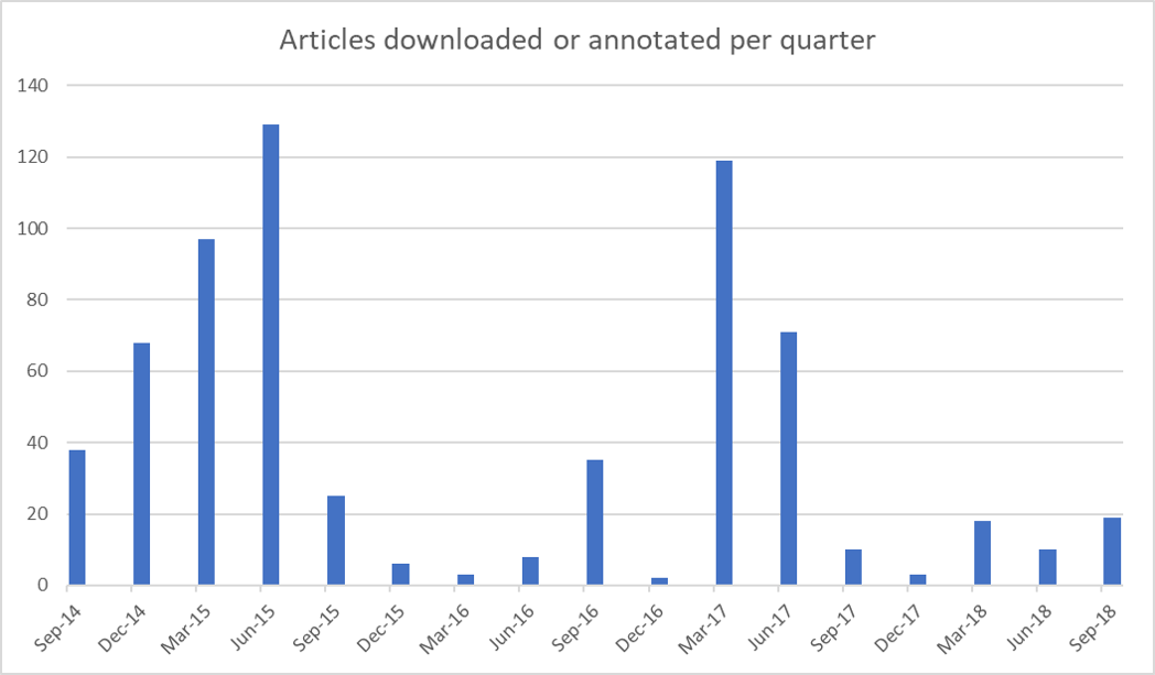
When I think about how my candidature progressed, the cyclical pattern in Figure 7 makes perfect sense. The year-and-a-bit leading up to my confirmation seminar in October 2015 was one of broad-spectrum exploration, as I expect is fairly common in the first year of a PhD. Starting with only a vague conception of what I was doing (I had only two firm starting points: text analytics and coal seam gas), I set off in any direction that looked like it might offer a credible framework and a viable project. Memetics, discourse theory, science communication, framing, agenda setting, corpus linguistics — I sampled them all. According to what I said at my confirmation seminar, my thesis was supposed to explore how the text analysis tool Leximancer could be used to operationalise frames and potentially other discourse features (I was particularly interested in the discourse theory of Laclau and Mouffe) within the study of public discourse.
In the year following my confirmation, I focussed instead on assembling and exploring my dataset, which ended up being a corpus of about 40,000 news articles and other texts about coal seam gas development in Australia. During this time I also explored the affordances of various analytical methods, particularly topic modelling and geoparsing–neither of which featured in my confirmation document, but both of which ended up being integral to my thesis. In other words, 2016 was primarily a period of doing, rather than reading. To the extent that I did read anything, it was mainly to assist my methodological experiments, hence the prominence of methodological topics in the third column of Figure 6. Many of my musings and explorations from this period are documented in previous posts on this blog.
2017 was my Year of Getting Real. As the chair of my mid-candidature review (which happened in September 2016) was at pains to point out, I did not yet have a thesis. All I had, really, was a dataset and proof that I could do some neat things with topic models, maps and networks. So I ventured once more into the Forest of Scholarly Delights, still with an open mind but with a tighter focus than in 2015. I emerged with a plan that married up my methodological experiments in topic modelling, geoparsing and network analysis with literature about social movements and agenda setting. Finally, I had a pathway to completion.
The right time to write
And then I started writing. The role of writing was a bone of contention in the middle portion of my candidature — not within my advisory team, who were supportive of my direction throughout, but within certain administrative cells of my school, for whom my thesis was something of a foreign object. It’s a tale as old as time: Arts School meets Communication School; Arts School marries Communication School (but assumes control of most of its affairs); Arts School doesn’t understand what Communication School does but tries to oversee its research anyhow; Communication School spends many nights on the couch before both parties learn how to move forward.
Less opaquely, there was disagreement about how much of my thesis should have been written by the half-way point of my candidature. In my estimation, and the estimation of most other people I talked to, the answer to this question was ‘not much’. The reason is that if research involves the collection and analysis of empirical data, it’s very hard to write anything of lasting value until the data collection and analysis have been done. Even the methodology and literature review are liable to be moving targets until these tasks are completed. Even the research questions themselves might need adjustment in light of what emerges. Yes, you should have reviewed literature and devised a methodology and formulated a research question well before this point, but there is little point in investing serious time in writing the corresponding chapters until you know that your methods, theories and data all hold up in practice.
That was my take, anyway. The higher-ups in the school whose background was in literature and art history saw it differently. (Yes, our School of Journalism and Communication really did merge with the School of English, Media Studies and Art History.) In research paradigms where the closest thing to ‘data’ is an artist’s oeuvre or a canon of books or films; where ‘data collection’ means going to the library; and where ‘data analysis’ means furrowing your brow very deeply, there is less of a reason to defer the task of writing solid chapters. Indeed, if you haven’t written and discarded a thesis or two by this stage, you’re probably not even trying. This was the lens through which my 10-page progress summary and 22,000 words of blog posts was assessed at mid-candidature and found to be lacking. Thankfully, my advisors and I were able to make the case that I was on track despite not having written half of a thesis, and so I pressed on with the tasks that I felt were most urgent.
I still maintain that in my case, writing chapters prior to my mid-candidature milestone would have been a waste of time. And yet, I must also admit that when I did start to write what I imagined would be my actual thesis, the bounds of the project began to shift before my eyes. Mostly, they became much narrower (the bounds, that is; not my eyes, although that probably happened too). Like probably every PhD candidate before me, I had fallen into the trap of casting my net too widely. Only when I tried to actually write my newly devised chapters did I realise that each one deserved to be a thesis on its own.
At the same time, parts of my thesis that I thought would be only minor subsections began to mutate into whole chapters. My account of how I derived a topic model from my dataset about coal seam gas became a chapter about how any topic model might be derived. My discussion of how I interpreted my topic model became a chapter about the interpretation of topic models in general. And instead of using my topic model to analyse the social context of the discourse on coal seam gas, I wrote a chapter demonstrating how contextual information finds its way into a topic model even when you don’t want it to. To cap it off, I devised a unifying framework that tied these new chapters together as if they were part of a master-plan all along. Voila! I had a thesis.
The final cut
As is evident from Figure 6 (above) and Figure 8 (below), my submitted thesis covered only a few narrow bands of the full spectrum of topics that I explored over the course of my candidature. These two figures shows that my thesis was ultimately about topic modelling methodology, coal seam gas, and little else.
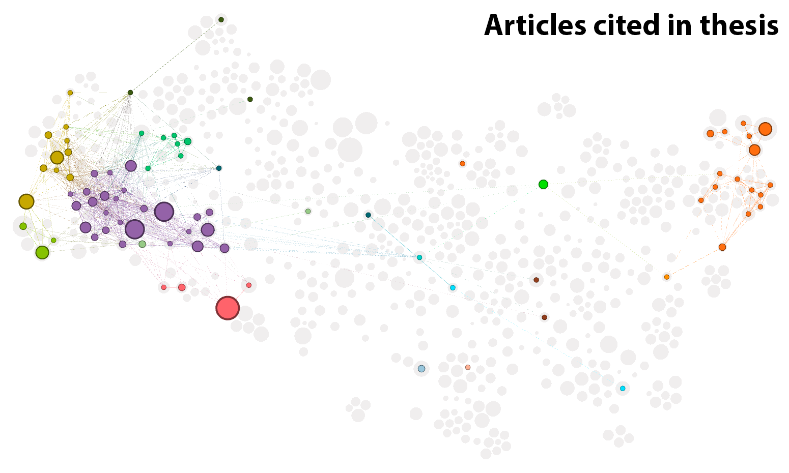
I’m not quite sure how to feel about Figure 8, which puts into stark relief just how much literature I engaged with but ultimately did not use in my thesis. This image is hardly a badge of honour, as it suggests that my journey could have been more focussed and disciplined than it was. But nor can I feel embarrassed about it, because none of the journey feels like wasted effort. I have no desire to trade in the perspective I gained by taking this path, even if I could get back the hours, days and weeks that I spent reading things that weren’t essential to my thesis. For a researcher, it’s all just grist to the mill, and you never know when the additional knowledge will come in handy. Besides, how can you truly know your topic, if your topic is all you know?
Another reason I can’t feel embarrassed about my seemingly inefficient journey is that I suspect it is in fact pretty normal, or at least not unusual, among PhDs, and probably many other research projects as well. If and when I get around to sharing my workflow for this analysis, perhaps other researchers can apply it to their own projects and compare the results.
Normal or not, that’s my PhD story. Hopefully, it won’t need an addendum to account for revisions once the examination report comes in. As cathartic as this retrospective has been, there is only so much reliving of my thesis that I want to do.
UPDATE, 18 April 2019: Finally, the examination reports came in. You can call me Dr Veitch!
Notes:
- Perverse? Consider the reward system that emphasises the number of publications an academic can churn out above all else–above the quality and importance of the research itself, and certainly above the quality of the teaching (the thing students pay many thousands of dollars for) that the academic is expected to do between churning out papers and attending meetings. Consider also the business model of academic publishing, whereby research that is funded by the public and reviewed for free by researchers is sold back to universities at an exorbitant fee, and is all but inaccessible to the public. Exploitative? Consider the business model, particularly common in scientific research, of using PhD students not only as a source of cheap or free labour but also as a source of the journal papers that the supervising academic is under pressure to produce. Or consider the standard practice of outsourcing teaching to overworked, underpaid casual staff–often the same PhD students who are already being underpaid for their work in the lab. It’s not hard to find more examples, whether by talking to an academic or googling a few keywords. ↩
- For completeness, I should note that I filtered out the weakest edges (those with a weight of less than 0.3) before running the layout algorithm, and then filtered out even more to make the screenshot less cluttered. ↩
- Instead of using the network clustering algorithm to do this (which would be sensible, but not practical given the way in which it is implemented in Gephi), I have used a more traditional hierarchical clustering method — namely, agglomerative hierarchical clustering — based on the prominence of topics within each cluster. ↩
Congratulations Dr Veitch.
I have enjoyed your OnceWasACreek blog for a few years, because it coincided with some of my own interests – OpenStreetMap, local history, once lived in Auchenflower, wannabe blogger.
Today I found some new articles and a reference to your seenanotherway blog.
Surfing along I found this very meta article, and the wonderful footnote.
Congratulations again,
John Sinclair