Don’t feel like reading? Fine, skip to the pictures!
My last post explored the spatial and temporal dynamics of news production, looking at how the intensity of news coverage about coal seam gas varied over time across regional newspapers. In this post, I will look instead at the geographic content of news coverage: which places do news articles about coal seam gas discuss, and how has the geographic focus changed over time?
Coal seam gas development in Australia has become a matter of national interest, at least insofar as it has a place (albeit a shrinking one) on the federal political agenda, and has featured (albeit to varying degrees) in news coverage and public debate across the country. But it’s hard to talk sensibly about coal seam gas — whether you are talking about the industry itself, its social and environmental impacts, or how the community has responded to it — without grounding the discussion in specific locations. From one gas field to another, the structures and dynamics of underground systems vary just as much as the social systems on the surface. I am convinced that any meaningful analysis of CSG-related matters must be highly sensitive to geographic context. (My very first PhD-related post on this blog, an analysis of hyperlinks on CSG-related web pages, pointed to the same conclusion.)
Most news stories about coal seam gas are ultimately about some place or another (or several), whether it be the field where the gas is produced, the power plant where it is used, the port from which it is exported, the environment or community affected, or the place where people gather to protest or blockade. Keeping track of which places are mentioned in the news could provide one way of tracking how the public discourse about coal seam gas develops. And the most logical way to present and explore this kind of information is with a map. In theory, every place mentioned in an article could be translated to a dot on a map. Mapping all of the dots from all of the articles should reveal the geographical extent and focus of news about coal seam gas.
Why do this? (Other than because I can, and it might be fun?) Firstly, because I’m still a little sketchy about how coal seam gas development and its attendant controversies have moved around the country over the last decade or two. I’m reasonably familiar with what has transpired in Queensland, but much less so with the situation in New South Wales. As for the other states, where there has been much less industry activity, I know virtually nothing about where and when coal seam gas has been discussed. So a map (especially one that can show time as well) of CSG-related news would provide a handy reference for understanding both the national and local geographic dimensions of the issue.
The other reason to map the news in this manner is that it may provide a way to both generate and answer interesting questions about the news landscape (or the public discourse more broadly) around coal seam gas — and this is, after all, what my PhD needs to do.
From names in text to dots on a map
By what means can we translate mentions of places in text to time-coded dots on a map? Reading the articles and tagging the place names manually is not an option — not when the articles number in the tens of thousands. Thankfully, there are computer-assisted methods of identifying place names and other named entities in text: they fall under the banner of named entity recognition, or NER. Knime, the rather wonderful data mining software that has so far saved me from learning how to use R, has a module that does exactly this, drawing on the named entity recogniser developed by the Stanford Natural Language Processing Group.
One option was to let the Stanford NER tagger find all of the named places in the dataset. To map these places, however, I would have to assign geographical coordinates to each place name. So I also needed a GIS layer of named places in Australia — and preferably not just towns, but also other localities such as homesteads (after which gas fields are typically named), water bodies, forests, valleys, and so on. I found such a layer in the form of the official Gazetteer of Australia 2012, which collates all of the place names gazetted by each state and territory. Upon acquiring the Gazetteer, however, I started to realise some of the complications in achieving my goal.
The first complication is that many place names apply to more than one location. There’s a Texas in Queensland and a Brisbane in California. Keeping within Australia, the name Gladstone might refer to the industrial port city of Queensland or the small rural town in South Australia, to give but one example. Looking in the Gazetter of Australia, you will find 374,619 records, but only 236,709 unique names. Matching a place name in a news article to a spot on a map is therefore not always straightforward: it often requires contextual information. I’m sure a computer algorithm could be (and probably has been) programmed to disambiguate a location in text by checking what other places it is mentioned with, but that is outside of my current grasp, so I resigned myself to some amount of manual intervention.
The second complication is that place names do not just apply to places. Often, they are named after people. So when the name Warren appears in a text, how is the Stanford NER algorithm to know whether it refers to a person or to the town of the same name in central New Souh Wales? I’m sure the algorithm employs some tricks for achieving this, but the results it produced when I tested it were far from perfect. My solution to this complication was to exclude any common person names, unless I could be confident that the majority of occurrences referred to a known place — the prime example being Tara, a small town in Queensland that was the focus of a lot of protests against coal seam gas.
Given that I had at my disposal a list of virtually every named place in Australia, it occurred to me that I might not need to use any fancy NER algorithm at all. Instead, why not just tag all instances of the gazetted names? The main downside of this approach, apart from it being computationally intensive (imagine checking every one of 26,863 articles against 236,709 names!), is that it did not take advantage of the Stanford NER tagger’s (admittedly imperfect) capability to distinguish people from places. The advantage, however, is that it is comprehensive. My test on a sample of 1000 articles showed that the Stanford NER tagger missed many important places, and identified many overseas locations that were irrelevant. There is probably a clever way to combine the capabilities of the two approaches (indeed, the Stanford NER webpage suggests that there is) but, being eager to just get on with things, I chose to just go with the simple gazette-based tagging method.
The outcome was a sobering reminder that using automated techniques does not always absolve you of drudge-work: sometimes, it just replaces one kind of drudgery with another, even if it ultimately allows you to do things that would not be feasible with manual methods. The initial tagging process — that is, throwing the entire gazette at all 26,863 articles — identified 7,110 unique names. My first bit of drudge-work was to manually scan through all of these and mark the ones that I wanted to retain — that is, the names that I felt were unambiguously place names, and that were likely used to refer to only one place. I performed this task carefully on all but the 4,000 or so names that featured in only three or fewer articles, which I scanned cursorily and mostly ignored. The result was a list of 1,542 names. I managed to match all but 220 of these to unique locations in the Gazetteer. These remaining places I had to disambiguate manually, a process which involved displaying all of the locations with matching names in ArcMap, inspecting some of their occurrences in the original texts, and making a call about which location each name referred to. Many names still proved to be ambiguous, in which case I removed them from the list. I also omitted many places that could not sensibly be shown as single points, such as rivers and highways. Finally, I ended up with a list of 1,448 names that I felt could be reliably attributed to a unique location.
The big picture
The image below shows the spatial distribution of the locations identified in all of the articles from 1996 to 2015. Hovering over the image (or touching it if you are using a mobile device) will remove the locations so you can see where the gas wells are.
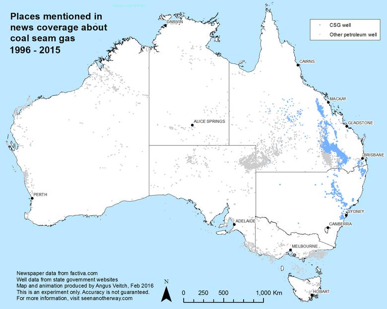
Figure 1. All of the locations mentioned in my dataset of news stories about coal seam gas, from 1996 to 2015. Hover over the image to see the distribution of petroleum and gas wells.
If the named entity tagging process has gone to plan, we might expect to see some correlation between the distribution of gas wells and the places mentioned in the news. On this measure, the results do not look terrible, but they include plenty of places that are located far from any coal seam gas wells. Some such places are located near other kinds of petroleum and gas wells, suggesting that some of the articles in my dataset discuss conventional gas production as well as coal seam gas. I’m guessing that these are mostly business-related stories that talk about the petroleum industry or energy sector more broadly.
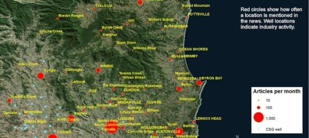
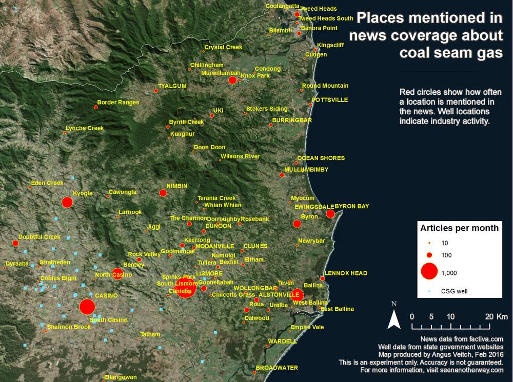
The results look much better when the locations are sized to reflect the number of articles that mention them, as in Figure 2. In this and many subsequent figures, I filtered out the places mentioned by fewer than 10 articles.
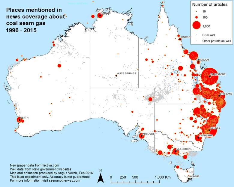
Figure 2. The same locations as in Figure 1, but sized to indicate the number of articles mentioning each location.
Now we can see a clear focus on the gas fields of Queensland and New South Wales, as well as Gladstone (where the LNG produced from CSG is being shipped from) and the capital cities. Interestingly though, the coverage of the gas fields is far from consistent. Some of the fields in central Queensland, for instance, have received minimal coverage compared with those in southern Queensland and New South Wales. Here is a good example of a regionally specific relationship between gas production and community response. The gas fields of central Queensland are generally a long way from populated areas or high-value farmland. They also tend to produce a relatively small volume of groundwater, which in the southern Queensland fields has been the major trigger for environmental concern.
The prominence of the capital cities among the data, while not surprising, does warrant some investigation. It’s possible that capital cities would be prominent in news about any issue, simply because of their economic and political importance.
Comparing content and production
A logical question to ask in light of the previous post is whether locations mentioned in the news align with the locations of the sources printing the news. For the most part, this seems to be the case, at least insofar as far as Figure 3 is a guide. Hovering over this image will help you to see the LGA-based publication data more clearly. When interpreting this image, remember that some newspapers are distributed across much broader areas than the gas fields, resulting in large shaded areas with minimal CSG-related news coverage. More interesting are areas that are lightly shaded but have received extensive news coverage. Probably, these areas point to gaps in the dataset (such as in the area around Roma, whose local newspaper is not catalogued by Factiva) or errors in my assignments of LGAs to the newspapers. By and large, though, I find the alignment of these two datasets, which were compiled using entirely different processes, to be rather encouraging.
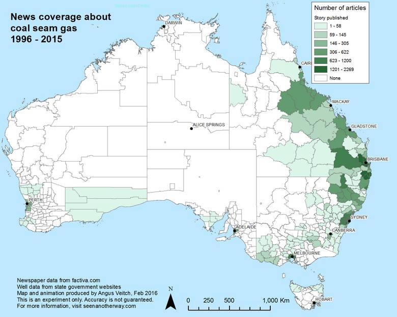
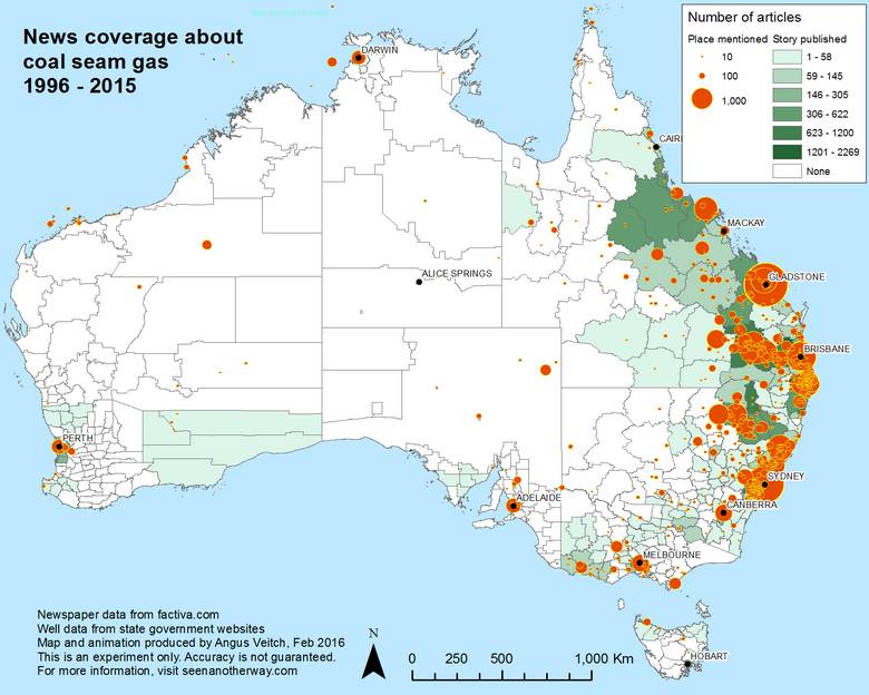
Figure 3. The locations mentioned in news coverage shown over the areas where news stories are published by regional newspapers. (See the previous post for more information.)
The long tail
The list of the most mentioned locations, shown below in Figure 4, is also encouraging. Among them are several hotspots of CSG development and/or community unrest, such as Lismore, Gloucester, Narrabri and Pilliga in New South Wales, and Chinchilla, Dalby and Tara in Queensland. Bowen shouldn’t have been included, as it is mostly a count of references to the Bowen Basin, and not the town of Bowen. Accidental inclusions like this are reminders that what you see in this post is not a precise science. Not every bit of data is accurate. But the broader patterns that emerge, are, I believe, sufficiently robust to tell us something worthwhile.
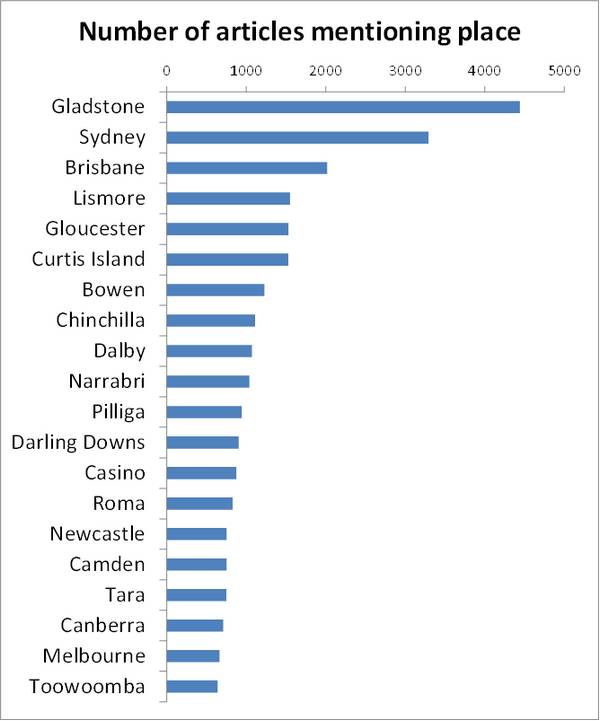
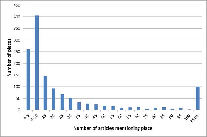
Even among the top 20 places, you can see a big difference between the frequency of those at the top and bottom of the list. This relationship also holds for the dataset as a whole, which exhibits what you could call a very long-tailed distribution. And keep in mind that the tail of this dataset has already been shortened, as I filtered out most of the the 4,000 places that were mentioned fewer than four times.
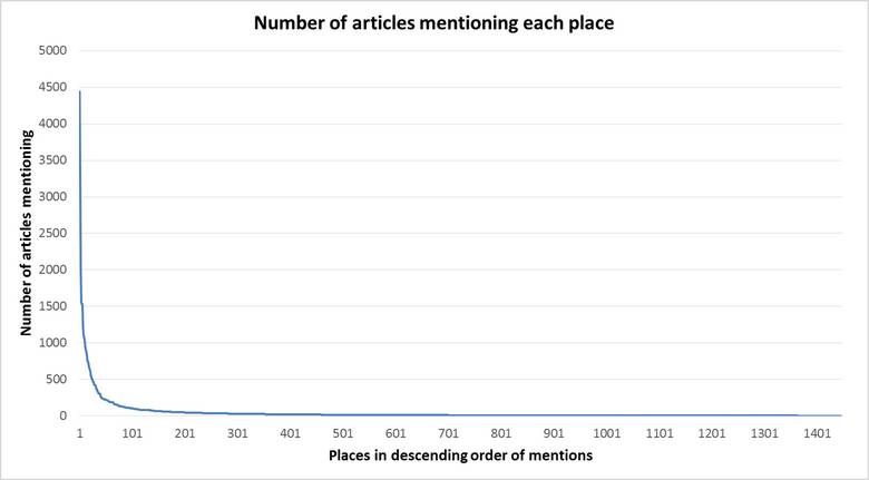
The histogram below in Figure 6 demonstrates the same point. More than 650 places feature in just 10 articles or fewer, while only 100 places feature in more than 100 articles. Just 24 places appear in more than 500 articles. The long-tailed shape of this distribution begs the question of how many places are worth including in an analysis, given that so many will only appear a few times. But I’ll park that question for the moment, and perhaps return to it in a subsequent post.
A geographic history of CSG news
Regardless of how many places are worth analysing, one thing that is clear from Figure 2 and the other analyses above is that the places receiving the most attention in the news are, unsurprisingly, in Queensland and New South Wales. The remainder of this post will focus on just these two states.
Let’s bring time into the analysis, and look at how the geographic coverage of news about coal seam gas has shifted. Figure 7 shows the coverage for the period 1996-2007. This was what we could call the Domestic Bliss era of the CSG industry, when production served only the local energy market, and no-one seemed to worry about it very much. As far as I know, all commercial production in this era was in Queensland except for the Camden gas project run by Sydney Gas (later AGL) beginning in 2001. Figure 7 shows that there was only a modest amount of news coverage in this period, and most of it related to the gas fields in Queensland. A small handful of stories covered the Lismore and Camden areas.
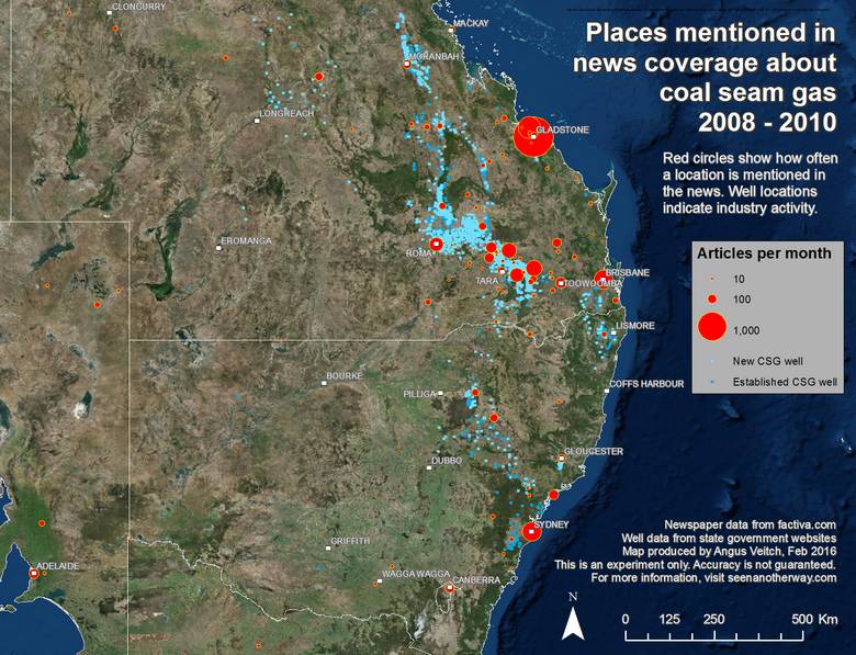
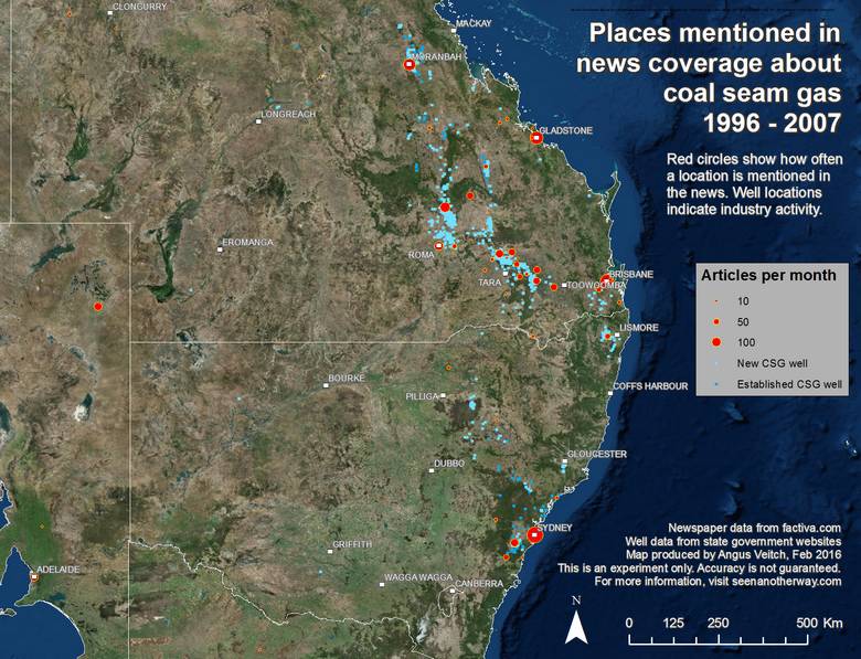
Figure 7. Hovering over this image reveals the shift in news coverage from the period 1996-2007 to 2008-10.
Hovering over Figure 7 (or looking at Figure 8 below) will reveal the corresponding data for the period from 2008 to the end of 2010. This era could be called the Race to Gladstone. This was when Queensland’s gas industry became turbo-charged by the newly announced CSG-LNG projects which would take gas from the Bowen and Surat basins, pipe it to Gladstone and ship it to Asia as liquefied natural gas. Accordingly, the coverage of the newly developed Surat Basin gas fields (roughly between Roma and Toowoomba) increases, and Gladstone becomes the most mentioned location. Meanwhile, gas well activity (mostly exploration rather than commercial production) continues in New South Wales around Lismore, Pilliga and Gloucester, but the news coverage of these areas remains sparse.
Hovering over Figure 8 shows the transition to the 2011-2013 period, when New South Wales Catches the Bug (or optionally, when The Shit Really Hits the Fan). The coverage of Queensland locations intensifies in this period as well, but nothing like the coverage of locations below the border. From a virtual standing start, the still prospective gas fields around Lismore, the Pilliga Forest and Gloucester came to generate as much news in this period as the booming commercial production areas in Queensland. If you look closely, you can see that virtually no new gas wells were drilled in New South Wales in this period — such was the effect of the community opposition to the industry in that state.
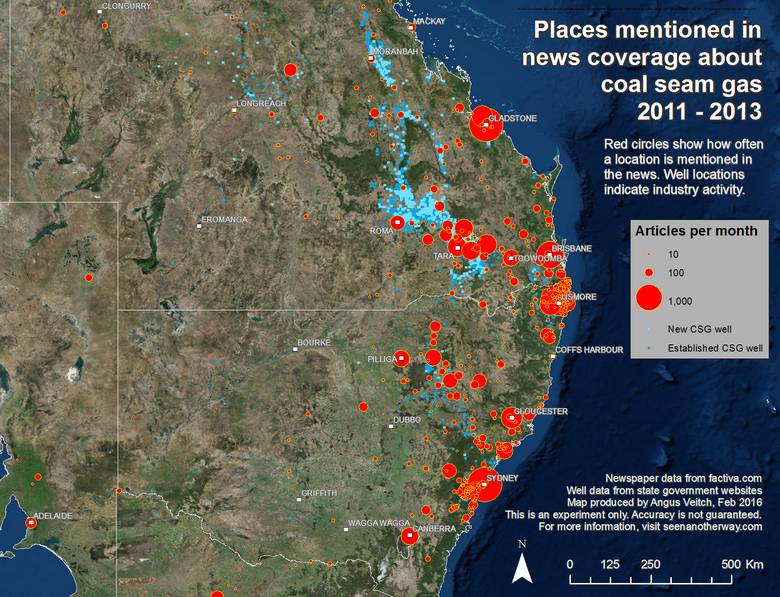
Figure 8. Hovering over this image reveals the shift in news coverage from the period 2008-10 to 2011-13.
What was behind the remarkable turn of events in New South Wales in 2011? I intend to tease this out in future investigations, but I suspect that the single biggest factor was the Lock the Gate Alliance, which began its action in Queensland in late 2010 but soon turned its attention to New South Wales, where it found the perfect set of social and political conditions for mobilising the community against coal seam gas.
I’m not sure what to call the final period from 2014-2015. Keeping in mind that it is a year shorter than the previous two periods, and thus not strictly comparable, there is one clear pattern: coverage of Queensland locations diminishes drastically, while coverage of New South Wales locations diminishes only slightly, and in some areas increases.
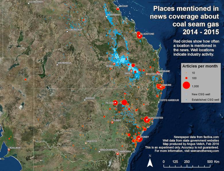
Figure 9. Hovering over this image reveals the shift in news coverage from the period 2011-13 to 2014-15.
I’m talking purely anecdotally here, but the pattern evident in Figure 9 squares with my impression that by 2014-15, things in Queensland had started to settle down. The big fights had been had, and the new reality had been established, with whatever uneasy truces that might involve. On top of that, the falling oil price meant that the big CSG-LNG projects were no longer going ahead as fast as planned.
In early 2016, just outside the range of this data, the big fights are winding down in New South Wales as well, but with the community protesters emerging as the victors. Metgasco accepted an offer in December 2015 from the New South Wales Government to buy back their exploration licences in the Northern Rivers region. And in February 2016, AGL announced that it was pulling out of its CSG projects in New South Wales.
Let’s get animated
The images above reveal some of the broad spatio-temporal trends in the news coverage about coal seam gas, but they do not show what is happening at a finer temporal scale. To see these finer dynamics, I animated the data using monthly timesteps. Still ignoring the rest of Australia, I made one video showing Queensland and one showing New South Wales. I began at 2000 because there simply isn’t much to see before then.
These aren’t the easiest visualisations to follow, I’ll admit. But they do convey the overall dynamics of the data, and if you pause the playback and use the slider, you can quickly jump to any month you wish.
These animations allow us to unpack in more detail each of the periods discussed above. Leading up to 2007, they show sparse but increasing coverage of Queensland’s gas fields. Then in July 2007, when the first CSG-LNG project was announced, Gladstone suddenly lights up, and thereafter pulsates like a beacon.
The early years in New South Wales are pretty quiet, with little news activity outside of Sydney and Camden until around 2006, when we start to see increasing — though still modest — coverage around Camden, Lismore and Gunnedah. Gloucester starts to light up in 2008.
The period from 2008 to 2010 sees increasing activity in both states, though considerably more so in Queensland. But the real action begins when both states erupt in early 2011 — and interestingly, this seems to start in February in New South Wales, and in March in Queensland. This eruption is geographically widespread, rather than focussed on any one region, suggesting that it was the result of a shift in awareness about the topic as a whole, rather than a site-specific event.
I can’t see much of note in the final two years of the animations, except for the huge spike in coverage across New South Wales in March 2015. This is surely is due to the flurry of campaigning in the lead-up to the New South Wales state election that was held on 28 March.
Let’s get local
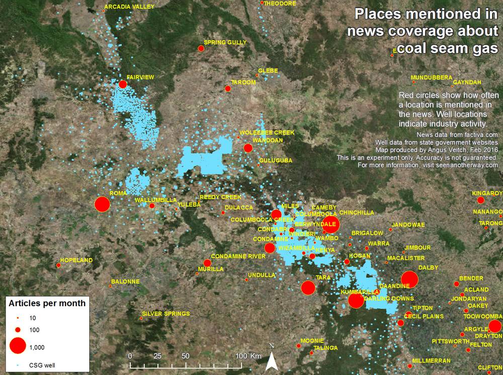
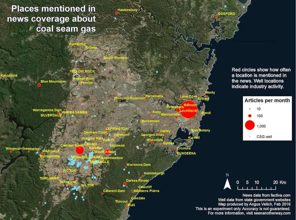
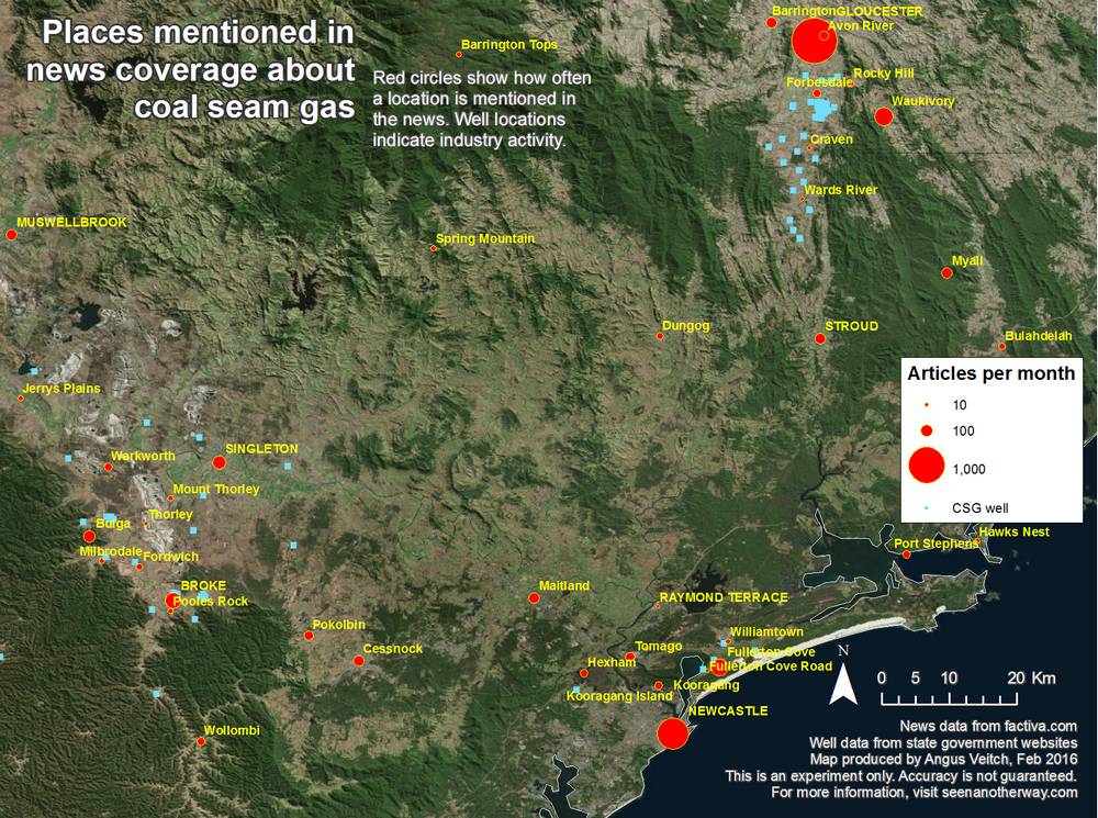
As I mentioned in an earlier section that you probably skipped, when it came to identifying and counting the place names in my text data, I chose to be comprehensive rather than focussing on just a few prominent places. I did this with no particular goal other than to see the full extent of what could be done with the data. One thing that this extra effort bought me is the ability to map the news coverage on a local scale. What this ability is worth, I don’t really know; but nonetheless, below in Figures 10-13 are some examples showing how localised the results can get. These examples show the gas fields in Queensland’s Surat Basin, and around Camden, Gloucester and Lismore in New South Wales.
If you have local knowledge of these areas, I’d love to hear any thoughts you might have about these images. My feeling is that they are difficult to interpret without knowing more about the context in which the locations are mentioned. For example, I noticed that some locations refer to the senders’ addresses of letters to the editor, rather than places of concern. Some analysis of this context, perhaps allowing the locations to be categorised or filtered, could produce some interesting analyses.
Comparing News Corp and Fairfax papers
If I were to single out a shortcoming in the preceding analyses, it is that I was not selective when it came to choosing which news sources to map. I just used the entire dataset of news articles that I collected from Factiva, which threw together all kinds of newspapers (metropolitan, regional, local, national) along with other sources such as The Coversation, The Monthy, the ABC and a few newswire services. Not entirely meaningless, but not easy to draw clear conclusions from, either. I think the real value in this mapping textual data like this will lie in being able to compare how different sources have covered an issue.
To get a taste of what might be possible when the sources are selected more deliberately, I set up a pilot analysis. I selected what I hoped were comparable sets of newspapers from the two main publishers in Australia: News Corp and Fairfax Media. I picked their major Sydney, Melbourne, and national newspapers, namely the Australian, the Herald Sun and the Daily Telegraph from News Corp; and the Australian Financial Review, the Age and the Sydney Morning Herald from Fairfax. I would have included Brisbane papers as well, but Fairfax has no counterpart to News Corp’s Courier-mail (Fairfax does publish the Brisbane Times online, but this title is not in Factiva’s catalogue).
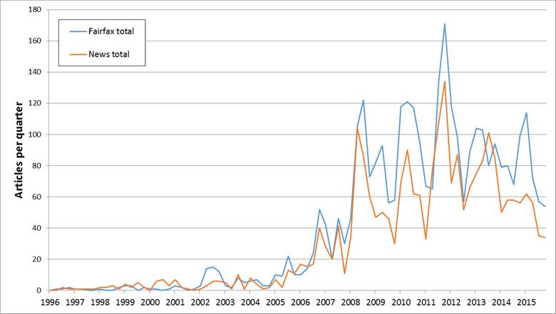
Before looking at the resulting map, we should check how the two sets of papers compare in terms of the number of CSG-related articles published. It turns out that the Fairfax papers published considerably more, with a total of 3,284 articles against News Corp’s 2,442. Figure 14 shows the results by quarter.
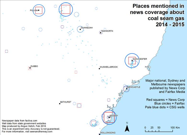
Perhaps the newspapers that I selected are not strictly comparable. Or perhaps the Fairfax newspapers took a greater interest in coal seam gas. In any case, the geographical results can still be informative if we keep the underlying numbers in mind. Figure 15 shows how the geographical coverage differs between the Fairfax and News Corp papers for the entire 1996-2015 period. The blue circles represent the Fairfax papers, and the red squares represent News Corp. The coverage of a location is equal if the circle and square have exactly the same width.
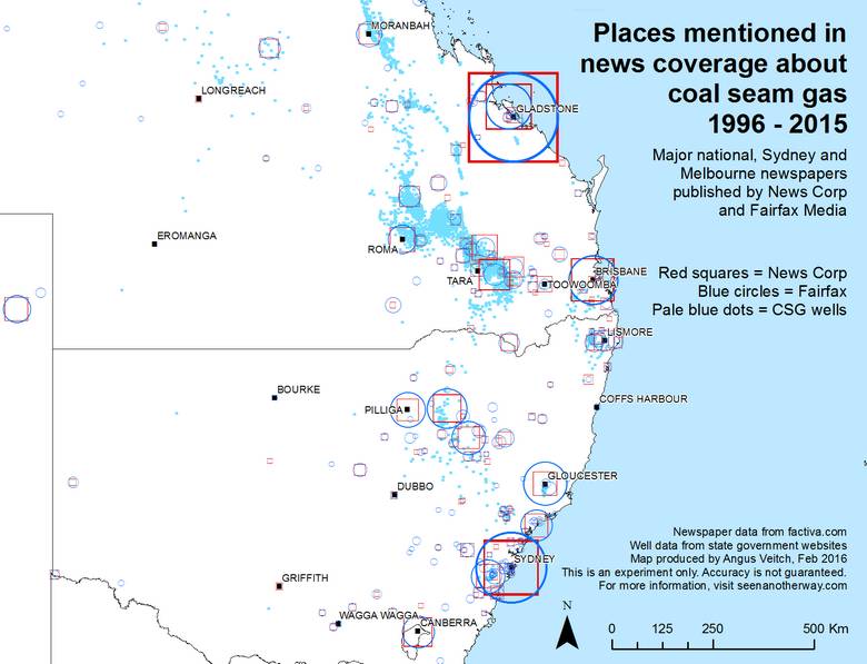
The most striking features of Figure 15 are the near-identically sized markers around Gladstone (the large one is Gladstone, the smaller one is Curtis Island) and Sydney. These locations received equal amounts of coverage from both publishers. Other locations have received less equal coverage, the clearest example being Gloucester, which was mentioned much more frequently by the Fairfax papers.
Figures 16 and 17 examine some more specific times and regions. We can see that in the period 2008-10, News Corp published considerably more articles than Fairfax mentioning Chinchilla, Dalby, Toowoomba and (though it is not labelled here) the Darling Downs region. Fairfax, meanwhile, provided equal or greater coverage of places like Roma, St George and the gas fields. A possible explanation for News Corp’s stronger focus on Queensland towns is that News Corp publishes Queensland’s main newspaper, the Courier-mail, which, although it is not in this dataset, might nevertheless influence the content of News Corp’s southern and national papers.
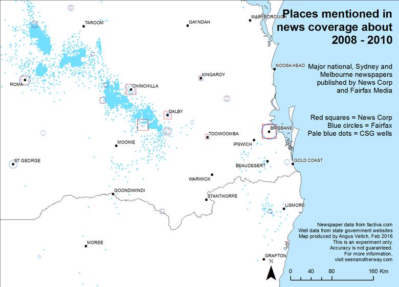
Figure 17 shows that the Fairfax papers provided more coverage than News Corp of locations in regional New South Wales in the period 2014-15. I know of no obvious explanation for this, but I wonder if it might reflect the political interests and alignments of the two publishers. The stories about coal seam gas around Pilliga and Gloucester in this period would have been nearly all about community opposition to the industry. Might News Corp have been less inclined to report on this opposition, given its conservative orientation? This is really a wild guess, but if true, it could make for a very interesting case study.
The wrap
That’s it, I’m mapped out. I hope you learned something from these visualisations. I certainly did, although I’d caution against making too much of the specifics of these results. As I mentioned already, a precise analysis using these methods must begin with a more careful selection of news sources.
There’s a lot more that could be done with this geographically coded text data, and more that could be unpacked in what I’ve shown here. With any luck I’ll get around to doing some of this in a follow-up post. But don’t be surprised if instead I choose to move on to examining other data — such as the text I’ve collected from websites, which I have so far ignored — or different analytical methods — such as those targeted to the thematic content of the text, which is what my PhD is supposed to be about. When a finger is pointing up to the sky, only a fool looks at the finger.
So where did that last quote come from, or is it an Angus original?????? Fascinating, but exhausting story!
Well spotted! It’s from Amelie, which I happened to watch the night before finishing the post. There’s also a Zen saying along the same lines… something to do with mistaking a finger pointing at the moon for the moon itself.