Your thesis has been deposited.
Is this how four years of toil was supposed to end? Not with a bang, but with a weird sentence from my university’s electronic submission system? In any case, this confirmation message gave me a chuckle and taught me one new thing that could be done to a thesis. A PhD is full of surprises, right till the end.
But to speak of the end could be premature, because more than two months after submission, one thing that my thesis hasn’t been yet is examined. Or if it has been, the examination reports are yet to be deposited back into the collective consciousness of my grad school.
The lack of any news about my thesis is hardly keeping me up at night, but it does make what I am about to do in this post a little awkward. Following Socrates, some people would argue that an unexamined thesis is not worth reliving. At the very least, Socrates might have cautioned against saying too much about a PhD experience that might not yet be over. Well, too bad: I’m throwing that caution to the wind, because what follows is a detailed retrospective of my PhD candidature.
Before anyone starts salivating at the prospect of reading sordid details about about existential crises, cruel supervisors or laboratory disasters, let me be clear that what follows is not a psychodrama or a cautionary tale. Rather, I plan to retrace the scholastic journey that I took through my PhD candidature, primarily by examining what I read, and when.
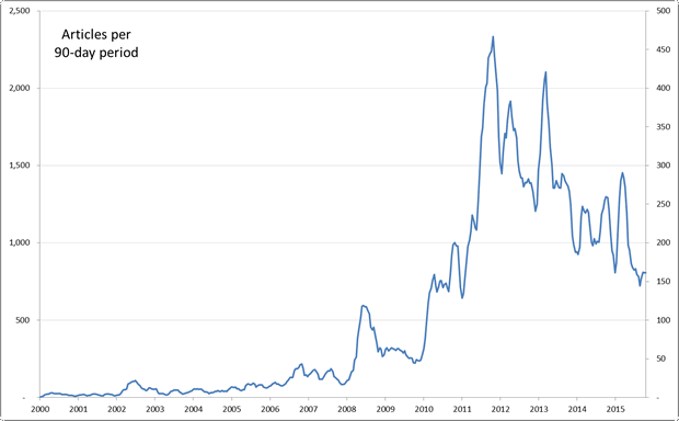
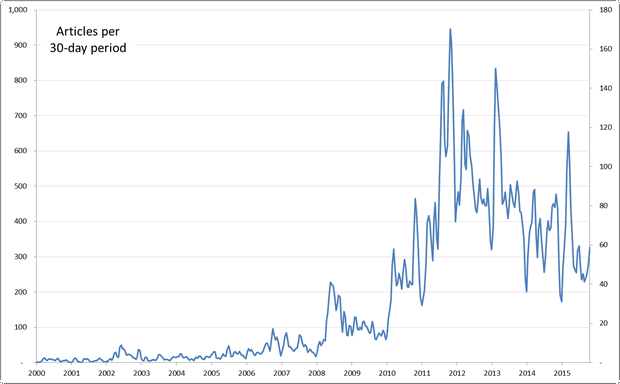
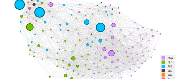
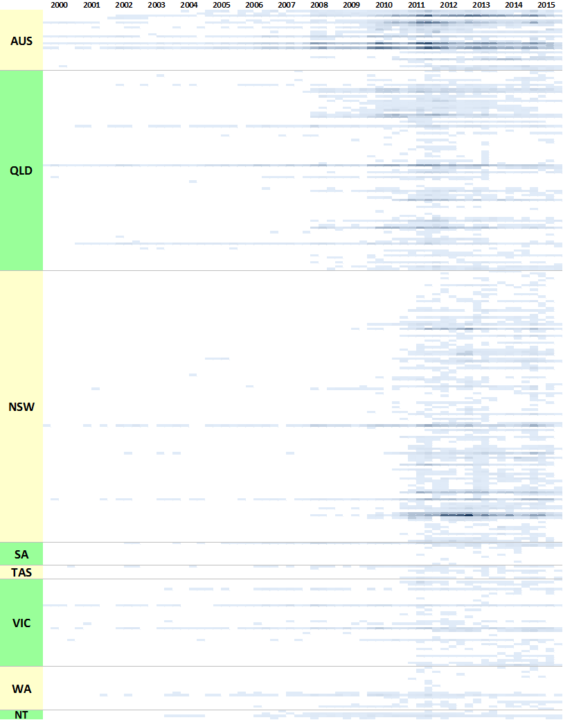
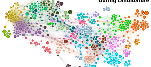
I know, I know: that sounds really boring. But bear with me, because this post is anything but a literature review. This is a data-driven, animated-GIF-laden, deep-dive into the PhD Experience. Continue reading A thesis relived: using text analytics to map a PhD journey