The rise of the machines
Over the past several years, I’ve stumbled into two fields of research which, although differing in their subject matter, are united by the recent entrance of computational methods into domains that were previously dominated by manual modes of analysis.
One of these two fields is computational social science. This is the broad category into which my all-but-examined PhD thesis, and most of the posts on this blog, could be placed. Of course, my work, which focuses on the application of text analytics to communication studies, occupies a tiny niche within this larger field, which encompasses the use of all kinds of computational methods to the study of social phenomena, including network science and social simulations using agent-based models.
The other field to which I can claim some degree of membership is the digital humanities. This tag is one way to describe what I do on my other blog, in which I have drawn on digitised maps and newspapers to produce visualisations that explore the history of a suburban environment. History is just one field of the humanities that has been opened up to new possibilities through the extensive digitisation of source materials. Scholars of literature have joined the party as well, while those operating in the GLAM sector, consisting of galleries, libraries, and museums, can now use digital platforms to manage and share their collections.
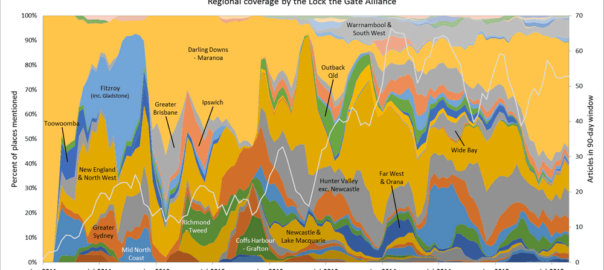
Though often lumped together in the same faculty (or indeed the same school at my last university), the humanities and social sciences don’t generally have a lot to do with one another. They do, however, have commonalities that lend themselves to similar computational methods. One is the study of text, often in large quantities. Within the social sciences, communication scholars analyse (st)reams of news texts and social media feeds; qualitative sociologists often amass hours of interview transcripts; political scientists analyse speeches and parliamentary transcripts. In the humanities, scholars of history and literature now have at their disposal huge archives of digitised novels, journals, newspapers, and government records. Of course, there is nothing compelling scholars in these fields to analyse all of the available data at once. They are free to sample or cherry-pick as they please. But any scholar wishing to work with large textual datasets in their totality can hardly afford to ignore computational tools like topic models, named entity extraction, sentiment analysis, and domain-specific dictionaries such as LIWC.
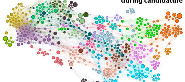
Another analytical method that is applicable within both the social sciences and humanities is the study of networks. Sociologists and historians have long used networks to represent and analyse social ties. More recently, social media platforms have hard-wired the logic of networks into social relationships, explicitly representing all of us as nodes tied to one another by virtue of our acquaintances, interactions, and browsing histories. Accordingly, it is becoming increasingly difficult to study social phenomena without invoking the concept of networks, if not also the science of network analysis. By no means restricted to real-world phenomena, network analysis techniques are equally applicable to fictitious societies, whether those in Game of Thrones or the plays of Shakespeare. As with the analysis of text, network analysis doesn’t have to be done with a computer; but as the size of a network grows, so too does the need for computational tools.
Besides an interest in certain computational methods, something else that the digital humanities and computational social sciences have in common is that many of the scholars trying to break into these fields are doing so without any training in data science or computer programming. This is especially the case in the humanities, where traditionally, quantitative methods have been virtually taboo. In some branches of the social sciences, quantitative methods are well established, but these are more likely to take the form of spreadsheets and statistical tests rather than machine learning and network analyses.
(Of course, the story is very different for those researchers entering these fields from the other direction, such as the many physicists, mathematicians and computer scientists who have somehow claimed the territory of computational social science. What these researchers lack, although many of them seem not to realise it, is any training in understanding the actual substance of what they are studying.)
The bottom line is that for many researchers, embracing the new opportunities presented by the digital humanities and computational social sciences means learning skills that are totally outside of their disciplinary training. At a minimum, researchers hoping to use computational methods in these fields will need to learn how to calculate statistics and use spreadsheets, and perhaps also how to use network visualisation software like Gephi or text-cleaning software like OpenRefine. Increasingly though, getting your hands dirty in computational social science or the computational end of the digital humanities means learning something far worse — something that is commonly denoted by a certain four-letter word. Continue reading Coding without code: Knime as a tool for digital humanities and computational social science →