Topic models: a Pandora’s Black Box for social scientists
Probabilistic topic modelling is an improbable gift from the field of machine learning to the social sciences and humanities. Just as social scientists began to confront the avalanche of textual data erupting from the internet, and historians and literary scholars started to wonder what they might do with newly digitised archives of books and newspapers, data scientists unveiled a family of algorithms that could distil huge collections of texts into insightful lists of words, each indexed precisely back to the individual texts, all in less time than it takes to write a job ad for a research assistant. Since David Blei and colleagues published their seminal paper on latent Dirichlet allocation (the most basic and still the most widely used topic modelling technique) in 2003, topic models have been put to use in the analysis of everything from news and social media through to political speeches and 19th century fiction.
Grateful for receiving such a thoughtful gift from a field that had previously expressed little interest or affection, social scientists have returned the favour by uncovering all the ways in which machine learning algorithms can reproduce and reinforce existing biases and inequalities in social systems. While these two fields have remained on speaking terms, it’s fair to say that their relationships status is complicated.
Even topic models turned out to be as much a Pandora’s Box as a silver bullet for social scientists hoping to tame Big Text. In helping to solve one problem, topic models created another. This problem, in a word, is choice. Rather than providing a single, authoritative way in which to interpret and code a given textual dataset, topic models present the user with a landscape of possibilities from which to choose. This landscape is defined in part by the model parameters that the user must set. As well as the number of topics to include in the model, these parameters include values that reflect prior assumptions about how documents and topics are composed (these parameters are known as alpha and beta in LDA). 1 Each unique combination of these parameters will result in a different (even if subtly different) set of topics, which in turn could lead to different analytical pathways and conclusions. To make matters worse, merely varying the ‘random seed’ value that initiates a topic modelling algorithm can lead to substantively different results.
Far from narrowing down the number of possible schemas with which to code and analyse a text, topic models can therefore present the user with a bewildering array of possibilities from which to choose. Rather than lending a stamp of authority or objectivity to a textual analysis, topic models leave social scientists in the familiar position of having to justify the selection of one model of reality over another. But whereas a social scientist would ordinarily be able to explain in detail the logic and assumptions that led them to choose their analytical framework, the average user of a topic model will have only a vague understanding of how their model came into being. Even if the mathematics of topics models are well understood by their creators, topic models will always remain something of a ‘black box’ to many end-users.
This state of affairs is incompatible with any research setting that demands a high degree of rigour, transparency and repeatability in textual analyses. 2 If social scientists are to use topic models in such settings, they need some way to justify their selection of one possible classification scheme over the many others that a topic modelling algorithm could produce, 3 and to account for the analytical opportunities foregone in doing so.
If you’ve ever tried to interpret even a single set of topic model outputs, you’ll know that this is a big ask. Each run of a topic modelling algorithm produces maybe dozens of topics (the exact number is set by the user), each of which in turn consists of dozens (or maybe even hundreds) of relevant words whose collective interpretation constitutes the ‘meaning’ of the topic. Some topics present an obvious interpretation. Some can be interpreted only with the benefit of domain expertise, cross-referencing with original texts, and perhaps even some creative licence. Some topics are distinct in their meaning, while others overlap with each other, or vary only in subtle or mysterious ways. Some topics are just junk.
If making sense of a single topic model 4 is a complex task, comparing one model with another is doubly so. Comparing many models at a time is positively Herculean. How, then, is anyone supposed to compare and evaluate dozens of candidate models sampled from all over the configuration space?
Topic model evaluation and the limits of automation
Thankfully, there are ways of comparing and evaluating topics models that don’t involve the messy business of human interpretation. Before topic models were even invented, data scientists had been evaluating machine learning outputs by comparing their predictions or classifications with training data that was ‘held out’ from the model training process. Applied to topic models, this approach amounted to assessing the probability of the held out documents being generated from the modelled topics.
However, close inspection showed that such measures of statistical performance did not correlate well with human judgements of quality in topic models. In particular, the models that performed best on traditional statistical measures tended not to include the topics that human users judged to be the most coherent and meaningful. In light of these shortcomings, researchers developed new statistical metrics that more directly measured topic properties such as coherence (insofar as this can be quantified) and exclusivity. (Roughly speaking, coherence measures the extent to which the terms in a topic are thematically related to one another, while exclusivity measures the extent to which the terms in a topic are exclusive to that topic.)
Automated methods for measuring qualities such as topic coherence and exclusivity provide a principled and efficient way to narrow down the pool of candidate models, or even to select a single preferred model (here is one example of how this might be done). These methods therefore go a long way towards solving the problem of topic model selection for social scientists. However, such methods do not measure all of the qualities that a user might value in a topic model. In particular, measures of generic attributes such as coherence can reveal nothing about how well a given model captures subject matter that is of particular interest to the user. Conceivably, a model could perform only moderately well in terms of overall coherence, yet be the superior choice for describing the issues that are the focus of an investigation. In such cases, an evaluation process that relies heavily on automated methods could guide the user towards a sub-optimal model. Furthermore, even if the user is content to select a model on the grounds of generic measures alone, doing so will leave the user no wiser about the substantive differences between the selected model and the discarded candidates. A user who has conducted only a quantitative evaluation of candidate models will be unable to comment on how the analysis might have been influenced by the choice of a different model.
There are various reasons, then, why a social scientist should want to use more than just quantitative metrics to select a topic model from a pool of candidates. There are aspects of topic models that can only be determined through manual interpretation and comparison. However, manually interpreting and comparing more than a few models at a time is a daunting task. It is a task that, by its very nature, cannot be automated. However, as I will show below, it is one that can be massively streamlined with the help of some relatively simple data clustering, sorting and visualisation techniques.
Methods for qualitatively evaluating topic models
When I encountered the problem of topic model variability during the course of my PhD, I was surprised to find that there was little in the way of tools or methods available to assist the qualitative comparison of topics models. I decided to cobble together some of my own, and soon discovered that I had a whole new chapter for my thesis.
The methods I came up with reflected the state of my theoretical knowledge and data manipulation skills at the time — which is to say, they were relatively unsophisticated, at least in comparison with the state of the art. They used nothing more than standard similarity measures and clustering techniques in combination with strategic sorting and formatting tables, which — I’ll just come out and say it — I did in Excel, after performing all of the underlying data manipulation in Knime.
I came to embrace the simplicity of these methods as part of their strength. After all, their intended audience was not data scientists but social scientists with limited technical knowledge about topic models. But if helping social scientists (rather than satisfying my thesis examiners) was the goal, then the virtues of the methods counted for naught unless social scientists could easily use or reproduce them. Unfortunately, my skills at the time did not extend to making programmable data visualisations or user-friendly Knime workflows, so I did not manage to package the methods into a form that others could easily use.
In recent weeks, I have finally found myself with both the time and the ability to share these methods in a more useful way. I have packaged them together in a Knime workflow with the working title of TopicKR, which I hope to expand to a more comprehensive workbench for creating and evaluating topic models in Knime. As I have written previously, Knime is a viable alternative to R or Python for many analytical tasks, and is particularly well suited to users who are not used to working in a code-based environment such as R. (Incidentally, the workflow does invoke R to produce the formatted outputs, but does so in a way that is essentially invisible to the user.)
You can download the TopicKR workflow from the Knime Hub. To use it, you will have to install Knime and activate its R integration capabilities. This post about my TweetKollidR workflow, which uses Knime and R in a similar way, contains some discussion about the installation process. At present, the workflow includes components that help you generate and qualitatively compare a pool of candidate topic models from text that has already been preprocessed (that is, has had stop words removed, case standardised, and so on). Before too long, I hope to expand the workflow to include text preprocessing and quantitative model evaluation tasks.
In the remainder of the post, I will demonstrate two methods for qualitatively comparing topic models. The first method facilitates the side-by-side comparison of two individual topic models. As the example will show, qualitative pairwise comparisons of topic models can be useful for assessing the descriptive granularity provided by different numbers of topics. The second method is designed to assist the comparison of more than two models at once, and is especially useful for comparing several different parameter configurations while controlling for the variability associated with model initialisation (that is, different random seed values).
The examples below feature outputs taken straight from the TopicKR workflow. The topic models in the examples were generated by the workflow from a dataset of tweets about the lockdown in Melbourne, Australia (where I live) enforced in response to a Covid-19 outbreak. In the sections below, I’ll say a bit more about this dataset and briefly review some previous related work, before proceeding to demonstrate the methods.
That case study dataset: tweets about Victoria’s lockdown
The topic models I will compare in the examples that follow are derived from a dataset of about 160,000 tweets (of which about 34,000 are unique) about the lockdown measures that the Victorian Government imposed in July 2020 to suppress a wave of Covid-19 infections. I’ve been collecting this dataset for several weeks now by querying Twitter’s Search API on a daily basis using my own TweetKollidR workflow, which was the subject of my last post. The dataset for this analysis only includes tweets posted between the 1st and 30th of September 2020.
I’ve chosen to use this dataset largely for the sake of continuity with other recent posts. Ordinarily, I would not use Twitter data to demonstrate a topic modelling method, as the short length and repetitious nature of twitter texts pose their own set of challenges for topic models. Until now, I’ve not attempted to create a topic model from tweets, but I’ve heard and read that non-specialist topic modelling techniques such as LDA (which I use here) usually struggle to produce satisfactory results from Twitter data. This is unsurprising, given that many tweets have just a few terms in them once stop words have been removed, while LDA was designed to work with documents containing dozens of terms each. However, in a previous experiment, I have succeeded in creating meaningful ‘geotopics’ from nothing but the place names mentioned in news articles. Given that most articles included just a few names, this experiment suggested to me that LDA might be able to handle sparse data after all.
The other reason why Twitter data might produce poor topic models is the huge amount of redundancy in the content. Including lots of documents with duplicated text is a sure way to create a poor topic model, since you end up with topics that reflect the duplicated texts rather than the more general underlying themes. Most of the duplication in Twitter datasets is due to retweets, which are easy to remove. However, removing retweets often leaves a lot of tweets that are essentially identical, ensuring that the resulting topic model will still suck. This is why I included an extra layer of duplicate detection in the TweetKollidR. Removing tweets that are officially categorised as retweets reduced the size of my lockdown dataset from just under 160,000 tweets to just under 42,000. Removing those that were essentially duplicates regardless of their retweet status brought the dataset down to just over 38,000 tweets. In my experience, 4,000 duplicated documents is more than enough to corrupt a topic model. Will removing them be enough to produce a decent model of the lockdown dataset? As we’ll see, the answer is sort of yes, but sort of no.
I should also mention that the case study dataset was pre-processed as per the steps described in my post about the TweetKollidR workflow. This included the removal of stopwords and terms that were very common or very rare, the tagging of ngrams, named entities and (some) hashtags, and the ‘soft’ standardisation of plurals and other case variants.
Related work
As I mentioned earlier, I developed the methods described below because when I wrote my PhD thesis, I found very little in the way of published methods or tools that could support qualitative comparisons of topic models. A skim of the literature as it stands today suggests that not much has changed on this front. (Which is good news for me, as I’m only now taking steps to formally publish these methods.)
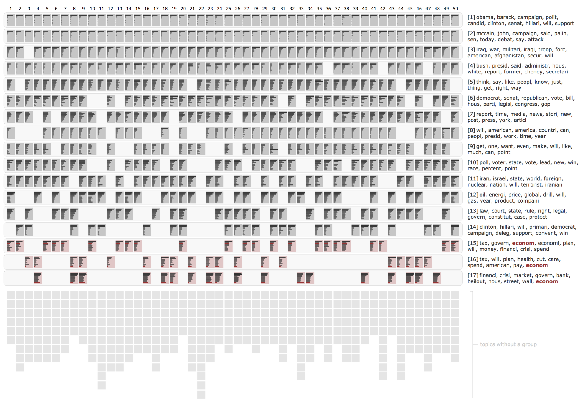
Several tools have been produced to assist the exploration of individual topic models, including Termite and LDAvis. These tools, however, are not much help for comparing multiple models. Two tools stand out for enabling a more comparative approach. InPhO Topic Explorer visualises the distribution of topics across similar documents. While its visualisation shows one model at a time, multiple instances can be compared side by side to see how models with different numbers of topics carve up the same documents. TopicCheck, on the other hand, is explicitly designed to compare the qualitative content of lots of different models at once. As shown in Figure 1, it features a highly sophisticated visualisation that shows how as many as 50 different models represent a series of synthesised topics derived by clustering topics from across all of the models.
Although I wasn’t aware of TopicCheck when I developed my own multi-model comparison method, the underlying logic is very similar, as are some of the computational techniques. TopicCheck is truly an impressive project, and one that could be developed in even more fruitful directions. Sadly, however, it suffers from one fatal flow, which is that — at least as far as I can tell — no implementation of it is publicly available.
Next to the sophistication of TopicCheck, my own visualisations look like kindergarten stuff. However, sophistication is not the same thing as utility, and for some users and applications, simple is better. And besides, my methods are now publicly accessible, whereas TopicCheck is apparently not.
Comparing two topic models
My method for qualitatively comparing two topic models is summarised in Figure 2. It works by restricting the comparison of two topic models to pairs of topics that are semantically similar, and sorting these paired topics to highlight specific aspects of alignment between the models.
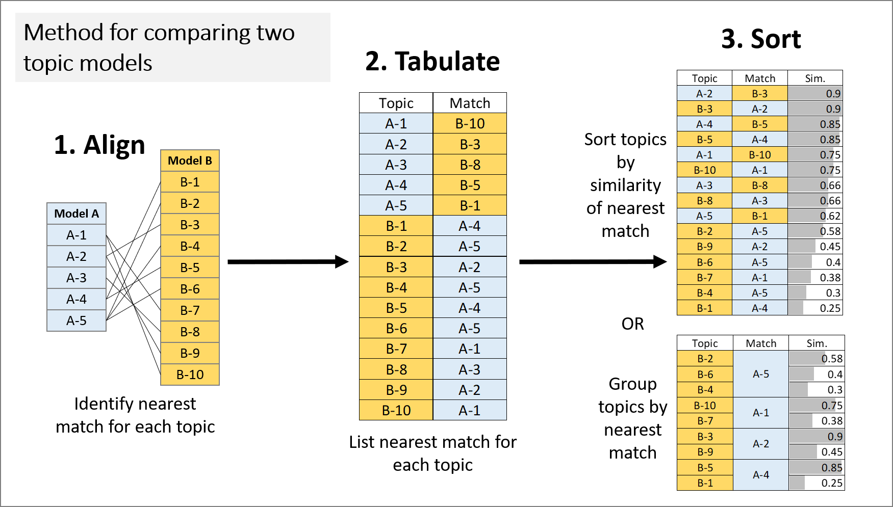
Fundamental to this method is the concept of topic model alignment. The alignment of two models is defined by identifying, for every topic in the two models, the most similar topic in the opposite model. 5 The similarity between topics can be calculated in one of two ways. One option is to compare topics on the basis of the weights or ranks of their constituent terms. The other is to compare how the topics are allocated across a set of documents (typically the dataset from which the model was derived). Both approaches are well represented in the topic modelling literature. In this example, I have chosen to define similarity in terms of document allocations. I compared the document allocations for each pair of topics using cosine similarity, which is a commonly used similarity metric for comparing vector representations of text.
As per Figure 2, the aligned topics can be sorted in two ways: by degree of similarity, and by nearest match. Sorting by similarity reveals the areas of greatest convergence and divergence between the models, as it places closely paired topics at the top of the table, and unique or poorly matched topics at the bottom. Grouping by nearest match reveals one-to-many relationships between the models, as it groups the topics in the first column according to their shared matches in the second column. This view highlights instances where the two models use different numbers of topics to represent similar subject matter.
In the examples that follow, I will show how each of these views can be used to inform the selection of the number of topics, and to see how similar two identically configured models really are.
Comparing models with different numbers of topics
Of all the choices to be made in selecting a topic model, the number of topics is likely to be the most consequential. Broadly speaking, the number of topics determines the level of granularity with which the model classifies the content in the texts from which it is derived. The number of topics that is desired in a given situation is likely to depend on several factors. One consideration is the effect that the number of topics has on measurable topic attributes such as coherence and exclusivity. Models with too many topics are likely to include topics that are incoherent or redundant.
More fundamentally, however, the number of topics should reflect the desired level of detail in the proposed analysis. If the aim is to produce a high-level description of a dataset, then a small number of topics may be appropriate. If a high level of detail is required, then more topics may be necessary. This is a judgement that can only be made by a human (more specifically, the human doing the analysis). But that doesn’t meant that it can’t be supported by a computationally informed presentation of the relevant information.
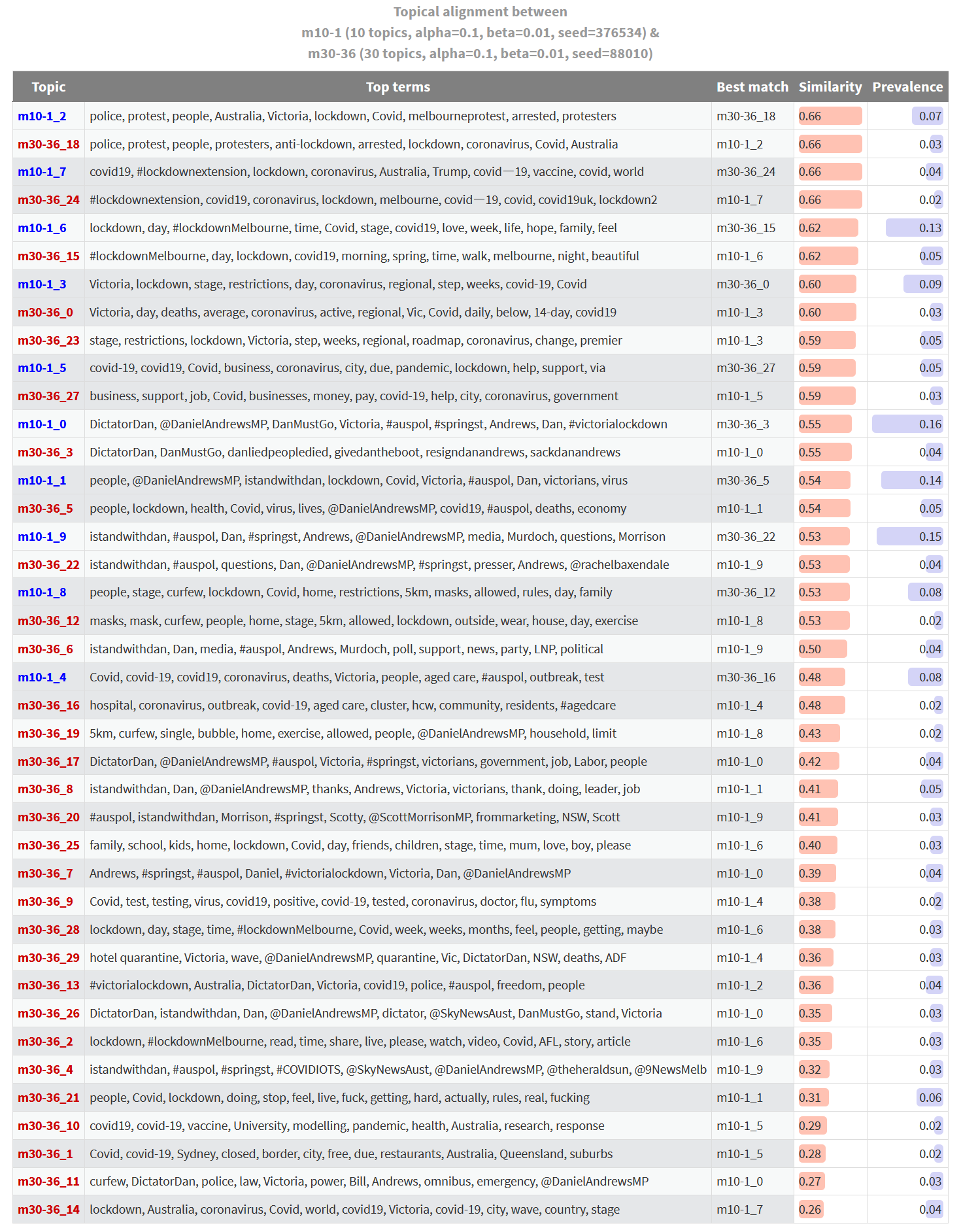
Figure 3 is one such presentation. It shows what I call the ‘one-to-many alignment’ between two topic models. The two models being compared are both derived from the lockdown tweets, but one contains 10 topics, while the other contains 30 topics. Each topic listed on the left is the nearest between-model match of the corresponding topics on the right. The degree of similarity between the aligned topics is shown in the right-most column. To say it another way, for each topic listed on the right, there is no more similar topic in the other model than the one listed on the left.
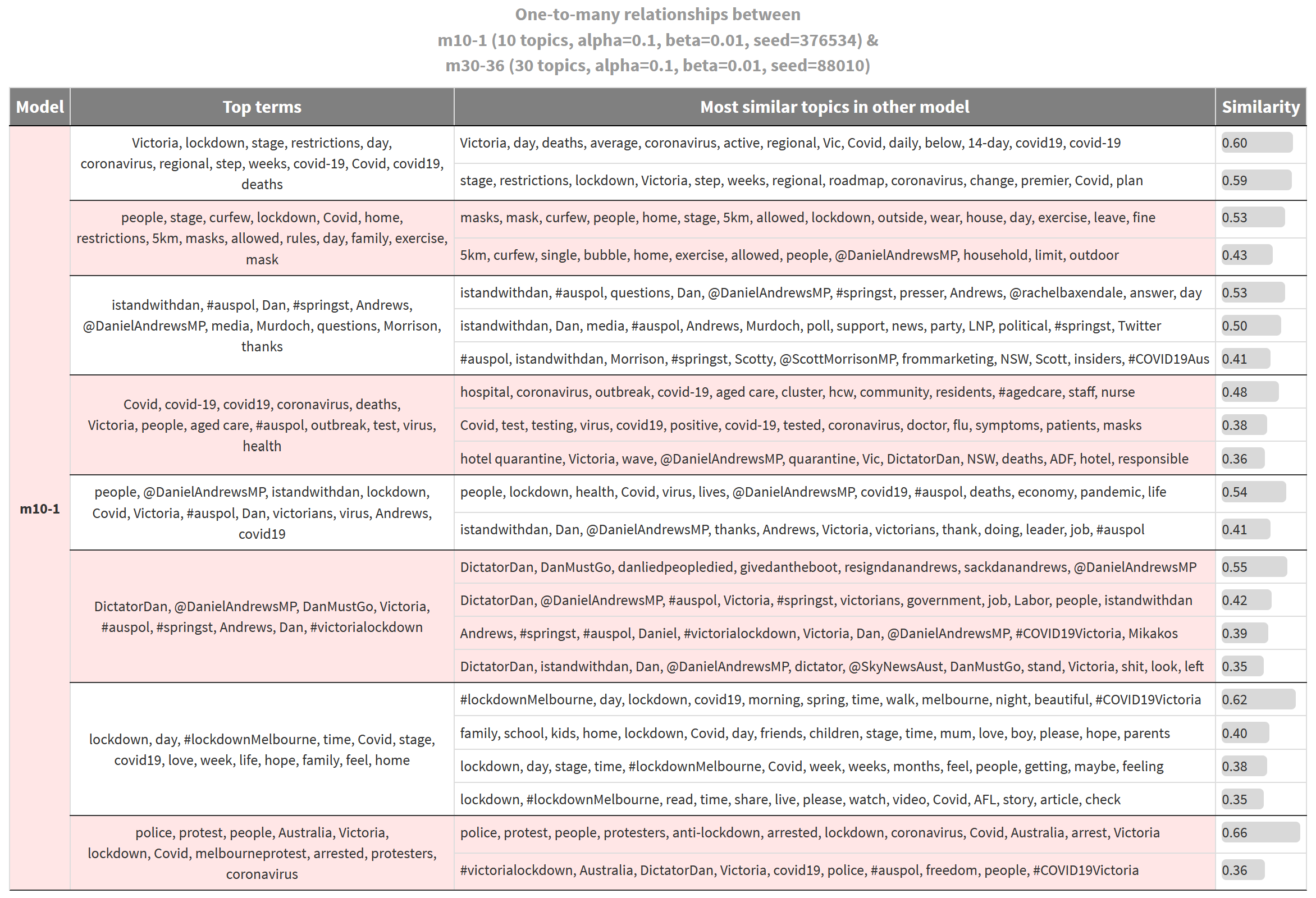
In effect, this table shows the areas of subject matter for which one model provides more detail than the other. In this case, all of the topics on the left are from the 10-topic model, while those on the right are from the 30-topic model. 6 So the table gives us an indication of how much extra granularity the additional ten topics have provided. 7
For example, the first topic listed in Figure 3, whose top three terms are Victoria, lockdown and stage, could be interpreted as being about the lockdown restrictions in Victoria. The terms step and weeks suggest that the topic incorporates discussion about the timetable for the lockdown measures, while the term deaths suggests that it might also relate to the impacts that the measures are trying to avoid. This topic belongs to the 10-topic model. The corresponding rows in the adjacent column show us that this topic aligns with two topics in the 30-topics model. The first of these topics, which includes the terms day, daily, deaths, average, and 14-day, is about the daily statistics that drive decision-making around the restrictions. The second topic, which includes the terms restrictions, step, roadmap and plan, is about the restrictions themselves and the roadmap for lifting them.
To take another example, the fourth topic listed in the left-hand side of Figure 3, which includes terms like aged care, outbreak, test, and health, is not easy to interpret, other than to say that it is about outbreaks of Covid-19, potentially in aged care settings. This topic aligns (albeit weakly in two cases) with three topics from the 30-topic model, all of which lend themselves to clearer and more specific interpretations. The first is about outbreaks in aged care and other community settings; the second is about Covid-19 testing; and the third is about the debate around the hotel quarantine system, the failure of which triggered the second wave of infections.
If the thematic distinctions offered by the topics on the right are useful ones, then this is an argument for using a model with more than 10 topics. To determine whether 30 topics is too many or not enough, you could repeat the process by comparing models with 20 and 30 topics, or 30 and 50. If at any point the distinctions afforded by additional topics are of no consequence to your analysis, you can conclude that there is probably no need for a more detailed model.
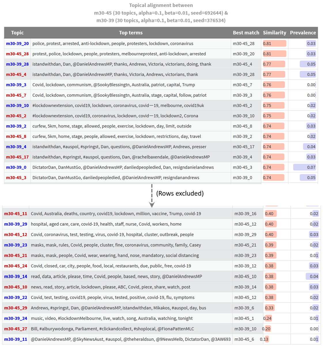
It’s important to remember that the table Figure 3 only shows those topics from both models that exhibit a one-to-many alignment. A more complete view of the alignment between these two models is shown in Figure 4. Here, every topic from both models is listed. Topics with similar matches in the other model are listed first, while topics with the least similar matches are listed last. Topics that are aligned exclusively with each other (and thus have identical similarity scores for their nearest match) are listed sequentially, with their pairing highlighted by the shading of the rows. The prevalence column shows the proportion of all tweets in the dataset that the topic accounts for.
This table shows us where the two models align and diverge in their thematic coverage. If we are only interested in the topics at the top of the table, then we could probably get by with either model. On the other hand, if any of the topics at the bottom of the table are of interest, then we will need to use the larger of the two models. In this case, only the 30-topic model offers us a topic about vaccines, modelling and research; and only the 30-topic model includes the wonderfully passionate topic featuring the terms people, Covid, lockdown, doing, stop, feel, live, fuck, getting, hard, actually, rules, real, fucking.
Comparing two identically configured models
In the discussion above, I glossed over the fact that the most closely aligned topics from the two models aren’t actually very similar. Their similarity scores are just 0.66, or two thirds of a perfect match. You might think that this is to be expected, given that one model has three times as many topics as the other. But my past experience has led my to expect higher similarity scores for the best-matched topics, even with this disparity in topic numbers.
As a sanity check, I ran a comparison of two 30-topic models that were identically configured except for their initialisation values (random seeds). The result is shown below, albeit with the middle section of the table excluded.
This is troubling. I always expect some differences between identically configured models, but with models built from other datasets, I’ve found that most topics are matched with similarity scores much closer to 1.0 than to 0.8. Here is an example using models from a dataset of news articles articles about energy resources:
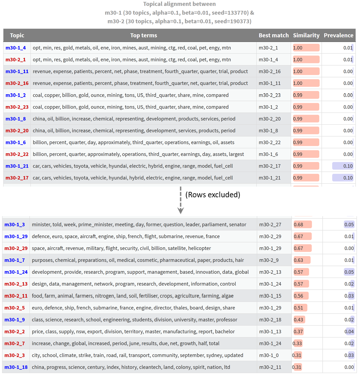
In this case, and most others that I have examined, most topics have near-perfect matches, and only a handful of topics are novel. The fact that the most similar topics from supposedly equivalent models of the lockdown-themed Twitter dataset have similarity scores of just 0.81 tells me that something is wrong. My guess is that this has something to do with the short length of the tweets upon which the model is built. When there are as few as five processed terms in a tweet (I excluded any with fewer terms than this), the allocation of a single term in to one topic or another could substantially change how a tweet is classified. Given that the similarity measurements that underpin these outputs are based on the matrix of topic allocations to tweets, such differences might manifest in poor similarity scores.
I could test this theory by excluding more short tweets (increasing the threshold from 5 to 8 terms, for instance) and by basing the topic similarity measurement on topic terms instead of document allocations. But for the moment, I’ll simply take this as a warning that LDA may indeed struggle to perform with Twitter data.
Comparing several topic model configurations
While useful for some purposes, pairwise comparisons of topic models are inherently limited in the types of evaluations that they allow. A user may also wish to compare the qualitative results of several different model configurations at once in order to examine the effects of graduated changes and interactions among parameters. My method for doing this is summarised in Figure 7. In many respects, this method is a simplified and re-purposed implementation of TopicCheck (discussed earlier)—simplified in that it does not depend on a custom-built interface and novel visualisations (instead using nothing more complex than heatmapped cells); and repurposed because it is designed to compare different model configurations rather than assess model stability.
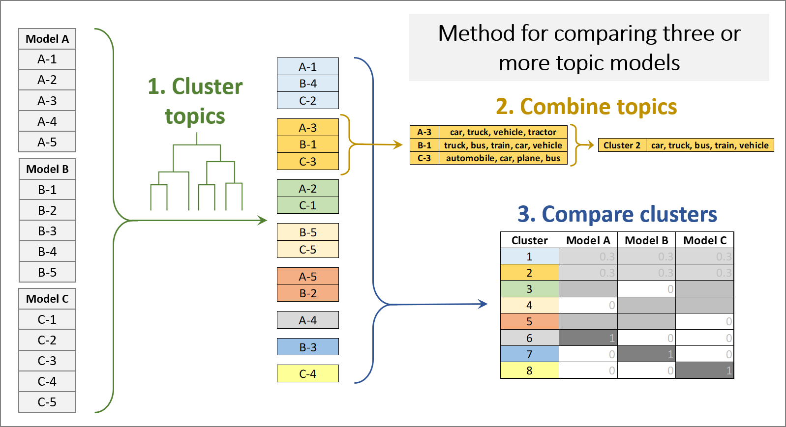
Given a set of topic models, the first step of this method is to cluster the topics from all models into groups of topics that meet a specified threshold of similarity. For this purpose, I used agglomerative hierarchical clustering (using complete linkages), based on the same similarity measure as that used in the pairwise comparisons — namely, the cosine similarity of the document allocation vectors. The result is a hierarchy of clusters, often represented as a tree or dendrogram, which can be ‘cut’ to produce clusters with a given threshold of similarity.
The second step is to combine the term distributions of the clustered topics to create a single term distribution or ‘metatopic’ that represents each cluster. I did this by summing the weights of terms across the clustered topics. If the similarity threshold is chosen appropriately, none of the topics within a cluster will be substantially different from the metatopic.
Finally, this method uses a heatmapped table to indicate the exclusivity of each model to each topic cluster. Or, as in the example below, the method can be used to show how often each of several model configurations produces a topic from each cluster. Comparing several models from each configuration in this way is useful because it averages out the effects of model instability. Any variations that are observed can be reliably attributed to differences in model configuration rather than model initialisation.
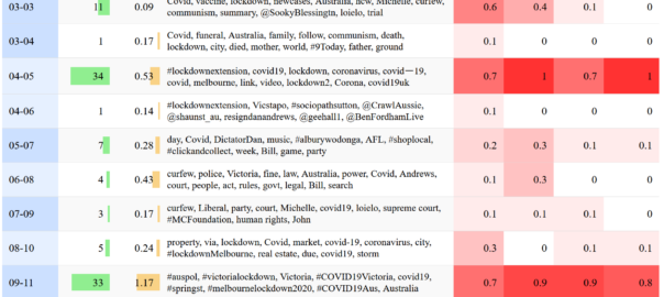
To produce the visualisation in Figure 8, I first generated 40 topic models from the lockdown dataset, all of which were identical except for their alpha values, of which there were four values allocated across groups of 10 models. Each of the four columns on the right represents one of these configuration groups. The values and colours in these columns indicate the proportion of models in each configuration group that produced a topic from the relevant topic cluster (table rows). A final feature of this visualisation is that the rows are sorted and shaded to indicate higher-level thematic groupings of the metatopics (although you can also resort it by whichever column you like). Since the full table is very long, I’ve just shown the first 16 rows in the figure below. Figure 9 will give you some idea of what the full table looks like.
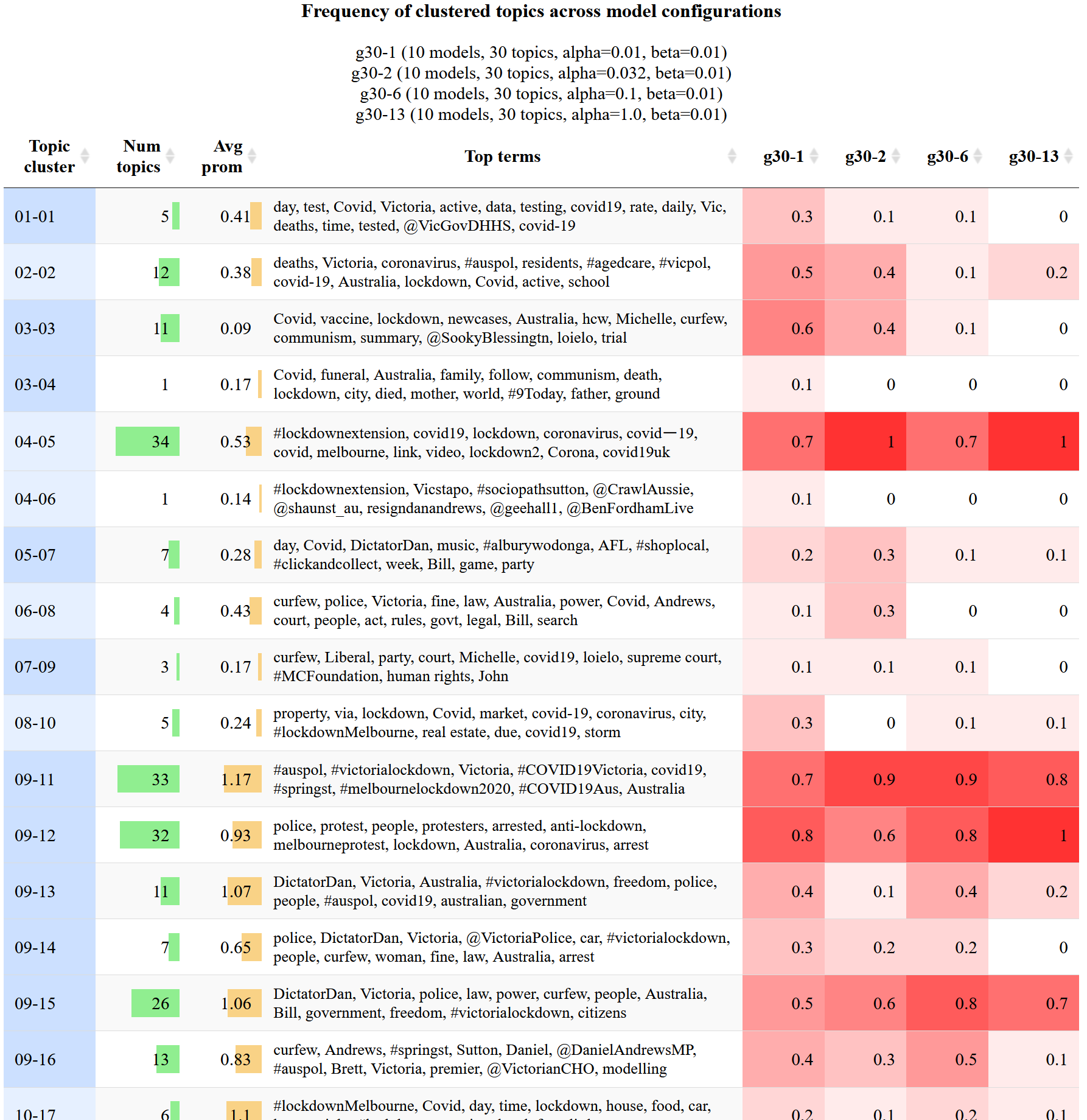
The first thing that this visualisation can tell you is which topics (or metatopics) are rare and which ones are common. The topic cluster numbered 04-05, for instance, is produced reliably by all four configurations, while the cluster below it (04-06) was produced by just one of the 40 models. Rarity of this nature is determined partly by the similarity threshold at which the topics are clustered. In this case, raising the threshold might result in clusters 04-05 and 04-06 being merged. Whether this is desirable depends entirely on your analytical needs.

This visualisation might also help you to determine which parts of the configuration space are most likely to contain your preferred or ideal model. For instance, the second two metatopics listed in Figure 8 were produced most reliably in models with lower alpha values, and hardly at all by models with higher alpha values. If these topics were of particular interest, then you might choose to do some further comparisons of models with low alpha values (perhaps while varying the number of topics or the beta value).
This method can be used in the same way to compare models with different beta values, topic numbers, or combinations of all three. Even if you don’t find differences that clearly suggest one alpha or beta value over another, this method is still an efficient way to survey the full suite of topics that might be extracted from your data. It can therefore help you to answer the question of what analytical opportunities are foregone by choosing one model over another. At the same time, the method reveals which topics will be present regardless of the model or configuration. With this information at hand, the user can provide assurance about the robustness and reproducibility of the resulting analysis, and can comment on the extent to which alternate configurations could produce different results.
Conclusion
There’s no getting around it: topic models are complex beasts, both inside and out. Their internal workings are beyond the understanding of the average user, while their outputs can be overwhelming even if they are instantly meaningful. To the unsuspecting user, topic models may perform a diabolical bait-and-switch, offering amazing results straight out of the box before revealing a paralysing array of alternatives each time a dial is tuned. Automated measures of coherence and other desirable attributes can help to reduce the ocean of possibilities down to a manageable pool of candidates, but leave the user with few clues about what rare treasures or strange creatures lurk in the unexplored depths.
In other words, social scientists should be wary of delegating too much responsibility to quantitative metrics and optimisation criteria in their selection of topic model outputs. The clusters of terms that topic models produce are algorithmic artefacts that, thanks to an ingenious process of reverse engineering, happen to resemble the products of human intelligence. We trust and use these outputs because the stories that they tell tend to check out. But each such output represents just one way in which the subject matter of the input data can be sliced and diced into coherent topics. Before entrusting an algorithm to make decisions that could affect how a body of text is understood and analysed, users of topic models should seek to understand the qualitative differences that distinguish the algorithm’s range of possible outputs.
This task is irreducibly complex, as least insofar as the words that define topics cannot be reduced to numbers. However, as I have demonstrated in this post, the process of qualitatively comparing topic models can be massively streamlined by strategically repackaging the relevant information. My hope is that the methods that I have demonstrated here, as humble as they are, will help fellow social scientists (and other users, for that matter) to select and use topic models in a more informed and transparent way.
I am not for a minute suggesting that these methods should be used instead of established evaluation methods such as coherence metrics. Rather, I envisage that these methods could be used in concert with such metrics to allow for a more holistic evaluation process. One option would be to use these qualitative methods to compare a small pool of candidates selected on the basis of quantitative criteria. Another would be to sample and qualitatively compare candidates from across the configuration space at the same time as comparing these quantitatively, to ensure that the quantitative criteria do not exclude qualitatively interesting options too early in the process. Finally, even if the qualitative methods are not used to narrow or finalise the choice of a topic model, they can be used to at least provide an understanding of the substantive differences between the selected model and the foregone alternatives. Being able to account for these differences is an important step towards using topic models with confidence and transparency in social science.
I plan to produce a journal paper about these methods soon. In the meantime, if you use these methods, please cite this blog post and/or my thesis, with my name (Angus Veitch).
Notes:
- The generative model of LDA assumes that each document in a collection is generated from a mixture of hidden variables (topics) from which words are selected to populate the document. The number of topics in the model is a parameter that must be set by the user. The proportions by which topics are mixed to create documents, and by which words are mixed to define topics, are presumed to conform to specific distributions which are sampled from the Dirichlet distribution, which is essentially a distribution of distributions. The shape of these two prior distributions is determined by two parameters—often referred to as hyperparameters to distinguish them from the internal components of the model—which are usually denoted as alpha (α) and beta (β). Whereas alpha controls the presumed specificity of documents (a smaller value means that fewer topics are prominent within a document), beta controls the presumed specificity of topics (a smaller value means that fewer words within a topic are strongly weighted). Like the number of topics, these hyperparameters are set by the user, ideally with some regard for the style and composition of the texts being analysed. ↩
- It’s important to recognise that criteria such as transparency and repeatability are not applicable to all textual analysis traditions. Some traditions assume a degree of interpretation and subjectivity that render such criteria all but irrelevant. The probabilistic nature of topic models presents a very different set of challenges and opportunities to such traditions, at least insofar as practitioners are inclined to use them. ↩
- That is, assuming that only one fitted topic model is used in the analysis. Conceivably, an analysis could use and compare several models. ↩
- In this post, as in much of the literature on topic modelling, the term ‘topic model’ may describe one of two things. The more general sense of the term refers to a particular generative model of text, which may or may not be paired with a specific inference algorithm. In this sense, LDA is one example of a topic model, and the structural topic model is another. The second sense of the term refers to the outputs, in the form of term distributions and document allocations, obtained by applying a topic model in the first sense to a particular collection of texts. (These outputs may also be referred to as a ‘fitted topic model’.) The relevant sense of the term will usually be evident from the context in which it is used. ↩
- Aligning models in this manner, or by using similar methods, is a common step in analyses of topic model stability (e.g. de Waal and Barnard 2008, Greene, O’Callaghan, and Cunningham 2014). More specifically, the topic pairs described here constitute a local alignment of the models, because they are paired independently of one another without any attempt to maximise the sum of similarities among all paired topics (Roberts, Stewart, and Tingley 2016). In algorithmic terms, the local alignment arises from applying a ‘greedy’ approach to the alignment task. ↩
- This is simply because there are no topics in the 30-topics model that align with two or more topics in the 10-topics model. If there are one-to-many alignments in both directions, the table will list both models in the left-hand column. ↩
- It’s important to note that the topics on the left don’t necessarily ‘contain’ the corresponding topics on the right. All we can say for sure is that the topics on the left are the nearest thing (with the similarity column telling us just how near) that the 10-topic model has to those in the 30-topic model on the right. If any topics from the 10-topic model index the same content as those on the right, we can assume that they are the ones shown in the table. ↩