The opportunity
As documented elsewhere on this blog, I recently spent four years of my life playing with computational methods for analysing text, hoping to advance, in some small way, the use of such methods within social science. Along the way, I became interested in using topic models and related techniques to assist the development of public policy. Governments regularly invite public comment on things like policy proposals, impact assessments, and inquiries into controversial issues. Sometimes, the public’s response can be overwhelming, flooding a government department or parliamentary office with hundreds or thousands of submissions, all of which the government is obliged to somehow ‘consider’.
Not having been directly at the receiving end of this process, I’m not entirely sure how the teams responsible go about ‘considering’ thousands of public submissions. But this task strikes me as an excellent use-case for computational techniques that, with minimal supervision, can reveal thematic structures within large collections of texts. I’m not suggesting that we can delegate to computers the task of reading public submissions: that would be wrong even if it were possible. What we can do, however, is use computers to assist the process of navigating, interpreting and organising an overwhelming number of submissions.
A few years back, I helped a panellist on the Northern Territory’s Scientific Inquiry into Hydraulic Fracturing to analyse concerns about social impacts expressed in more than 600 public submissions. Rather than manually reading every submission to see which ones were relevant, I used a computational technique called probabilistic topic modelling to automatically index the submissions according to the topics they discussed. I was then able to focus my attention on those submissions that discussed social impacts, making the job a whole lot easier than it otherwise would have been. In addition, the topic model helped me to categorise the submissions according to the types of social impacts they discussed, and provided a direct measurement of how much attention each type of impact had received.
This experience proved that computational text analysis methods can indeed be useful for assessing public input to policy processes. However, it was far from perfect case study, as I was operating only on the periphery of the assessment process. The value of computational methods could be even greater if they were incorporated into the process from the outset. In that case, for example, I could have indexed the submissions against topics besides social impacts. As well as making life easier for the panellists responsible for other topics, a more complete topical index would have enabled an easy analysis of which issues were of most interest to each category of stakeholder, or to all submitters taken together.
In this post, I want to illustrate how topic modelling and other computational text analysis methods can contribute to the assessment of public submissions to policy issues. I do this by performing a high-level analysis of submissions to the Victorian parliament about a proposal to expand Melbourne’s ‘free tram zone’. I chose this particular inquiry because it has not yet concluded (submissions have closed, but the report is not due until December) and because it received more than 400 hundred submissions, which although perhaps not an overwhelming number, is surely enough to create a sense of foreboding in the person who has to read them all.
This analysis is meant to be demonstrative rather than definitive. The methods I’ve used are experimental and could be refined. More importantly, these methods are not supposed to stand on their own, but rather should be integrated into the rest of the analytical process, which obviously I am not doing, since I do not work for the Victorian Government. In other words, my aim here is not to provide an authoritative take on the content of the submissions, but to demonstrate how certain computational methods could assist the task of analysing these submissions.
Obtaining and preparing the data
Getting hold of the submissions was easy enough. I simply used the Firefox extension DownThemAll to save every one of the 405 PDFs listed on the inquiry’s website. Unfortunately, PDFs are a terrible format for doing computational analyses, as the plain text that you extract from a document is typically a mish-mash of page headers, figure captions, footnotes, and broken prose. Sometimes, as was the case for about a hundred of the submissions to the tram inquiry, there is no text layer at all, as the document is just a scanned image of printed pages. Thankfully, Adobe Acrobat has a batch-executable OCR tool that adds a plain text layer to such documents. The results are not always perfect (low quality scans will inevitably result in text recognition errors), but on the whole are pretty good.
I parsed the PDFs, and did virtually everything else described below, using Knime, an open-source data analytics platform that is a great alternative to code-based options such as R and Python. (I did, however, use R to produce some of the graphical and tabular outputs.) To make the text more ‘machine-readable’, I performed various cleaning, filtering and enrichment tasks such as removing ‘boilerplating’ from the front and back of submissions, tagging named entities such as locations and organisations, tagging statistically interesting n-grams (strings of two or three words), and removing words that were rare or carried no thematic content (that is, words like ‘the’ and ‘to’). I also split the longer submissions into shorter chunks, while capping the number of chunks per submission to prevent large submissions from overly influencing the topic model.
I should also note that the analysis below includes only submissions that contained enough text to be meaningfully considered by a topic model. It therefore excludes about 70 submissions that consisted of only a sentence or two.
Modelling the topics
Topic modelling is not a simple business, or at least it shouldn’t be. As I explored in some depth in my PhD thesis, topic models look like every analyst’s new best friend until you discover that they can provide not one but an infinite number of answers to the question of what’s in my text? You may find some solace in the realisation that most of these infinite answers are just variations on a theme, but the fact remains that any given topic model represents just one of many possible ways of slicing and dicing a collection of texts. You can go to great lengths optimising your model, choosing the number of topics and tweaking the parameters to get the most stable and useful output; but in some cases you may be served just as well by lowering your expectations about what a topic model is supposed to achieve. In this particular exercise, the topic model is serving as nothing more than a guide to the content of the submissions, and as a basis for grouping together similar submissions.
All of which is a long way of saying that I didn’t do anything fancy to choose my model. I used LDA, which is the simplest topic modelling algorithm around, and I did just a few qualitative comparisons of results to decide how many topics to include.
If you’re wondering what a topic model even is, the table below will hopefully make things clearer. It lists the ‘top terms’ in each of the 33 ‘topics’ 1 generated by the LDA algorithm. Each topic is essentially a ranked list of terms that occur together with some regularity in the submissions. Groups of terms terms that co-occur in this way can generally be interpreted as coherent topics that capture a distinctive slice of the subject matter in the data. For example, the second topic listed in Figure 1 consists of words such as fare, day, pass, trips, discount, and peak hour. While a precise interpretation requires an inspection of the text, we can guess that this topic relates to discussion about ticketing and pricing models, including day-passes and peak-hour rates.
You’ll notice that the topics listed below are grouped into higher-level themes. I assigned these groupings by mathematically clustering the topics based on their top terms. The groupings could no doubt be improved, but they do have some coherence even in this ‘raw’ form.
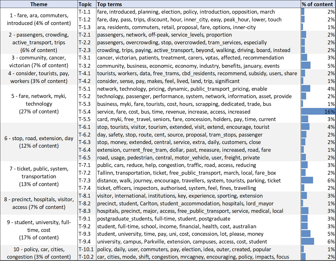
Scanning through these topics gives us an idea of what is in the submissions even before we lay eyes on them. Among other things, there are discussions about fares and pricing, visitors and tourists, networks and technologies, and students and university campuses.
None of this is surprising. Indeed, many of these topics reflect those listed on the terms of reference for the inquiry. But a topic model doesn’t have to be surprising to be useful. Firstly, there is value in merely knowing how the submissions conform to and depart from the terms of reference. Secondly, the topic model tells us how much of each topic is present in each submission, so we can use the outputs to find specific submissions that discuss any given topic. Thirdly, we can use the model outputs to see which issues have received the most attention. We can see, for example, that discussion about university students and campuses (Theme 9) accounts for 17 per cent of all of the submissions, while more than a quarter of the submitted content relates to network technologies and pricing models. 2
Clustering the submissions
As well as helping us to classify and index the submissions, the topic model provides a mathematically efficient way to cluster the submissions based on their thematic similarity. This is the computational equivalent of sorting similar submissions into physical piles so that each can be considered in turn. 3
As anyone who has tried to devise a seating plan for a wedding will know, there is rarely a single or perfect solution to the question of how to group related items. Usually there are many valid solutions, not to mention multiple methods for arriving at them. To sort the submissions into discrete piles, I used a method called k-medoids, but there are many other methods that could do the job, albeit with slightly different results.
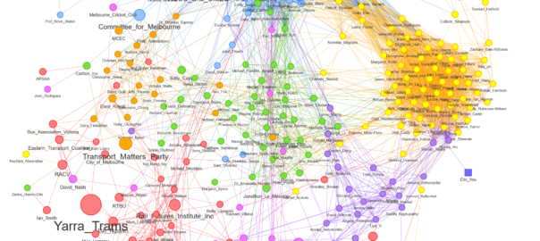
While dividing the submissions into separate piles can be useful, we need to remember that in reality, the divisions between the piles are soft and fuzzy rather than hard and fast. There may be considerable differences between submissions in the same pile, and there may be important similarities between submissions in different piles. To get a more complete picture of these differences and similarities, I like to represent the submissions as a similarity network, as in Figure 2. Each node in this network is a submission, and the strength of a connection between two nodes reflects their level of similarity. Submissions that are similar to one another get pulled together, while dissimilar submissions are allowed to drift apart. 4 The colours of the nodes reflect the cluster assignments of the k-medoids algorithm. By combining the discrete clusters with a fuller representation of similarities, the network in Figure 2 lets us have our cake and eat it too, even if the clustering results don’t always align perfectly with the network structure. 5
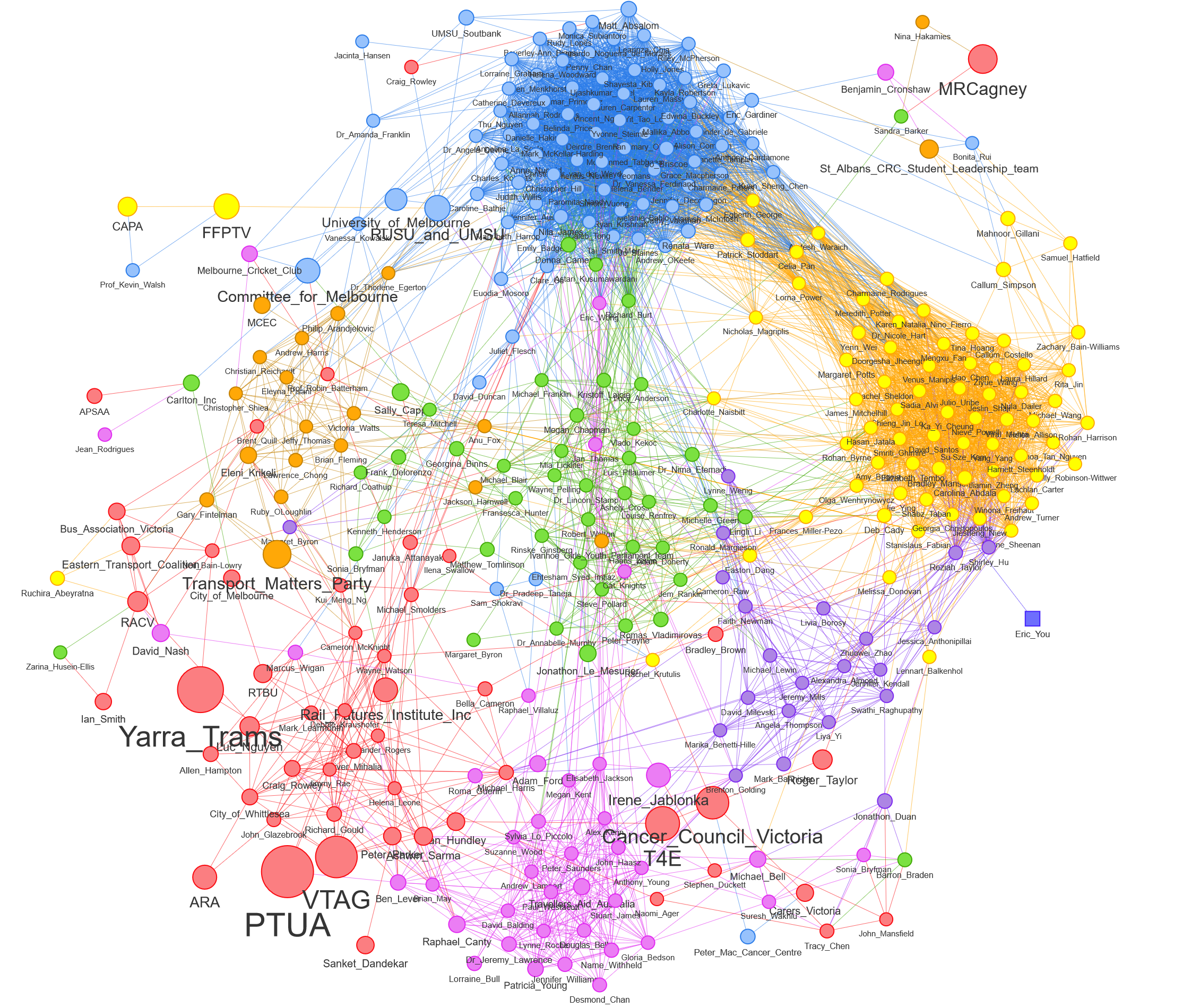
Just by glancing at Figure 2, we can see that many of the submissions fall into two large and tightly defined clusters. That’s great news, because it means that we can expect the submissions in those clusters to be very similar to one another, on top of being short (since the node sizes are small). Many of the remaining submissions fall into smaller and somewhat less coherent clusters, while a few of the submissions straddle multiple clusters or hover on their own.
Note that Figure 2 is just a static image of the network. To explore it more fully, please view the interactive version. Not only can you zoom in for more detail, but you can also open each submission directly by hovering over its node and clicking on the link. Hovering over a node also tells you which cluster it belongs to, which will be important for the next stage of the analysis.
Interpreting the clusters
Putting the submissions into discrete piles is only useful if we know what makes each pile distinctive. One way to do that would be to read a selection of submissions in each pile and note their similarities. A quicker way is to see which terms are most prominent in each cluster, and to review a sample of sentences that contain those terms. This is made easy by the table below, which has been generated automatically based on term-frequency statistics. 6
For this analysis, I chose to sort the submissions into seven clusters, although a larger or smaller number of clusters might be equally defensible. Note also that the clusters are numbered from the largest to smallest.
This summary tells us that the two largest clusters are both related to universities, which explains their proximity and connectedness in the network. The clusters are distinct in that Cluster 1 appears to focus on accessibility to university campuses, while Cluster 2 emphasises the implications of an extended free tram zone for students, such as relieving financial stress and making movement safer at night. Cluster 1 includes submissions from the University of Melbourne and the student unions of this university and RMIT, while Cluster 2 includes a submission from the Fares Fair PTV Campaign Coalition (FFPTV), a student-led campaign with members from student unions across Victoria.
Cluster 3, which is scattered across the lower left part of the network graph, contains submissions that focus on fare systems and the network-wide implications of extending the free tram zone. The cluster includes weighty contributions from public transport advocates such as the Public Transport Users Association (PTUA), the Victorian Transport Action Group (VTAG) and Transport for Everyone (T4E), alongside the submission from Yarra Trams. Interestingly, some members of this cluster, including T4E and Cancer Council Victoria, are situated in the lower-right part of the network, suggesting that their cluster membership is somewhat ambiguous.
The submissions in Cluster 4, which lies mainly in the centre of the network, appear to focus on the benefits that an extended free tram zone might have for visitors to the arts precinct, tourist attractions, and hospitals. With the exception of Carlton Inc (the traders association for the Carlton business district), all of the submissions in this cluster are from individuals.
The 40 submissions in Cluster 5, which lie mostly at the bottom of the network, address issues such as overcrowding (supposedly made worse by free tram travel because it encourages people to take the tram for short trips rather than walk), journey times (made longer by overcrowding, but also by the need for paying passengers to ‘touch on’ their myki cards) and the fairness of the current fare system.
Cluster 6, which includes only 22 submissions, is not quite as easy to interpret from this summary information alone, but appears to relate to arguments for including new stops in the free zone. Like Cluster 5, it includes discussion about equity issues and overcrowding.
Finally, Cluster 7, located in the upper-left of the network, includes submissions that discuss how extending the free tram zone might affect traffic congestion and pollution. This cluster includes submissions from the Transport Matters Party and the Melbourne Convention and Exhibition Centre.
Terminus
As I stressed earlier, this analysis is supposed to be demonstrative rather than definitive, and that’s only partly because it’s been done in quick order. The techniques I’ve used are not supposed to substitute for human assessment, but to guide and complement it. Topic modelling, k-medoids clustering and network layout algorithms are all computational methods that grapple with complexity by way of optimisation and approximation rather than deduction and precision. They are analytical aids rather than arbiters of truth. As such, they could be implemented differently from how I have used them, and probably better, but never perfectly. All I ever hoped to demonstrate here is that these methods can be useful when applied to the analysis of public submissions.
Hopefully, I’ve shown that topic modelling and related methods can be useful in this context in several ways. First, they can provide the analyst with a rapid and high-level understanding of the scope of issues covered in the submissions. Second, they allow the analyst to easily locate submissions that address a given topic. Third, they allow for a quantitative assessment of the issues discussed. And fourth, they provide a mathematical basis for clustering together submissions that are similar, whether visually through a network graph or categorically through discrete clustering.
At the end of the day, however, the true value of these contributions can only be known through their real-world application. To this end, the foregoing analysis barely scratches the surface of what the submissions contain, and does so without any knowledge of the true machinations and imperatives of the assessment process. If anyone in the Victorian parliament is interested in exploring what could be achieved by incorporating these methods into a real assessment process, I just might be available.
Notes:
- There were originally 35, but I removed two that were not informative. ↩
- This table measures the prominence of topics and themes in terms of the percentage of words across all submissions. An alternative, and probably better, measure would be the number of submissions in which a topic is present. This can be easily done. ↩
- An important caveat here is that topic-based clustering will not necessarily separate submissions that are supportive of the proposed change from those that are unsupportive. Rather, it separates the submissions primarily according to the issues that they discuss, whether in a supportive light or otherwise. This is a shame, because supportiveness is likely to be one of the main criteria by which a human analyst would separate their piles. Doing this computationally would require an additional layer of analysis using separate techniques such as sentiment analysis. This is something I hope to incorporate into my workflow in the near future. ↩
- Note that the edges in the network have been filtered to include only those above a certain threshold of similarity. To stop the network from fragmenting, edges below this threshold were retained if they were the strongest connection to a node. ↩
- Differences between the network structure and clustering results are to be expected, especially given that the clustering was performed based on all connections, while the network excludes weak connections. The disparity can be resolved by using a network community detection method to define the clusters. However, the clusters derived in this way will not take into account the full similarity matrix, potentially making them less accurate. ↩
- More specifically, the top terms for each cluster are those that occur most frequently in the cluster (have a high term frequency, or TF) while also having a high ‘inverse category frequency’ (ICF), which is a fancy way of saying that a term occurs in a small number of clusters. The top sentences and submissions are those whose terms have the highest combined TFxICF scores. ↩
Great job! Is the visual representation performed with other tool than knime? Thx
Yeah, I made the network with Gephi, and the tables with one of the various table-making packages in R (KableExtra, it might have been).