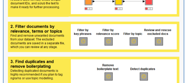
This post describes the motivation for the TextKleaner workflow and provides instructions on how to use it. You can obtain the TextKleaner workflow from the KNIME Hub.
Confronting the first law of text analytics
The computational analysis of text — or text analytics for short — is a field that has come into its own in recent years. While computational tools for analysing text have been around for decades — the first notable example being The General Inquirer, developed in the 1960s — the need for such tools has become greater as the amount of textual data that permeates everyday life has increased. Websites, social media and other digital communication technologies have created vast and ever-expanding repositories of text, recording all kinds of human interactions. Meanwhile, more and more texts from previous eras are finding their way into digital form. While all kinds of scholarly, commercial and creative rewards await those who can make sense of this wealth of data, its sheer volume means that it cannot be comprehended in the old fashioned way (otherwise known as reading). Just as computers are largely responsible for generating and transmitting this data, they are indispensable for managing and understanding it.
Thankfully, computers and the people who program them have both risen to the challenge of grappling with Big Text. As computers have become more and more powerful, the ways in which we use them have become more and more sophisticated. No longer a synonym for glorified word counting, computational text analysis now includes or intersects with fields such as natural language processing (NLP), machine learning and artificial intelligence. Simple formulas that compare word frequencies now work alongside complex algorithms that parse sentences, recognise names, detect sentiments, classify topics, and even compose original texts.
Such technologies are not the sole domain of tech giants and elite scientists, even if they do sit at the core of digital mega-infrastructures such as Google’s search engine or Amazon’s hivemind of personal assistants. Many of them are available as free or open-source software libraries, accessible to anyone with a well-specced laptop and a basic competence in computer science.
Topic models: a Pandora’s Black Box for social scientists
Probabilistic topic modelling is an improbable gift from the field of machine learning to the social sciences and humanities. Just as social scientists began to confront the avalanche of textual data erupting from the internet, and historians and literary scholars started to wonder what they might do with newly digitised archives of books and newspapers, data scientists unveiled a family of algorithms that could distil huge collections of texts into insightful lists of words, each indexed precisely back to the individual texts, all in less time than it takes to write a job ad for a research assistant. Since David Blei and colleagues published their seminal paper on latent Dirichlet allocation (the most basic and still the most widely used topic modelling technique) in 2003, topic models have been put to use in the analysis of everything from news and social media through to political speeches and 19th century fiction.
Grateful for receiving such a thoughtful gift from a field that had previously expressed little interest or affection, social scientists have returned the favour by uncovering all the ways in which machine learning algorithms can reproduce and reinforce existing biases and inequalities in social systems. While these two fields have remained on speaking terms, it’s fair to say that their relationships status is complicated.
Even topic models turned out to be as much a Pandora’s Box as a silver bullet for social scientists hoping to tame Big Text. In helping to solve one problem, topic models created another. This problem, in a word, is choice. Rather than providing a single, authoritative way in which to interpret and code a given textual dataset, topic models present the user with a landscape of possibilities from which to choose. This landscape is defined in part by the model parameters that the user must set. As well as the number of topics to include in the model, these parameters include values that reflect prior assumptions about how documents and topics are composed (these parameters are known as alpha and beta in LDA). 1 Each unique combination of these parameters will result in a different (even if subtly different) set of topics, which in turn could lead to different analytical pathways and conclusions. To make matters worse, merely varying the ‘random seed’ value that initiates a topic modelling algorithm can lead to substantively different results.
Far from narrowing down the number of possible schemas with which to code and analyse a text, topic models can therefore present the user with a bewildering array of possibilities from which to choose. Rather than lending a stamp of authority or objectivity to a textual analysis, topic models leave social scientists in the familiar position of having to justify the selection of one model of reality over another. But whereas a social scientist would ordinarily be able to explain in detail the logic and assumptions that led them to choose their analytical framework, the average user of a topic model will have only a vague understanding of how their model came into being. Even if the mathematics of topics models are well understood by their creators, topic models will always remain something of a ‘black box’ to many end-users.
This state of affairs is incompatible with any research setting that demands a high degree of rigour, transparency and repeatability in textual analyses. 2 If social scientists are to use topic models in such settings, they need some way to justify their selection of one possible classification scheme over the many others that a topic modelling algorithm could produce, 3 and to account for the analytical opportunities foregone in doing so.
If you’ve ever tried to interpret even a single set of topic model outputs, you’ll know that this is a big ask. Each run of a topic modelling algorithm produces maybe dozens of topics (the exact number is set by the user), each of which in turn consists of dozens (or maybe even hundreds) of relevant words whose collective interpretation constitutes the ‘meaning’ of the topic. Some topics present an obvious interpretation. Some can be interpreted only with the benefit of domain expertise, cross-referencing with original texts, and perhaps even some creative licence. Some topics are distinct in their meaning, while others overlap with each other, or vary only in subtle or mysterious ways. Some topics are just junk.
If making sense of a single topic model 4 is a complex task, comparing one model with another is doubly so. Comparing many models at a time is positively Herculean. How, then, is anyone supposed to compare and evaluate dozens of candidate models sampled from all over the configuration space? Continue reading Qualitative evaluation of topic models: a methodological offering→
Notes:
The generative model of LDA assumes that each document in a collection is generated from a mixture of hidden variables (topics) from which words are selected to populate the document. The number of topics in the model is a parameter that must be set by the user. The proportions by which topics are mixed to create documents, and by which words are mixed to define topics, are presumed to conform to specific distributions which are sampled from the Dirichlet distribution, which is essentially a distribution of distributions. The shape of these two prior distributions is determined by two parameters—often referred to as hyperparameters to distinguish them from the internal components of the model—which are usually denoted as alpha (α) and beta (β). Whereas alpha controls the presumed specificity of documents (a smaller value means that fewer topics are prominent within a document), beta controls the presumed specificity of topics (a smaller value means that fewer words within a topic are strongly weighted). Like the number of topics, these hyperparameters are set by the user, ideally with some regard for the style and composition of the texts being analysed. ↩
It’s important to recognise that criteria such as transparency and repeatability are not applicable to all textual analysis traditions. Some traditions assume a degree of interpretation and subjectivity that render such criteria all but irrelevant. The probabilistic nature of topic models presents a very different set of challenges and opportunities to such traditions, at least insofar as practitioners are inclined to use them. ↩
That is, assuming that only one fitted topic model is used in the analysis. Conceivably, an analysis could use and compare several models. ↩
In this post, as in much of the literature on topic modelling, the term ‘topic model’ may describe one of two things. The more general sense of the term refers to a particular generative model of text, which may or may not be paired with a specific inference algorithm. In this sense, LDA is one example of a topic model, and the structural topic model is another. The second sense of the term refers to the outputs, in the form of term distributions and document allocations, obtained by applying a topic model in the first sense to a particular collection of texts. (These outputs may also be referred to as a ‘fitted topic model’.) The relevant sense of the term will usually be evident from the context in which it is used. ↩
Several weeks ago, I posted an analysis of tweets about the restrictions imposed on Melbourne residents in an effort to control an outbreak of Covid-19. That analysis was essentially a road-test of a Knime workflow that I had been piecing together for some time, but that was not quite ready to share. Since writing that post, I have revised and tidied up the workflow so that anyone can use it, and I have made it available on the Knime Hub.
In the present post, I provide a thorough description of the workflow, which I have named the TweetKollidR, and demonstrate its use through a case study of yet another dataset of tweets about Melbourne’s lockdown (which, as I write this, still has not ended, although it has been eased). 1
As you will see from the search queries in Figure 3, this dataset includes some keywords that relate to Victoria more generally, rather than just Melbourne. However, since most of the content concerns the Melbourne lockdown, I will continue to refer to it as such. ↩
It’s been part of my routine for several weeks now. Almost like clockwork, at around 8:30am, my phone buzzes. I hold my breath, partly avert my gaze, and unfold the notification just far enough to see the familiar sentence: “Victoria has recorded…”
What comes next can set the tone for the whole day. If the number of new Covid-19 cases recorded in the preceding 24 hours is smaller than the number reported the day before, I breathe a sigh of relief and ease into the day as if a small weight has lifted. If the number has gone up, I slap down my phone in disappointment and try — usually without success — to console myself with the idea that it is probably just a blip that will be corrected with a lower number tomorrow.
I’m sure that the story is similar for many Victorians. It could hardly be otherwise, given that these daily case numbers are now our ticket to freedom, as laid out in the state’s Roadmap to Covid-normality. If the case numbers stay low until September 28 — or more specifically, if the 14-day average at that point is less than 50 — Dan Andrews will let Melbourne residents socialise with up to five people from two households. Luxury! If we get the average down to below five by 26 October, we’ll almost be allowed to behave like human beings again. Under the current framework, our only way out of lockdown is through the numbers.
Given that the only numbers that really matter according to the roadmap are fortnightly averages, it makes little sense to get worked up about the number of cases announced on any given day. Probably we’d all be better off ignoring the daily announcements and getting weekly summaries instead. But I, for one, am not about to kick the habit. As long as that magic number is reported each day, I am going to keep getting my fix and reading into it as much as I can.
Weekly Covid cycles
One thing that has become apparent to case number junkies like me is that not every day of the week is equal. On average, certain days of the week tend tend to have higher case numbers than others. You can see this most clearly in the global total, as in the version reproduced below from Our World in Data. Nested within the larger wave of cases is a recurring ripple of a week’s duration.
Surprisingly, there is no consensus yet about why this weekly cycle occurs. The handful of research papers that I have found about the topic all confirm that weekly cycles in cases and deaths are real, but offer contrasting explanations. One paper examining data specific to the US concluded that most of the weekly variations could be explained by quirks in reporting regimes and fluctuations in testing activity. Other studies, especially those looking at countries other than the US, have argued against this explanation and suggested alternative causes. Noting that new cases in several countries tend to peak on Thursdays or Fridays and then fall on weekends, one paper hypothesises that infections rise when the stress of the working week compromises the immune system. Another paper explains the same pattern by suggesting that weekends provide more opportunities for young people to mingle with their elders, thus causing infections that will become symptomatic five days later (i.e. on Thursday or Friday) and leading to deaths about 14 days after symptoms emerge. Yet another paper hypothesises that cycles in air pollution (caused by traffic, for example) or the bodies own circadian rhythms could play a role.
This kind of weekly oscillation has not been as obviously apparent in Australian case numbers, largely because the numbers have been so low to begin with. When cases did get out of control in Victoria a couple of months ago, the Stage 4 lockdown measures introduced in early August turned the numbers around so quickly that there has never been a stable baseline against which to notice more nuanced levels of variation. Even so, I’ve noticed on several occasions that the numbers reported on a Monday are relatively low; and I recently heard Casey Briggs refer to ‘hump day’ in one his regular case reports on the ABC (even if I didn’t catch which day he was actually referring to). I’ve also heard vague references by media commentators to backlogs and fluctuations in the processing of test results, which could influence the number of cases announced on any given day.
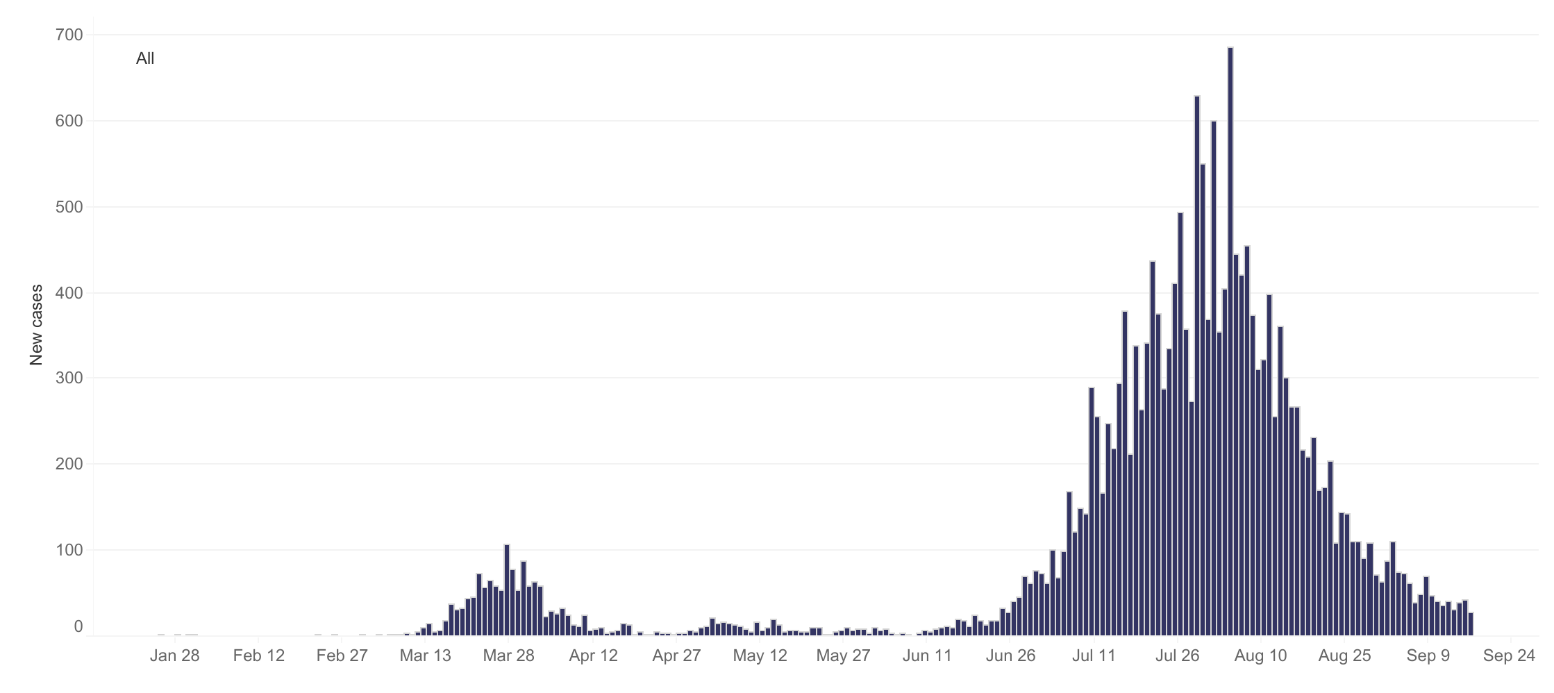
Victoria’s daily Covid-19 cases since January (reproduced from dhhs.vic.gov.au )
This is the sort of information that you need to know if, against your own better judgement, you are going to try to extract some kind of meaning from the daily announcement of new case numbers. As I write this, tomorrow is Friday. If the number that pops up on my phone just after breakfast is hardly any lower than today’s, how worried or surprised or disappointed should I be? Is Friday a day when the numbers tend to be higher or lower than would be dictated by the underlying trend?
I couldn’t find any existing answers to this question, so I got hold of Victoria’s daily case data and took a stab at answering it myself. I should stress that I did this by following my own statistical intuitions rather than emulating any of the methods used in the papers mentioned above (most of which I hadn’t read until after I did this!). I think my approach makes sense, but I make no claims to it being the best method available. If it turns out that I’ve committed some kind of crime against statistics here, I’ll humbly (indeed gratefully) accept a fine from the statistics police. Continue reading Is there a weekly cycle in Victoria’s Covid case numbers?→