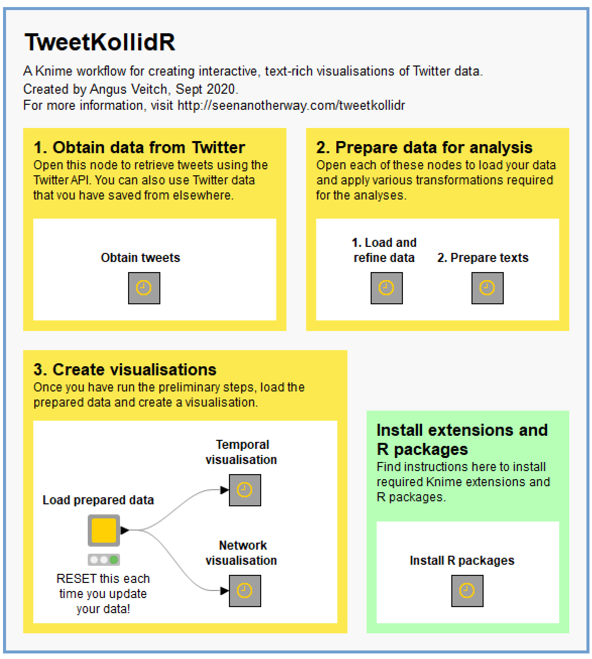
Several weeks ago, I posted an analysis of tweets about the restrictions imposed on Melbourne residents in an effort to control an outbreak of Covid-19. That analysis was essentially a road-test of a Knime workflow that I had been piecing together for some time, but that was not quite ready to share. Since writing that post, I have revised and tidied up the workflow so that anyone can use it, and I have made it available on the Knime Hub.
In the present post, I provide a thorough description of the workflow, which I have named the TweetKollidR, and demonstrate its use through a case study of yet another dataset of tweets about Melbourne’s lockdown (which, as I write this, still has not ended, although it has been eased). 1
Overview of the TweetKollidR
Firstly, I’ll explain in broad terms what the TweetKollidR is, what it does and what it is for.
What is the TweetKollidR?
The TweetKollidR is a workflow for Knime, 2 an open-source analytics platform that allows you to construct complex analytical workflows through a visual interface. As I have written previously, the beauty of Knime is that it enables you to do much of what you might otherwise do in R or Python, but without having to learn to code. The visual, point-and-click nature of Knime workflows also means that they can be readily used, understood, and even modified by non-expert users in a way that is just not possible with an R package or Python script. If prepared with the right care, a Knime workflow can even behave as something like a standalone application with its own user interface — a quality that I have done my best to leverage in the TweetKollidR.
As I mentioned, Knime allows you to do much, but not all, of what you might otherwise do in R or Python. One area in which Knime is not as flexible as R or Python is data visualisation. While Knime’s own visualisation functions cover many basic needs, they do not offer the same breadth of functionality or degree of customisability as R packages such as ggplot2 or igraph, or the interactivity that is possible with packages like visNetwork or Plotly. 3 The good news is that Knime can integrate fairly seamlessly with R or Python (though I have not attempted the latter), which means that you can plug these gaps in functionality if you are willing to get your hands dirty with a bit of code. This is precisely what I’ve done with the TweetKollidR. While virtually all of the computation is done with Knime’s native nodes (the only exception being some network processing done with the igraph R package), the final visualisations are created with the Plotly and visNetwork R packages.
The processing done by R all happens behind the scenes, so you don’t need to know anything about how to use R in order to use the TweetKollidR. You do, however, have to perform a few preliminary steps to ensure that Knime’s R integration is working, and that the necessary R packages are installed. These installation steps are described later in this post.
What does the TweetKollidR do?
The TweetKollidR does the following:
- It helps you to assemble a dataset of tweets about a given topic. To do this, you will need an access key for the Twitter API, but don’t let that deter you, because the application process is pretty painless. To build a dataset, all you need to do is enter your search terms and your API key, and the workflow does the rest. This part of the worfklow is designed specifically to help you assemble a longitudinal dataset within the constraints of the standard (i.e. free) access tier of the Twitter Search API. Alternatively, you can use a Twitter dataset that you have acquired by other means, provided that it has columns that match those used by the TweetKollidR.
- It visualises networks of interactions between twitter users. Rather than showing the interactions (retweets and mentions) between every pair of individual users 4 (which may number into the hundreds of thousands), the TweetKollidR shows the high-level network structure of your dataset by first detecting tightly interconnected clusters (also known as communities) of users, and then visualising the connections between those clusters. Summary information about each cluster, including prominent terms from tweets and user descriptions, is available through tooltips that appear when you hover your cursor over the cluster. The summary information is rich with hyperlinks that take you straight to representative examples of tweets and users.
- It visualises the volume and content of tweets over time. While there are many ways in which you could plot the volume of Twitter activity over time (you could even do it in Excel if you wanted to), the TweetKollidR enriches this quantitative information with annotations and tool-tips that summarise the content of tweets created within each division of time and period of peak activity. These summaries list prominent keywords and names and reproduce the full text of popular tweets. They also link directly to online examples of tweets and user profiles.
In summary, the TweetKollidR enables you to assemble and visually analyse a dataset of tweets that contain particular keywords or hashtags. What sets it apart from other methods for doing this is that it incorporates rich textual information into the visualisations. Examples of the TweetKollidR’s visual outputs can be found in the latter half of this post.
What is the TweetKollidR for?
The TweetKollidR is designed primarily to facilitate the exploratory or descriptive analysis of Twitter data. It is designed to provide rapid insights about the content, network structure and temporal dynamics of Twitter activity around a given topic.
With respect to network structure, the TweetKollidR answers questions such as
- what communities of users are tweeting about this topic?
- what interests and attributes define the members of these communities?
- what specific issues do these communities discuss, and what sort of language do they use?
- how are these communities connected to one another?
With respect to temporal dynamics, the TweetKollidR answers questions such as
- how does the amount of Twitter activity about the topic change over time?
- how does the content of tweets about the topic change over time?
- what issues, events and users are driving spikes in activity?
- at any given point of time, what sorts of users are most active?
The answers that the TweetKollidR provides to these questions are, for the most part, approximate rather than definitive. They are impressionistic rather than precise. This is entirely by design. Even if your research ultimately demands numerical detail and statistical rigour, you will need a solid understanding of what, in broad terms, is going on in your space of interest before you can formulate intelligent research questions and hypotheses. This is the kind of understanding that the TweetKollidR can provide in a very short period of time. (In addition, there is a good chance that in producing its outputs, the TweetKollidR will crunch through many of the numbers that you need to perform a more statistically precise analysis. You can harness these numbers by poking around under the hood of the workflow and adding your own components.)
Something else that the TweetKollidR provides, thanks to the extensive hyperlinks in its visual outputs, is a curated repository of evidence and examples to ground your analysis. For example, rather than just telling you that a group of users is fond of a certain hashtag, or that a certain pair of users has interacted with each other, the TweetKollidR’s visualisations link you directly to actual tweets in which the hashtag appeared or the interaction occurred. If your research methodology is qualitative in nature, then the pattern-revealing and evidence-curating functionalities of the TweetKollidR might be all you need to both formulate and answer your research questions.
In short, the main purpose of the TweetKollidR is to give you a rapid yet rich understanding of what is going on in your dataset. This will help you to formulate good research questions if you are using a quantitative approach, and to substantiate your arguments if your research is qualitative. The TweetKollidR also provides a direct portal to actual tweets and user profiles that exemplify distinctive aspects of your data.
How do you use it?
One of the nice things about the Knime platform is that it allows for extensive documentation of workflow components to be displayed within the workflow environment itself. When you select a component on the screen, you will immediately see information about how to use it in the ‘description pane’ on the right-hand side of the Knime interface. In addition, each of the main screens of the workflow (you’ll see some examples below) contains detailed annotations to guide you through the relevant process.
All of which is to say that I’ve done my best to ensure that you won’t need any instructions beyond what is contained in the workflow itself. Nevertheless, I’ve taken the opportunity in this post to present an overview of the steps required to use the TweetKollidR. Aside from showing what the Knime interface looks like (as I’m sure many readers will be unfamiliar with it), I’m presenting this overview in order to explain some of the steps in more detail than is appropriate within the workflow.
Installing the TweetKollidR
The first thing you will need to do to use the TweetKollidR is install Knime. Once you’ve done that, the first thing I suggest you do is create a workflow group in your Knime workspace to contain the TweetKollidR workflow and its associated files. The workflow is designed so that you create a new copy of it for every new project that you use it for. That way, you can make project-specific modifications to the workflow without affecting any other instances. (Note that this is a different logic from that of R packages, which are like stand-alone services performed by invisible agents that you call upon whenever you need them.) To do this, right-click on the LOCAL (Local Workspace) folder in the KNIME Explorer, and select New Workflow Group. This simply creates a new folder with the specified name within your Knime workspace.
To obtain the TweetKollidR workflow, go to its home on the Knime Hub. From there, you can install the workflow simply by dragging the yellow icon at the top of the page into the newly created workflow group in your Knime interface.
When you open the workflow, Knime will ask you to install the extensions that it uses (unless you already have them installed). Just follow the prompts. At the end of the process, it will probably tell you that some extensions could not be installed. Don’t worry: these are just the Palladian for KNIME extensions that live in a different repository from the other extensions. To install the Palladian nodes, go to Install new software in the Help menu, click on Add, then enter https://download.nodepit.com/palladian/4.2 in the Location field, and ‘Palladian’ (or whatever) in the Name field. The Palladian for KNIME extension should then be available to select and install.
The final hurdle to clear before using the TweetKollidR is to make sure R is installed and integrated with Knime. If you are using Windows, all you should need to do is activate the KNIME Interactive R Statistics (Windows Binaries) extension, which you can do via the Install new software menu described above. If you are not using Windows, or you want Knime to use an existing installation of R instead, you will have to cross a few more bridges, as described in this discussion on the Knime forum. Once you’ve got R and Knime talking to each other, you will need to install several R packages that the workflow uses. You can do this by executing a pre-prepared script that you will find by following the prompt on the main screen of the workflow — which, at the time of writing, looks like this:
Obtaining data from Twitter
If you don’t already have a Twitter dataset to analyse, the TweetKollidR can help you to build one. To do this, you will need to obtain an access key for the Twitter API, which you can do by following the instructions on this page.
It’s important to note that unless you pay for premium access to the Twitter API, you will have to contend with some pretty big limitations on what data you can retrieve. For the keyword search facility, which the TweetKollidR uses, you can only access a sample of relevant tweets from the last seven days, and can only retrieve up to 18,000 tweets in a 15-minute period (at least those are the rules at the time of writing). If your research requires data that is more complete or is from further back in time, then you will need to pay either Twitter or another provider to obtain it.
If you can make do with data that is contemporary and incomplete — and, maddeningly, incomplete in ways that Twitter won’t even specify 5 — then it may be worth persevering with the free access tier of the API. If you do go down this path, you will probably need to query the API more than once, and perhaps on a recurring basis, to build up a useful dataset. The TweetKollidR is set up to help you through this process.
Here is what you see if you open the ‘Obtain tweets’ component on the main screen:
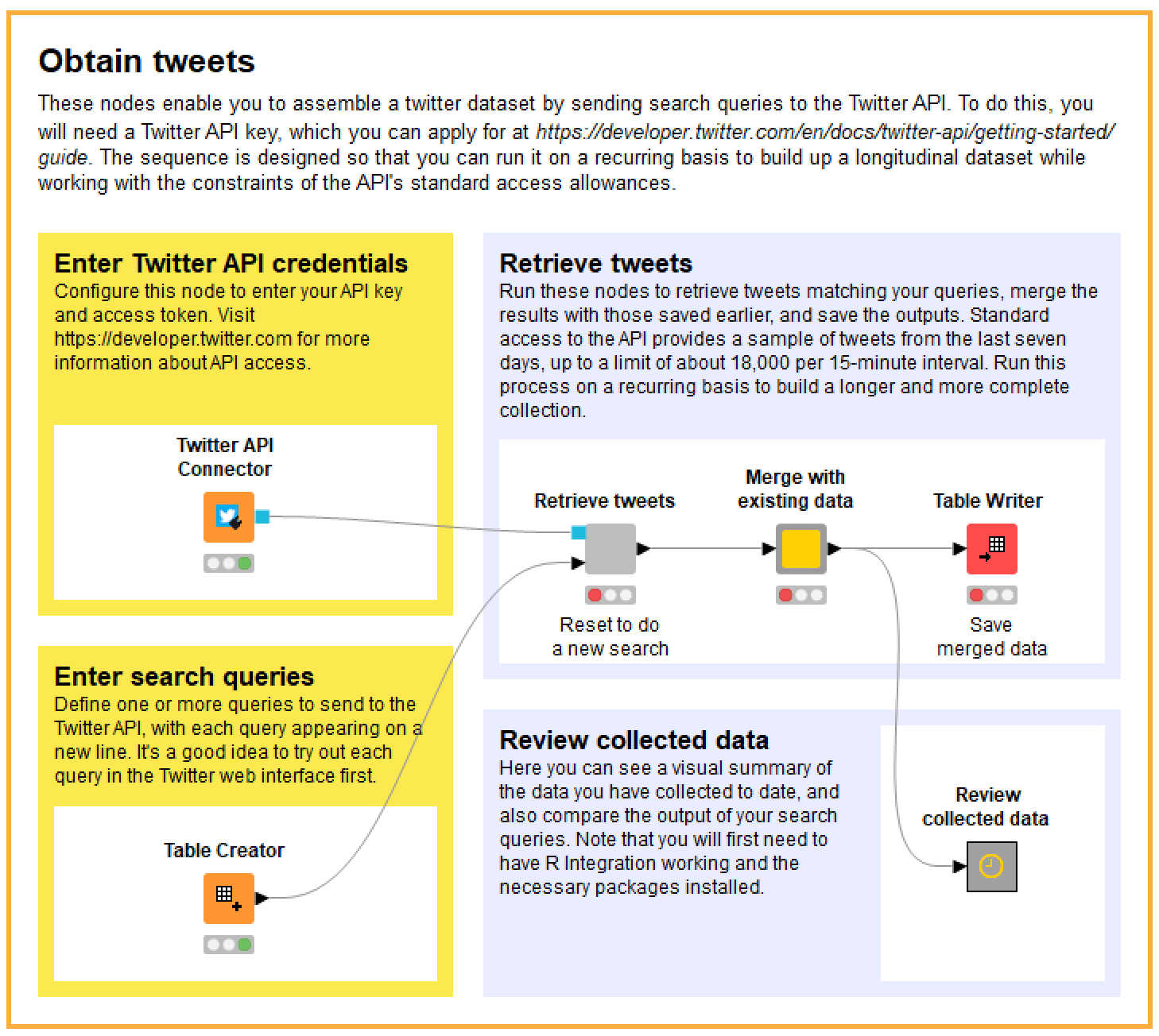
As you can see, the instructions are all there for you for follow, so I will only provide some high-level commentary here.
The sequence is designed so that you can run the Retrieve tweets component on multiple occasions, each time merging the results with those collected previously. How often you need to run it depends on how many people are tweeting about your topic of interest. If the volume of relevant tweets is not too high, you may find that running the search once a day is enough to reach the ‘saturation point’ of what the API will give you (remembering that the free API will give you at most 18,000 tweets in a 15-minute session). If your topic is really popular, you may need to run it more frequently.
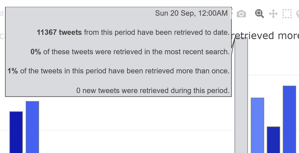
Inside the Review collected data component, you will find a visualisation that will help you to appraise how far your dataset is from this saturation point. The example below shows you the state of my dataset after 20 days of daily searches (I performed my first search on September 7th). The height of the bars shows how many tweets from each timestep (or day, in this case) are in the dataset, while the red components show how many of those tweets were retrieved in the last search. Meanwhile, the shading of the bars indicates the percentage of tweets in each timestep that have been retrieved more than once. This information is also available in a more precise form via tooltips that appear when you hover over each timestep.
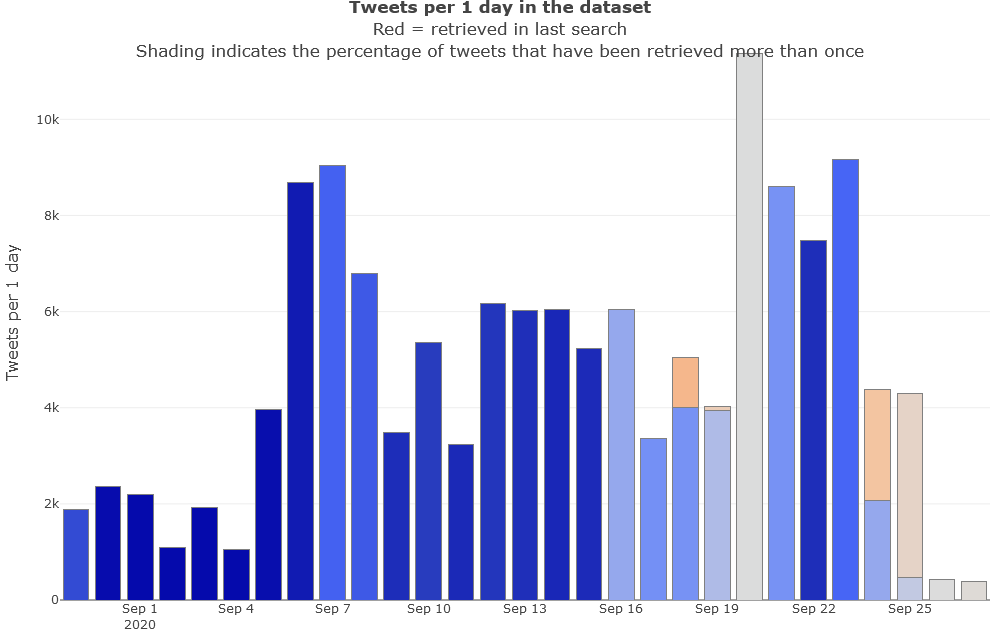
In this case, we can see that nearly all tweets in the dataset were retrievd multiple times up until the 16th, at which point there are several successive days where the data is less saturated. The likely reason for this lull is that I slacked off in my data collection — I did not collect any new tweets on the 19th, 20th or 22nd — just as activity about this topic was hotting up. Most worryingly, the popup information reveals that only one percent of the tweets collected from the 20th, when activity peaked, had been retrieved more than once when I made this chart:
Furthermore, since the 20th was already a week ago by the time I made the graph in Figure 3, there was no reason to expect that future searches would yield any more tweets from this date. This doesn’t necessarily mean that the collection September 20th is incomplete compared to what I could have retrieved, but it does make this scenario rather likely. Whether this is a critical problem depends on the nature of your research.
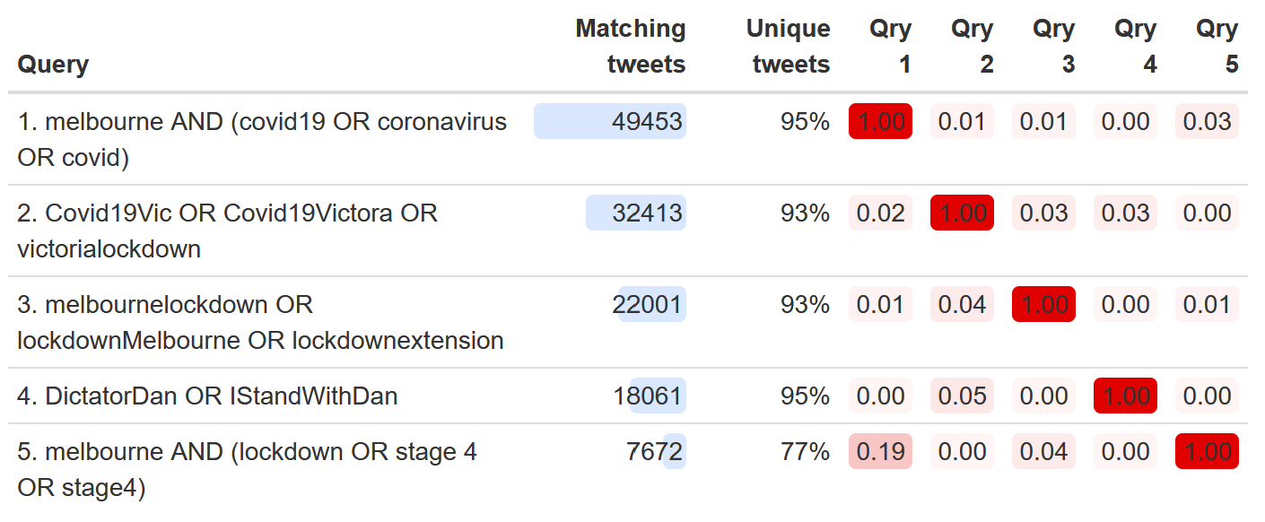
Aside from not slacking off with your recurring data collection, I would also caution against using complex search queries, as Twitter’s Search API does not seem to like them. As an alternative, the TweetKollidR allows you to specify multiple complementary queries. When you run the search process, it will loop through these queries, taking steps to ensure that no one of them hogs all of your allotted retrieval capacity.
To help you optimise your queries, the worklflow also provides an output summarising the relative contributions and overlaps of each query. In the example below, we can see that while some queries have yielded far more tweets than others, 6 there is very little overlap among the queries in terms of the tweets they retrieve. Even the most redundant query is still retrieving tweets that are 77% unique.
Preparing your data for analysis
Whether you’ve gathered your data with the help of the TweetKollidR or acquired it from elsewhere, you will need to subject it to a series of refinements and transformations before it is ready to be visualised. The first of these steps are laid out within the Load and refine data component:
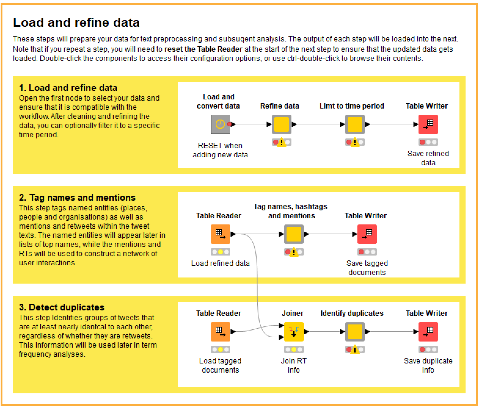
In case this is starting to look complicated, be assured that all you really need to do in most cases is right-click on the last node in each sequence and execute it. I could have packaged all of these steps into a single box that would run with a single click, but I split them up for a few reasons. The main reason is that if your dataset is large (say, getting into the hundreds of thousands of tweets), these steps can take a considerable time to run, and in the process can chew up lots of memory and temporary storage space. Separating the steps and saving intermediate outputs gives the user a better sense of how the process is progressing, and provides some insurance against the whole process crashing if memory is exhausted or a bug creeps in.
One principle for using this workflow is to double-click on any coloured node that you see with a grey border, such as the first three in the figure above. Nodes that look like this are configurable, and double-clicking them will reveal their configuration options. (If you want to see what is inside one of these nodes, hold down Crtl while double-clicking.) For example, the configuration options in the second two nodes in Figure 6 allow you to choose whether to exclude tweets that are not in English, and to filter your dataset to a specific time period. In most cases, the configurations are optional, but it always pays to check to see what options are available. Details about each node and its options can be found in the description pane in the Knime interface.
Loading and converting data
If you are analysing data that you have collected with the workflow itself, then loading it will be straightforward. However, if you want to analyse data from another source, you will probably have to perform a few extra steps to make sure it is compatible with the workflow. For example, columns might need to be renamed, and the date and time might need to be reformatted. This all takes place within the Load and convert data node, the contents of which are shown here:
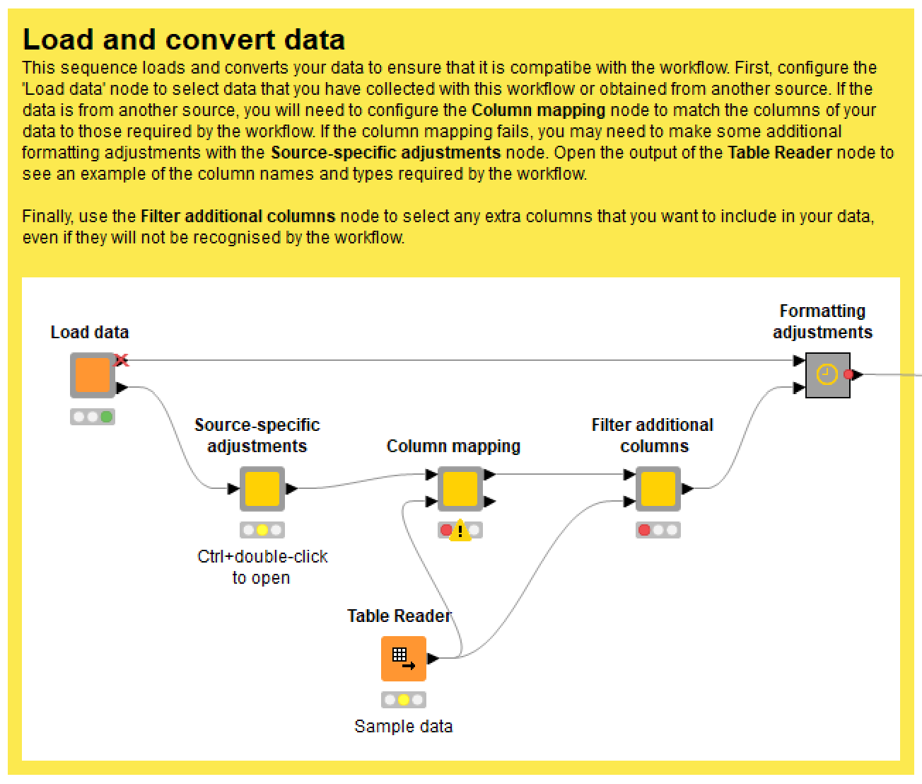
I’ve tried to make the conversion process as easy as possible. To map the columns in your data to those required by the workflow, just double-click the Column mapping node and choose the appropriate column names, as per the example below.
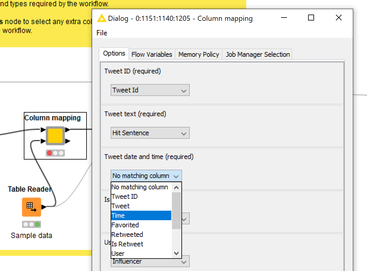
The workflow will then do its best to make your data compatible (doing simple conversions such as strings to numbers), but if the validation step fails, you will need to make some additional adjustments in the space provided in the Source-specific adjustments node. Over time, I hope to add some pre-defined conversion options in here for common data sources.
After (and only after) you have run the data refinement step, execute the Table Reader in Step 2 and run the Tag names, hashtags and mentions node. This node converts your tweets into Knime’s native document format (in which the words are tokenised, making them machine-readable) and tags named entities (people, places and organisations), hashtags and @mentions so that these can be tallied and analysed later on. Please be patient, as this process can be quite resource-intensive. The following description of the two main parts of the process should give you an idea as to why.
First, the workflow applies a multi-step named entity tagging process that tries to improve on the results of the Stanford NLP named entity tagger, which, though impressive, can often leave a lot to be desired. In essence, the workflow uses the outputs of the Stanford NLP tagger to build a tagging dictionary which assigns each name to a single entity type. This negates the supposed capability of the Stanford NLP tagger to distinguish between, for example, Victoria as person’s name and Victoria as a state of Australia; but in my experience, the few instances where this might occur are far outweighed by the number of misclassifications that the tagging dictionary corrects, not to mention the number of additional classifications that the dictionary makes that the Stanford NLP tagger misses. As an added bonus, the TweedKollidR also makes an effort to standardise the case of tagged names, so, for example, Victoria and VICTORIA will both be tagged as Victoria (this being the most common form the dataset). This, too, creates the opportunity for errors, but again, my observation suggest that the corrections and additions outweigh the number of mistakes that this step introduces.
Second, the workflow standardises hashtags and their non-hashed equivalents. While most hashtags are unique linguistic constructions, some are ordinary words (for example, #facemasks appeared in several tweets in my lockdown dataset), which leads to the question of whether they should be counted separately from or together with their non-hashed counterparts. The TweetKollidR compares the number of hashed and non-hashed instances of each hashtag, and tags only those whose hash-to-non-hash ratio is above a threshold value, while also adding hashes to non-hashed versions of those terms. All other hashtags with non-hashed equivalents are converted to ordinary words. In addition, the retained hashtags are case-standardised. 7
Detecting duplicates
It’s no secret that much of the content on Twitter is recycled. The retweet function is designed precisely to facilitate the repeating or quoting of other people’s tweets. This duplication of content raises issues for many types of analysis, but especially for textual analysis, which lies at the heart of the TweetKollidR. If your question is what are the most frequently used terms in the dataset?, the answer might be very different depending on whether you include or exclude all of the duplicated tweets. If you include the duplicates, then the words in the most duplicated tweets will dominate your lists of top terms. This might be what you want, but it probably isn’t.
In any case, most Twitter datasets will flag whether a tweet is a retweet as opposed to an original, and even if the ‘is retweet’ field is missing, it’s easy enough to automatically classify any tweet that begins with ‘RT’. It’s trivially easy, then, to remove most of the duplication in a Twitter dataset when you want to. Most, but not all. In the datasets I have examined, excluding retweets can still leave an enormous number of tweets that are virtually identical. They may not have been retweeted in the usual way, but they have clearly been copied and pasted from the same source. If your objective is to remove duplicated content regardless of how the duplication occurred, then you need to do more than just filter out the retweets.
To this end, the TweetKollidR implements a duplicate detection method of my own design (which doesn’t necessarily mean that it’s original, since I do have a penchant for reinventing the wheel). Essentially, it looks for tweets that share a few long or several short ngrams (sequences of consecutive words) in common, and clusters them into families of duplicates. Typically, each family will include several sub-families of similar or identical retweets. Depending on your purposes, you might feel that this extra layer of de-duplication is unnecessary, in which case, you are welcome to switch it off and just use retweets as the benchmark for duplication.
Text preprocessing
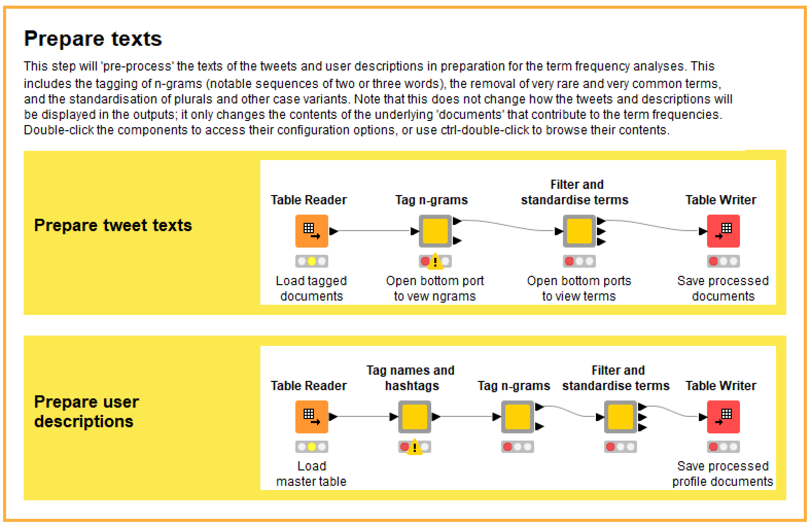
There’s one more step to go before you can proceed to the visualisations. This step is commonly called text preprocessing, and involves modifying and removing terms so that when we tally and list them later, the results will be intelligible and insightful. This process actually began earlier with the tagging of names and hashtags. The additional operations performed in the Prepare texts component include the tagging of ngrams (short sequences of words that we want to count as single terms), the standardisation of word variants, and the filtering of rare and uninformative terms, all of which are discussed in more detail below. As you can see from the workflow screen in Figure 9, these operations are performed not only on the texts of the tweets in your dataset, but also on the texts of the user descriptions.
Tagging ngrams
The challenge with tagging ngrams is deciding which of the countless pairs of words in your dataset are worthy of tagging. A simple solution is to tag only those ngrams that occur frequently in the dataset. However, some ngrams that are not very common might still be really interesting, and might even be the defining feature of a certain time period or group of users. One way to measure the ‘interestingness’ of ngrams is with a statistic called pointwise mutual information (PMI), which essentially compares how often two words occur together with how often they each occur in general, yielding a measure of how surprised or interested we should be to find them together. Word pairings with a high PMI score tend to be ones that do truly belong together, regardless of their overall frequency. 8
A problem with using PMI to prioritise ngrams is that it can’t be extended to sequences longer than two words — at least, not in a way that is conceptually sound (or so I’ve been led to believe). However, I think this is a case where an approximate hack is quite sufficient, so that is exactly what I have implemented. To rate the interestingness of a three-word sequence (a trigram), I pretend that it is a two-word sequence by treating the first or last two words as a single term. More specifically, I take the average of the two PMI scores obtained by collapsing the first and the last two terms. It’s totally a hack, and might violate certain mathematical principles, but the results are satisfactory in that the trigrams with the highest scores are generally those that are most meaningful and striking to a human reader.
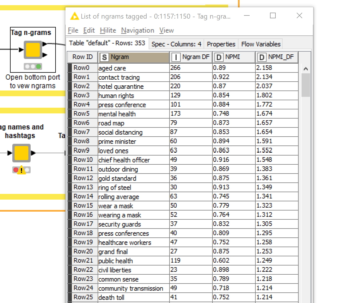
To decide which ngrams to tag, the TweetKollidR uses a metric that combines PMI and term frequency. After running the Tag ngrams node, you can view the list of ngrams by opening the second output port, as in the example below. If you think there are too many or not enough, you can adjust the scoring threshold accordingly.
Filtering and standardising terms
The Filter and standardise terms node performs some standard text preprocessing steps, such as removing stopwords (words like the or and, which have no substantive meaning) and removing words that are very rare or very common (the former because they are unnecessary baggage, the latter because they tend not to be informative). It also runs a process that standardises certain word variants, such as plurals, so that these are tallied as a single word.
The usual methods for standardising word variants are stemming, which reduces words to their stems (for example, argues and arguing both become argu) and lemmatisation, which reduces words to their simplest dictionary form. Stemming is a nightmare if your outputs are meant to be read by humans (as opposed to crunched by a computer), since many of the stemmed forms are not familiar words (as in the example just given). Lemmatisation produces interpretable results but can be computationally intensive and — I’ll be honest — I haven’t gotten around to tying it since it found its way into Knime. Instead, the TweetKollidR uses a custom-built method, which uses a simple set of rules to find pairs of terms in the data that could be variants of one another. For example, horse and horses would be matched because they fit the basic template for a plural (add ‘s’), as would jump and jumped because they fit the basic template for past tense. If one variant is much more common than the other, even if it is not the root form, then all instances of the less common form are replaced with the more common form. If each variant is as common as the other, then they are left untouched, with the logic being that they might be sufficiently different in their meaning or connotation to count separately.
Actually, the process is exactly this, except terms are not matched and replaced unless they occur within the same topic in a topic model. That’s right: the workflow actually uses LDA, a widely used topic modelling algorithm, to find groups of contextually related words within which to search for word variants. The rationale is that if apparent variants of a term do not occur in the same contexts, there is a good chance that they are either not real variants at all, or are variants that deserve to be counted separately. Does the extra computational effort required to build a topic model justify the improvements in the results? I obviously thought so when I first devised this process, but I confess that I have not yet done a rigorous assessment of this question. Whatever the case, the results are satisfactory.
Visualising communities of users
As explained in the overview, the TweetKollidR allows you to visualise your dataset in two ways: a network visualisation, and a temporal visualisation. I’ll discuss the network visualisation first.
Network analyses are par for the course with Twitter data. One of the defining features of the platform is that users can interact — at least insofar as retweets and mentions can be described as interactions — with whomever they want, regardless of whether they are known to or followed by the other user. This feature gives rise to vast and complex webs of interactions. Conveniently, these interactions are encoded in the texts of tweets themselves through the account names of mentioned users, making it very easy (if you are a data scientist) to turn a list of tweets into a network of users.
But what do you do with a network of hundreds of thousands of users? As with any network, one attractive option is to visualise it. Network visualisations of this kind can be both beautiful and intriguing. As in the example below, they can reveal high-level structures in the data, giving the analyst a reassuring feeling that there is some sense to be made from this massive web of interactions.
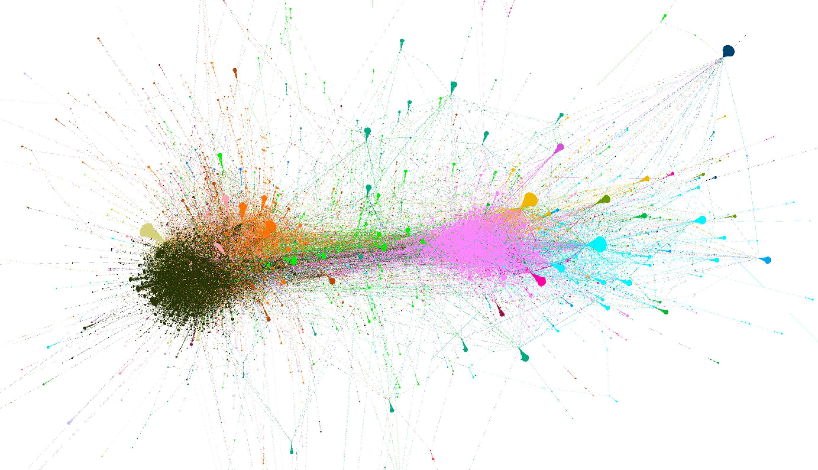
But actually making sense of a structure like this is not a straightforward process. It’s easy enough to use a community detection algorithm to find clusters of tightly connected users, which is what the colours represent in Figure 11. But these splatters of colour are nothing but eye candy until we know what unites and defines the members of each cluster.
The network visualisation produced by the TweetKollidR is designed to provide rapid insights about these clusters of users and their connections with one another. It does this in two ways. First, it simplifies the user network by visualising whole clusters, rather than individual users, as network nodes. Second, it provides rich summary information about each cluster via tooltips that appear when you hover the cursor over a node. It also provides tooltip information about each connection between a pair of clusters.
The following case study, which examines the network structure of my dataset of about 100,000 tweets about Melbourne’s lockdown, presents examples of the TweetKollidR’s network visualisations, and shows how these can be interpreted so as to gain meaningful insights about your data. Following the case study, I will briefly discuss some of the configuration options for the visualisation.
Case study 1 – The network of users tweeting about the lockdown
Figure 12 shows the ‘summary network’ of users in my dataset of about 100,000 tweets relating to the Covid-19 lockdown in Victoria between 29 August and 27 September 2020. Like the images that follow, this is a static snapshot of the interactive visualisation, which you can explore here in its proper form.

Each node in this network is a cluster of users, identified automatically by a community detection algorithm. 9 Each cluster is named after its most highly retweeted user, while the node size reflects the number of times that users from other clusters have retweeted members of the cluster.
Of the hundred or so clusters visible in this graph, four stand out: PRGuy+, VicGovDHHS+, Avi Yemini+, and ABC News+. In the middle of the graph are clusters that have connections to two or more of these large clusters. The clusters radiating outwards from these big four clusters tend to connect to only one of the big four, while the free-floating clusters on the periphery of the graph are what we might call closed communities, with no connection to the the other clusters. It’s worth noting that some of the smaller, isolated clusters in the network have been excluded from the visualisation.
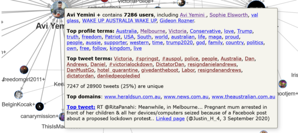
Figures 13 and 14 show the pop-up information that appears when you over over two of these larger clusters. In Figure 13, we can see that the PRGuy+ cluster is quite large, containing 7,502 users. By inspecting the top profile terms 10 (these are prominent terms that appear in the users’ Twitter profiles), we can see that most of these users are likely to be Australian. We can also infer from terms such as social justice, left, human rights, and perhaps even teacher and science, that this cluster is mostly left-leaning in its politics.
The inference that this cluster’s users are politically inclined to the left is supported by the actual profiles of the top users, which can be viewed (in the interactive version) simply by clicking on the listed names. Among them are Kon Karapanagiotidis, who is the founder of a non-for-profit organisation that supports refugees and asylum seekers, and Peter Murphy, who describes himself as a progressive Christian who supports human rights. The namesake of the cluster describes himself simply as “A PR guy. Lives in Melbourne, works in Canberra.” His feed consists largely of original content and retweets that are supportive of Victoria’s Premier, Daniel Andrews, and are critical of the behaviour of various conservative politicians and media outlets.
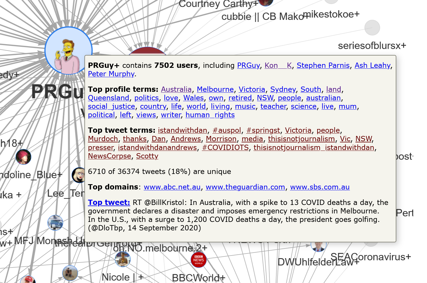
The presence of the #IStandWithDan hashtag at the top of the top tweet terms list provides further evidence that this cluster is supportive of the Victorian premier. Meanwhile, terms like Murdoch, NewsCorpse and thisisnotjournalism suggest that many users in this cluster are critical of how Newscorp outlets have covered the lockdown debate. This can be confirmed by clicking on any of these terms in the visualisation, which opens up an actual tweet from within the cluster that uses the term. For example, clicking on the term thisisnotjournalism opens the following tweet:
"Threat to democracy" – News Corp journalists have been named and shamed for dangerous misreporting on Premier Dan Andrews during #COVID19Vic #ThisIsNotJournalism https://t.co/T7alAaf6gx
— PRGuy (@PRGuy17) September 22, 2020
The summary information for this cluster also reveals that the top three websites linked in tweets from this cluster are the ABC, The Guardian, and SBS — all of which are likely to be preferred by people who are wary of NewsCorp outlets. Finally, and perhaps surprisingly, the most popular tweet in the cluster was originally authored by the conservative American poliical analyst, Bill Kristol. 11
The Avi Yemini+ cluster, which is summarised in Figure 14, contrasts starkly with the PRGuy+ cluster. While the top three profile terms suggest that many of the users are Melburnians, the terms that follow suggest that the main unifying thread in this cluster is an alignment with conservative and right-wing politics, particularly of the American variety.
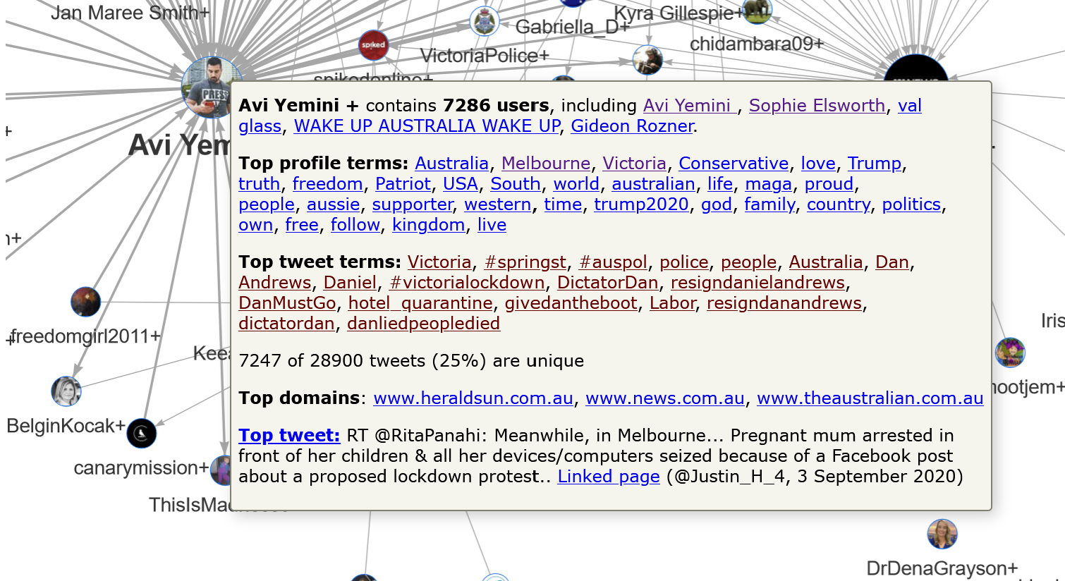
The presence of terms such as Trump, USA, maga and Trump2020 among the top profile terms in this cluster is interesting, given that all five of the top users are Australian. (Avi Yemini is the Australian correspondent for the right-wing Rebel News; Sophie Elsworth is a Newscorp columnist based in Melbourne; val glass is a resident of country Victoria; Gideon Rozner is the Director of Policy for the Institute of Public Affairs, and WAKE UP AUSTRALIA WAKE UP is … well, it’s Australian at any rate.) By inspecting the profiles that are hyperlinked from these terms, we can see that many of the accounts using them are in fact Australian. Here is one example:
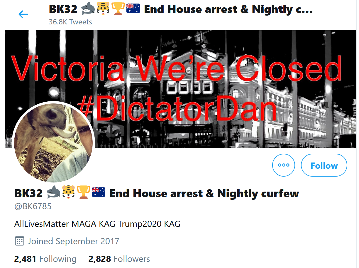
The football-themed emoji (at least I assume that’s what the tiger and the shark refer to), along with the Australian flag, #DictatorDan hashtag and anti-lockdown slogans, all position this account as thoroughly Australian. Furthermore, nearly all of the recent tweets from this account relate to the Victorian lockdown. Yet the description of the account consists of nothing but Trump campaign slogans (the acronyms expand to ‘Make America Great Again’ and ‘Keep America Great’) and AllLivesMatter, a slogan used by Trump supporters and other conservatives to push back against the ‘Black Lives Matter’ movement.
The top tweet terms listed in Figure 14 suggest that other users in this cluster are similarly focussed on local lockdown issues rather than American politics. Perhaps this is to be expected, given that the dataset consists only of tweets that mention Melbourne or Victoria. Regardless, this cluster points to a curious intersection between Trumpism and domestic Australian politics.
Finally, it’s worth noting that the three domains most commonly linked to by tweets in this cluster are Newscorp websites. Given Newscorp’s well-known conservative political leanings, it is hardly surprising that users in this cluster would preference Newscorp outlets over alternatives such as the Guardian, ABC or Nine (ex-Fairfax) newspapers. It is perhaps a little worrying, however, to see just how well Newscorp seems to be serving this particular community, which, at least on first appearances, seems to be located a considerable distance to the right of the political centre.
Then again, we shouldn’t rush to make generalisations about a community of 7,286 users. To really understand this cluster, we need to know more about its internal structure. We need to ‘zoom’ in on this part of the network. The TweetKollidR provides two ways of doing this. Firstly, there is an option to create separate ‘subnetwork’ visualisations of each cluster whose size falls within a specified range. These subnetworks show connections between individual users, and can be accessed directly from the summary visualisation.
The user-to-user subnetwork visualisations are useful for examining clusters of up to a few hundred users, but become overwhelming (both for you and your computer) if the clusters are much larger. To help you unpack the structure of large clusters such as Avi Yemini+, the TweetKollidR lets you run the summary network visualisation on just one or a selection of cllusters. 12 The result is a network of second-level clusters:
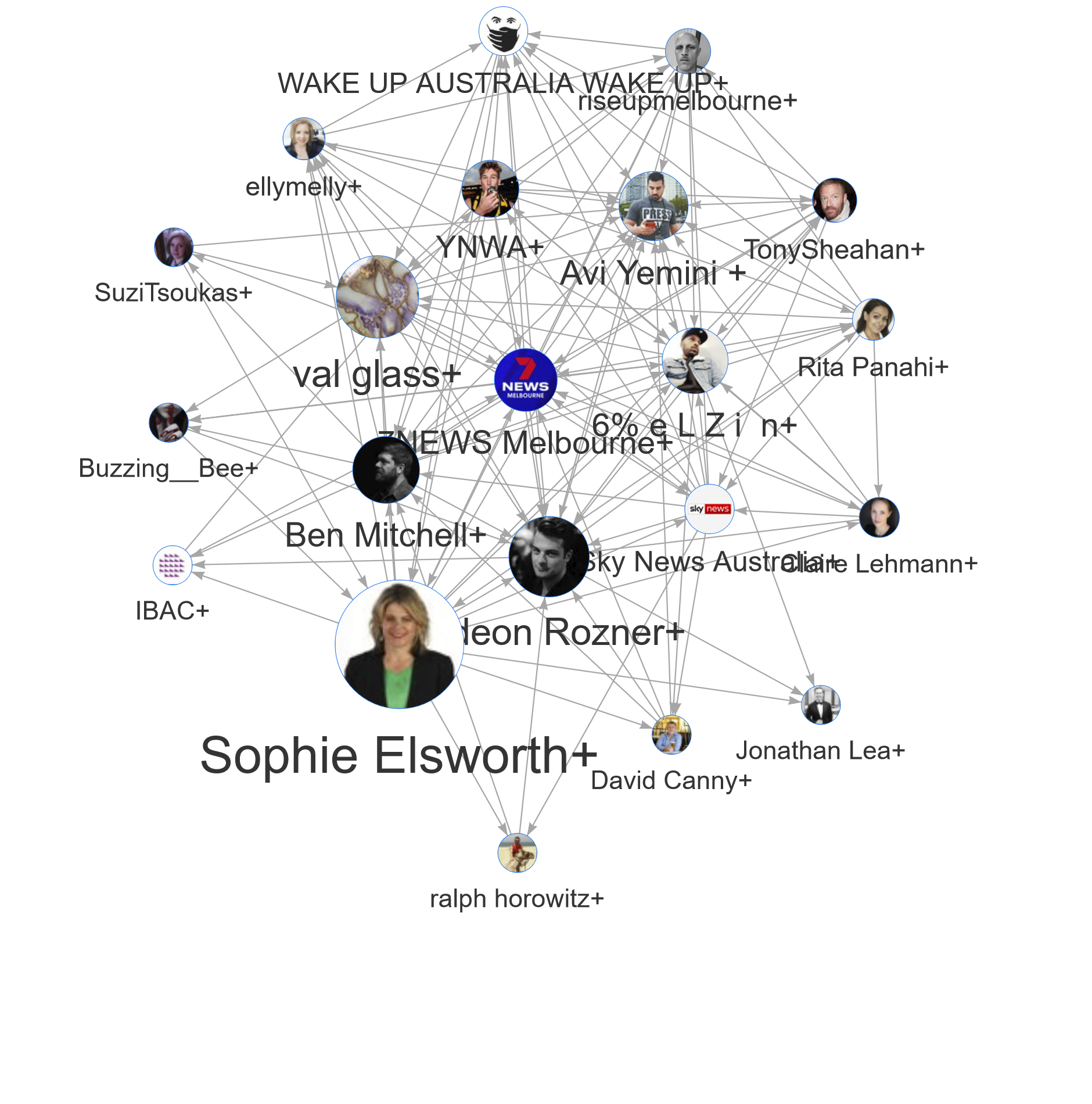
There is still a lot of complexity being hidden here. Most of these clusters still contain several hundred users, and, as with the main summary network, some smaller clusters have been pruned. You could dig into this all day, but I’ll just make some brief observations.
Firstly, it’s clear that there is a mixture of mainstream and more radical conservative voices here. The more radical voices, such as risupmelbourne and Avi Yemini, are largely clustered in the top part of the network, while in the lower half, we find clusters featuring Sophie Elsworth (the national personal finance writer for Newscorp), 7News Melbourne, and even Victoria’s anti-corruption agency, the IBAC. The 7News Melbourne+ cluster at the centre of the network contains several mainstream news outlets, including the Herald Sun, The Australian, and the Sunrise television program. Its central position in the network is interesting, as it suggests that these mainstream outlets are a common point of reference for both moderate and radical conservative actors.
Also interesting is that Sophie Elsworth, although a columnist for mainstream news outlets, stands apart from the 7News Melbourne+ cluster. The popup information for the Sophie Elsworth+ cluster suggests that its 1,214 users include few journalists or news organisations. Indeed, the top profile terms do not hint at any particular professions (but they do include the word retired). A look at Elsworth’s recent tweets provides a possible explanation for her position within the network: her tweets, of which there are typically more than a dozen each day, are relentlessly critical of the Andrews Government, to the point that her feed resembles that of a political activist more than that of a journalist.
While these examples touch on only a fraction of the information available in the summary network visualisation for this dataset, they are sufficient to illustrate how this visualisation can help you to understand the structure and content of your dataset in quick order. To recap:
- The TweetKollidR’s network visualisation shows you the high-level structure of the user network by visualising clusters of users as nodes and showing the aggregated connections between the clusters.
- For each cluster, the visualisation provides popup information including top users, top profile terms, top tweet terms, top domains, and the most popular tweet. Every item in these lists is hyperlinked to relevant tweets and user profiles, allowing you to see curated examples of the data in its original form.
- Popup information also summarises the connections between each cluster, again providing linked examples of tweets that contribute to the connections.
- You can investigate the clusters in more detail in two ways: either through user networks for each cluster, accessible through the main visualisation; or by re-creating the summary visualisation just for the users in one or more clusters.
As the preceding examples demonstrate, the top tweet and profile terms help you to form an immediate impression of the users and content in each cluster, while the linked tweets and user profiles provide evidence with which to appraise that impression and develop a fuller understanding.
Configuring the network visualisation
The screen that allows you to create the network visualisation is shown below.
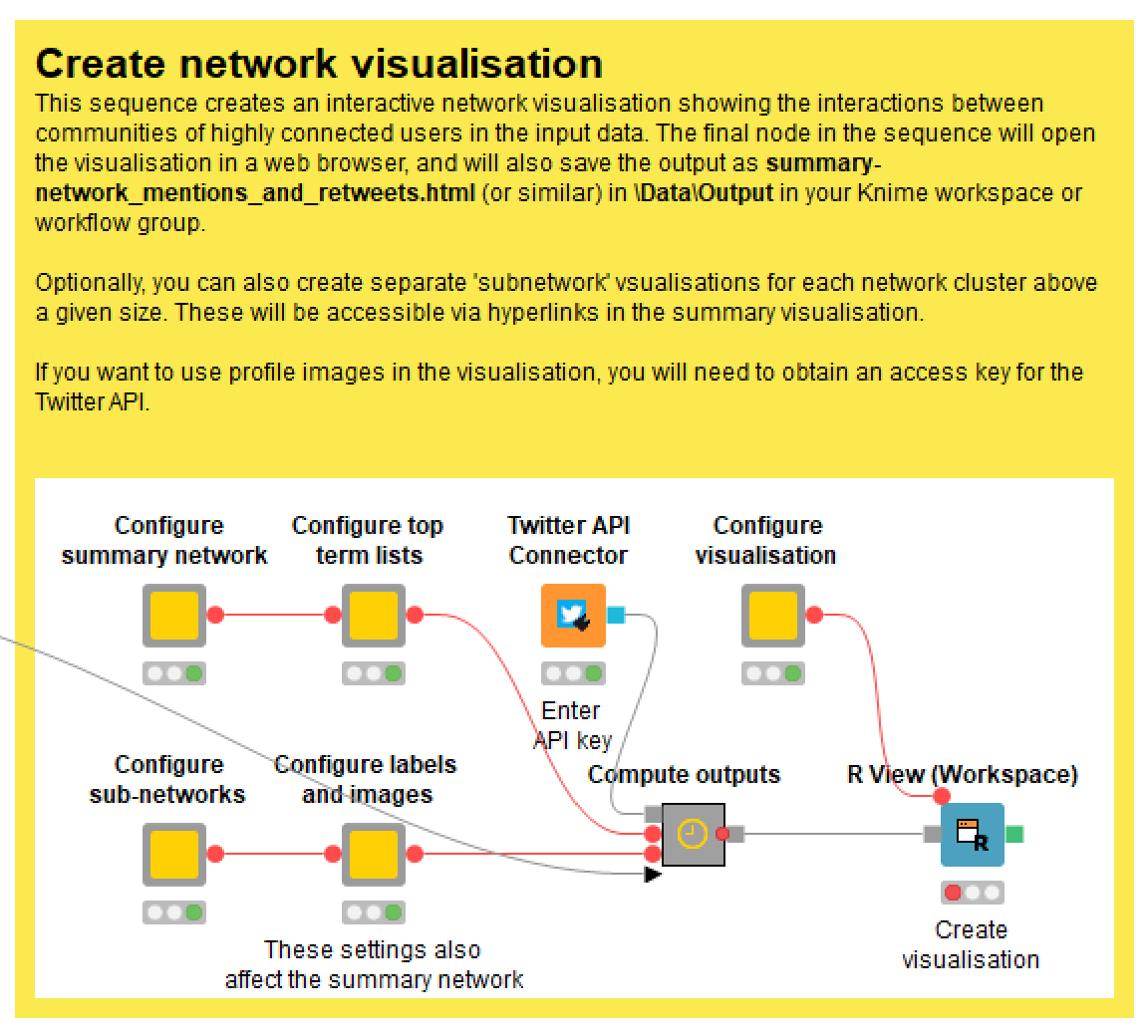
As I mentioned earlier, instructions for all of these components are conveniently available from within the workflow itself, so I won’t talk through every one of them here. I’ll acknowledge firstly that this is a somewhat unconventional configuration menu, and that it’s not organised quite as I would like. This is just the price that we have to pay for working at the limits of how Knime was designed to be used.
Configuring the network structure
These options can be found by double-clicking the ‘Configure summary network’ and ‘Configure sub-networks’ nodes. Just to make things more confusing, there are some additional options are in the ‘Configure labels and images’ node.
- You can choose to build the network based on retweets, mentions, or both combined. Generally I find that retweets create a more insightful network, since retweets more often reflect some degree of endorsement of the original content, wheras mentions are just as likely to be hostile as friendly.
- You can choose to filter out connections between clusters that comprise fewer than a specified number of retweets or mentions, while retaining such connections if they are the all that tie a cluster to the rest of the network. This lets you thin out the network while keeping it together in one piece. There are similar options for the subnetworks that you can choose to create for clusters falling in a given size range.
- The number of clusters that the network is divided into is determined by the community detection algorithm used by the workflow (the fast_greedy option in igraph, if anyone is wondering). If you want to force the network to be divided into more of fewer clusters, you can enter a modifying number here. Note, however, that this may not always produce the results that you have in mind. For example, adding more clusters may just increase the number of small clusters rather than dividing up the large ones, which would be a more useful outcome.
Configuring the top term lists
- You can configure the length and composition of the top term lists by firstly specifying the total number of characters (rather than number of terms) and then specifying what percentage will be allocated to words as opposed to names.
- You can also choose how terms will be ranked. By default terms are ranked according to their document frequency (that is, the number of tweets they appear in) multiplied by their inverse category frequency, which is a fancy way of saying that a term’s rank is promoted if it appears in only a small number of clusters (thus making it a more informative descriptor of the cluster). Alternatively, you can choose to weight terms by their inverse document frequency (thus promoting terms that are rare, regardless of how many clusters they appear in), or just rank them by their raw document frequencies.
- You can also choose whether to promote the ranks of ngrams. I included this option because I find that the tagged ngrams are often highly descriptive and informative, yet rarely make it into the top term lists. By default, the frequency scores of ngrams are boosted by a factor of 1.5.
Configuring images and popup labels
- As you will have seen in the examples above, the TweetKollidR fills the network nodes with the relevant user’s profile picture wherever possible. It does this by retrieving the relevant pictures via the Twitter API. So, in order to use this feature, you will need to supply an API access key. If you don’t have one, the network nodes will just be a uniform colour.
- The workflow retrieves the profile images, saves them in a local folder and links the network visualisation to this folder. If you plan to host a visualisation online (as I have done for this post), you will need to specify the ultimate hosting address, so that this can be incorporated into the code of the visualisation.
- In the same menu as the above settings, you can also choose the variable with which to size the nodes, and choose whether to exclude small and non-connecting clusters from the visualisation.
Visualising Twitter activity over time
The second visualisation that the TweetKollidR produces is a bar chart showing the number of tweets in your dataset per unit of time. This is a very common type of graph, and one that is much simpler to understand than the network visualisation. However, the TweetKollidR adds some layers of qualitative information that make this output more informative than a standard plot of activity over time. As per the discussion of the network visualisation, I will walk through a case study employing the temporal visualisation before briefly touching on the configuration options.
First, however, a word of caution. If you have collected your data by doing recurring searches with the free Twitter API (as per the method that the TweetKollidR facilitates), you need to be doubly careful when interpreting temporal trends. Firstly, remember that the Search API provides only a sample of all existing tweets that match your criteria, and that this sample is not necessarily a random one. Even if you’ve run your searches to the point of saturation, your dataset will not include every relevant tweet that exists. Secondly, the way in which the API samples these tweets might mean that temporal aspects of the dataset are distorted. In particular, there is evidence that data obtained in this way may not show the true extent of spikes in activity. None of this means that the results are not meaningful; it just means that you need to treat the results as approximate or indicative rather than as definitive.
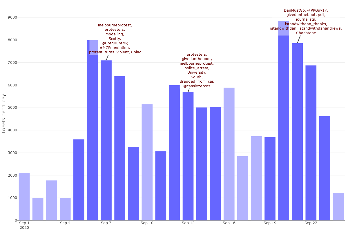
Case study 2 – temporal trends in tweets about the Melbourne lockdown
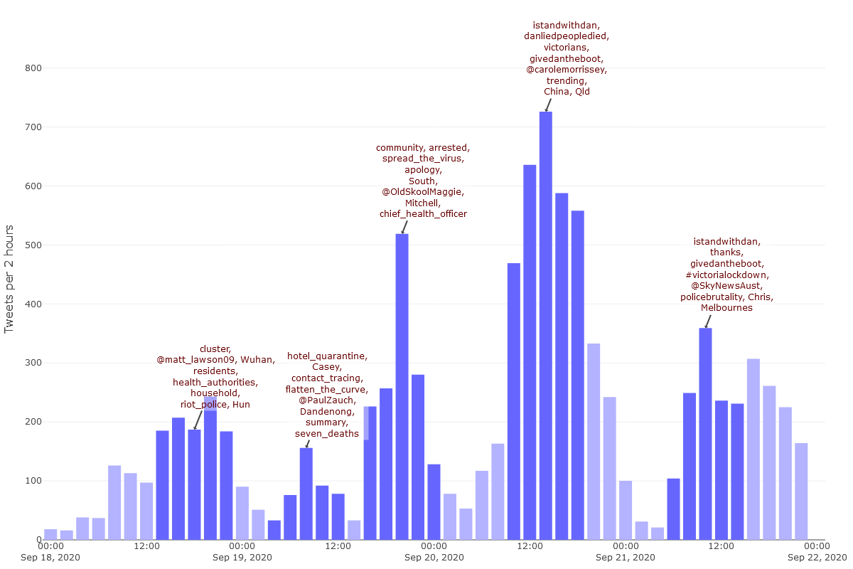
As we saw in the ‘progress graph’ in Figure 3, it is likely that my dataset has some completeness issues for the period of the 16th to the 21st of September, in that a relatively low number of tweets from this period were retrieved more than once (meaning that I had not reached the saturation point of what the API was willing to give me). If I was being careful, I would refrain from investigating the temporal trends in this period. However, since I am really curious about the spike in activity on the 20th of September, I’m going to analyse the period from the 1st to the 23rd of September. Figure 17 shows the level of activity per day over this period.
As with the network visualisation, this output is interactive. To see the full functionality, open the interactive version.
As well as showing the number of tweets in each timestep, Figure 17 shows a list of prominent terms from each ‘peak period’ of activity. These peak periods, which are shaded dark blue, are automatically detected based on some simple criteria that the user can customise. The top terms are not simply those that occur most frequently in each peak period (at least not by default). Rather, they are selected according to their frequency as well as their uniqueness to the period. 13 In addition, they exclude terms that appear in every single timestep, and force the inclusion of at least one location and person or organisation.
The purpose of the annotations is to provide a rough idea of what is going on in each period of peak activity. In this case, the terms for the first peak period (the peak itself was Sunday, 6 September) suggest that protests were a major talking point. As well as the word protesters and the hashtag 14 #melbourneprotest, the list includes the juicy ngram, protest_turns_violent. These terms are all hyperlinked to representative tweets, so all we need to do to get further context is click on them. Clicking on protesters, for instance, gives us this tweet:
Anti-lockdown protesters defied police in Melbourne, prompting arrests, even as the state of Victoria continued its improvement in stemming new cases https://t.co/fg89OCNE5y pic.twitter.com/YWPllpGCtD
— Reuters (@Reuters) September 5, 2020
Also discussed during this period was modelling (specifically, that used by the Victorian Government to justify their lockdown measures), the Prime Minister (known by some as Scotty), and the federal health minister, Greg Hunt. Meanwhile, Colac is the name of a town that had the majority of active cases in Victoria at the time.
Protests were again a prominent topic in the second peak period, which occurred almost exactly a week after the first. Among the protest-related terms in this period are police_arrest and dragged_from_car. Unfortunately, but interestingly, the tweet that the workflow chose as evidence for this last term turns out to be from a suspended account.
Another prominent term from the second peak period is the hashtag #GiveDanTheBoot. This also appears in the third peak period — which again is centred around a weekend — along with several others, including #DanMustGo, and #IstandWithDan. There are even tagged ngrams constructed out of hashtags, which is a result of these hashtags being frequently paired together.
The density of Dan-related hashtags in this third list suggests that the activity in this third period was qualitatively different from that of the first two periods. It appears that discussion of more substantive matters might have been getting crowded out by more purely political content. Indeed, the evidence tweet for #DanMustGo basically confirms that a hashtag war had broken out:
Shout out to the #DanMustGo whingers/bots/trolls/etc who haven't realised we stole their hashtag and now they're plugging our tweets. #DanMustGo on to become Prime Minister of Australia. #IStandWithDan #ThanksDan
— PRGuy (@PRGuy17) September 20, 2020
(Incidentally, if you followed the earlier section about the network visualisation, you’ll recognise @PRGuy17 as the central figure in the main left-leaning cluster of users.)
Half a dozen words and names is not much upon which to form an impression of several thousand tweets posted across several days. To allow a fuller and more nuanced characerisation of activity over time, the visualisation (in its interactive form) provides popup information summarising each timestep. Here is an example:
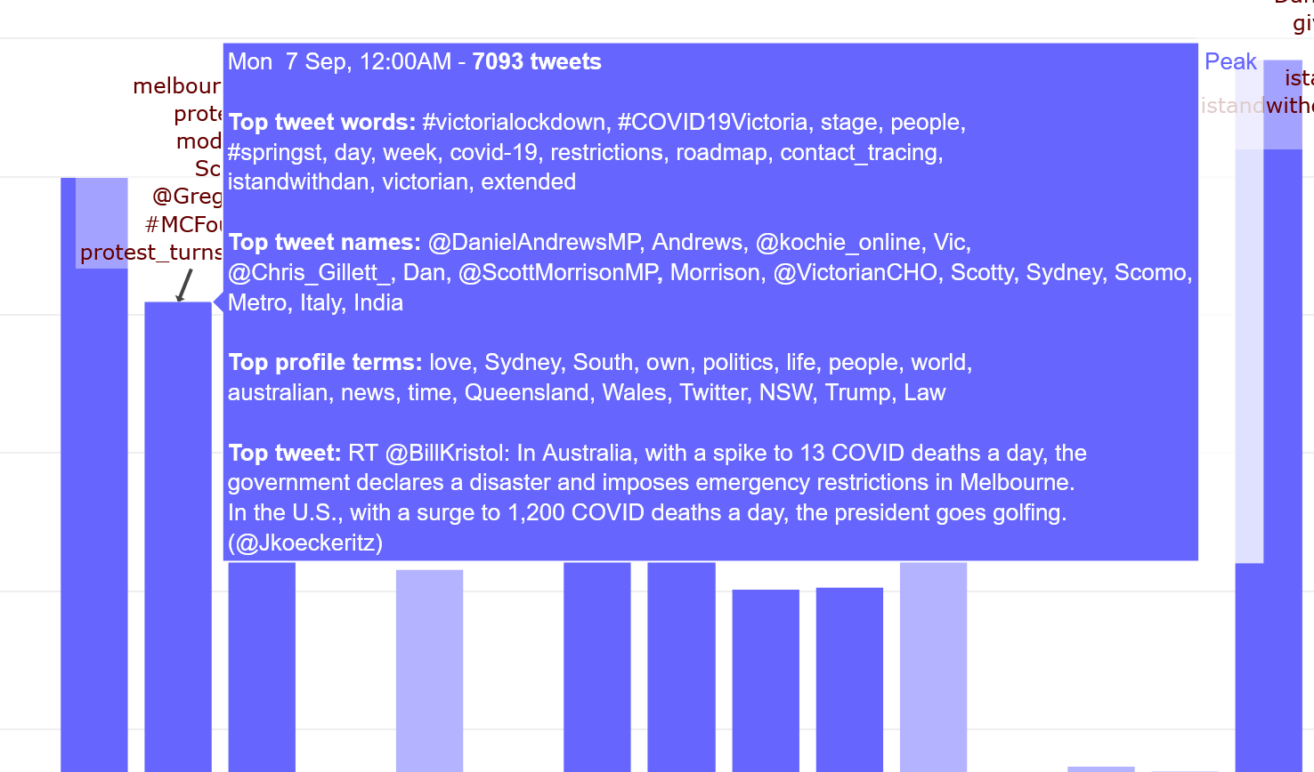
These popups provide similar information to those in the network visualisation: separate lists of prominent terms and names used in tweets (these have been filtered less agressively than the annotation lists, hence the presence of ubiquitous hashtags such as #victorialockdown), top terms from user profiles, and the most popular tweet from the timestep. Unfortunately, these lists are not clickable, becuase Plotly (the R package that produces the visualisation) only allows the popup text to display while your cursor is over the relevant bar.
A busy Sunday for #DictatorDan
As the earlier network analysis revealed, at any given time there is not one conversation about the lockdown happening on Twitter, but several. When we examined who retweets whom, we found that most retweets occur within clusters of users who interact much more frequently with each other than with users from other clusters. We should keep this in mind when examining activity over time. We might find, for example, that not all groups of users contribute equally to spikes in activity.
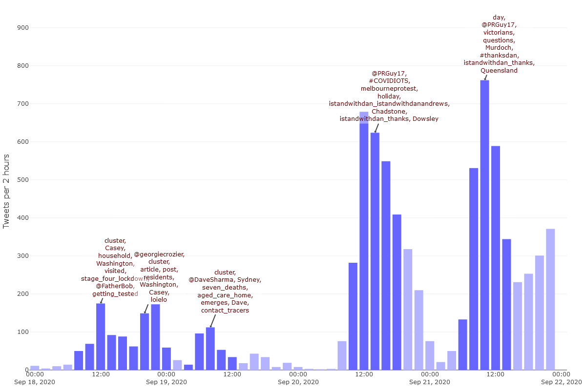
You can explore such possibilities in the TweetKollidR by visualising activity over time for one or more specific network clusters. Figure 19 shows activity over time for the Avi Yemini+ cluster, which, as the network analysis showed, contains users who are predominantly at the the right-hand end of the political spectrum. This shows the same time range as Figure 17, but uses timesteps of 12 hours instead of whole days.
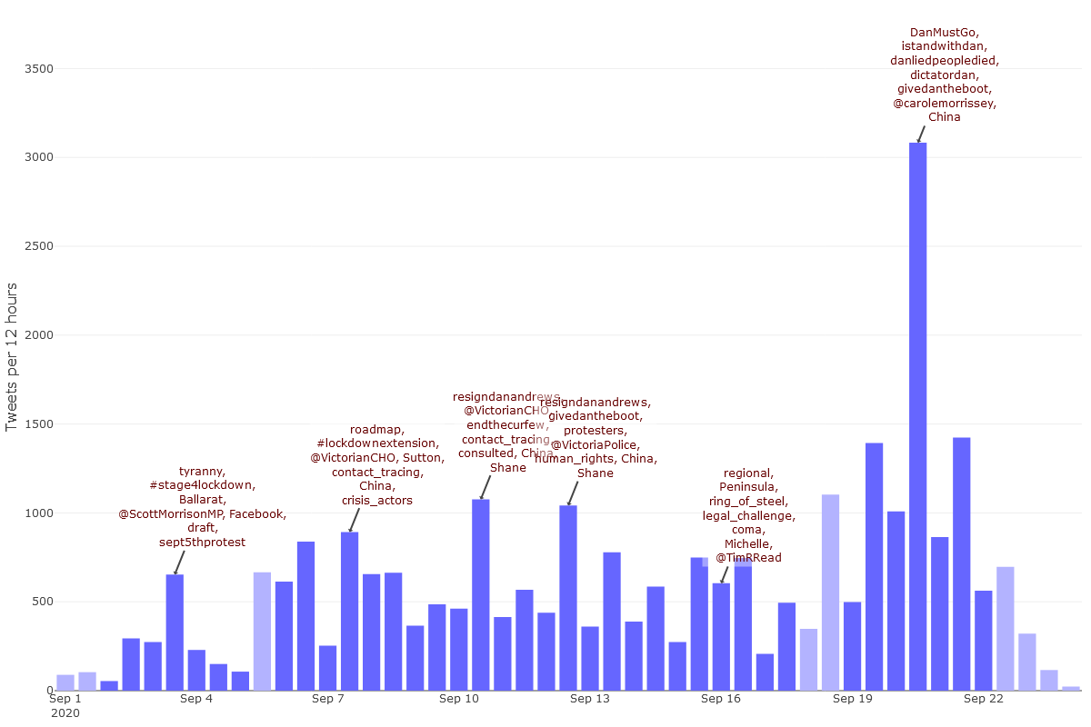
The annotations and pop-up information in Figure 19 suggest that the huge spike in activity in the latter half of Sunday 20 September was laden with politicised hashtags in a way that content from other periods were not. Don’t be fooled by the presence of #IStandWithDan in this list: it derives from tweets like this one that target the hashtag (or those who use it) rather than using it positively.
Figure 20 zooms in for a closer look, showing just the period from the 18th to the 22nd of September, using 2-hour timesteps. We can see even more clearly now that the hashtag frenzy really was limited to the Sunday afternoon. At this point, even the word trending was trending!
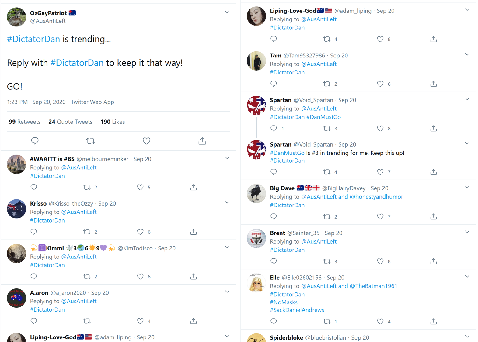
Clicking on the word trending (in the interactive version) in the annotation opens up this tweet by @AusAntiLeft, the sole purpose of which was to encourage people to keep the #DictatorDan hashtag trending. As the replies to this tweet in Figure 21 show, @AusAntiLeft’s followers were happy to oblige.
So does this little hashtag frenzy account for the spike in the dataset as a whole on Sunday 20 Setpember? Not quite, as Figure 20 shows that the users in the PRGuy+ cluster were also busy that afternoon, although they were tweeting about #COVIDIOTS rather than #DictatorDan. However, the activity form the Avi Yemini+ cluster does provide a good example of the sort of coordinated activity that some users will engage in to amplify a hashtag. Recently, Tim Graham from QUT has written about exactly this kind of behaviour in connection with the #DanLiedPeopleDied hashtag.
Configuring the temporal visualisation
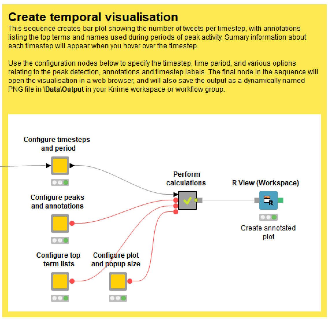
As with the network visualisation, the temporal visualisation is configured by opening up a series of configuration nodes, as shown below.
The most important setting is the length of the timesteps, as this will fundamentally affect the appearance and utility of the visualisation.
The only aspect of the temporal visualisation that is likely to cause any headaches is the classification of peak periods. As you might imagine, this is not an easy task to automate. The technique that I’ve implemented is home-built and experimental, and does not always produce good results the first time. The technique has two components, both of which the user can adjust:
- The workflow calculates a moving average of the number of tweets per timestep. This smooths out the ups and downs, providing a simpler trajectory in which to identify peaks. The size of the window (and thus the smoothness of the trace) is can be set in the ‘Configure peaks and annotations’ node.
- The workflow then identifies peaks in the moving average by scanning for a prescribed sequence of increases and decreases. The sequence, which is configurable is defined in terms of ups (U) and downs(D) — for example, I find that UUDD often works well, but sometimes UD is sufficient. Depending on the temporal characteristics of your dataset, you may need to experiment with the size of the moving average window, the peak profile sequence, and the timestep length, in order to achieve a useful classification of peak periods. You also have the option of omitting the annotations altogether.
The length and composition of top term lists is configured in the same way as in the network visualisation: specify the length of the list in characters, and then the proportion of the lists that you want to dedicate to words as opposed to names.
Finally, if you want to visualise the activity of one or more specific network clusters, you will need to select the relevant options in the Load prepared data node on the TweetKollidR’s main screen.
Final formalities
As per the installation instructions earlier in this post, the TweetKollidR is available from the Knime Hub for anyone to use or to adapt to their own purposes. All I ask is that you credit me as appropriate. I plan to publish an academic paper about the workflow soon, but in the meantime, feel free to cite this post, along with my name (Angus Veitch).
Also, please note that at the time of writing, the workflow is essentially in beta release, as it has not been extensively tested by other users. I fully expect that some bugs will surface as the workflow is used in other environments. If you encounter one, please let me know by commenting on this post or sending me an email. For similar reasons, I can provide no guarantee about the accuracy of outputs from this workflow, as I have not yet had anyone scrutinise its internals or compare its outputs to comparable results generated by other means.
The future of this workflow will depend largely on the extent to which other people use it. If people find it useful, I will do my best to maintain and improve it. I might even consider porting it to another platform. While Knime has many advantages, I have started to wonder if the type of functionality and complexity that I’ve packed into this workflow might be easier to implement in code, perhaps as an R Shiny app. But since I’ve never made one of those before, the job of translating the workflow would be a long-term project. (Unless, that is, there is someone out there who would want to help me!)
Happy Kolliding!
Notes:
- As you will see from the search queries in Figure 3, this dataset includes some keywords that relate to Victoria more generally, rather than just Melbourne. However, since most of the content concerns the Melbourne lockdown, I will continue to refer to it as such. ↩
- The official capitalisation is KNIME, an acronym for Konstanz Information Miner, but I prefer to capitalise it like a normal name. Apologies to any all-caps purists out there. ↩
- At the time of writing, Knime does actually have a Plotly extension under development, but it appears not to offer quite the same functionality as the R package. ↩
- Within limits, the TweetKollidR does this as well, as it can optionally visualise the interactions between users in each cluster. ↩
- It is really hard to find a straight answer to the question of how inclusive and representative are the results obtained from the Search API with free access. The closest you’ll get is in some academic studies — like this one and this one — that have compared the results with ostensibly complete datasets. But even after reading those, I’m still confused! ↩
- In this particular case, the big difference in the number of tweets per query is likely to be because for the first several days of the collection, I had not yet implemented any measures to shuffle the queries and prevent any one of them from hogging the limited number of tweets allocated by the API. ↩
- Unfortunately, at the time of writing, there is a bug in one of Knime’s tagging nodes that is causing many hashtags to be treated as ordinary words (that is, without their hashes). Hopefully this will be fixed soon. ↩
- If you dig into the workflow, you’ll see that I actually use a variant of PMI called normalised pointwise mutual information, described in this paper by G. Bouma in 2007. It does the same thing as PMI, but returns a score between -1 and 1. ↩
- The workflow uses the fast_greedy algorithm from the igraph package. ↩
- It’s important to note that the top terms listed in the visualisation are not simply those that were used most frequently within the cluster (at least not by default). Rather, the terms are ranked to reflect their uniqueness to the cluster as well as their overall frequencies. Keep in mind also that by default, the term frequencies are calculated without duplicate tweets included. On top of that, don’t forget that depending on your settings, the lists omit the most common terms in the data. ↩
- Since writing this post, I have changed the method by which the top tweet is selected. Previously, the top tweet was defined as the one that had received the most likes and retweets, regardless of the original author or who did the retweeting. This is why a user with a large international following but with little relevance to this particular cluster was able to produce the top tweet. Now, the top tweet is defined as the most popular tweet (measured by likes and retweets) of the user who was retweeted by the highest number of users within the dataset. ↩
- As mentioned elsewhere, you can also create user-to-user ‘subnetworks’ for clusters of a specified size range. There a few of these available in the interactive version of the summary network. For example, try looking at the BeachMilk+, Jacinta_DiMase+ and spikedonline+ clusters. ↩
- More specifically, they are weighted by their ‘inverse peak frequency’. You can also choose to weight them by their inverse timestep frequency, their inverse document frequency, or to just use their raw document frequency. ↩
- I know, the hash sign is missing. I suspect that this is due to a bug in one of Knime’s tagging nodes; hopefully it will be fixed soon. ↩
Hi there,
this is Paolo Tamagnini from the KNIME Evangelism team!
This is great work! I can see you also shared the workflow here on hub.knime.com!
https://hub.knime.com/angusveitch
Would you consider also share the Components one by one like we do for Verified Components (https://www.knime.com/verified-components) ?
This would enable people to reuse your work just like standard nodes! It might require a bit of work setting up component dialogues with configuration nodes in a few places but I think it would totally be worth it!
Cheers
Paolo
Hi Paolo. I hadn’t thought of sharing the components separately, but I will look into it. Let me know (perhaps by email) if you have any suggestions about which components would be most useful. Cheers!
Angus:
Great piece of work. I’m struggling with how to embed user images in the network visualization. I think I’ve found the relevant nodes, but I’m not sure how to set them. If you have time, could you provide a detailed explanation. Thank you.
Hi Gene. Thanks for your interest in the workflow! I admit that the configuration settings can be confusing due to the way they are laid out. (I’ll try to improve this in future releases.) In theory though, all you should need to do is to enable the ‘Retrieve profile pictures’ option in the ‘Configure labels and images’ component. You will also need to enter your Twitter API credentials in the nearby API Connector node.
The only other setting that should affect this is ‘Prepare for web publication’. If you are just viewing the output locally, this option must NOT be selected. You will only need this option if you want to post the output on a website, like I did on this blog.
If all of the above is set up correctly but the images are still not loading, then you might have found a bug in the workflow. In which case, feel free to contact me directly so that we can sort it out.
Let me know how it goes!
I didn’t get an email notice. Thanks for the reply. Got it working. If you don’t mind, I have a few other questions, but I’m going to play with your workflow some more to see if I can figure it out on my own.