2019 was quite a year. I proposed to my wife and got married. We relocated from Brisbane to Melbourne. We got a dog. China got Covid. And Australia got burned to a crisp.
I wrote about two of those things exactly five years ago in a post published on 27 January 2020 — a data-driven reflection on the climatic contrasts between Brisbane, where I spent the first four decades of my life, and Melbourne, which I now call home. That post was written on the first-year anniversary of our two-day drive from the humid heat of south-east Queensland into the meteorological madness of Melbourne. In the last few hours of that drive, as we raced to reach the real estate office in time to pick up our key before the the Australia Day weekend, the temperature was over 40°C. By the time we opened the door to our rental in Fitzroy, the temperature had dropped to the mid 20s. A cool change indeed.
When I started writing that post in the dying weeks of 2019, much of the country was on fire. Melbourne, meanwhile, was veering from day to day between baking in smoke and 40-dergree heat or basking in a glorious combination of clear sunshine and cool, crisp southerly breezes. It was really hard not to talk about the weather.
Since 2020, I’ve only published four posts, and since 2022 I’ve posted none. I was nearly ready to declare this blog deceased until I realised that it still has a faint trace of a pulse. That pulse happens to be Australia Day. This is not an expression of nationalism. As my post on January 28 2021 explained, I’m as ambivalent as anyone about what our national day does, can or should mean. But for whatever reason, since my January 2020 post on the anniversary of the previous Australia Day, I’ve managed to post on two successive Australia Day weekends. In keeping with the tone set by the first one, the last of those posts was yet another meditation on Melbourne’s weather.
So this post is partly an effort to keep the tradition — and indeed the blog — alive. But I also happen to I have something worth sharing — something that loops all the way back to that first Australia Day post. As before, it revolves around the visualisation of climatic data, but this time the final product is not a graph on a computer screen.
This time, I painted a fence.
The concepts of a plan
The reason I stopped posting on this blog is pretty simple: I got a job. Not only did that mean I had less time for playing with data and writing, it also meant that I had less inclination to switch on a computer and play with data even when I did have time, because that’s exactly what my job entails. Instead, I’ve filled my spare time with pursuits that are more hands-on, like brewing beer and improving the home that we bought a couple of years ago.
Like many homes in suburban Melbourne, ours is separated from the property behind us by a wooden fence that has seen better days. Being generous, you could say that it perfectly complemented the bleak aesthetic that the yard had when we first moved in. But after we replaced the lawn of quartz pebbles and concrete with a garden and artificial grass (I’d love to plant real grass here, but am not sure it would thrive in shade most of the day), there was no denying that the grey, weathered fence was bringing down the vibe.
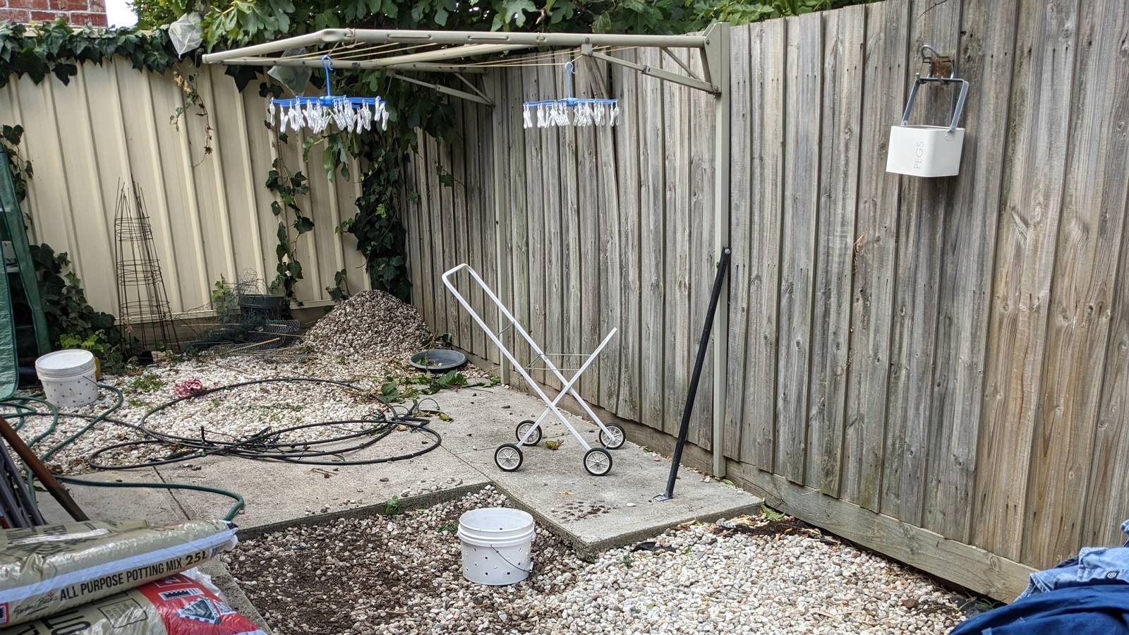
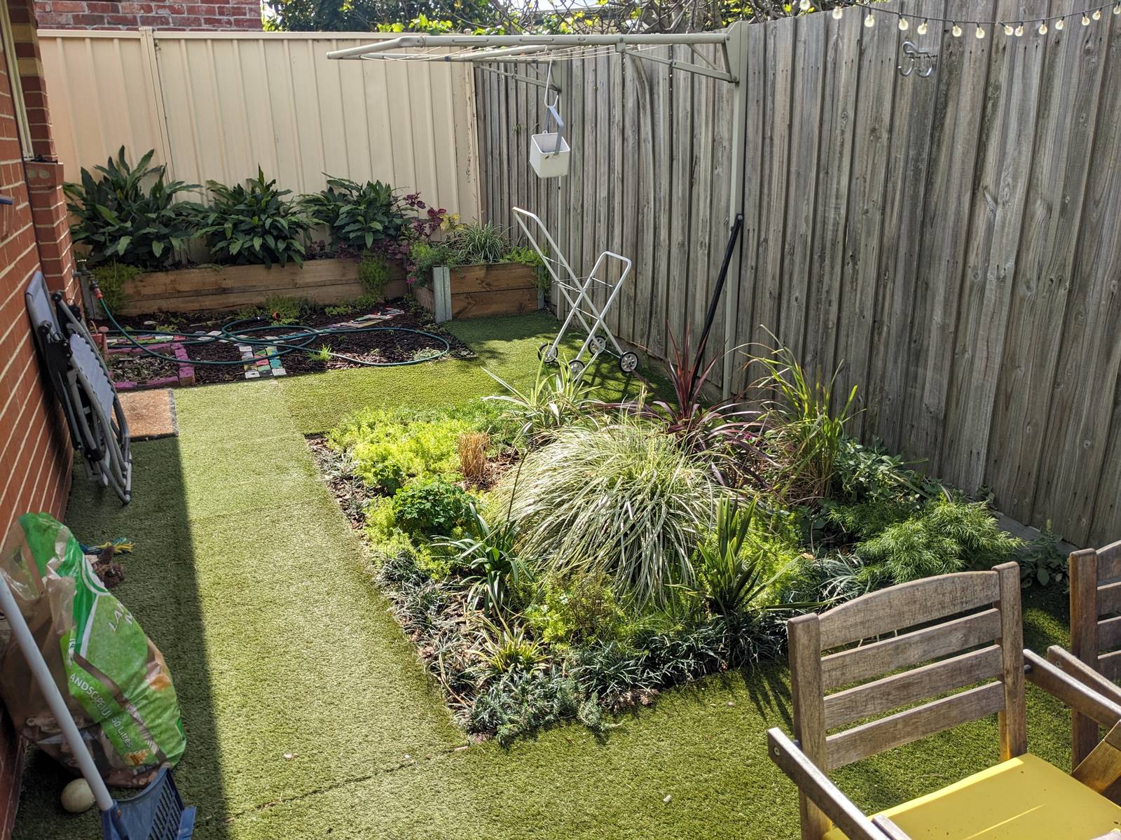
I got as far as preparing a letter to the neighbours about replacing the fence. But then I wondered if I was letting an opportunity pass me by. For what is the point of owning your own home if you don’t do things to it that a landlord wouldn’t allow? And if the fence’s days were numbered anyway, why not do something creative with it in the meantime?
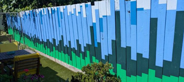
After months of gazing at the fence and wondering how to improve it, I began to imagine it as a giant data visualisation, where each of the 112 available palings could represent … something. It was a very small leap for me to settle on climatic data as that something. If each paling represented a day (or three or four), the whole fence could depict a year’s worth of temperature data. But which year? That question had one obvious answer.
FenceSim 1.0
How does one go about turning a fence into a bar chart? I’m not sure how many other people have grappled with this question, but for me the obvious place to start was with a computer simulation. There were too many variables to consider any other way. How to divide 112 fence palings across 365 days? How to scale the temperatures? What other data might I be able to include? What colour combinations would work?
So I fired up KNIME, my data science tool of choice, and set about building a fence simulator app. A neat thing about KNIME is that building visualisations and interactivity on top of a bunch of calculations is really easy — easy, at least, compared with doing it in a traditional programming language.
Here’s what the app looks like:
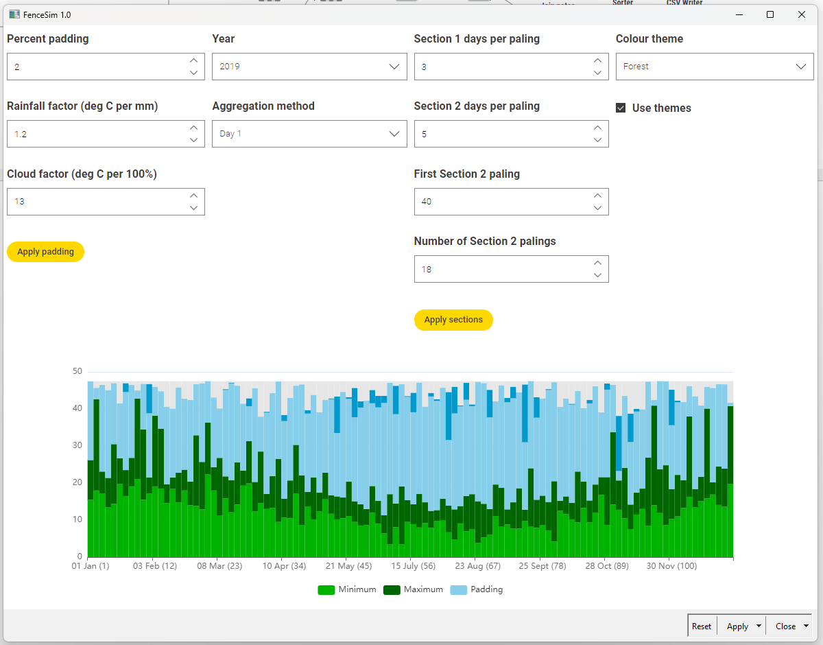
Here’s all you need to know to understand the graph:
- Each of the 112 simulated fence palings represents the first of three successive days in 2019, except between 1 May and 1 August, where each paling is the first of five days.
- The bottom two data series are minimum and maximum daily temperatures.
- The top two series are cloud cover (inferred from solar exposure) and rainfall.
- The light blue portion does not reflect any data, and is just there to provide background to the other series.
- All data were downloaded from the Bureau of Meteorology, and pertains to the Melbourne (Olympic Park) observation station.
The chart shown here is the one that ended up on the fence. But it was one of many alternatives that I first explored with the app. Among the parameters that I experimented with are:
- The size of the rainfall and cloud cover series relative to the temperature (the rainfall and cloud factors), since these are in completely different units of measurement.
- The minimum padding to allow between the rainfall and maximum temperature series.
- The method for aggregating three days into one paling. I toyed with averages or min/max values, but the results were either too boring or too artificial. I chose to show data for individual days so that each paling represented something concrete in reality.
- The points at which the number of days per paling changes. And yes, I know that this completely corrupts the integrity of the graph. But remember, we are painting a fence here, not doing science! I’ll explain further below.
You’ll notice that I even loaded the app with data from different years, even though my heart was already set on 2019. The capture below shows the app in action:
At the end of the day, I was chasing an output that looked interesting and told the story I wanted to tell. This is why, among other things, I divided the graph into sections with different timescales (three days per paling, then five, then three again). My desire to fill all 112 available palings conflicted with the mathematical reality that 365 when divided by 112 does not yield anything close to a whole number. And I chose to compress the second timescale into winter (rather than have a longer period of four days per paling) because there just wasn’t as much day-to-day variation to see in winter. And besides, if any Melburnian could make winter shorter, they surely would.
The other reason for simulating the fence on the computer first was to gain my wife’s approval before transforming the fence — which, amazingly, she granted.
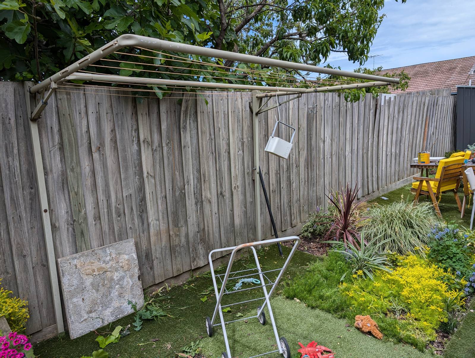
Making it real
Needless to say, simulating a fence is a very different exercise from painting one. The latter required first converting the graph into a spreadsheet with measurements scaled to the size of the fence, then marking up these measurements on the fence, and then finally painting to these measurements. Given that I had never painted a fence (or anything, really) before this one, you can imagine that the last of these steps presented the biggest challenge of them all, but I’m not going to recount that experience here. I’ll just show some pictures.
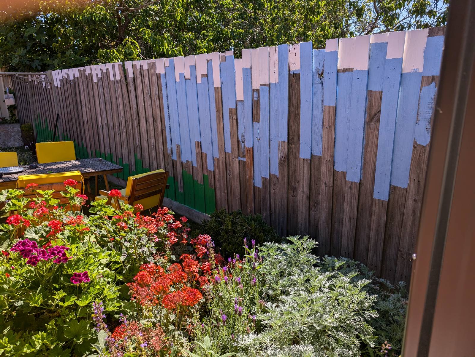
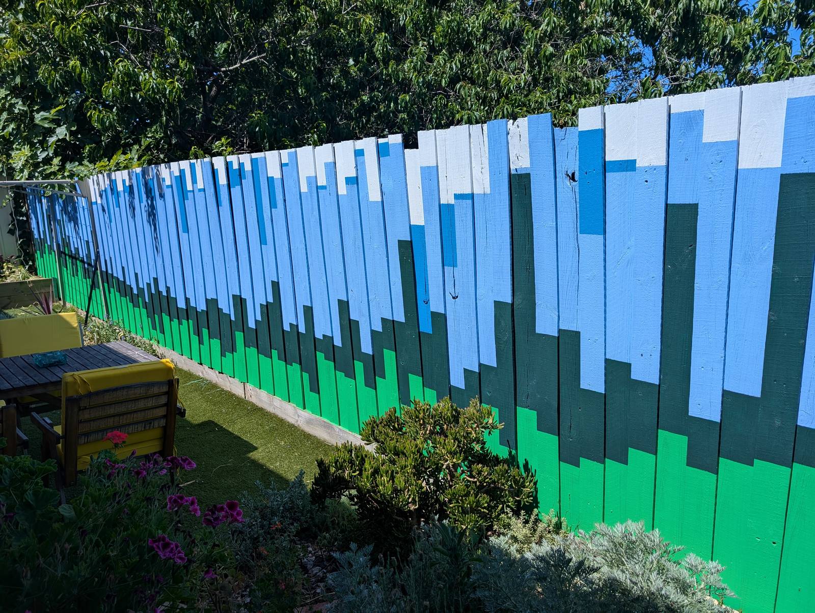
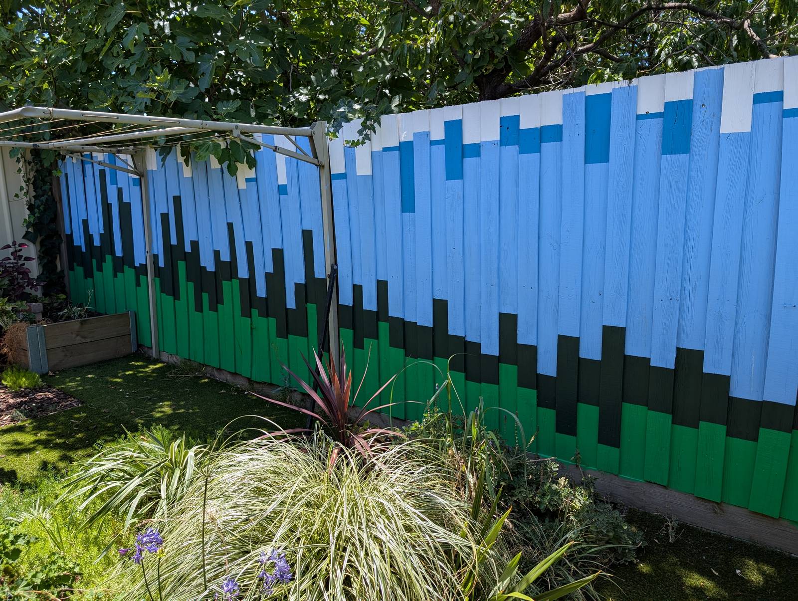
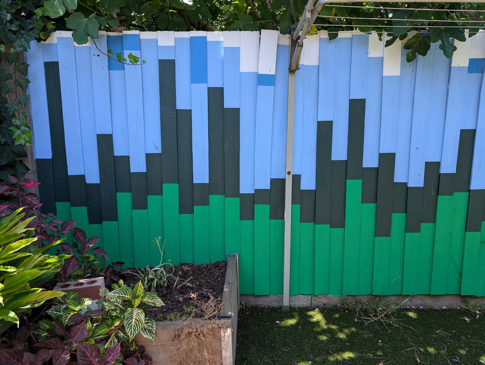
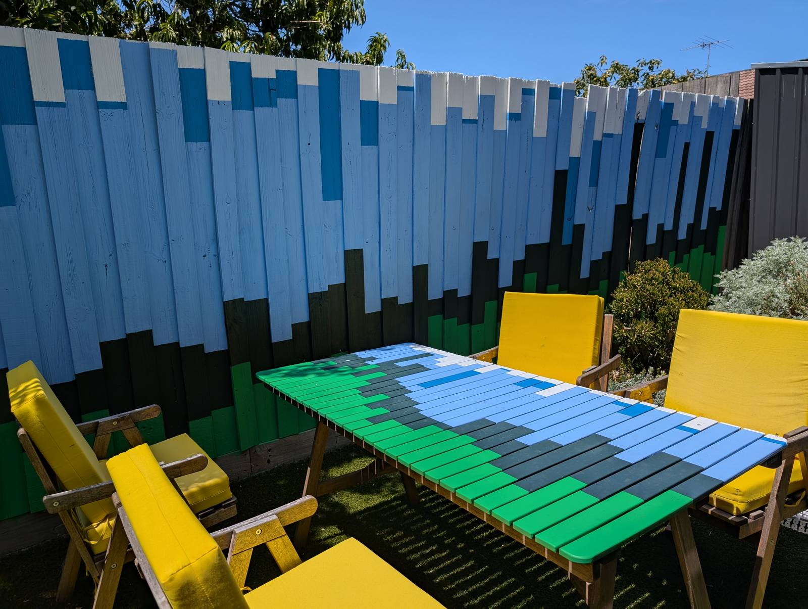
The final result has far exceeded my expectations. Not so much in terms of its execution, which is merely ok if you don’t look too closely, but in terms of its impact on the yard and the house as a whole. The colours, which were chosen to evoke the natural surroundings, make the outdoor space feel calmer and more inviting. They transform the indoor space too, as they are visible from many points of the house, and reflect colour onto the inside walls when bathed in the afternoon sun.
To be sure, there are still some things missing. Some markings to indicate scale, for one. I know that the hottest temperature depicted, on the ninth paling from the left — which happens to be the day we arrived in Melbourne six years ago — is 42.8°C, but visitors don’t. Nor does anyone else know which of these days aligns with our wedding, or when we got our dog, or when Covid-19 was first detected in Wuhan Province, or when our then-Prime Minister Scott Morrison said he didn’t hold a hose, mate while the bushfires raged among those towering maximum temperatures in December. In time, I plan to add some subtle annotations to mark these moments.
Oh, and you might have noticed something else in that last picture: I also painted our old wooden table to match the fence — because how could I not? Finished on New Years Eve just passed, it represents 2024, each paling the first of 12 days.
Now, should I paint the house?