GameStop the press!
Remember GameStop? You know, the video game retailer whose decaying share price exploded after a bunch of Reddit users bought its stock and succeeded in bankrupting a hedge fund who was trying to short it? Yeah, that was nearly a week ago now, so my memory of it is getting hazy. I mostly remember all the explainers about how the share market works and what a short squeeze is. And the thought pieces about how this kind of coordinated market behaviour is nothing criminal, just ordinary folk playing the big boys at their own game and finally winning. And the memes: who can forget the memes? Well, me, for a start.
Somewhere amid the madness, I decided that I should harvest some Twitter data about this so-called GameStop saga (can something really only be a saga after only three days?) to capture the moment, and to see whose hot takes and snide remarks were winning the day in this thriving online marketplace of shotposts and brainfarts.
I confess that I had another motive for doing this as well, which was to provide some fodder for my TweetKollidR workflow, which turns Twitter datasets into pretty and informative pictures. The TweetKollidR is a workflow for the KNIME Analtyics Platform that I developed while locked down for three months in the latter half of 2020. I’ve made the workflow publicly available on the KNIME Hub, but it is still in need of road-testing, having been used (by me, at least) to analyse only two issues — the Covid-19 lockdown that spurred its genesis, and the wearisome public discourse about Australia Day. I felt that it was time to test the workflow on an issue that was not so close to home.
So, using the TweetKollidR workflow to connect to Twitter’s Search API, 1 I collected just over 50,000 tweets containing the terms gamestop or game stop. Because I am not paying for premium access to the API, I was only able to grab tweets that were made within about 24 hours of the search (usually you can go back in time up to a week, but the sheer volume of activity around this topic might have shortened the window offered by the API). The 50,000 tweets in the dataset therefore cover just two days, namely 28 and 29 January 2021.
Let’s take a squiz! (By which, for the non-Australians among you, I mean a look or glance, esp an inquisitive one.)
All the retweets, all at once
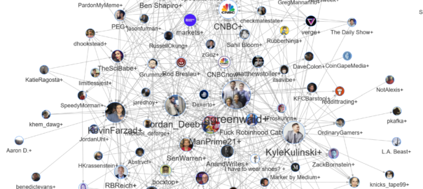
The TweetKollidR visualises Twitter datasets as networks of users who are connected by virtue of their retweets and/or mentions of one another. Rather than showing all users at once (this would amount to around 47,000 users in the GameStop dataset), the TweetKollidR simplifies the network into clusters, or communities, of users who share a lot of mutual connections.
The image below shows the communities of users who tweeted about GameStop on 28 or 29 January 2021.
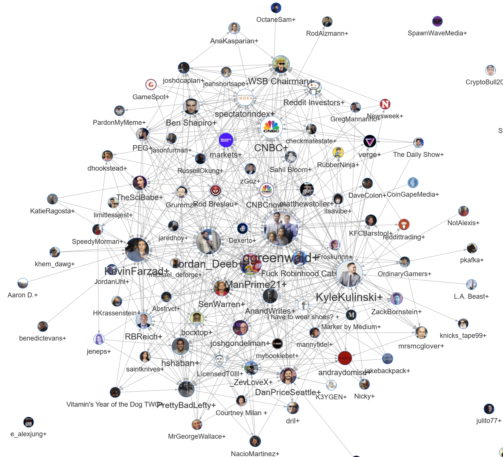
The single most important thing to remember about this visualisation is that it does not show individuals, but clusters of interconnected users. The names and profile images in the graph represent the users who were retweeted most often by other cluster members. The next most important thing to know is that the connections between users represent retweets, not mentions or replies. The TweetKollidR can also include mentions in the network, but I stuck to retweets in this case because they are more likely than mentions to reflect endorsement of views, 2 making the network simpler to interpret. Thirdly, the sizes of the nodes do not represent the number of users in each cluster, but rather the number of times the tweets in a cluster have been retweeted by users in other clusters. The number of users and the number of retweets often correlate with one another, but can sometimes diverge, especially if a cluster containing many users is largely ignored by the rest of the network.
What does the image above tell us? Firstly, it tells us something about which Twitter users were most influential during these two days of conversation about GameStop. Among the most widely retweeted users are Glenn Greenwald, an influential journalist and co-founder of The Intercept; Kyle Kulinski, the host of Secular Talk on YouTube; Kevin Farzad, the drummer for a band called Sure Sure; and Justin Jackson (J_ManPrime21), a running back (am I saying that right?) for the LA Chargers American football team.
Thus, we can see that this conversation is not being driven just be journalists and news outlets. Among the most influential voices are a YouTube host, a sportsman, and a musician.
Is Glenn Green-walled?
As I’ve emphasised already, each of the names on the graph is just a front for many more names, some of whom may be influential in their own right. The interactive version of the visualisation provides an easy way to learn more about the contents of each cluster. For example, by hovering your mouse cursor over the Glenn Greenwald cluster, you can see the following information:
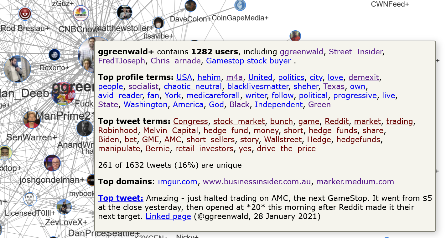
As well as quoting the most popular tweet in the cluster, this box provides various summary lists, the first of which is the five most prominent accounts in the cluster. Other than Glenn Greenwald, these include Street Insider (a trading news site), Frederick Joseph (author of The Black Friend: On Being A Better White Person), and Chris Arnade (author of Dignity: Seeking Respect in Back Row America).
If you’re getting a bit of a progressive vibe from this cluster, just wait until you see the top terms from the user profiles. These include he/him 3 (a statement of the user’s preferred pronoun, generally indicating solidarity with non-binary genders), M4A (Medicare for all), DemExit (a movement to create an alternative leftwing political party, potentially a Green party), socialist, BlackLivesMatter, she/her (notably, a long way behind he/him in this case), and progressive.
The top terms from tweets in this cluster are less informative, as they are mostly words and names that just describe the subject matter. Finally, the list of the top domains tells us that users in this cluster most frequently shared content from imagur.com (an image hosting site, often used to share memes), Business Insider, and Marker, a publication from medium.com offering ‘pop business intelligence for the intelligent reader’.
Pronouns are the new BLM
Politically homogeneous groups of users on Twitter? Who’d have thought!?
Seriously though, having now analysed three datasets (the other two relating to the Melbourne Lockdown and Australia Day) with the TweetKollidR, I can confirm that it is particularly useful for characterising the political alignment of groups of users. Many Twitter users evidently use their profile descriptions as a space in which to curate various hashtags, slogans and other descriptors that signal their political views. These tokens invariably find their way into the top profile term lists made by the TweetKollidR.
You can see more profile term lists by hovering over other clusters in the interactive visualisation. As you do, you’ll notice how often the terms he/him, she/her, they/them, BlackLivesMatter, BLM and Black all appear together, even as the other descriptors change. You’ll also notice some clusters in which all of these terms are absent. Take, for example, the cluster of users around the conservative political commentator, Ben Shapiro:
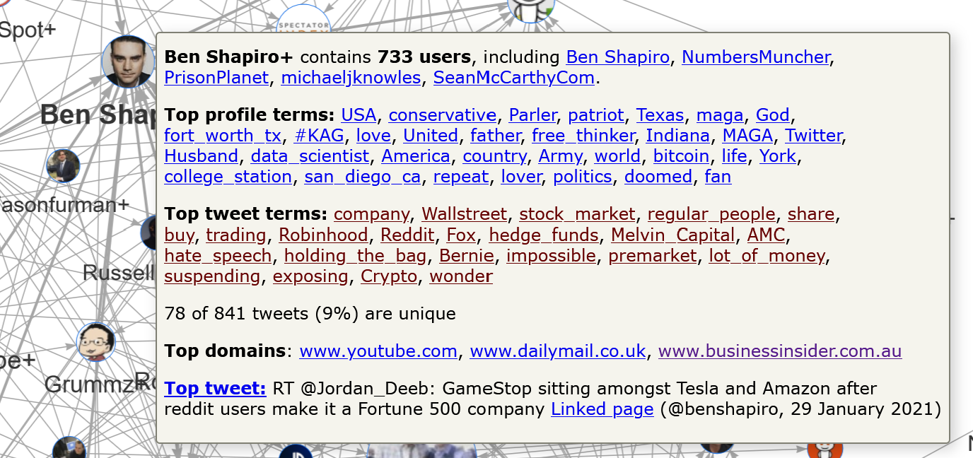
No preferred pronouns here. Instead we find terms like conservative, patriot, MAGA, KAG (Keep America Great), and Army. Also popular in this cluster is Parler, a social media platform popular among the political right. Hop across to the neighbouring cluster around PEG (Pascal-Emmanuel Gobry, who is a fellow with the Ethics and Public Policy Centre, ‘Washington, D.C.’s premier institute dedicated to applying the Judeo-Christian moral tradition to critical issues of public policy’), and you can see these same terms alongside Trump, Trump2020, deplorable, Christian and NRA. Interestingly though, the top tweet terms in these clusters are not much different from those in the progressive clusters, a finding that is consistent with the observation that Republicans and Democrats have both adopted essentially the same ‘Wall Street vs Main Street‘ line on the Gamestop story.
My own cursory survey of the clusters in the interactive graph suggests that the conservative clusters are well and truly outnumbered by the progressive ones. 4 I can only see one or two other conservative clusters besides the two mentioned above, while counting probably a dozen or so progressive ones. Whether this reflects something about the user base of Twitter, or just something about this particular issue, is something that this analysis cannot determine. There are also many clusters that are not obviously political, including some based around media outlets (CNBC being the most prominent) and several relating to the Reddit and gaming communities.
As an aside, I find the recent appearance of preferred pronouns in Twitter profiles to be an interesting development. Generally, researchers who are interested in the gender of Twitter users have to infer this information from clues such as screen names, profile pictures and stated interests. The declaration of preferred pronouns by users themselves removes any need to guess. Perhaps a little ironically, the users who are most likely to volunteer this information — political and cultural progressives — would probably have been the first to object to this information being disclosed by other means, such as through a ‘gender’ field in the profile.
When we are analysing whole clusters of communities, the preferred pronouns provide a way to infer the overall gender balance of a community. We could even do this by comparing the positions of she/her and he/him and they/them in the top profile terms lists described above. This method is far from fool-proof and would require further investigation (are women more likely than men to specify their pronouns, for instance?), but does present some interesting possibilities.
Conclusion
As always, I’ve barely scratched the surface of what could be learned by exploring this visualisation, not to mention the others that the TweetKollidR could make with the same data. This is partly because I don’t have time to do more, but also because I know very little about most of the characters involved in this saga, let alone about the finer points of the stock market.
Then again, my lack of knowledge about this issue has helped to make it a useful test of the TweetKollidR. One of the main goals of the workflow is to provide rapid insights about a new dataset, giving you a sense of what it is all about before you dig deeper and explore specific research questions. On this account, the workflow has passed the test, as I was able to make some meaningful observations very quickly without knowing anything about the dataset.
The TweetKollidR can assist the digging-deeper part of the research process as well, but for examples of that capability, you will have to consult my earlier posts or, better still, download the workflow yourself from the Knime Hub and undertake your own analysis. After all, I can’t find all the bugs myself!
Notes:
- API stands for application programming interface, which is essentially a protocol by which content can be requested and supplied in a machine-readable format, rather than as eye candy. ↩
- Yes, I know ‘retweets do not equal endorsement’, but on average retweets are much more likely to be used this way than mentions or replies. ↩
- Backslashes, along with most other punctuation marks, get removed by the TweetKollidR during data preparation, but this is a case where retaining them would be useful. ↩
- Incidentally, I noticed the same thing in my recent Australia Day analysis ↩
Really Awesome work.. Would appriciate if you can suggest the way to scheduled loop to build exhaustive tweet repository and link various step tables as well.. Currently need to reset many a times..
You are a gem.. you have really used the platform to the edge.. and a perfect use case in current world..
Thanks Anil. I agree, automated scheduling for the tweet harvesting component would be really useful, but is something I just haven’t found time yet to explore. I’ll definitely keep it in mind, and who knows, it might find its way into a future version. Cheers.
Great to see you continuing to work with your great capacity for visualizing data Angus. And for different forms of digital history, including contemporary history