A Covid case number junkie
It’s been part of my routine for several weeks now. Almost like clockwork, at around 8:30am, my phone buzzes. I hold my breath, partly avert my gaze, and unfold the notification just far enough to see the familiar sentence: “Victoria has recorded…”
What comes next can set the tone for the whole day. If the number of new Covid-19 cases recorded in the preceding 24 hours is smaller than the number reported the day before, I breathe a sigh of relief and ease into the day as if a small weight has lifted. If the number has gone up, I slap down my phone in disappointment and try — usually without success — to console myself with the idea that it is probably just a blip that will be corrected with a lower number tomorrow.
I’m sure that the story is similar for many Victorians. It could hardly be otherwise, given that these daily case numbers are now our ticket to freedom, as laid out in the state’s Roadmap to Covid-normality. If the case numbers stay low until September 28 — or more specifically, if the 14-day average at that point is less than 50 — Dan Andrews will let Melbourne residents socialise with up to five people from two households. Luxury! If we get the average down to below five by 26 October, we’ll almost be allowed to behave like human beings again. Under the current framework, our only way out of lockdown is through the numbers.
Given that the only numbers that really matter according to the roadmap are fortnightly averages, it makes little sense to get worked up about the number of cases announced on any given day. Probably we’d all be better off ignoring the daily announcements and getting weekly summaries instead. But I, for one, am not about to kick the habit. As long as that magic number is reported each day, I am going to keep getting my fix and reading into it as much as I can.
Weekly Covid cycles
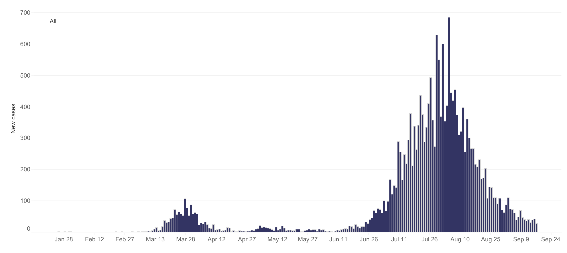
One thing that has become apparent to case number junkies like me is that not every day of the week is equal. On average, certain days of the week tend tend to have higher case numbers than others. You can see this most clearly in the global total, as in the version reproduced below from Our World in Data. Nested within the larger wave of cases is a recurring ripple of a week’s duration.
Surprisingly, there is no consensus yet about why this weekly cycle occurs. The handful of research papers that I have found about the topic all confirm that weekly cycles in cases and deaths are real, but offer contrasting explanations. One paper examining data specific to the US concluded that most of the weekly variations could be explained by quirks in reporting regimes and fluctuations in testing activity. Other studies, especially those looking at countries other than the US, have argued against this explanation and suggested alternative causes. Noting that new cases in several countries tend to peak on Thursdays or Fridays and then fall on weekends, one paper hypothesises that infections rise when the stress of the working week compromises the immune system. Another paper explains the same pattern by suggesting that weekends provide more opportunities for young people to mingle with their elders, thus causing infections that will become symptomatic five days later (i.e. on Thursday or Friday) and leading to deaths about 14 days after symptoms emerge. Yet another paper hypothesises that cycles in air pollution (caused by traffic, for example) or the bodies own circadian rhythms could play a role.
This kind of weekly oscillation has not been as obviously apparent in Australian case numbers, largely because the numbers have been so low to begin with. When cases did get out of control in Victoria a couple of months ago, the Stage 4 lockdown measures introduced in early August turned the numbers around so quickly that there has never been a stable baseline against which to notice more nuanced levels of variation. Even so, I’ve noticed on several occasions that the numbers reported on a Monday are relatively low; and I recently heard Casey Briggs refer to ‘hump day’ in one his regular case reports on the ABC (even if I didn’t catch which day he was actually referring to). I’ve also heard vague references by media commentators to backlogs and fluctuations in the processing of test results, which could influence the number of cases announced on any given day.
This is the sort of information that you need to know if, against your own better judgement, you are going to try to extract some kind of meaning from the daily announcement of new case numbers. As I write this, tomorrow is Friday. If the number that pops up on my phone just after breakfast is hardly any lower than today’s, how worried or surprised or disappointed should I be? Is Friday a day when the numbers tend to be higher or lower than would be dictated by the underlying trend?
I couldn’t find any existing answers to this question, so I got hold of Victoria’s daily case data and took a stab at answering it myself. I should stress that I did this by following my own statistical intuitions rather than emulating any of the methods used in the papers mentioned above (most of which I hadn’t read until after I did this!). I think my approach makes sense, but I make no claims to it being the best method available. If it turns out that I’ve committed some kind of crime against statistics here, I’ll humbly (indeed gratefully) accept a fine from the statistics police.
Method
Anyway, here are the steps I followed in my attempt to find a weekly pattern lurking behind the curve that we have been trying to crush for the past few months:
- I retrieved the daily case data from the Victorian Government’s Covid-19 data page (there is a ‘download’ icon on each of the charts shown).
- I filtered the dataset to start on 1 March 2020, which was just before Victoria’s first wave of cases began.
- I calculated a moving average of the cases per day, using a window of six days on either side of the day for which the average is calculated.
- For each day, I calculated the difference between the recorded number of cases and the moving average. I then calculated the standard deviation of the case numbers for the 13-day window with respect to the moving average.
- For each day, I then converted the number of recorded cases to a Z-score; or in other words, I expressed it as a number of standard deviations from the (moving) mean. The Z-score for each day can be interpreted as a measure of the departure from the trend defined by the moving average. I chose to use Z-scores instead of a more direct measure (such as the difference as a percentage of the mean) because they allow for more meaningful comparisons between periods with markedly different magnitudes and/or variability in case numbers.
- Finally, I converted each date to a day of the week and made the box plot shown below, which summarises the extent to which the recorded numbers on each day of the week, from March until now, were above or below the moving average.
I performed all of these steps in Knime, which is my data analysis tool of choice, as I have written about previously. If you want to retrace my steps or run your own analyses (perhaps with different data or different parameters), you can obtain the workflow from the Knime Hub and run or modify it yourself.
Results and discussion
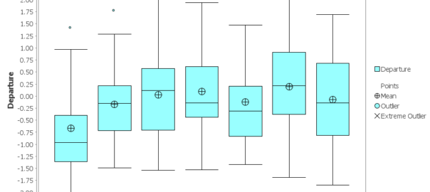
I don’t know if box-and-whisker plots are cool anymore, and this one is pretty ugly as far as they go, but the plot below conveys all that I have been able to determine about the daily variation in Victoria’s Covid-19 cases. If you’re not familiar with this kind of plot, the main thing to know is that half of all the observations for each day are contained within the relevant blue box. The horizontal line inside the box is the median, and the circle with the cross-hairs is the mean. The limits of the ‘whiskers’ mark the maximum and minimum values, except in cases where there are ‘outliers’ beyond a distance of 1.5 times the inter-quartile range (the range covered by the box) from the edge of the box.
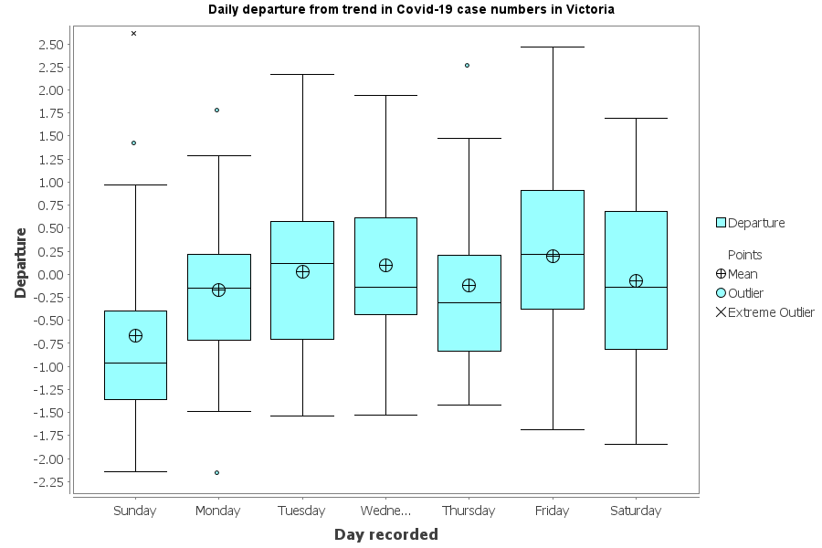
The value being measured in the plot is the distance of daily case numbers from the 13-day moving average, measured in standard deviations (otherwise known as a Z-score). A positive score describes a case number that is higher than the moving average, while a negative number describes a case number below the moving average. The period being analysed is about six months, so there are around 26 observations for each day of the week.
What does the plot tell us? Firstly, it tells us that there is a lot of variation in how far each day’s case numbers depart from the moving average. If we consider only the maximum and minimum values, then each day is essentially the same as the next. But if we turn our attention to the boxes, where half of the observations for each day lie, we can see tantalising signs of a cyclic pattern. Case numbers recorded on Sundays tend to be well below the moving average, and much further below the average than numbers reported on any other day.
Between Sunday and Thursday, there is evidence of a rise and fall, peaking on either Tuesday or Wednesday depending on whether you look at the mean or the median. Thursday’s numbers tend to be relatively low, while the numbers reported on Fridays tend to be relatively high. Saturdays are around average.
Overall, you’d be hard-pressed to identify a ‘hump day’, but you could reasonably declare that Sunday is ‘slump day’. In fact, if I am being cautious, I’d say that this is the only clear finding to be taken from the plot. There is some evidence of a hump on Tuesdays and Wednesdays, and Fridays tend to be high as well, but at the end of the day, there is a lot of overlap among the statistics for Monday through to Saturday.
I know very little about how tests are administered, performed and reported across the week in Victoria, so I am hesitant to speculate about the causes behind these results. It seems intuitively plausible that fewer people might go out of their way to get tested on Sundays, or that fewer testing resources are available, but I have no idea if this is why the numbers recorded on Sundays tend to be low.
Whatever the case, these results do not align very well with the observations from other countries, where (according to the papers I reviewed) cases tend to peak on Thursdays or Fridays and fall on weekends. While the cases recorded in Victoria on Fridays tend to be high, those recorded on Thursdays tend to be low. And while the cases recorded on Sundays tend to be lower than any other day, those recorded on Saturdays are on par with the working week. So if there is indeed a weekly cycle in Victoria’s cases, its profile appears to differ from the cycle observed in other parts of the world.
Other countries
Speaking of the rest of the world, let’s see what the case data from other countries looks like when passed through the same process as I’ve just done for Victoria. Here are the plots for Germany, Sweden, Italy, Indonesia and the United States. All plots pertain to data reported between 1 March and 16 September. I obtained the data for these plots from Our World in Data.
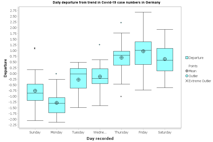
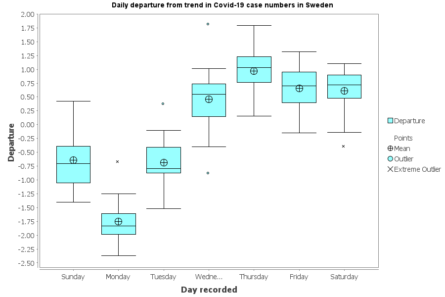
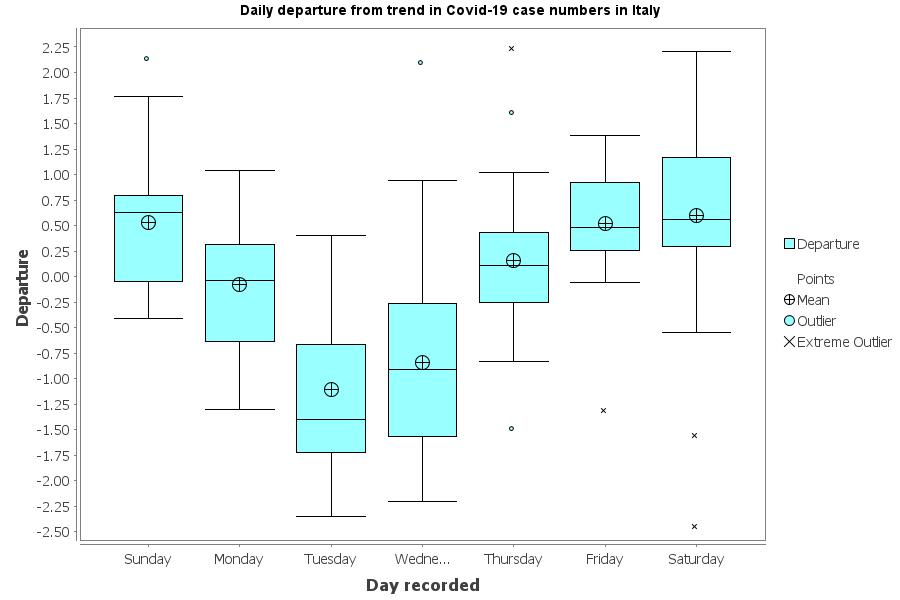

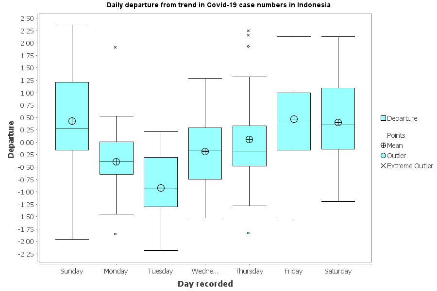
All of these plots show clearer trends than the plot for Victoria. Interestingly though, they don’t all show the same pattern as each other. Germany’s numbers are lowest (compared to the trend) on Tuesdays, while Sweden’s are lowest on Mondays. Italy and Indonesia have low points on Wednesdays, while Tuesdays and Wednesdays are equal lowest in the United States. Peak days also vary: Thursday in Sweden, Sunday in the US, and Saturdays and Sundays in Germany and Italy.
In any case, one thing that these plots do show is that my method can detect clear weekly cycles in countries that have had a large number of cases. In comparison, the weekly cycle in Melbourne is barely detectable.
Conclusion
After all that, I’m afraid I’m not that much better equipped to interpret whatever number gets announced by Victoria’s Health Department tomorrow morning. I know only that the numbers reported on Fridays (that is, those recorded on Thursdays) numbers are, on average, slightly lower than what you would expect based on a moving average. If tomorrow’s number is higher than the average from the last few days, then I suppose I’ll have more reason to be peeved. If it is as low as today’s three-month low of 28, I’ll be just as happy as I otherwise would be. And if it is somewhere in between, I’ll probably start thinking about next Monday morning, when I’ll be hopeful of seeing an especially low number, given the tendency for Sundays to have fewer cases than the moving average. If that doesn’t eventuate, I’ll console myself with the knowledge that plenty of Sundays have been above trend, as well.
In other words, my findings about Victoria’s case numbers have next to no predictive utility at all, such is the level of variability that they reveal. Even so, they do provide weak evidence that the variation in Victoria’s case numbers from day to day is not entirely random. Furthermore, insofar as there is a cyclical pattern, it appears to be quite different from those observed overseas.